ASP.NET Core
A set of technologies in the .NET Framework for building web applications and XML web services.
4,156 questions
This browser is no longer supported.
Upgrade to Microsoft Edge to take advantage of the latest features, security updates, and technical support.
' cx='32' cy='32' r='32' /%3E%3Ctext x='50%25' y='55%25' dominant-baseline='middle' text-anchor='middle' fill='%23FFF' %3EJ%3C/text%3E%3C/svg%3E)
I prepare applications to cover both mobile devices and the website. For this, I created the razor library with the entire user interface, shared by two other projects. Blazor and MAUI. In this RCL library, it is a great idea to make various UI adjustments depending on whether it is a mobile device or a browser on a PC. Others depending on screen resolution. How to check from RCL whether it is a mobile device or a browser? How to check the screen resolution from the RCP level?
' cx='32' cy='32' r='32' /%3E%3Ctext x='50%25' y='55%25' dominant-baseline='middle' text-anchor='middle' fill='%23FFF' %3EZL%3C/text%3E%3C/svg%3E)
Hi @jjurkowski ,
In the RCL application, whether your are using Bootstrap framework to set the CSS style or set the CSS style by yourself?
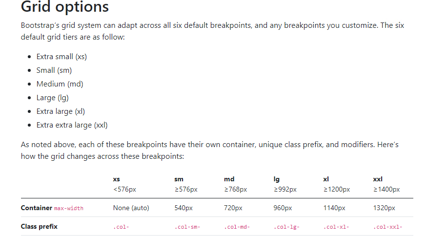
The Bootstrap Framework is a HTML, CSS, and JavaScript framework for developing responsive, mobile-first websites. By default asp.net core application will use it to set the response layout.
If you are using it, you can use the Bootstrap Breakpoints or Grid to control when your layout can be adapted at a particular viewport or device size. More detail information about using Bootstrap, see Bootstrap tutorial
If you set the CSS style by yourself, you can set the @media rules for mobile device or PC browser.
// Small devices (landscape phones, 576px and up)
@media (min-width: 576px) { ... }

// Medium devices (tablets, 768px and up)
@media (min-width: 768px) { ... }

// Large devices (desktops, 992px and up)
@media (min-width: 992px) { ... }

// X-Large devices (large desktops, 1200px and up)
@media (min-width: 1200px) { ... }

// XX-Large devices (larger desktops, 1400px and up)
@media (min-width: 1400px) { ... }
If the answer is the right solution, please click "Accept Answer" and kindly upvote it. If you have extra questions about this answer, please click "Comment".
Note: Please follow the steps in our documentation to enable e-mail notifications if you want to receive the related email notification for this thread.
Best regards,
Dillion