Tutorial: From Excel workbook to stunning report in Power BI Desktop
APPLIES TO: ![]() Power BI Desktop
Power BI Desktop ![]() Power BI service
Power BI service
In this tutorial, you build a beautiful report from start to finish in 20 minutes!
Your manager wants to see a report on your latest sales figures. They've requested an executive summary of:
- Which month and year had the most profit?
- Where is the company seeing the most success (by country/region)?
- Which product and segment should the company continue to invest in?
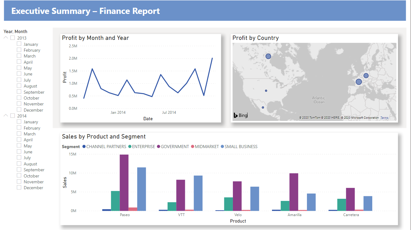
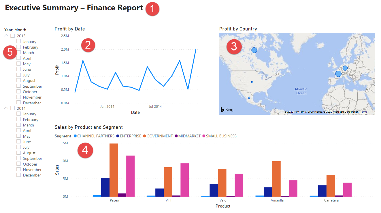
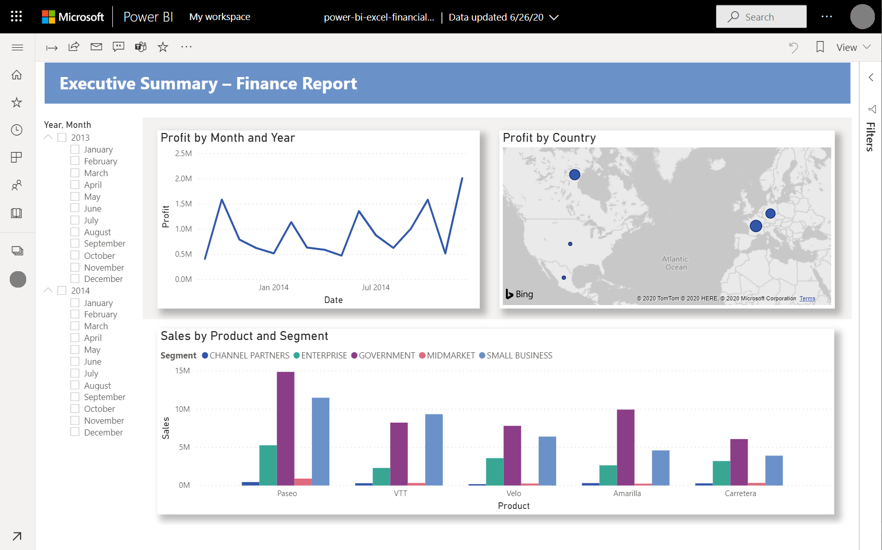
Using our sample finance workbook, we can build this report in no time. Here’s what the final report will look like. Let’s get started!
In this tutorial, you'll learn how to:
- Download sample data two different ways
- Prepare your data with a few transformations
- Build a report with a title, three visuals, and a slicer
- Publish your report to the Power BI service so you can share it with your colleagues
Prerequisites
- Before you start, you need to download Power BI Desktop.
- If you're planning to publish your report to the Power BI service and you aren't signed up yet, sign up for a free trial.
Get data
You can get the data for this tutorial using one of two methods.
Get data in Power BI Desktop
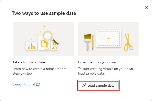
When you open Power BI Desktop, select Try a sample semantic model from the blank canvas.
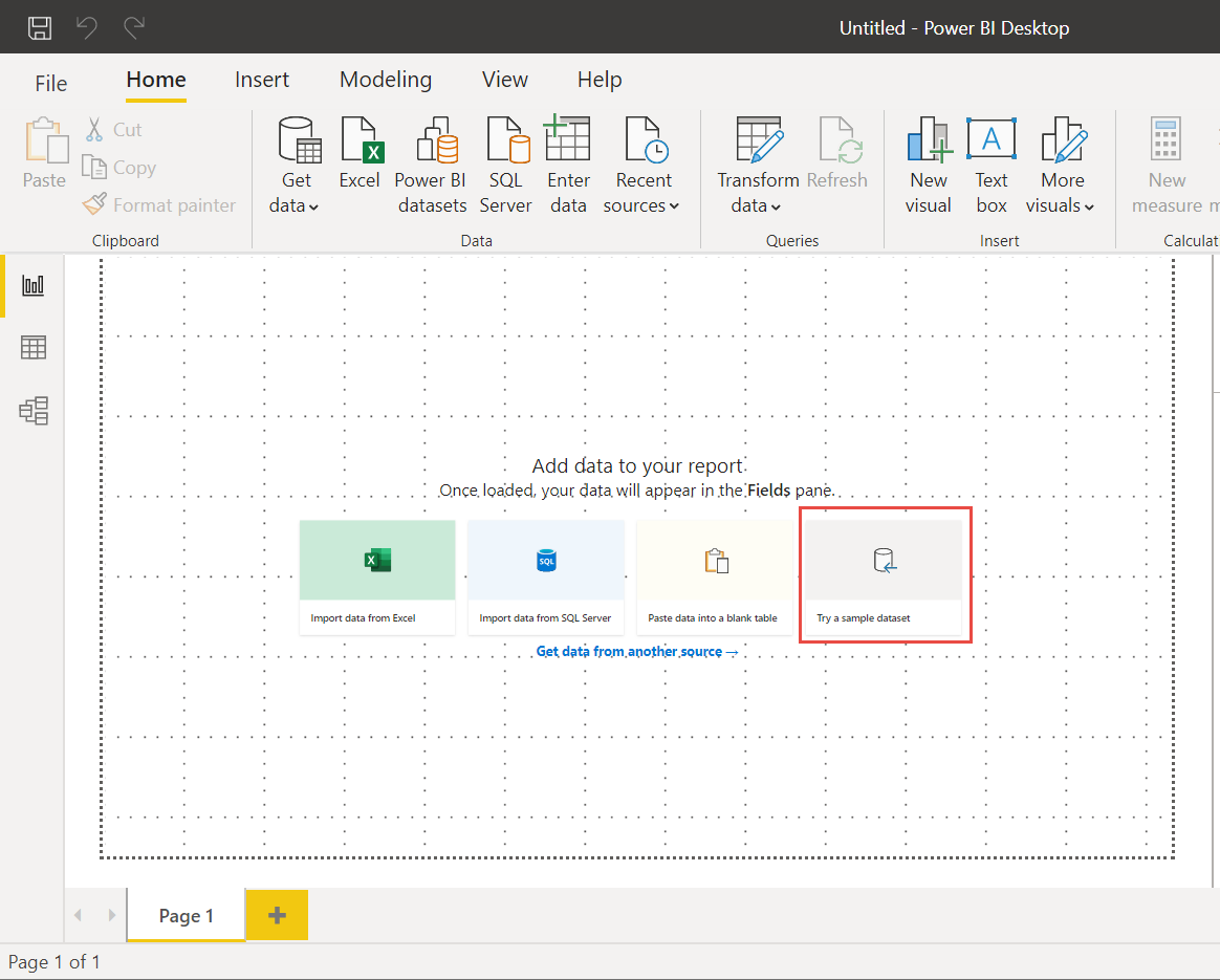
If you've landed on this tutorial from Power BI Desktop, go ahead and choose Load data.
Download the sample
You can also download the sample workbook directly.
- Download the Financial sample Excel workbook.
- Open Power BI Desktop.
- In the Data section of the Home ribbon, select Excel.
- Navigate to where you saved the sample workbook, and select Open.
Prepare your data
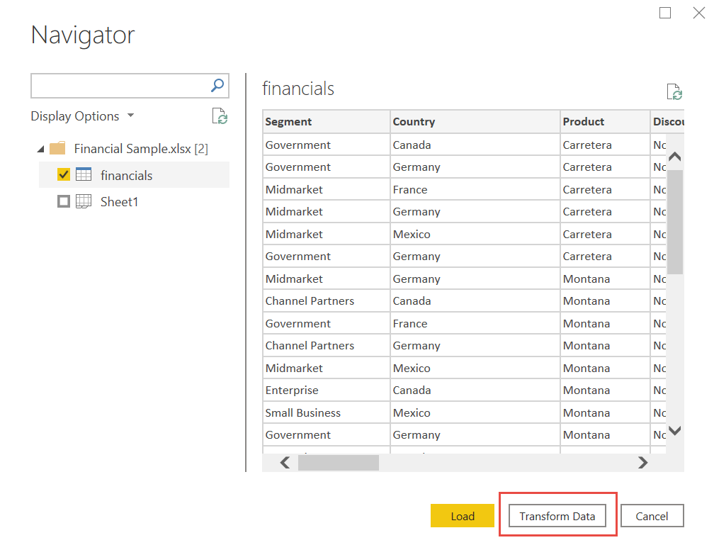
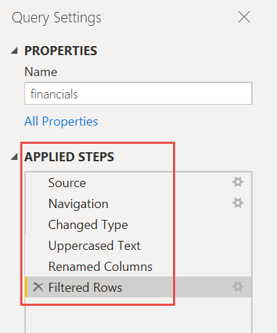
In Navigator, you have the option to transform or load the data. The Navigator provides a preview of your data so you can verify that you have the correct range of data. Numeric data types are italicized. If you need to make changes, transform your data before loading. To make the visualizations easier to read later, we do want to transform the data now. As you do each transformation, you see it added to the list under Query Settings in Applied Steps
Select the Financials table, and choose Transform Data.
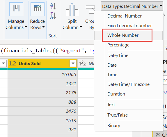
Select the Units Sold column. On the Transform tab, select Data Type, then select Whole Number. Choose Replace current to change the column type.
The top data cleaning step users do most often is changing data types. In this case, the units sold are in decimal form. It doesn’t make sense to have 0.2 or 0.5 of a unit sold, does it? So let’s change that to whole number.
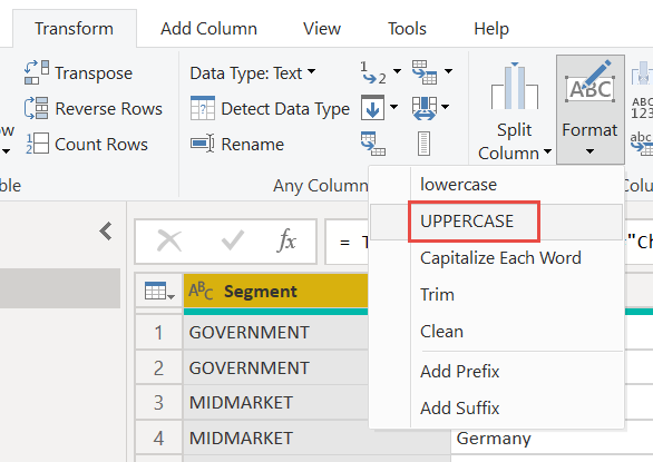
Select the Segment column. We want to make the segments easier to see in the chart later, so let’s format the Segment column. On the Transform tab, select Format, then select UPPERCASE.
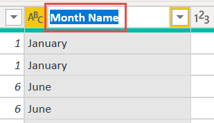
Let's shorten the column name from Month Name to just Month. Double-click the Month Name column, and rename to just Month.
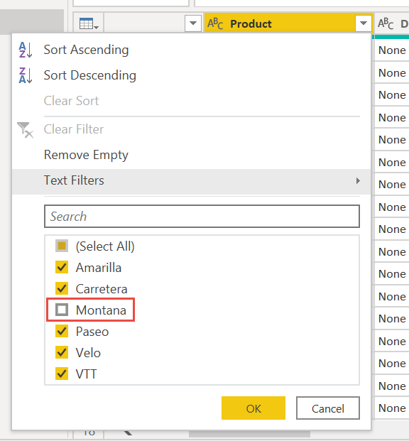
In the Product column, select the dropdown and clear the box next to Montana.
We know the Montana product was discontinued last month, so we want to filter this data from our report to avoid confusion.
You see that each transformation has been added to the list under Query Settings in Applied Steps.
Back on the Home tab, select Close & Apply. Our data is almost ready for building a report.
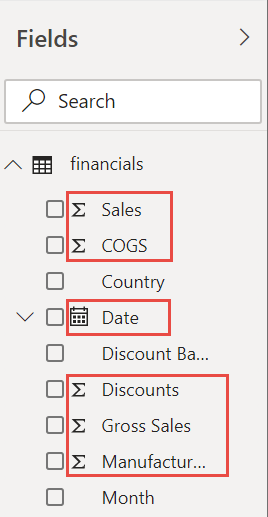
You see the Sigma symbol in the Fields list? Power BI has detected that those fields are numeric. Power BI also indicates the date field with a calendar symbol.
Extra credit: Write an expression in DAX
Writing measures and creating tables in the DAX formula language is super powerful for data modeling. There's lots to learn about DAX in the Power BI documentation. For now, let's write a basic expression and join two tables.
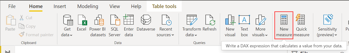
On the Home ribbon, select New measure.
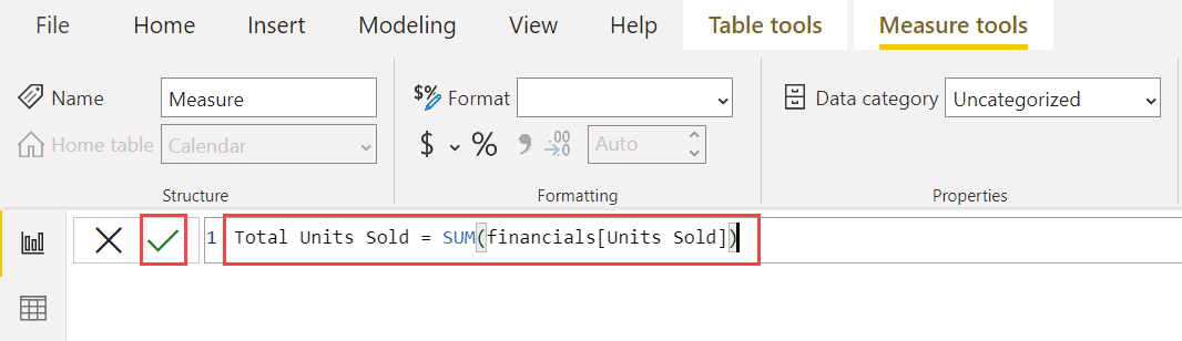
Type this expression to add all the numbers in the Units Sold column.
Total Units Sold = SUM(financials[Units Sold])Select the check mark to commit.
Now select the Data view on the left.
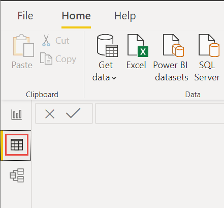
On the Home ribbon, select New table.
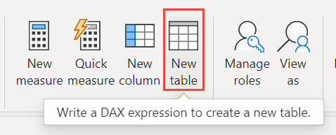
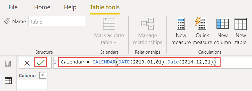
Type this expression to generate a Calendar table of all dates between January 1, 2013, and December 31, 2014.
Calendar = CALENDAR(DATE(2013,01,01),Date(2014,12,31))Select the check mark to commit.
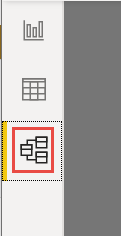
Now select Model view on the left.
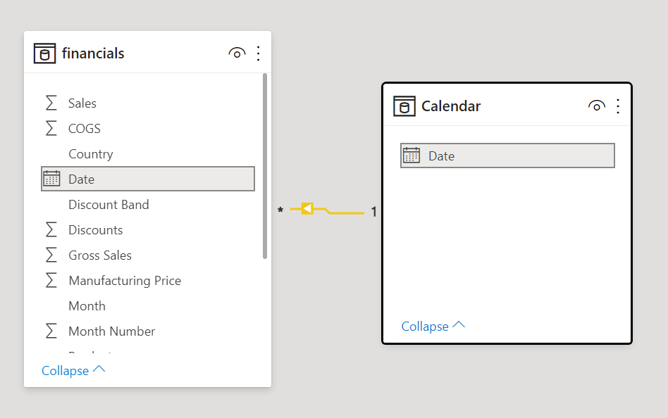
Drag the Date field from the financials table to the Date field in the Calendar table to join the tables, and create a relationship between them.
Build your report
Now that you've transformed and loaded your data, it's time to create your report. In the Fields pane on the right, you see the fields in the data model you created.
Let’s build the final report, one visual at a time.
Visual 1: Add a title
On the Insert ribbon, select Text Box. Type “Executive Summary – Finance Report”.
Select the text you typed. Set the Font Size to 20 and Bold.
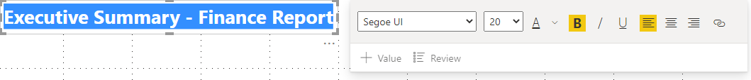
Resize the box to fit on one line.
Visual 2: Profit by Date
Now, you create a line chart to see which month and year had the highest profit.
From the Fields pane, drag the Profit field to a blank area on the report canvas. By default, Power BI displays a column chart with one column, Profit.
Drag the Date field to the same visual. If you created a Calendar table in Extra credit: Create a table in DAX earlier in this article, drag the Date field from your Calendar table instead.
Power BI updates the column chart to show profit by the two years.
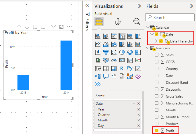
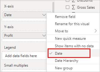
In the Fields section of the Visualizations pane, select the drop-down in the X-axis value. Change Date from Date Hierarchy to Date.
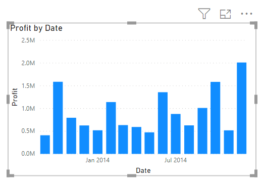
Power BI updates the column chart to show profit for each month.
In the Visualizations pane, change the visualization type to Line chart.
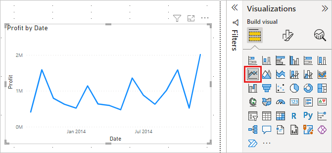
Now you can easily see that December 2014 had the most profit.
Visual 3: Profit by Country/Region
Create a map to see which country/region had the highest profits.
From the Fields pane, drag the Country field to a blank area on your report canvas to create a map.
Drag the Profit field to the map.
Power BI creates a map visual with bubbles representing the relative profit of each location.
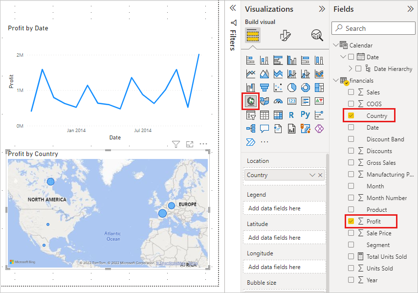
Europe seems to be performing better than North America.
Visual 4: Sales by Product and Segment
Create a bar chart to determine which companies and segments to invest in.
Drag the two charts you've created to be side by side in the top half of the canvas. Save some room on the left side of the canvas.
Select a blank area in the lower half of your report canvas.
In the Fields pane, select the Sales, Product, and Segment fields.
Power BI automatically creates a clustered column chart.
Drag the chart so it's wide enough to fill the space under the two upper charts.
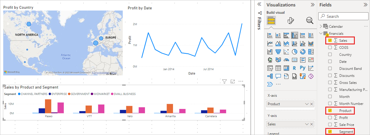
Looks like the company should continue to invest in the Paseo product and target the Small Business and Government segments.

Visual 5: Year slicer
Slicers are a valuable tool for filtering the visuals on a report page to a specific selection. In this case, we can create two different slicers to narrow in on performance for each month and year. One slicer uses the date field in the original table. The other uses the date table you may have created for "extra credit" earlier in this tutorial.
Date slicer using the original table
In the Fields pane, select the Date field in the Financials table. Drag it to the blank area on the left of the canvas.
In the Visualizations pane, choose Slicer.
Power BI automatically creates a numeric range slicer.
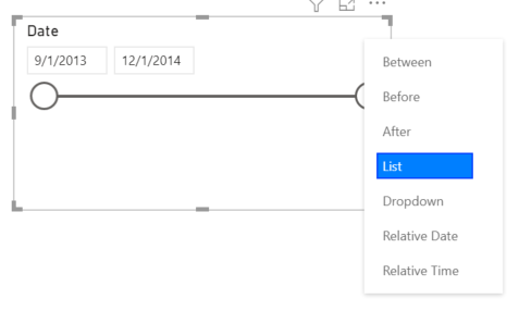
You can drag the ends to filter, or select the arrow in the upper-right corner and change it to a different type of slicer.
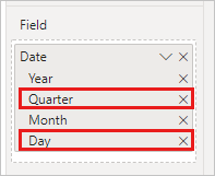
Date slicer using the DAX table
In the Fields pane, select the Date field in the Calendar table. Drag it to the blank area on the left of the canvas.
In the Visualizations pane, choose Slicer.
In the Fields section of the Visualizations pane, select the drop-down in Fields. Remove Quarter and Day so only Year and Month are left.
Expand each year and resize the visual, so all months are visible.
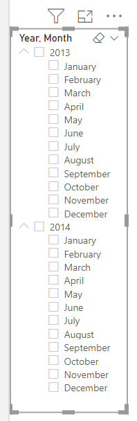
We'll use this slicer in the finished report.
Now if your manager asks to see just 2013 data, you can use either slicer to select years, or specific months of each year.
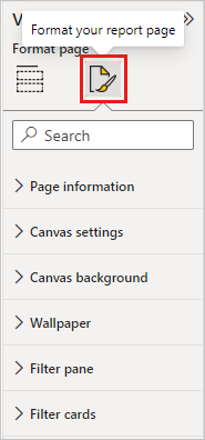
Extra credit: Format the report
If you want to do some light formatting on this report to add more polish, here are a few easy steps.
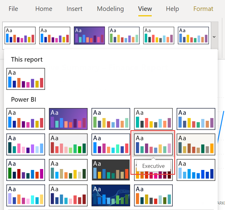
Theme
On the View ribbon, change the theme to Executive.
Spruce up the visuals
Make the following changes on the Format tab in the Visualizations pane.
Select Visual 2. In the Title section, change Title text to “Profit by Month and Year” and Text size to 16 pt. Toggle Shadow to On.
Select Visual 3. In the Map styles section, change Theme to Grayscale. In the Title section, change title Text size to 16 pt. Toggle Shadow to On.
Select Visual 4. In the Title section, change title Text size to 16 pt. Toggle Shadow to On.
Select Visual 5. In the Selection controls section, toggle Show "Select all" option to On. In the Slicer header section, increase Text size to 16 pt.
Add a background shape for the title
On the Insert ribbon, select Shapes > Rectangle. Place it at the top of the page, and stretch it to be the width of the page and height of the title.
In the Format shape pane, in the Outline section, change Transparency to 100%.
In the Fill section, change Fill color to Theme color 5 #6B91C9 (blue).
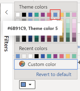
On the Format tab, select Send backward > Send to back.
Select the text in Visual 1, the title, and change the font color to White.
Add a background shape for visuals 2 and 3
- On the Insert ribbon, select Shapes > Rectangle, and stretch it to be the width and height of Visuals 2 and 3.
- In the Format shape pane, in the Outline section, change Transparency to 100%.
- In the Fill section, set the color to White, 10% darker.
- On the Format tab, select Send backward > Send to back.
Finished report
Here's how your final polished report will look:
In summary, this report answers your manager’s top questions:
Which month and year had the most profit?
December 2014
Which country/region is the company seeing the most success in?
In Europe, specifically France and Germany.
Which product and segment should the company continue to invest in?
The company should continue to invest in the Paseo product and target the Small Business and Government segments.
Save your report
- On the File menu, select Save.
Publish to the Power BI service to share
To share your report with your manager and colleagues, publish it to the Power BI service. When you share with colleagues that have a Power BI account, they can interact with your report, but can’t save changes.
In Power BI Desktop, select Publish on the Home ribbon.
You may need to sign in to the Power BI service. If you don't have an account yet, you can sign up for a free trial.
Select a destination such as My workspace in the Power BI service > Select.
Select Open 'your-file-name' in Power BI.
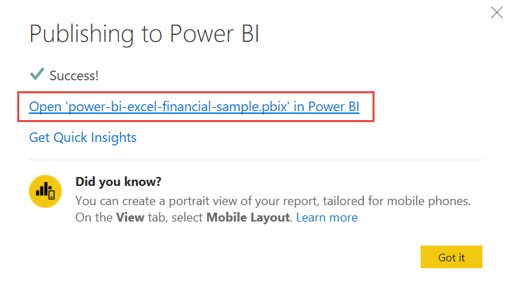
Your completed report opens in the browser.
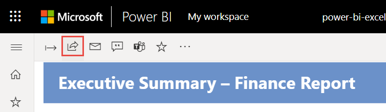
Select Share at the top of the report to share your report with others.
Related content
More questions? Try the Power BI Community.
Povratne informacije
Uskoro: tokom 2024. postepeno ćemo ukidati probleme s uslugom GitHub kao mehanizam povratnih informacija za sadržaj i zamijeniti ga novim sistemom povratnih informacija. Za više informacija, pogledajte https://aka.ms/ContentUserFeedback.
Pošalјite i prikažite povratne informacije za