Troubleshooting metrics charts
Use this article if you run into issues with creating, customizing, or interpreting charts in Azure metrics explorer. If you're new to metrics, learn about getting started with metrics explorer and advanced features of metrics explorer. You can also see examples of the configured metric charts.
Chart shows no data
Sometimes the charts might show no data after selecting correct resources and metrics. Several of the following reasons can cause this behavior:
Microsoft.Insights resource provider isn't registered for your subscription
Exploring metrics requires Microsoft.Insights resource provider registered in your subscription. In many cases, it's registered automatically (that is, after you configure an alert rule, customize diagnostic settings for any resource, or configure an autoscale rule). If the Microsoft.Insights resource provider isn't registered, you must manually register it by following steps described in Azure resource providers and types.
Solution: Open Subscriptions, Resource providers tab, and verify that Microsoft.Insights is registered for your subscription.
You don't have sufficient access rights to your resource
In Azure, Azure role-based access control (Azure RBAC) controls access to metrics. You must be a member of monitoring reader, monitoring contributor, or contributor to explore metrics for any resource.
Solution: Ensure that you have sufficient permissions for the resource from which you're exploring metrics.
Your resource didn't emit metrics during the selected time range
Some resources don’t constantly emit their metrics. For example, Azure doesn't collect metrics for stopped virtual machines. Other resources might emit their metrics only when some condition occurs. For example, a metric showing processing time of a transaction requires at least one transaction. If there were no transactions in the selected time range, the chart is naturally empty. Additionally, while most of the metrics in Azure are collected every minute, there are some that are collected less frequently. See the metric documentation to get more details about the metric that you're trying to explore.
Solution: Change the time of the chart to a wider range. You may start from “Last 30 days” using a larger time granularity (or relying on the “Automatic time granularity” option).
You picked a time range greater than 30 days
Most metrics in Azure are stored for 93 days. However, you can only query for no more than 30 days worth of data on any single chart. This limitation doesn't apply to log-based metrics.
Solution: If you see a blank chart or your chart only displays part of metric data, verify that the difference between start- and end- dates in the time picker doesn't exceed the 30-day interval. Once you select a 30 day interval, you can pan the chart to view the full retention window.
All metric values were outside of the locked y-axis range
By locking the boundaries of chart y-axis, you can unintentionally make the chart display area not show the chart line. For example, if the y-axis is locked to a range between 0% and 50%, and the metric has a constant value of 100%, the line is always rendered outside of the visible area, making the chart appear blank.
Solution: Verify that the y-axis boundaries of the chart aren’t locked outside of the range of the metric values. If the y-axis boundaries are locked, you may want to temporarily reset them to ensure that the metric values don’t fall outside of the chart range. Locking the y-axis range isn’t recommended with automatic granularity for the charts with sum, min, and max aggregation because their values will change with granularity by resizing browser window or going from one screen resolution to another. Switching granularity may leave the display area of your chart empty.
You're looking at a Guest (classic) metric but didn’t enable Azure Diagnostic Extension
Collection of Guest (classic) metrics requires configuring the Azure Diagnostics Extension or enabling it using the Diagnostic Settings panel for your resource.
Solution: If Azure Diagnostics Extension is enabled but you're still unable to see your metrics, follow steps outlined in Azure Diagnostics Extension troubleshooting guide. See also the troubleshooting steps for Cannot pick Guest (classic) namespace and metrics
Chart is segmented by a property that the metric doesn't define
If you segment a chart by a property that the metric doesn't define, the chart displays no content.
Solution: Clear the segmentation (splitting), or choose a different property.
Filter on another chart excludes all data
Filters apply to all of the charts on the pane. If you set a filter on another chart, it could exclude all data from the current chart.
Solution: Check the filters for all the charts on the pane. If you want different filters on different charts, create the charts in different panes. Save the charts as separate favorites. If you want, you can pin the charts to the dashboard so you can see them together.
“Error retrieving data” message on dashboard
This problem may happen when your dashboard was created with a metric that was later deprecated and removed from Azure. To verify that it's the case, open the Metrics tab of your resource, and check the available metrics in the metric picker. If the metric isn't shown, the metric has been removed from Azure. Usually, when a metric is deprecated, there's a better new metric that provides with a similar perspective on the resource health.
Solution: Update the failing tile by picking an alternative metric for your chart on dashboard. You can review a list of available metrics for Azure services.
Chart shows dashed line
Azure metrics charts use dashed line style to indicate that there's a missing value (also known as “null value”) between two known time grain data points. For example, if in the time selector you picked “1 minute” time granularity but the metric was reported at 07:26, 07:27, 07:29, and 07:30 (note a minute gap between second and third data points), then a dashed line connects 07:27 and 07:29 and a solid line connects all other data points. The dashed line drops down to zero when the metric uses count and sum aggregation. For the avg, min or max aggregations, the dashed line connects two nearest known data points. Also, when the data is missing on the rightmost or leftmost side of the chart, the dashed line expands to the direction of the missing data point.

Solution: This behavior is by design. It's useful for identifying missing data points. The line chart is a superior choice for visualizing trends of high-density metrics but may be difficult to interpret for the metrics with sparse values, especially when corelating values with time grain is important. The dashed line makes reading of these charts easier but if your chart is still unclear, consider viewing your metrics with a different chart type. For example, a scattered plot chart for the same metric clearly shows each time grain by only visualizing a dot when there's a value and skipping the data point altogether when the value is missing:
Note
If you still prefer a line chart for your metric, moving mouse over the chart may help to assess the time granularity by highlighting the data point at the location of the mouse pointer.
Units of measure in metrics charts
Azure monitor metrics uses SI based prefixes. Metrics only use IEC prefixes if the resource provider chooses an appropriate unit for a metric.
For ex: The resource provider Network interface (resource name: rarana-vm816) has no metric unit defined for "Packets Sent". The prefix used for the metric value here's k representing kilo (1000), a SI prefix.

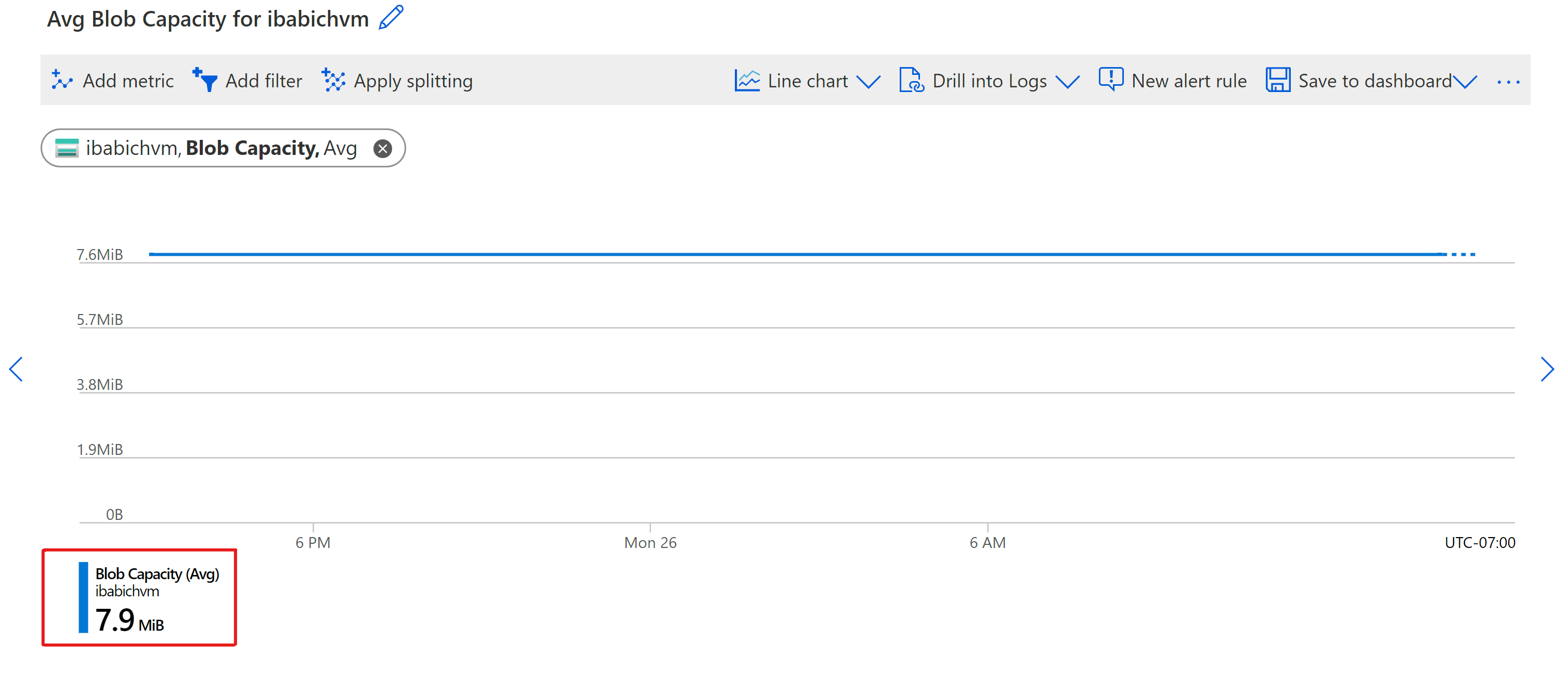
The resource provider Storage account (resource name: ibabichvm) has metric unit defined for "Blob Capacity" as bytes. Hence, the prefix used is mebi (1024^2), an IEC prefix.

SI uses decimal
| Value | abbreviation | SI |
|---|---|---|
| 1000 | k | kilo |
| 1000^2 | M | mega |
| 1000^3 | G | giga |
| 1000^4 | T | tera |
| 1000^5 | P | peta |
| 1000^6 | E | exa |
| 1000^7 | Z | zetta |
| 1000^8 | Y | yotta |
IEC uses binary
| Value | abbreviation | IEC | Legacy | SI |
|---|---|---|---|---|
| 1024 | Ki | kibi | K | kilo |
| 1024^2 | Mi | mebi | M | mega |
| 1024^3 | Gi | gibi | G | giga |
| 1024^4 | Ti | tebi | T | tera |
| 1024^5 | Pi | pebi | - | |
| 1024^6 | Ei | exbi | - | |
| 1024^7 | Zi | zebi | - | |
| 1024^8 | Yi | yobi | - |
Chart shows unexpected drop in values
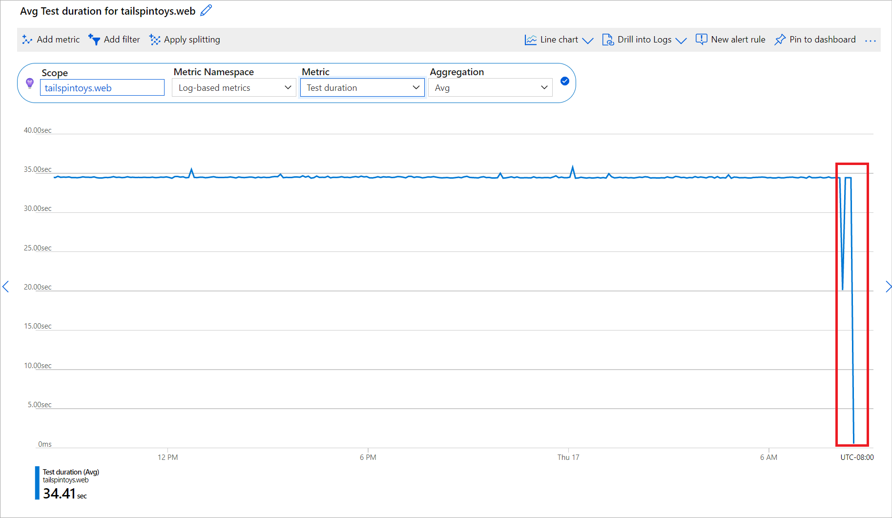
In many cases, the perceived drop in the metric values is a misunderstanding of the data shown on the chart. You can be misled by a drop in sums or counts when the chart shows the most-recent minutes because Azure hasn't received or processed the last metric data points yet. Depending on the service, the latency of processing metrics can be within a couple minutes range. For charts showing a recent time range with a 1- or 5- minute granularity, a drop of the value over the last few minutes becomes more noticeable:

Solution: This behavior is by design. We believe that showing data as soon as we receive it's beneficial even when the data is partial or incomplete. Doing so allows you to make important conclusion sooner and start investigation right away. For example, for a metric that shows the number of failures, seeing a partial value X tells you that there were at least X failures on a given minute. You can start investigating the problem right away, rather than wait to see the exact count of failures that happened on this minute, which might not be as important. The chart updates once we receive the entire set of data, but at that time it may also show new incomplete data points from more recent minutes.
Cannot pick Guest namespace and metrics
Virtual machines and virtual machine scale sets have two categories of metrics: Virtual Machine Host metrics that are collected by the Azure hosting environment, and Guest (classic) metrics that are collected by the monitoring agent running on your virtual machines. You install the monitoring agent by enabling Azure Diagnostic Extension.
By default, Guest (classic) metrics are stored in Azure Storage account, which you pick from the Diagnostic settings tab of your resource. If Guest metrics aren't collected or metrics explorer cannot access them, you'll only see the Virtual Machine Host metric namespace:
Solution: If you don't see Guest (classic) namespace and metrics in metrics explorer:
Confirm that Azure Diagnostic Extension is enabled and configured to collect metrics.
Warning
You cannot use Log Analytics agent (also referred to as the Microsoft Monitoring Agent, or "MMA") to send Guest (classic) into a storage account.
Ensure that Microsoft.Insights resource provider is registered for your subscription.
Verify that storage account isn't protected by the firewall. Azure portal needs access to storage account in order to retrieve metrics data and plot the charts.
Use Azure Storage Explorer to validate that metrics are flowing into the storage account. If metrics aren't collected, follow the Azure Diagnostics Extension troubleshooting guide.
Log and queries are disabled for Drill into Logs
To view recommended logs and queries, you must route your diagnostic logs to Log Analytics.
Solution: To route your diagnostic logs to Log Analytics, see Diagnostic settings in Azure Monitor.
Only the Activity logs appear in Drill into Logs
The Drill into Logs feature is only available for select resource providers. By default, activity logs are provided.
Solution: This behavior is expected for some resource providers.
Next steps
Feedback
Coming soon: Throughout 2024 we will be phasing out GitHub Issues as the feedback mechanism for content and replacing it with a new feedback system. For more information see: https://aka.ms/ContentUserFeedback.
Submit and view feedback for

