Visualize data using the Azure Data Explorer connector for Excel
Azure Data Explorer provides two options for connecting to data in Excel: use the native connector or import a query from Azure Data Explorer. This article shows you how to use the native connector in Excel and connect to the Azure Data Explorer cluster to get and visualize data.
The Azure Data Explorer Excel native connector offers the ability to export query results to Excel. You can also add a KQL query as an Excel data source for additional calculations or visualizations.
Define Kusto query as an Excel data source and load the data to Excel
Open Microsoft Excel.
In the Data tab, select Get Data > From Azure > From Azure Data Explorer.
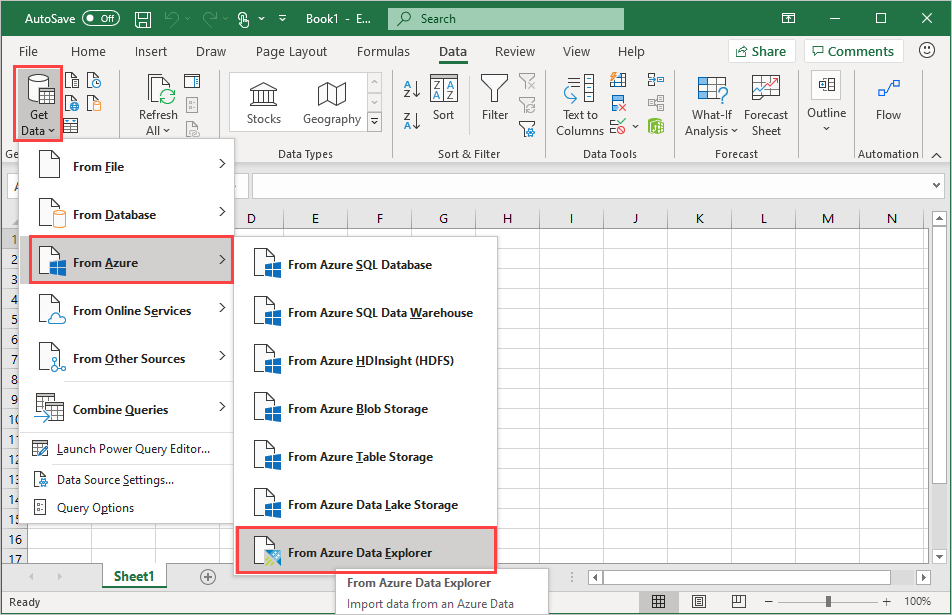
In the Azure Data Explorer (Kusto) window, complete the following fields and select OK.
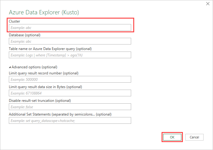
Field Description Cluster Name of cluster (mandatory) Database Name of database Table name or Azure Data Explorer query Name of table or Azure Data Explorer query Advanced Options:
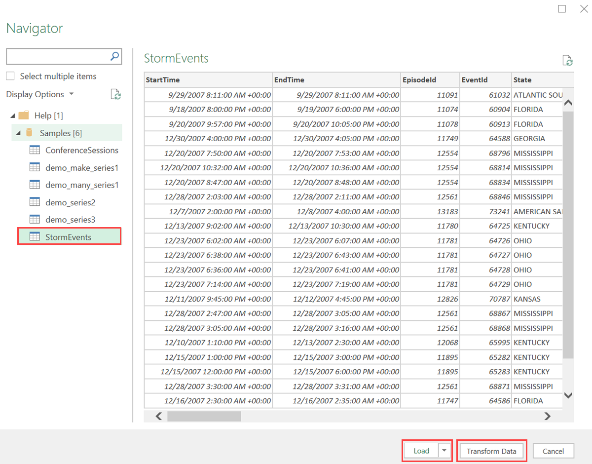
Field Description Limit query result record number Limit the number of records loaded into excel Limit query result data size (bytes) Limit the data size Disable result-set truncation Additional Set statements (separated by semicolons) Add setstatements to apply to data sourceIn the Navigator pane, navigate to the correct table. In the table preview pane, select Transform Data to make changes to your data or select Load to load it to Excel.
Tip
If Database and/or Table name or Azure Data Explorer query are already specified, the correct table preview pane will open automatically.
Analyze and visualize data in Excel
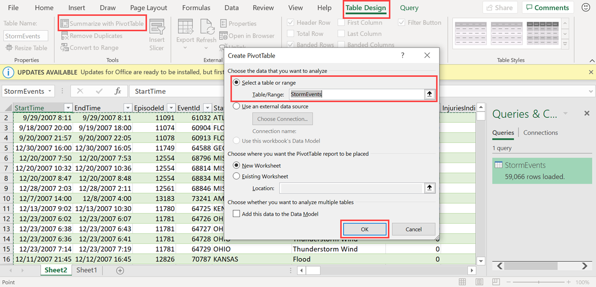
Once the data loads to excel and is available in your Excel sheet, you can analyze, summarize, and visualize the data by creating relationships and visuals.
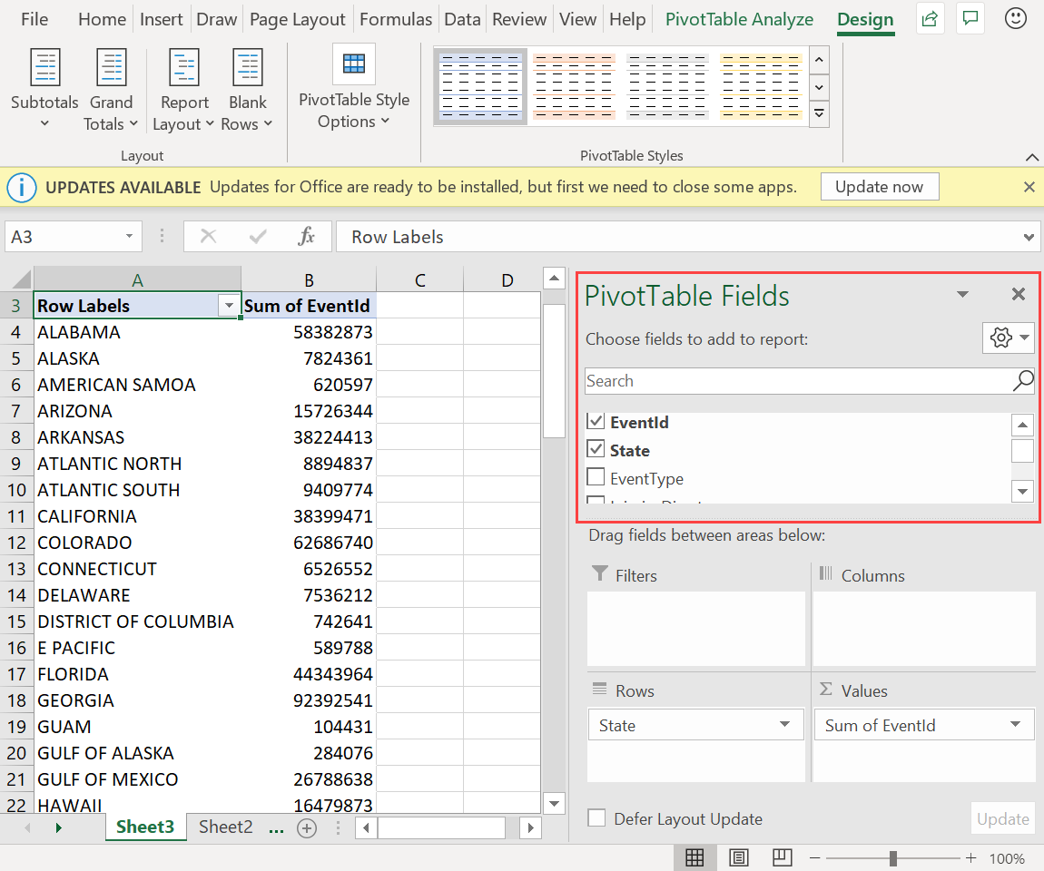
In the Table Design tab, select Summarize with PivotTable. In the Create PivotTable window, select the relevant table, and select OK.
In the PivotTable Fields pane, select the relevant table columns to create summary tables. In the example below, EventId and State are selected.
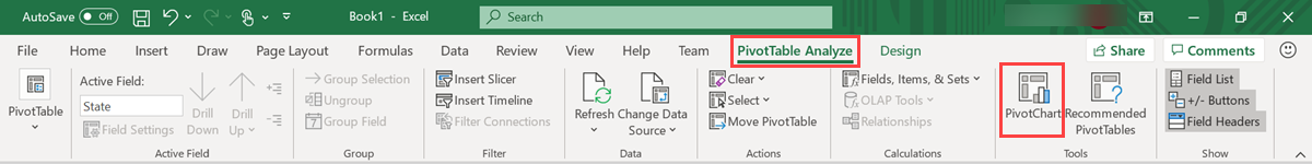
In the PivotTable Analyze tab, select PivotChart to create visuals based on the table.
In the example below, use Event Id, StartTime, and EventType to view additional information about the weather events.
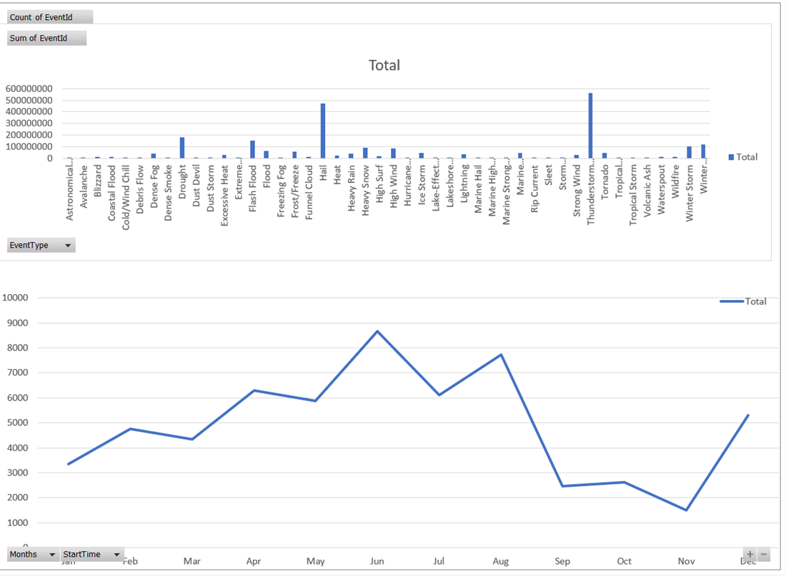
Create full dashboards to monitor your data.
Next step
Feedback
Coming soon: Throughout 2024 we will be phasing out GitHub Issues as the feedback mechanism for content and replacing it with a new feedback system. For more information see: https://aka.ms/ContentUserFeedback.
Submit and view feedback for