Use the Responsible AI dashboard in Azure Machine Learning studio
Responsible AI dashboards are linked to your registered models. To view your Responsible AI dashboard, go into your model registry and select the registered model you've generated a Responsible AI dashboard for. Then, select the Responsible AI tab to view a list of generated dashboards.

You can configure multiple dashboards and attach them to your registered model. Various combinations of components (interpretability, error analysis, causal analysis, and so on) can be attached to each Responsible AI dashboard. The following image displays a dashboard's customization and the components that were generated within it. In each dashboard, you can view or hide various components within the dashboard UI itself.

Select the name of the dashboard to open it into a full view in your browser. To return to your list of dashboards, you can select Back to models details at any time.

Full functionality with integrated compute resource
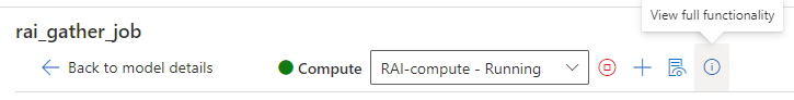
Some features of the Responsible AI dashboard require dynamic, on-the-fly, and real-time computation (for example, what-if analysis). Unless you connect a compute resource to the dashboard, you might find some functionality missing. When you connect to a compute resource, you enable full functionality of your Responsible AI dashboard for the following components:
- Error analysis
- Setting your global data cohort to any cohort of interest will update the error tree instead of disabling it.
- Selecting other error or performance metrics is supported.
- Selecting any subset of features for training the error tree map is supported.
- Changing the minimum number of samples required per leaf node and error tree depth is supported.
- Dynamically updating the heat map for up to two features is supported.
- Feature importance
- An individual conditional expectation (ICE) plot in the individual feature importance tab is supported.
- Counterfactual what-if
- Generating a new what-if counterfactual data point to understand the minimum change required for a desired outcome is supported.
- Causal analysis
- Selecting any individual data point, perturbing its treatment features, and seeing the expected causal outcome of causal what-if is supported (only for regression machine learning scenarios).
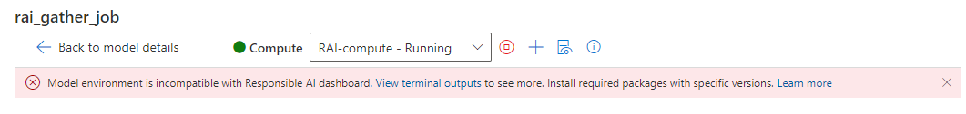
You can also find this information on the Responsible AI dashboard page by selecting the Information icon, as shown in the following image:
Enable full functionality of the Responsible AI dashboard
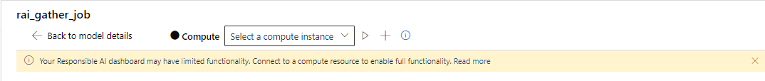
Select a running compute instance in the Compute dropdown list at the top of the dashboard. If you don't have a running compute, create a new compute instance by selecting the plus sign (+) next to the dropdown. Or you can select the Start compute button to start a stopped compute instance. Creating or starting a compute instance might take few minutes.
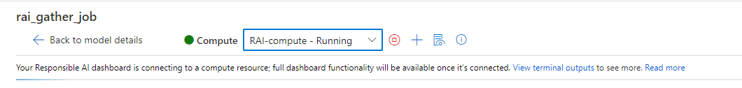
When a compute is in a Running state, your Responsible AI dashboard starts to connect to the compute instance. To achieve this, a terminal process is created on the selected compute instance, and a Responsible AI endpoint is started on the terminal. Select View terminal outputs to view the current terminal process.
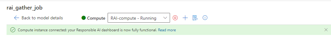
When your Responsible AI dashboard is connected to the compute instance, you'll see a green message bar, and the dashboard is now fully functional.
If the process takes a while and your Responsible AI dashboard is still not connected to the compute instance, or a red error message bar is displayed, it means there are issues with starting your Responsible AI endpoint. Select View terminal outputs and scroll down to the bottom to view the error message.
If you're having difficulty figuring out how to resolve the "failed to connect to compute instance" issue, select the Smile icon at the upper right. Submit feedback to us about any error or issue you encounter. You can include a screenshot and your email address in the feedback form.


UI overview of the Responsible AI dashboard
The Responsible AI dashboard includes a robust, rich set of visualizations and functionality to help you analyze your machine learning model or make data-driven business decisions:
- Global controls
- Error analysis
- Model overview and fairness metrics
- Data analysis
- Feature importance (model explanations)
- Counterfactual what-if
- Causal analysis
Global controls
At the top of the dashboard, you can create cohorts (subgroups of data points that share specified characteristics) to focus your analysis of each component. The name of the cohort that's currently applied to the dashboard is always shown at the top left of your dashboard. The default view in your dashboard is your whole dataset, titled All data (default).

- Cohort settings: Allows you to view and modify the details of each cohort in a side panel.
- Dashboard configuration: Allows you to view and modify the layout of the overall dashboard in a side panel.
- Switch cohort: Allows you to select a different cohort and view its statistics in a pop-up window.
- New cohort: Allows you to create and add a new cohort to your dashboard.
Select Cohort settings to open a panel with a list of your cohorts, where you can create, edit, duplicate, or delete them.

Select New cohort at the top of the dashboard or in the Cohort settings to open a new panel with options to filter on the following:
- Index: Filters by the position of the data point in the full dataset.
- Dataset: Filters by the value of a particular feature in the dataset.
- Predicted Y: Filters by the prediction made by the model.
- True Y: Filters by the actual value of the target feature.
- Error (regression): Filters by error (or Classification Outcome (classification): Filters by type and accuracy of classification).
- Categorical Values: Filter by a list of values that should be included.
- Numerical Values: Filter by a Boolean operation over the values (for example, select data points where age < 64).

You can name your new dataset cohort, select Add filter to add each filter you want to use, and then do either of the following:
- Select Save to save the new cohort to your cohort list.
- Select Save and switch to save and immediately switch the global cohort of the dashboard to the newly created cohort.

Select Dashboard configuration to open a panel with a list of the components you've configured on your dashboard. You can hide components on your dashboard by selecting the Trash icon, as shown in the following image:

You can add components back to your dashboard via the blue circular plus sign (+) icon in the divider between each component, as shown in the following image:

Error analysis
The next sections cover how to interpret and use error tree maps and heat maps.
Error tree map
The first pane of the error analysis component is a tree map, which illustrates how model failure is distributed across various cohorts with a tree visualization. Select any node to see the prediction path on your features where an error was found.

- Heat map view: Switches to heat map visualization of error distribution.
- Feature list: Allows you to modify the features used in the heat map using a side panel.
- Error coverage: Displays the percentage of all error in the dataset concentrated in the selected node.
- Error (regression) or Error rate (classification): Displays the error or percentage of failures of all the data points in the selected node.
- Node: Represents a cohort of the dataset, potentially with filters applied, and the number of errors out of the total number of data points in the cohort.
- Fill line: Visualizes the distribution of data points into child cohorts based on filters, with the number of data points represented through line thickness.
- Selection information: Contains information about the selected node in a side panel.
- Save as a new cohort: Creates a new cohort with the specified filters.
- Instances in the base cohort: Displays the total number of points in the entire dataset and the number of correctly and incorrectly predicted points.
- Instances in the selected cohort: Displays the total number of points in the selected node and the number of correctly and incorrectly predicted points.
- Prediction path (filters): Lists the filters placed over the full dataset to create this smaller cohort.
Select the Feature list button to open a side panel, from which you can retrain the error tree on specific features.

- Search features: Allows you to find specific features in the dataset.
- Features: Lists the name of the feature in the dataset.
- Importances: A guideline for how related the feature might be to the error. Calculated via mutual information score between the feature and the error on the labels. You can use this score to help you decide which features to choose in the error analysis.
- Check mark: Allows you to add or remove the feature from the tree map.
- Maximum depth: The maximum depth of the surrogate tree trained on errors.
- Number of leaves: The number of leaves of the surrogate tree trained on errors.
- Minimum number of samples in one leaf: The minimum amount of data required to create one leaf.
Error heat map
Select the Heat map tab to switch to a different view of the error in the dataset. You can select one or many heat map cells and create new cohorts. You can choose up to two features to create a heat map.

- Cells: Displays the number of cells selected.
- Error coverage: Displays the percentage of all errors concentrated in the selected cell(s).
- Error rate: Displays the percentage of failures of all data points in the selected cell(s).
- Axis features: Selects the intersection of features to display in the heat map.
- Cells: Represents a cohort of the dataset, with filters applied, and the percentage of errors out of the total number of data points in the cohort. A blue outline indicates selected cells, and the darkness of red represents the concentration of failures.
- Prediction path (filters): Lists the filters placed over the full dataset for each selected cohort.
Model overview and fairness metrics
The model overview component provides a comprehensive set of performance and fairness metrics for evaluating your model, along with key performance disparity metrics along specified features and dataset cohorts.
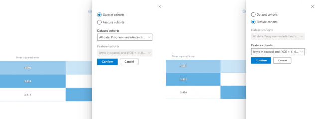
Dataset cohorts
On the Dataset cohorts pane, you can investigate your model by comparing the model performance of various user-specified dataset cohorts (accessible via the Cohort settings icon at the top right of the dashboard).

- Help me choose metrics: Select this icon to open a panel with more information about what model performance metrics are available to be shown in the table. Easily adjust which metrics to view by using the multi-select dropdown list to select and deselect performance metrics.
- Show heat map: Toggle on and off to show or hide heat map visualization in the table. The gradient of the heat map corresponds to the range normalized between the lowest value and the highest value in each column.
- Table of metrics for each dataset cohort: View columns of dataset cohorts, the sample size of each cohort, and the selected model performance metrics for each cohort.
- Bar chart visualizing individual metric: View mean absolute error across the cohorts for easy comparison.
- Choose metric (x-axis): Select this button to choose which metrics to view in the bar chart.
- Choose cohorts (y-axis): Select this button to choose which cohorts to view in the bar chart. Feature cohort selection might be disabled unless you first specify the features you want on the Feature cohort tab of the component.
Select Help me choose metrics to open a panel with a list of model performance metrics and their definitions, which can help you select the right metrics to view.
| Machine learning scenario | Metrics |
|---|---|
| Regression | Mean absolute error, Mean squared error, R-squared, Mean prediction. |
| Classification | Accuracy, Precision, Recall, F1 score, False positive rate, False negative rate, Selection rate. |
Feature cohorts
On the Feature cohorts pane, you can investigate your model by comparing model performance across user-specified sensitive and non-sensitive features (for example, performance across various gender, race, and income level cohorts).

Help me choose metrics: Select this icon to open a panel with more information about what metrics are available to be shown in the table. Easily adjust which metrics to view by using the multi-select dropdown to select and deselect performance metrics.
Help me choose features: Select this icon to open a panel with more information about what features are available to be shown in the table, with descriptors of each feature and their binning capability (see below). Easily adjust which features to view by using the multi-select dropdown to select and deselect them.
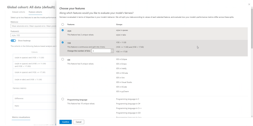
Show heat map: Toggle on and off to see a heat map visualization. The gradient of the heat map corresponds to the range that's normalized between the lowest value and the highest value in each column.
Table of metrics for each feature cohort: A table with columns for feature cohorts (sub-cohort of your selected feature), sample size of each cohort, and the selected model performance metrics for each feature cohort.
Fairness metrics/disparity metrics: A table that corresponds to the metrics table and shows the maximum difference or maximum ratio in performance scores between any two feature cohorts.
Bar chart visualizing individual metric: View mean absolute error across the cohorts for easy comparison.
Choose cohorts (y-axis): Select this button to choose which cohorts to view in the bar chart.
Selecting Choose cohorts opens a panel with an option to either show a comparison of selected dataset cohorts or feature cohorts, depending on what you select in the multi-select dropdown list below it. Select Confirm to save the changes to the bar chart view.
Choose metric (x-axis): Select this button to choose which metric to view in the bar chart.


Data analysis
With the data analysis component, the Table view pane shows you a table view of your dataset for all features and rows.
The Chart view panel shows you aggregate and individual plots of datapoints. You can analyze data statistics along the x-axis and y-axis by using filters such as predicted outcome, dataset features, and error groups. This view helps you understand overrepresentation and underrepresentation in your dataset.

Select a dataset cohort to explore: Specify which dataset cohort from your list of cohorts you want to view data statistics for.
X-axis: Displays the type of value being plotted horizontally. Modify the values by selecting the button to open a side panel.
Y-axis: Displays the type of value being plotted vertically. Modify the values by selecting the button to open a side panel.
Chart type: Specifies the chart type. Choose between aggregate plots (bar charts) or individual data points (scatter plot).
By selecting the Individual data points option under Chart type, you can shift to a disaggregated view of the data with the availability of a color axis.

Feature importances (model explanations)
By using the model explanation component, you can see which features were most important in your model's predictions. You can view what features affected your model's prediction overall on the Aggregate feature importance pane or view feature importances for individual data points on the Individual feature importance pane.
Aggregate feature importances (global explanations)

Top k features: Lists the most important global features for a prediction and allows you to change it by using a slider bar.
Aggregate feature importance: Visualizes the weight of each feature in influencing model decisions across all predictions.
Sort by: Allows you to select which cohort's importances to sort the aggregate feature importance graph by.
Chart type: Allows you to select between a bar plot view of average importances for each feature and a box plot of importances for all data.
When you select one of the features in the bar plot, the dependence plot is populated, as shown in the following image. The dependence plot shows the relationship of the values of a feature to its corresponding feature importance values, which affect the model prediction.
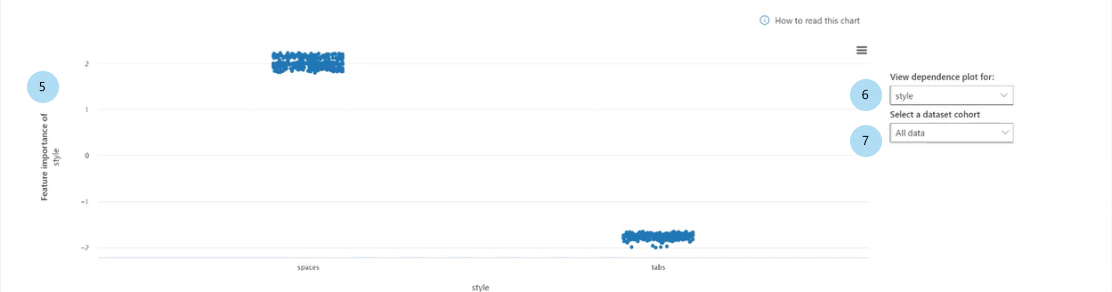
Feature importance of [feature] (regression) or Feature importance of [feature] on [predicted class] (classification): Plots the importance of a particular feature across the predictions. For regression scenarios, the importance values are in terms of the output, so positive feature importance means it contributed positively toward the output. The opposite applies to negative feature importance. For classification scenarios, positive feature importances mean that feature value is contributing toward the predicted class denoted in the y-axis title. Negative feature importance means it's contributing against the predicted class.
View dependence plot for: Selects the feature whose importances you want to plot.
Select a dataset cohort: Selects the cohort whose importances you want to plot.

Individual feature importances (local explanations)
The following image illustrates how features influence the predictions that are made on specific data points. You can choose up to five data points to compare feature importances for.

Point selection table: View your data points and select up to five points to display in the feature importance plot or the ICE plot below the table.

Feature importance plot: A bar plot of the importance of each feature for the model's prediction on the selected data points.
- Top k features: Allows you to specify the number of features to show importances for by using a slider.
- Sort by: Allows you to select the point (of those checked above) whose feature importances are displayed in descending order on the feature importance plot.
- View absolute values: Toggle on to sort the bar plot by the absolute values. This allows you to see the most impactful features regardless of their positive or negative direction.
- Bar plot: Displays the importance of each feature in the dataset for the model prediction of the selected data points.
Individual conditional expectation (ICE) plot: Switches to the ICE plot, which shows model predictions across a range of values of a particular feature.

- Min (numerical features): Specifies the lower bound of the range of predictions in the ICE plot.
- Max (numerical features): Specifies the upper bound of the range of predictions in the ICE plot.
- Steps (numerical features): Specifies the number of points to show predictions for within the interval.
- Feature values (categorical features): Specifies which categorical feature values to show predictions for.
- Feature: Specifies the feature to make predictions for.
Counterfactual what-if
Counterfactual analysis provides a diverse set of what-if examples generated by changing the values of features minimally to produce the desired prediction class (classification) or range (regression).

Point selection: Selects the point to create a counterfactual for and display in the top-ranking features plot below it.
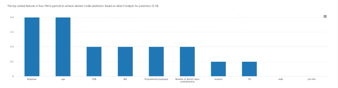
Top ranked features plot: Displays, in descending order of average frequency, the features to perturb to create a diverse set of counterfactuals of the desired class. You must generate at least 10 diverse counterfactuals per data point to enable this chart, because there's a lack of accuracy with a lesser number of counterfactuals.
Selected data point: Performs the same action as the point selection in the table, except in a dropdown menu.
Desired class for counterfactual(s): Specifies the class or range to generate counterfactuals for.
Create what-if counterfactual: Opens a panel for counterfactual what-if data point creation.
Select the Create what-if counterfactual button to open a full window panel.
Search features: Finds features to observe and change values.
Sort counterfactual by ranked features: Sorts counterfactual examples in order of perturbation effect. (Also see Top ranked features plot, discussed earlier.)
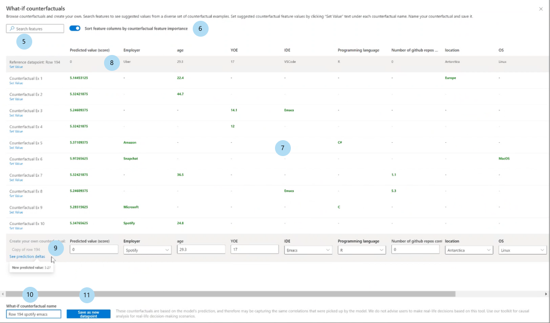
Counterfactual examples: Lists feature values of example counterfactuals with the desired class or range. The first row is the original reference data point. Select Set value to set all the values of your own counterfactual data point in the bottom row with the values of the pre-generated counterfactual example.
Predicted value or class: Lists the model prediction of a counterfactual's class given those changed features.
Create your own counterfactual: Allows you to perturb your own features to modify the counterfactual. Features that have been changed from the original feature value are denoted by the title being bolded (for example, Employer and Programming language). Select See prediction delta to view the difference in the new prediction value from the original data point.
What-if counterfactual name: Allows you to name the counterfactual uniquely.
Save as new data point: Saves the counterfactual you've created.


Causal analysis
The next sections cover how to read the causal analysis for your dataset on select user-specified treatments.
Aggregate causal effects
Select the Aggregate causal effects tab of the causal analysis component to display the average causal effects for pre-defined treatment features (the features that you want to treat to optimize your outcome).
Note
Global cohort functionality is not supported for the causal analysis component.

Direct aggregate causal effect table: Displays the causal effect of each feature aggregated on the entire dataset and associated confidence statistics.
- Continuous treatments: On average in this sample, increasing this feature by one unit will cause the probability of class to increase by X units, where X is the causal effect.
- Binary treatments: On average in this sample, turning on this feature will cause the probability of class to increase by X units, where X is the causal effect.
Direct aggregate causal effect whisker plot: Visualizes the causal effects and confidence intervals of the points in the table.
Individual causal effects and causal what-if
To get a granular view of causal effects on an individual data point, switch to the Individual causal what-if tab.

- X-axis: Selects the feature to plot on the x-axis.
- Y-axis: Selects the feature to plot on the y-axis.
- Individual causal scatter plot: Visualizes points in the table as a scatter plot to select data points for analyzing causal what-if and viewing the individual causal effects below it.
- Set new treatment value:
- (numerical): Shows a slider to change the value of the numerical feature as a real-world intervention.
- (categorical): Shows a dropdown list to select the value of the categorical feature.
Treatment policy
Select the Treatment policy tab to switch to a view to help determine real-world interventions and show treatments to apply to achieve a particular outcome.

Set treatment feature: Selects a feature to change as a real-world intervention.
Recommended global treatment policy: Displays recommended interventions for data cohorts to improve the target feature value. The table can be read from left to right, where the segmentation of the dataset is first in rows and then in columns. For example, for 658 individuals whose employer isn't Snapchat and whose programming language isn't JavaScript, the recommended treatment policy is to increase the number of GitHub repos contributed to.
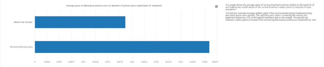
Average gains of alternative policies over always applying treatment: Plots the target feature value in a bar chart of the average gain in your outcome for the above recommended treatment policy versus always applying treatment.
Recommended individual treatment policy:
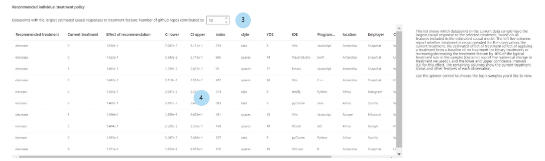
Show top k data point samples ordered by causal effects for recommended treatment feature: Selects the number of data points to show in the table.
Recommended individual treatment policy table: Lists, in descending order of causal effect, the data points whose target features would be most improved by an intervention.


Next steps
- Summarize and share your Responsible AI insights with the Responsible AI scorecard as a PDF export.
- Learn more about the concepts and techniques behind the Responsible AI dashboard.
- View sample YAML and Python notebooks to generate a Responsible AI dashboard with YAML or Python.
- Explore the features of the Responsible AI dashboard through this interactive AI lab web demo.
- Learn more about how you can use the Responsible AI dashboard and scorecard to debug data and models and inform better decision-making in this tech community blog post.
- Learn about how the Responsible AI dashboard and scorecard were used by the UK National Health Service (NHS) in a real-life customer story.
Feedback
Coming soon: Throughout 2024 we will be phasing out GitHub Issues as the feedback mechanism for content and replacing it with a new feedback system. For more information see: https://aka.ms/ContentUserFeedback.
Submit and view feedback for