Overview of the model-driven app designer
The model-driven app designer provides a modern WYSIWYG authoring experience when you work with model-driven apps.
Changes to the app are instantly reflected in the preview, enabling you to see exactly how the app will appear to users when published.
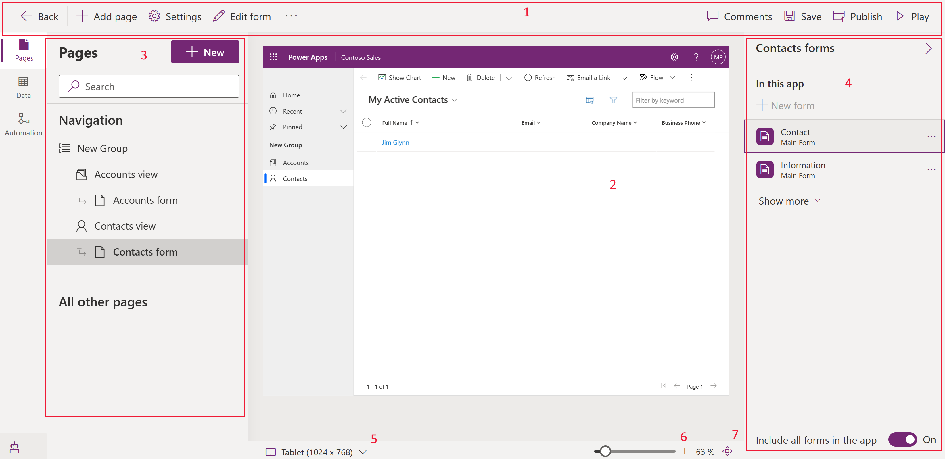
The app designer interface has the following areas:
Command bar – Displays the available actions:
- Back. Closes the model-driven app designer and returns you to the Power Apps website (make.powerapps.com).
- Add page. Creates a new page, which can include table forms and views, table dashboards, or a custom page for the app.
- Settings. Opens the app properties such as name and description.
- Edit form: Open the form designer to edit the default form shown in app preview.
- Comments. Add a comment to the app. More information: Add comments in the model-driven app designer
- Save. Saves the app.
- Publish. Makes the changes made available to other users.
- Play. Opens the app in a new tab in run mode.
App preview – Displays a real-time preview of the form as it will appear to users when published.
Panes - The left navigation pane consists of the following areas:
- Pages. The Navigation section displays a layout of your app that is formed using areas, groups, and subareas. You can add or remove groups and subareas to the navigation. The All other pages portion displays the components in your app. From this section, you can choose to add or remove forms, views, and dashboards for each table.
- Data. Provides a view of all available tables that are currently used within your app and a view of all tables that are available in your environment.
- Automation. Displays business process flows that are a part of this app. You can add, remove, or create new business process flows to the app.
Property pane – Displays properties of the selected component and associated forms and views with the selected table. Selecting the pencil or ellipsis opens the form or view designer.
Preview size switcher - Changes the size of the form preview helping you to see how the form will appear on various screen sizes.
Zoom slider - Zooms in or out of the app preview helping you take a closer look.
Fit to screen - Quick action to fit the app preview to the available screen size.

Navigation pane options
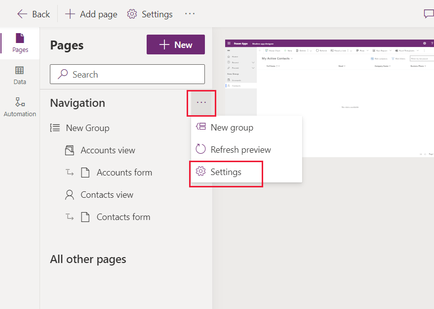
To edit the app's navigation, select ... next to Navigation, and then select Settings.
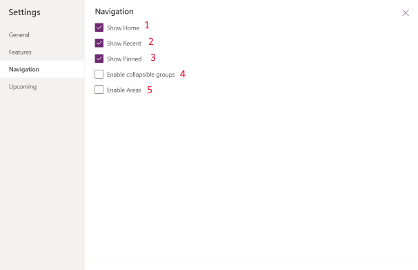
 The following options are available:
Show Home. Enabled by default. When selected, displays the Home page link for the app.
Show Recent. Enabled by default. When selected, displays the recently viewed pages link. Selecting the link displays all recently viewed pages.
Show Pinned. Enabled by default. When selected, displays the pages that have been pinned. App users select the push-pin icon next to a record listed under Recent to add it to their pinned rows.
Enable collapsible groups. Disabled by default. When selected, subareas displayed under groups in the site map can be expanded or collapsed.
Enable Areas. Disabled by default. When selected, new areas can be added to the app. For apps with existing multiple areas, this setting is enabled by default. You can't disable this setting while the app has multiple areas.
Known limitation
- The app’s URL can’t be specified.
Next steps
Feedback
Coming soon: Throughout 2024 we will be phasing out GitHub Issues as the feedback mechanism for content and replacing it with a new feedback system. For more information see: https://aka.ms/ContentUserFeedback.
Submit and view feedback for