Tutorial: Visualize anomalies using batch detection and Power BI (univariate)
Important
Starting on the 20th of September, 2023 you won’t be able to create new Anomaly Detector resources. The Anomaly Detector service is being retired on the 1st of October, 2026.
Use this tutorial to find anomalies within a time series data set as a batch. Using Power BI desktop, you will take an Excel file, prepare the data for the Anomaly Detector API, and visualize statistical anomalies throughout it.
In this tutorial, you'll learn how to:
- Use Power BI Desktop to import and transform a time series data set
- Integrate Power BI Desktop with the Anomaly Detector API for batch anomaly detection
- Visualize anomalies found within your data, including expected and seen values, and anomaly detection boundaries.
Prerequisites
- An Azure subscription
- Microsoft Power BI Desktop, available for free.
- An excel file (.xlsx) containing time series data points.
- Once you have your Azure subscription, create an Anomaly Detector resource in the Azure portal to get your key and endpoint.
- You will need the key and endpoint from the resource you create to connect your application to the Anomaly Detector API. You'll do this later in the quickstart.
Note
For best results when using the Anomaly Detector API, your JSON-formatted time series data should include:
- data points separated by the same interval, with no more than 10% of the expected number of points missing.
- at least 12 data points if your data doesn't have a clear seasonal pattern.
- at least 4 pattern occurrences if your data does have a clear seasonal pattern.
Load and format the time series data
To get started, open Power BI Desktop and load the time series data you downloaded from the prerequisites. This excel file contains a series of Coordinated Universal Time (UTC) timestamp and value pairs.
Note
Power BI can use data from a wide variety of sources, such as .csv files, SQL databases, Azure blob storage, and more.
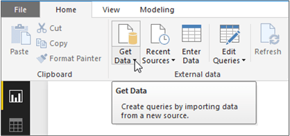
In the main Power BI Desktop window, select the Home ribbon. In the External data group of the ribbon, open the Get Data drop-down menu and select Excel.
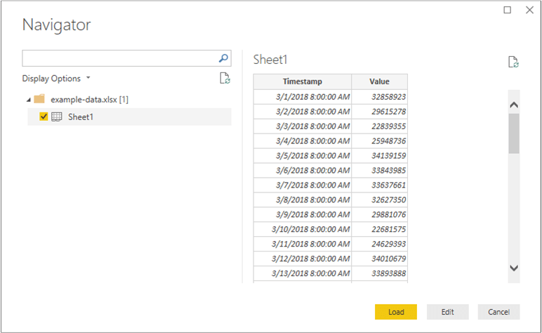
After the dialog appears, navigate to the folder where you downloaded the example .xlsx file and select it. After the Navigator dialogue appears, select Sheet1, and then Edit.
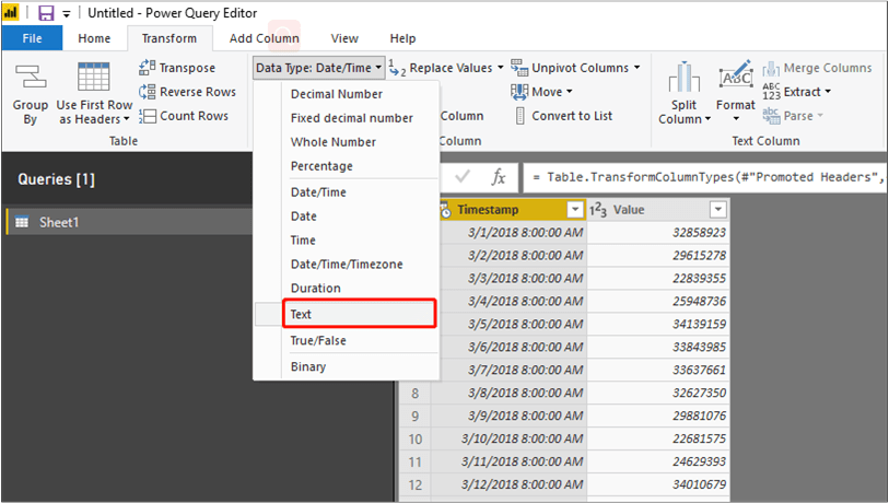
Power BI will convert the timestamps in the first column to a Date/Time data type. These timestamps must be converted to text in order to be sent to the Anomaly Detector API. If the Power Query editor doesn't automatically open, select Edit Queries on the home tab.
Select the Transform ribbon in the Power Query Editor. In the Any Column group, open the Data Type: drop-down menu, and select Text.
When you get a notice about changing the column type, select Replace Current. Afterwards, select Close & Apply or Apply in the Home ribbon.
Create a function to send the data and format the response
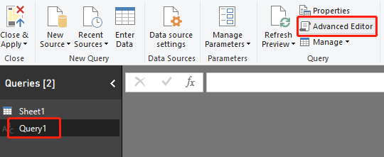
To format and send the data file to the Anomaly Detector API, you can invoke a query on the table created above. In the Power Query Editor, from the Home ribbon, open the New Source drop-down menu and select Blank Query.
Make sure your new query is selected, then select Advanced Editor.
Within the Advanced Editor, use the following Power Query M snippet to extract the columns from the table and send it to the API. Afterwards, the query will create a table from the JSON response, and return it. Replace the apiKey variable with your valid Anomaly Detector API key, and endpoint with your endpoint. After you've entered the query into the Advanced Editor, select Done.
(table as table) => let

    apikey      = "[Placeholder: Your Anomaly Detector resource access key]",
    endpoint    = "[Placeholder: Your Anomaly Detector resource endpoint]/anomalydetector/v1.0/timeseries/entire/detect",
    inputTable = Table.TransformColumnTypes(table,{{"Timestamp", type text},{"Value", type number}}),
    jsontext    = Text.FromBinary(Json.FromValue(inputTable)),
    jsonbody    = "{ ""Granularity"": ""daily"", ""Sensitivity"": 95, ""Series"": "& jsontext &" }",
    bytesbody   = Text.ToBinary(jsonbody),
    headers     = [#"Content-Type" = "application/json", #"Ocp-Apim-Subscription-Key" = apikey],
    bytesresp   = Web.Contents(endpoint, [Headers=headers, Content=bytesbody, ManualStatusHandling={400}]),
    jsonresp    = Json.Document(bytesresp),

    respTable = Table.FromColumns({

                     Table.Column(inputTable, "Timestamp")
                     ,Table.Column(inputTable, "Value")
                     , Record.Field(jsonresp, "IsAnomaly") as list
                     , Record.Field(jsonresp, "ExpectedValues") as list
                     , Record.Field(jsonresp, "UpperMargins")as list
                     , Record.Field(jsonresp, "LowerMargins") as list
                     , Record.Field(jsonresp, "IsPositiveAnomaly") as list
                     , Record.Field(jsonresp, "IsNegativeAnomaly") as list

                  }, {"Timestamp", "Value", "IsAnomaly", "ExpectedValues", "UpperMargin", "LowerMargin", "IsPositiveAnomaly", "IsNegativeAnomaly"}
               ),

    respTable1 = Table.AddColumn(respTable , "UpperMargins", (row) => row[ExpectedValues] + row[UpperMargin]),
    respTable2 = Table.AddColumn(respTable1 , "LowerMargins", (row) => row[ExpectedValues] -  row[LowerMargin]),
    respTable3 = Table.RemoveColumns(respTable2, "UpperMargin"),
    respTable4 = Table.RemoveColumns(respTable3, "LowerMargin"),

    results = Table.TransformColumnTypes(

                respTable4,
                {{"Timestamp", type datetime}, {"Value", type number}, {"IsAnomaly", type logical}, {"IsPositiveAnomaly", type logical}, {"IsNegativeAnomaly", type logical},
                 {"ExpectedValues", type number}, {"UpperMargins", type number}, {"LowerMargins", type number}}
              )

 in results
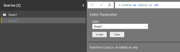
Invoke the query on your data sheet by selecting Sheet1 below Enter Parameter, and select Invoke.
Important
Remember to remove the key from your code when you're done, and never post it publicly. For production, use a secure way of storing and accessing your credentials like Azure Key Vault. See the Azure AI services security article for more information.
Data source privacy and authentication
Note
Be aware of your organization's policies for data privacy and access. See Power BI Desktop privacy levels for more information.
You may get a warning message when you attempt to run the query since it utilizes an external data source.

To fix this, select File, and Options and settings. Then select Options. Below Current File, select Privacy, and Ignore the Privacy Levels and potentially improve performance.
Additionally, you may get a message asking you to specify how you want to connect to the API.
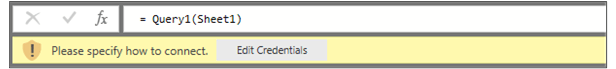
To fix this, select Edit Credentials in the message. After the dialogue box appears, select Anonymous to connect to the API anonymously. Then select Connect.
Afterwards, select Close & Apply in the Home ribbon to apply the changes.
Visualize the Anomaly Detector API response
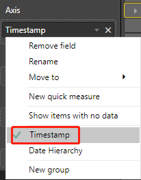
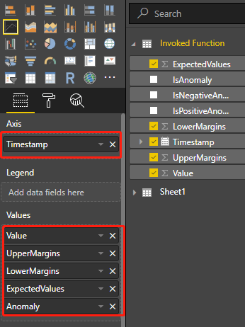
In the main Power BI screen, begin using the queries created above to visualize the data. First select Line Chart in Visualizations. Then add the timestamp from the invoked function to the line chart's Axis. Right-click on it, and select Timestamp.
Add the following fields from the Invoked Function to the chart's Values field. Use the below screenshot to help build your chart.
- Value
- UpperMargins
- LowerMargins
- ExpectedValues
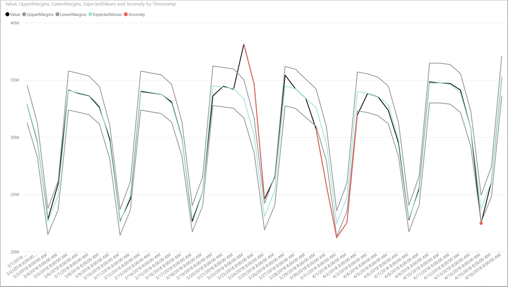
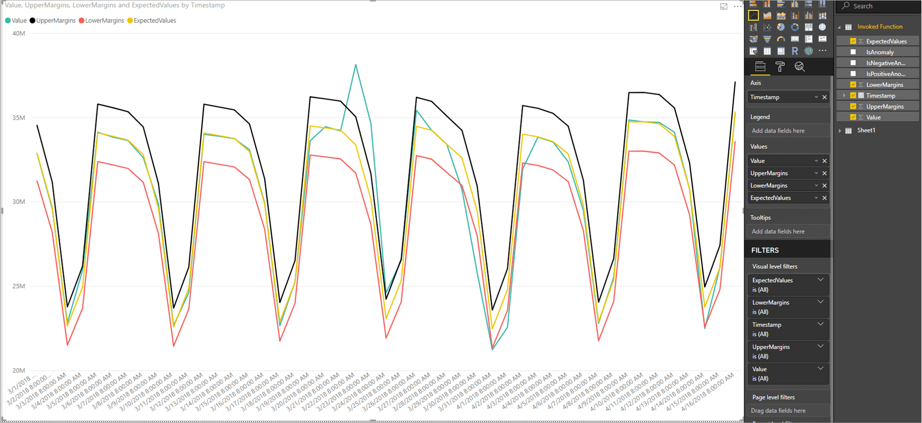
After adding the fields, select on the chart and resize it to show all of the data points. Your chart will look similar to the below screenshot:
Display anomaly data points
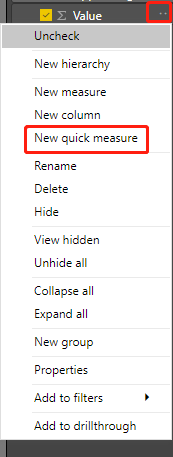
On the right side of the Power BI window, below the FIELDS pane, right-click on Value under the Invoked Function query, and select New quick measure.
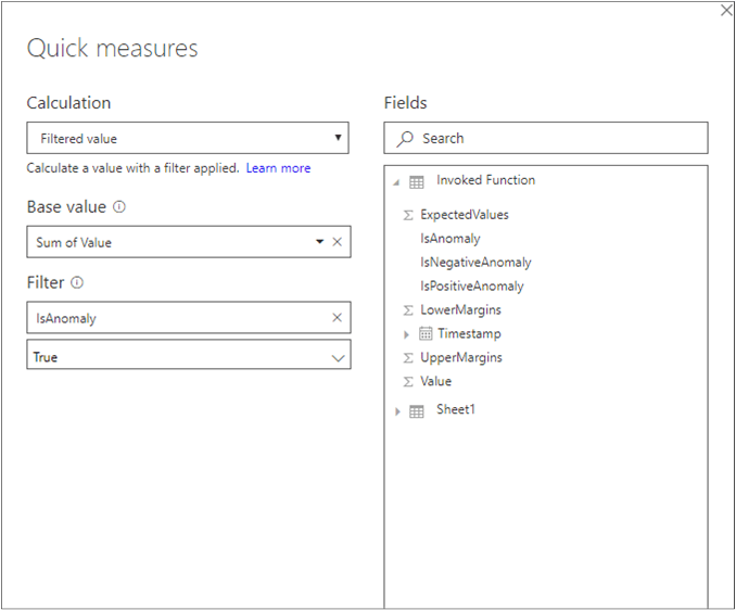
On the screen that appears, select Filtered value as the calculation. Set Base value to Sum of Value. Then drag IsAnomaly from the Invoked Function fields to Filter. Select True from the Filter drop-down menu.
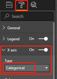
After selecting Ok, you will have a Value for True field, at the bottom of the list of your fields. Right-click it and rename it to Anomaly. Add it to the chart's Values. Then select the Format tool, and set the X-axis type to Categorical.
Apply colors to your chart by selecting on the Format tool and Data colors. Your chart should look something like the following: