Understand Power Apps Studio in Dataverse in a Teams environment
When you create a canvas app by using any method, you're taken to the canvas app builder called Power Apps Studio. You can use Power Apps Studio to design, build, and manage your canvas app.
Overview of Power Apps Studio

Build hub – select different pages in the Power Apps app.
Power Apps Studio options – options relevant to the settings in a Power Apps Studio session.
App actions - options to rename, save, preview, or publish the app.
Properties list - list of properties for the selected object.
Formula bar - compose or edit a formula for the selected property with one or more functions.
Power Apps app – Power Apps app in Microsoft Teams.
App authoring menu - selection pane to switch between data sources and insert options.
App authoring options - details pane with options relevant to the selected menu item for authoring the app.
Canvas/screen - primary canvas for composing the app structure.
Properties pane - properties list for the selected object in UI format.
Screen selector - switch between different screens in an app.
Change canvas screen size - change the size of the canvas during an authoring experience in Power Apps Studio.
Let's understand each option in Power Apps Studio in detail.
1 - Build hub
Opening Power Apps Studio from the build hub opens an app authoring experience that inherits the Teams interface and options. The Home, Build, and About tabs are described in Overview of the Power Apps app.
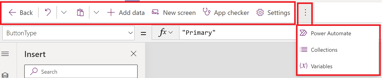
2 – Power Apps Studio options
Power Apps Studio options are available on the menu in the upper-left corner. The options are relevant to the current session and app-related settings.
Back
Takes you back to the build hub, closing the current Power Apps Studio session.
Undo and redo

- Undo – undo the last action.
- Redo – repeat the last action.
Cut, copy, and paste

- Cut – Cut the selection, and store it in the clipboard.
- Copy – Copy the selection, and store it in the clipboard.
- Paste - Paste the last cut, or copied selection from the clipboard.
Add data
- Create a new table by selecting Create new table.
- Select any other existing tables from the current environment.
- Search and select a connector, such as SharePoint or SQL Server.
New screen
Add screens based on the available layouts.
Layouts
Select a new screen to add to the app based on the layout of the screen.

Select a screen type based on the available scenarios, such as Blank, Scrollable, List, Success, Tutorial, Email, People, Meeting, or Calendar.
App checker
Runs the App checker with available rules and shows the results.

Settings
Configure the app's general settings.
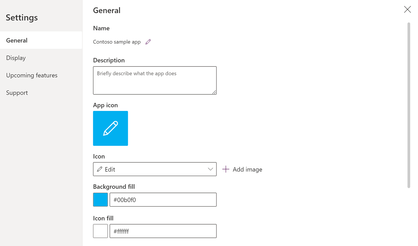
General
Shows app name, and allows changing the app icon. To update the icon, select a new icon or background color. To add or update description, enter text in the text box. You can also upload a custom icon for the app using the Browse option.
Display
Shows the screen size and orientation. To change, select the radio buttons for Orientation and Size.
Advanced settings allow you to further customize the app screen configuration.
- Scale to it: Scales the app to fit available space.
- Lock aspect ratio: Locks the height and width ratio.
- Lock orientation: Maintains app orientation when device rotates.
To change the setting, toggle the switch.
More information: Change screen size and orientation
Upcoming features
Allows you to configure advanced settings for the app that include features under preview, experimental or retired features.
More information: Understand experimental, preview, and deprecated features in Power Apps
Support
Shows current Power Apps Studio session details, version, and other information useful when working with Microsoft support.
Power Automate
Create a new flow with Power Automate, or select any available flow.

More information: Create flows using the Power Apps app in Teams
Collections
A collection is a group of items that are similar, such as products in a product list. This section lists the collections used by the current app. More information: Collections in canvas apps used by the app.

Variables
You can save data such as the result values from a data set into temporary storage by using variables. This section lists variables used by the current app. More information: Variables in canvas apps used by the app.

3 – App actions
Use the options in the upper-right corner of Power Apps Studio to work with app-specific actions.

App name editor
Select the name of the app to edit it.

Save
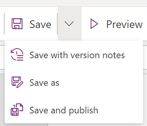
Save allows you to perform the following actions:
- Save - Saves recent and unsaved changes you made to the app in Power Apps Studio. Each time you save changes, a new version is created.
- Save as - Duplicate the app by saving the app with a different name.
- Save and publish - Allows you to both save the app, and publish it at the same time.
Preview
This will show a preview version of the app in Microsoft Teams that you can interact with.
Publish to Teams
Publishes the app’s current version to a channel within Microsoft Teams. For more information about publishing an app, go to Publish an app.
4 – Properties list
Shows the list of available properties for the selected object on the canvas. The properties list changes based on your selection. For a complete list of all properties, go to All properties.

5 – Formula bar
Use the formula bar to add, edit, or remove functions relevant to the selected object and the property selected from the properties list. For example, select the screen to update the background by using the RGBA function.

The formula bar is IntelliSense-enabled, and provides tips as you enter text to help you with the function syntax. If a formula returns an error, tips relevant to the syntax error and mitigation steps are displayed. When you start entering text that matches one or more functions, the formula bar shows inline function help and highlights help text relevant to the cursor position.

Similarly, you'll find help when working with complex functions, nested functions, or when correcting a formula syntax.
For a quick and easy function reference, you can also select the formula drop-down menu.

Select an event type from the drop-down menu at the top of the dialog box, such as Action instead of Text.

Select an action that you want to add a function for.

The available functions for the selected event type are dynamically updated depending on the object you select. For example, if you selected a button on the canvas, the available Action functions also include the function ClearCollect().
 selected")
You can read the description of the selected Action function. Double-clicking a function name adds it into the formula bar.
For a complete list of all canvas app functions, go to Formula reference.
6 – Power Apps app
The Power Apps app in Teams is described in detail in Overview of the Power Apps app.
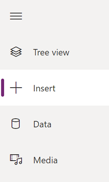
7 – App authoring menu
Switch between various authoring options while working with the app.
Tip
You can also select the expand button to expand the list to include names instead of just icons.
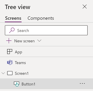
- Tree view - Shows a tree view of all screens and controls in the current app.
- Insert - Allows you to add different controls to the screen.
- Data - Add or remove data such as tables that the app connects to.
- Media - Insert or remove media from the app.
8 – App authoring options
The options for working with canvas apps change depending on the selection on the left pane.
Tree view
Select the tree view to show the screens available in the app,
Tip
Select App in the tree view to work with app-specific controls or to change app behavior, such as adding a formula on OnStart event of the app.
Switch to the Components tab to work with component library features. You can add new components or reuse those that were already published from published component libraries. More information: Component library

Insert
Insert shows all the popular objects or controls that you can add on the selected screen in your canvas app. You can also expand other choices or use the components option to insert controls from a component library.
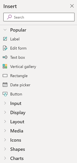
To insert controls on the canvas, you can drag the control to the canvas, select the control, or select (...) and then select Add to canvas.
Tip
Dataverse for Teams provides new components built on the Fluent UI framework. More information: Fluent UI controls.
Popular controls
| Name | Description |
|---|---|
| Label | A box that shows data such as text, numbers, dates, or currency. |
| Edit form | Display, edit, or create a record in a data source. |
| Text | A box that shows text. |
| Text box | A box in which the user can enter text, numbers, and other data. |
| Vertical gallery | A control that contains other controls and shows a set of data. |
| Add icon | Graphics for which you can configure appearance and behavior properties. |
| Rectangle | A rectangular shape to configure the canvas appearance. |
| Date Picker | A control that the user can select to specify a date. |
| Button | A control that the user can select to interact with the app. |
For more information about the controls that you can insert, and their properties and definitions, go to Controls and properties in Power Apps.
Classic controls
Dataverse for Teams uses Fluent UI controls by default. If necessary, you can enable classic controls by using the experimental feature setting. To do this, go to Settings > Upcoming features > Experimental > toggle Classic controls to On.
After you enable classic controls, you'll be able to see and add them from the Classic category.
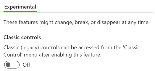
For example, you may need to enable classic controls when using dependent drop-down lists when using Dataverse for Teams.
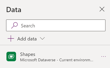
Data
Add, refresh, or remove data sources from your canvas app. You can add one or more connections by using data sources.
In addition to data stored within tables, there are many connectors available to interact with data in popular SaaS, services, and systems.
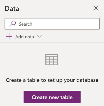
Select Create new table to create a new table in the Dataverse for Teams environment.
To choose other connectors such as SharePoint, OneDrive, or SQL Server, you can enter text in the data source search box or select from the list of connectors.

More information: List of all Power Apps connectors
Visual editor
When you select Create new table and enter a name for the new table, you open visual editor where you can design the table, add columns of different data types, enter data in rows, and save the changes.

To get started with visual editor, select Create a table and enter the table name. You can also expand the Advanced settings to update the table's plural name. For example, a table name can be Shape, and the plural table name can be Shapes.

Watch this video that shows you how to quickly create table and columns.
Note
You can use visual editor in Power Apps Studio to quickly create a table while authoring an app. However, you can also use the Build tab to edit or delete the tables you create by using Power Apps Studio. Go to Create tables in Microsoft Teams for more information about creating tables by using the Build tab.
Understand visual editor
Visual editor allows you to work with table rows, columns, and data.

Table name
Select Edit  to edit the name of the table.

Add row
Select Add row to add a new row to the table.

Add columns
Select Add columns to add new columns of the available column types supported by visual editor.
Supported column types
Visual editor supports specific data types as columns. The following options are available when creating a new column using visual editor inside Power Apps Studio:
- Text
- URL
- Phone
- Auto number
- Number
- Date (Only dates without the user locale (time zone) settings are supported.)
- Decimal
- Lookup
- Choice
- Yes/No
Important
To add columns of types that aren't supported by visual editor, such as file or image, create a table by using the solution explorer instead.
Advanced options
The advanced options for columns change depending on the type of column. For example, a Text column type has an advanced option for Max length. By contrast, an Auto number column type has options such as the type of autonumbering, prefixes, and maximum number of digits. More information: Types of fields
Show/hide columns
Use the Show/hide columns option to show or hide available columns, including columns automatically created as part of the table metadata.
For example, you can add an Owner column created by default to the existing table.

Refresh
Refreshes the current table with data.
Save
To save changes to a table, select Save. When you change a table and try to close it without saving changes, you're prompted to discard changes.

To ensure that changes to the table are saved, you can select the next row inside the table, or select any other cell after editing a cell to trigger the auto save functionality.

After you close a saved table, you'll see the table added to the list of available data sources in Data on the left pane.
Visual editor view
Select from the options of Compact, Default, or Comfortable layouts to switch the view with columns and rows spacing to change visual editor layout.
Row count
Shows the row counts in the table.
Column options
Select the drop-down menu next to the column heading to view column-related options.

| Option | Description |
|---|---|
| Edit column | Edit the column name or advanced options. After it's created, you can't change the name of the column. |
| Hide | Hide or unhide the column. |
| Insert column | Insert a new column at the selected column location. |
| A to Z | Sort records in ascending order. |
| Z to A | Sort records in descending order. |
| Filter by | Filter column data based on the filter criteria you define. |
| Move left | Move the column to the left from the current position. |
| Move right | Move the column to the right from the current position. |
| Pin left | Pin the column to the left side of the table. |
| Pin right | Pin the column to the right side of the table. |
| Delete column | Delete the column. |
Edit existing table
After you add rows and columns, and add data, you can close the table and use it as the data source in your app. To edit content in the table, you can use the app controls or go back to visual editor.
To edit the table, select the table data source, and then select Edit data to open the table in visual editor.
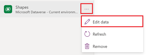
After you close visual editor, the data source is automatically refreshed to reflect the updated data in Power Apps Studio. You can also select Refresh to manually refresh Power Apps Studio to reflect the data in the controls you added on the canvas.
Media
Select Media to add images, video, or audio files to your app. Adding media directly to your app uploads the files to the app and uses the app storage. Each file uploaded to the app as media must be 64 MB or smaller, and the size of all media files uploaded to an app can't exceed 200 MB.
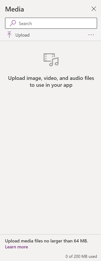
If you want to reference more media, consider using audio and video controls with URLs, using media from Azure Media Services, or from Microsoft Stream. More information: Using multimedia files in Power Apps
9 – Canvas/screen
The canvas shows the currently selected screen from the left pane.
10 – Properties pane
The properties pane shows properties and options available for the currently selected object on the canvas. The Properties tab shows generic options such as the name, color, size, or position. The Advanced tab shows more options for advanced customization. The advanced properties might sometimes be locked for editing, such as when working with data cards. You can select Unlock to change properties in such situations.

11 – Screen selector
Use the screen selector to switch between screens when your canvas app has multiple screens. You can also select a screen from the left pane by selecting the tree view. If the current selection is inside a container, or inside an individual cell in a gallery, the selector shows the breadcrumbs for the parent elements at each level.
12 – Change canvas screen size
You can zoom in or zoom out while authoring the canvas app. Select Ctrl+0 Fit to window to fit the screen size based on the current authoring window size. The zoom percentage or screen size you use while authoring a canvas app has no impact on the aspect ratio configured for the app when you preview your app or play a published app.
See also
Feedback
Coming soon: Throughout 2024 we will be phasing out GitHub Issues as the feedback mechanism for content and replacing it with a new feedback system. For more information see: https://aka.ms/ContentUserFeedback.
Submit and view feedback for