Explore data on a grid page
In model-driven apps, the default control that's used to show data in tabular form is the read-only grid. When a subarea contains a table, the subarea's default layout in the app sitemap is called the grid page.
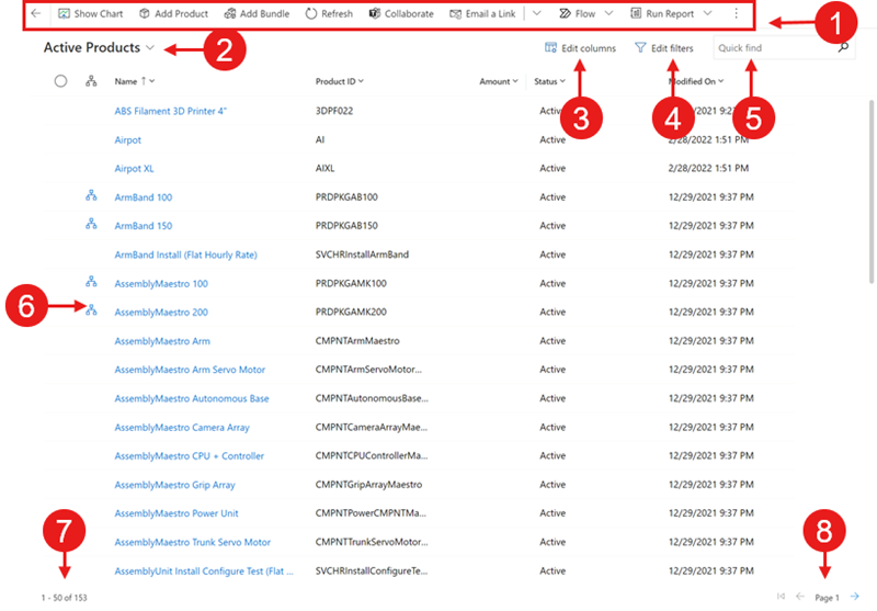
Legend:
- Command bar: The commands available for the page
- View selector: Select to change views
- Edit columns: Select to add, remove, or reorder columns
- Edit filters: Select to filter the view with advanced queries
- Filter by keyword or Quick find: Show only the rows in the current view that match your search criteria
- Hierarchy icon: Indicates the record is part of a hierarchy
- Record counter: The position of this page of records in the total number of records that are shown in the view
- Page navigation: Move forward or backward by page in the set of records that are shown in the view
Navigation
To view the details of a record, select the link in the first column. To open the record details in a new tab or a new window, right-click the link in the column and select Open link in new tab or Open link in new window.
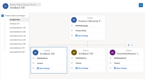
If a record is in a hierarchy relationship, select the hierarchy icon to open the hierarchy view.
If you navigate away from the grid page and come back, the view retains your filters, sort order, and the state the page was in, including the grid control you had last chosen from the Show as menu.
View selector
The view selector lists the views that are available for the table. By default, the list is divided into two groups:
- My Views: Personal views that you created
- System Views: Views that your administrator created and shared with you
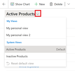
Personal views are listed before system views by default. Both lists are sorted alphabetically. You can change the order the views are listed in.
Note
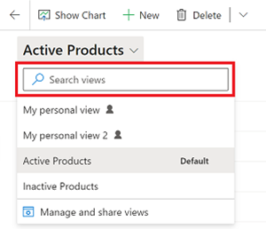
If your administrator has turned on the modern advanced find experience, the list of views isn't divided. To easily tell which kind of view you're looking at, personal views have a user icon  . You can also hover over the information icon
  to see the view type.
To quickly find a view in a long list, use the search box at the top of the view selector.
Every table in your app has a default view that's set by your administrator. The Default label in the view selector identifies which view is the default for the table.
Column editor
Use the column editor to add, remove, or reorder columns.
Filter editor
Use the filter editor to see or modify the query that selected the records in the view.
Grid search
Grid search enables you to filter the current view based on a keyword. When you choose the search box, an information tooltip appears indicating the list of columns on which a begins-with match is applied.

The search box can offer two different experiences, depending on how your administrator has configured search.
Note
If your app is configured to be offline by default, the search box will utilize Quick find regardless of the grid search configuration in place.
Filter by keyword
Filter by keyword is the default experience. When you enter text in the Filter by keyword box, the system filters the current view. It displays the results in the same columns that are used in the current view.
Quick find
If your administrator has turned on quick find, then the search box shows Quick find. When you enter text in the Quick find box, the system filters the table's quick find view. It displays the results in the columns of the quick find view rather than the current view.
Note
Grid search keywords that begin with an asterisk (*) will display a warning informing you that the search might be slower. If your administrator has turned on the Prevent slow keyword filter for quick find terms on view pages setting, then you cannot perform a search on keywords that begin with an asterisk (*).

Column header actions
Dropdown column headers provide a variety of options to let you modify the data shown in the grid.
Sorting
You can modify the order of records in the grid using the sorting actions in the dropdown column headers. By default, selecting to sort by a column replaces any existing sorting criteria on the grid.
Note
Multi-column sorting can be accomplished by holding the Shift key when you select a sort on a different column. This adds the sort condition to the existing sorting criteria on the grid, instead of replacing the sorting criteria.
Filtering
To focus on records that meet particular criteria, you can filter a view by one or more columns. The type of data in the column determines the available filter options.
Important
In Unified Interface, grids don't pre-populate column filters based on the current view definition.
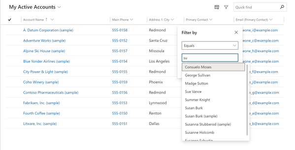
Filtering on a lookup column
When you filter data on a lookup column, you can select from a list of values, rather than typing. For example, to filter a view by Primary Contact, you can select a name from the list that appears when you select the filter text box.
If you start typing, the filter suggests matching results to help you complete the search. The results include all rows that aren't otherwise filtered out.
Filtering on a date column
When you filter on a date column, you can select from many different ways to specify a date or a time frame. For example, you can search On or after an exact date, Next fiscal year, or Last week.
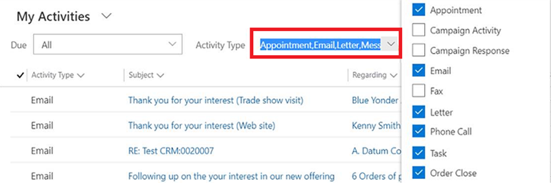
Filtering activities
Use the activity type filter to show only the activities you're interested in, such as appointments or email.
Grouping
When configured, the dropdown column headers surface a Group by option. This allows you to group the data in the grid by values in the selected group.
- Grouping is available for most kinds of columns. This notably does not include lookup columns.
- When grouping on date fields, you need to choose a timeframe to on which to group. This includes day, week, month, quarter, and year.
- You can only group by one column at a time; selecting Group by on a different column replaces any existing grouping criteria.
- You can remove the grouping by selecting Ungroup from the same dropdown column header to remove the grouping.
Note
Grouping criteria isn't saved to a view.
Aggregation
When configured, the dropdown column headers surface a Totals option in numeric columns. This allows you to surface an aggregate calculation in the grid footer for the data in this column. You can choose between showing a sum, the maximum value, the minimum value, or the average value. If the data in the grid has been grouped, the aggregate is calculated and displayed for each group.
Note
Aggretations aren't saved to a view.
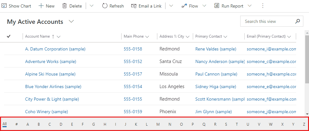
Jump bar
The jump bar is a quick way to filter out records based on letters of the alphabet. To see only records that start with the letter S, for instance, select S in the jump bar.
The jump bar acts on the first sorted column. If the sort order hasn't changed, the jump bar uses the primary column.
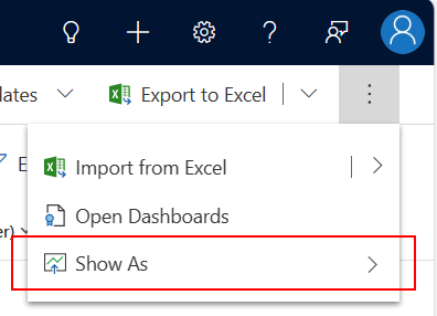
Show as
While the default read-only grid is initially used to show data, if multiple dataset controls are configured for the table view, you can switch between these controls using the Show as menu in the command bar, which is typically found under the More commands action. Once you've switched to a different display of the data, that control is remembered for future sessions on that device.
Feedback
Coming soon: Throughout 2024 we will be phasing out GitHub Issues as the feedback mechanism for content and replacing it with a new feedback system. For more information see: https://aka.ms/ContentUserFeedback.
Submit and view feedback for