Azure Monitor
An Azure service that is used to collect, analyze, and act on telemetry data from Azure and on-premises environments.
2,798 questions
This browser is no longer supported.
Upgrade to Microsoft Edge to take advantage of the latest features, security updates, and technical support.
' cx='32' cy='32' r='32' /%3E%3Ctext x='50%25' y='55%25' dominant-baseline='middle' text-anchor='middle' fill='%23FFF' %3ECH%3C/text%3E%3C/svg%3E)
I have an Azure dashboard with some pinned log analytics queries that result in a graph with multiple labels. I already made the labels' info as short as possible but some of the info can only be seen in the mouseover tooltip.
But when hovering over the labels at the bottom, only the bottom-most label shows a tooltip. That means the people watching the dashboard can only really identify a single of the graphs.
I haven't found any way to change this behavior.
edit: some screens
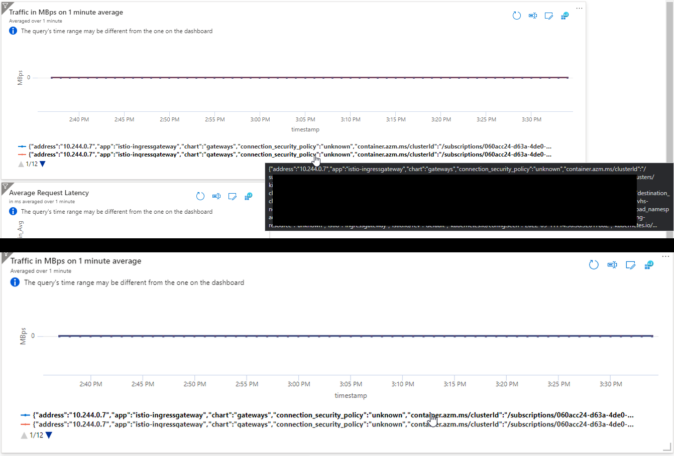
As you can see, in the upper picture when hovering over the lower label, I get a tooltip but not when hovering on the label above. That means I have a number of labels where I can't get the tooltip even though I need them.

Hi,
Azure Dashboards are limited in configuring the actual tiles. I cannot fully understand the exact problem without having some visualization what you mean but probably cannot be done in Azure Dashboards. May using Azure Monitor workbooks can overcome these issues as the workbooks have a lot of functionalities on how data should look.
Please "Accept the answer" if the information helped you. This will help us and others in the community as well.
Okay, updated my question with a graphic.
OK, now I understand the problem better. If the tool tip does not show on all entries I would consider this some kind of bug that you need to address to Azure Support. My recommendation is still to go with Azure Workbooks as it offers more functionality and features thus resulting in better experience for those who use the workbooks.