Microsoft 365 and Office | Excel | For business | Windows
A family of Microsoft spreadsheet software with tools for analyzing, charting, and communicating data
This browser is no longer supported.
Upgrade to Microsoft Edge to take advantage of the latest features, security updates, and technical support.
' cx='32' cy='32' r='32' /%3E%3Ctext x='50%25' y='55%25' dominant-baseline='middle' text-anchor='middle' fill='%23FFF' %3EVB%3C/text%3E%3C/svg%3E)
function main(workbook: ExcelScript.Workbook
) {
let selectedSheet = workbook.getWorksheet("Sheet1");
//get the current used range and lastRow
let myUsedRange = selectedSheet.getUsedRange();
let lastRow = myUsedRange.getAddress();
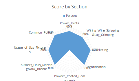
let radarchart = selectedSheet.addChart(ExcelScript.ChartType.radarFilled, selectedSheet.getRange(lastRow));
radarchart.getSeriesNameLevel[0]
radarchart.getTitle().setText('Score by Section')
radarchart.getAxes().getValueAxis().getFormat().getFont().setSize(1)
radarchart.getDataLabels().setShowValue(true);
let radarchartimage = radarchart.getImage()
radarchart.delete();
return [radarchartimage]
}
@Yutao Huang - MSFT
The Chart values are overlapping chart labels .
How to reposition them dynamically so that it does not overlap

Hi,
Your question is related to scripting, I am in charge of Office General. We recommend you go to office

This seems like a radar chart rendering issue. I'd suggest submitting a frown through the feedback button in Excel Online.
As a temporary workaround, maybe you can consider somehow concatenating the operation name and the score into a single column to be used as the "Category Labels", then hide the data labels (radarchart.getDataLabels().setShowValue(false)). Something like this (I used the sample data from another post of yours :) ):

Great Thanks
I did the same work around !