Clean Prototyping with Compositions
By now you’ve hopefully seen SketchFlow and how it can help you conceptualize your projects before turning them into reality. If not, I highly recommend you check out the Mix ‘09 session Sketch Flow: From Concept to Production.
One of the tasks common to prototyping and actual development is planning navigation between pages (or screens). Luckily, Blend make this as easy as right-clicking on any button and choosing Navigate To – <Screen Name> . When you do this, Blend builds links into the application flow so that the SketchFlow player and the live application understand how the user can get around. These links show up in blue and look something like this:
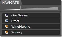
You’ll notice in the image above that both the Start page and Winary page can get to any other page in the application. That’s because both the Start page and the Winery page have a set of buttons that look like this:
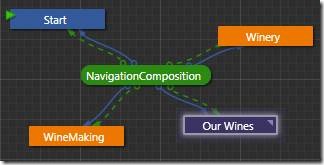
In fact it’s very common to want some piece of navigation shared across all the pages in an application. For example a navigation bar on the left side of a page or across the top is very common on websites and in SharePoint. In Blend 3 we can support the same concept by converting a group of controls into a ‘Composition Screen’. That composition can then be shared across all pages, and the navigation it provides comes along as well. In the application flow, it ends up looking something like this:
But you might notice that things have become a bit messy and we have blue lines and green lines that seem to go to the same places. That’s because Blend is showing the new composition lines in green and the old manually defined navigation links still remain in blue. Luckily, with the composition in place the manual links are extraneous and can be removed. This is done by right-clicking the line and choosing Remove Connection. The Sketchflow player and navigation system are smart enough to realize the composition still provides navigation routes, even if the manual links are gone. So the player still works just like it did before:
With the extra links removed, here’s one possible cleaned up flow for this application:
Of course it doesn’t hurt to leave the original links defined, and it may even be desirable to have them there to clarify intent . For example, just because the user can navigate directly from login to an empty shopping cart doesn’t necessarily mean we expect them to do it often.
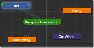
Finally, I’ll close with a cool new feature I noticed in one of the latest builds: It’s now possible to dim out navigation lines and / or composition lines for the screens you’re not currently viewing. Pretty cool.


