A high resolution fix for OneNote
One of the changes in the marketplace since we shipped OneNote 2013 was the rise of high resolution (QHD and higher) screens. Some companies have released laptops and such with screens that use 2580x1440 pixels, or 3200x1800. If you saw CES, even higher screen resolutions are on the way as well.
This is great. I recently received my Dell XPS laptop with a 3200x1800 screen and I love the crisp resolution. It is very easy on the eyes and I do not want to go back to anything lower.
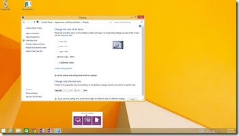
Since these came out after we shipped, we had a few rough edges with them at first. For instance, the most obvious example is that our Send To OneNote "hub" was too small to easily use, and frankly, was hard to read at that resolution. I'll spare everyone the details on scaling and dpi and pixels since the math gets fairly involved quickly. In any case, once we had some test hardware, we started working on a fix. Here's what it looked like:
Notice how small the clipping hub us relative to the rest of the screen.
In short, we detect that the machine is running at 200% or higher resolution and we scale the dialog to be bigger. We also got some new icons (the images you see on that dialog for screen clipping, sending to OneNote from Word, etc…) that are properly sized for the new screens and checked everything in. Testing on this was pretty simple - verify the behavior on the new screens and also ensure we did not break any behavior we currently have. I still have my old Lenovo laptop with 1024x768 and I used it to check with the lowest resolution we support.
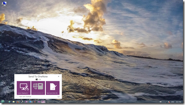
When I got my Dell last week, it arrived with the original version of OneNote 2013 on it. After a day or two, it prompted to install our update and the hub appeared as I expected. Here is what I see now. Notice how much larger the hub is:
That prompted me to write about this since my machine is now up to date with the latest fixes we released.
Oh, and someone noticed our work here as well-
"Word 2013 and all of Office look great at High-DPI. They've got great icons, great fonts and generally are awesome."
https://www.hanselman.com/blog/LivingAHighDPIDesktopLifestyleCanBePainful.aspx He also includes links to the details of how this works if you want to jump over there.
I hope you like the fix!
Questions, comments, concerns and criticisms always welcome,
John

