Operations Manager 2012 Dashboards – The Performance Widget
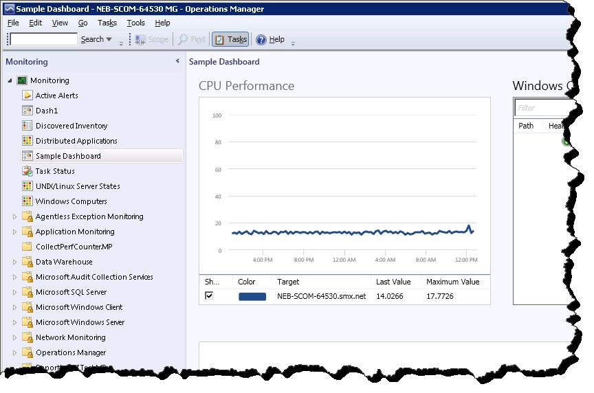
In a previous post my friend and co-worker Dale introduced the new Dashboard capability in System Center Operations Manager 2012. He showed a screenshot of a dashboard containing a Performance Widget, but now I want to show you how to configure your own Performance Widget.
First however, I have some great news for you. The performance widget does not have the same limitation as the performance view regarding the age of historical data that can be shown. Whereas the performance view only queries the Operations database for data, which by default only stores 7 days of historical data, the performance widget gets its data from the data warehouse (OperationsDW database), which contains up to 400 days of data by default!
(This post assumes that you have already created a dashboard using the instructions in the previous post, and that you have at least one cell that does not yet have a widget.)
Adding a performance widget to a dashboard
Step 1: click on the “Click to add widget…” link in an empty dashboard cell. This will open the New Dashboard and Widget Wizard.
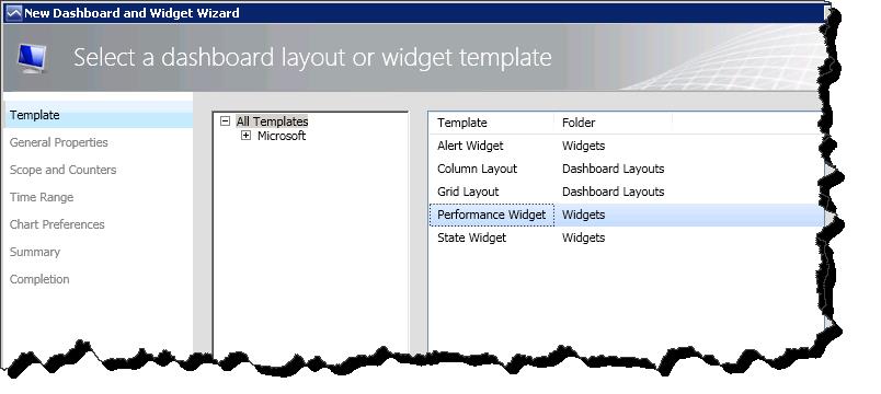
Step 2: Now you will see the widgets available. Select the performance widget.
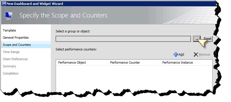
Step 3: After giving the new widget a name, select a group of objects to display performance data for:
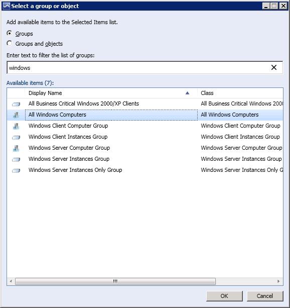
For instance, the All Windows Computers group:
Step 4: Select the performance counter(s) that you want to see:
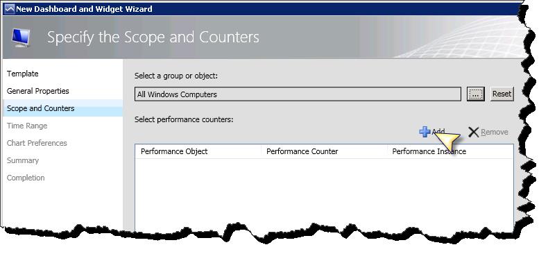
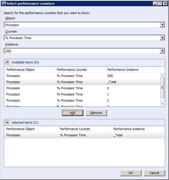
In order to make it easy to get a widget that shows data on the first attempt, the list of available performance counters is scoped to only those counters being collected for the objects in the group you specified in the previous step.
You have the ability to select more than one object/counter/instance to show. Just find your additional counters and add them to the list of Selected Items at the bottom.
Step 5: Specify the time range that you want to see data for.
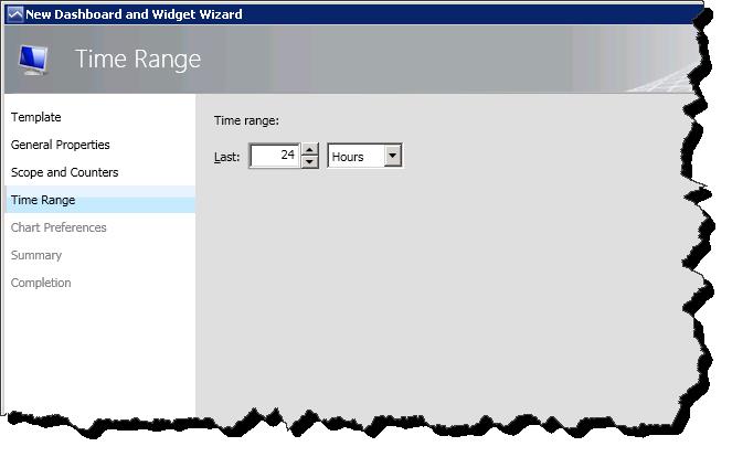
The chart is optimized to show no more than 100 data points per line to improve querying and rendering performance. It is important to consider this when configuring the time range for the following reasons:
- If the time range is less than 100 hours the widget will show raw data from the data warehouse
- If the time range is between 100 hours and 100 days the widget will show hourly aggregated data
- If the time range is greater than 100 days the widget will show daily aggregated data
- In addition, in order to optimize rendering performance, if the time range is 2 weeks (336 hours) the query will return 336 hourly data points, but the widget will reduce the number of points in the resulting line to approximately 100 points. This is very similar to what PerfMon does in Windows.
Step 6: Finally, configure the way you would like the chart and legend to display.
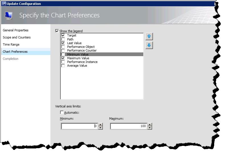
In the legend, you can specify which columns to show. If you select a column like Maximum Value, for each series the maximum value of all the displayed points will be shown in the legend.
Stay tuned…
Keep watching the Operations Manager Team Blog for more information about our out-of-the-box dashboards, how partners will ship their dashboards and the new widgets!