Working with XY Scatter Charts in Reporting Services 2008
Recently, I’ve been fielding a few questions regarding XY Scatter Charts in Reporting Services 2008 (see MSDN Forum Question). We have definitely noticed that working with XY Scatter charts is a bit difficult, and we do appreciate the feedback and will work to improve them in a future release. The remainder of this post will detail how you can successfully build these charts in SSRS 2008.
Option 1: Use a Unique Identifier on Rows.
This example relies on using the Category Grouping feature of the chart, but requires a unique identifier in your result set for each row. Star with this example query:
| SELECT 1 as X, 1 as Y, 100 as RowNumber UNION ALL SELECT 2 as X, 3 as Y, 200 as RowNumber UNION ALL SELECT 2 as X, 7 as Y, 300 as RowNumber UNION ALL SELECT 3 as X, 10 as Y, 400 as RowNumber |
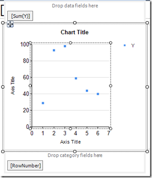
Next, insert an XY Scatter chart into the report. Place the RowNumber on Category Groups, and add “Y” to the Data Fields area. At this point the chart will look like the image below.
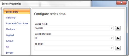
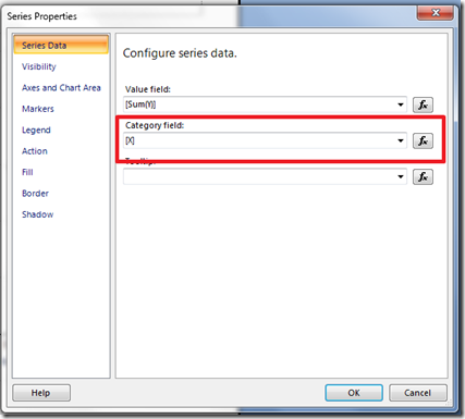
Finally, right click on the [Sum(Y)] token in the data fields area and bring up the property page for the series. Here, change the Category field value to the X field.
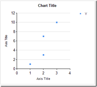
Now, run the report, and your chart should look like the one below.
Option 2: Use a Detail Group as the Category Group
Instead of returning a unique identifier on your records, another option is to rely on a detail group for the category group for the chart. From a UI perspective, this one is very difficult to discover.
First, let’s start with the same SQL query provided above, and insert a new XY Scatter chart into the report.
Again, place the Y field in the data fields area of the chart flange, but this time place the X field as the Category Group (it actually doesn’t matter which field you put here as you will see in a moment).
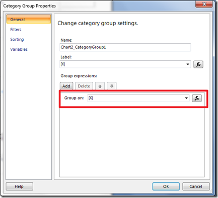
Next, right-click on the Category Group in the chart flange and bring up its property page. It should look like this:
With the page open, select the single group (shown outlined in red) and press the “Delete” button. This will empty the group box. Hit “OK” when done. Believe it or not, you have just created a detail group for the chart.
Once the detail group is created, there is an issue where the chart flange is no longer available. To edit the series, select the series in the plot area and bring up its property page. On this page, set the Category Field equal to [X].
Run the report. The XY scatter chart should display correctly.
I agree that both of these solutions are effectively work-arounds for a feature that should be much easier to use, and this is something we will work to address in a future release of Reporting Services.
