Follow-up #3: How can I increase the visibility of keyboard focus feedback in my UWP XAML app, without having to write custom visuals?
This post describes a question arising from the discussion detailed at More tips on building accessible Windows apps, including a couple of things introduced with the Windows 10 Anniversary Update.
One of the very important aspects relating to keyboard accessibility is knowing where keyboard focus is when you’re using the keyboard. So when some standard control gains keyboard focus, its visuals change. I demo’d this with the UWP XAML version of my demo app, but pointed out that the keyboard focus feedback was very subtle. This meant I really had to scrutinize the app in order to find the control with keyboard focus.
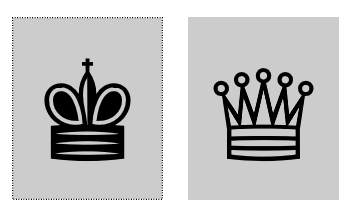
Figure 1: Two UWP XAML app buttons, with the button on the left showing subtle keyboard focus feedback visuals.
Personally, I’d much prefer more prominent visuals which draw my attention to the control, without me having to search for the visuals.
Well, it just so happens that there is a way for me to have more prominent keyboard focus feedback shown in the app. All I have to do is change the target OS in the app’s properties to be the Windows 10 Anniversary Update.
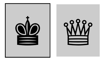
Figure 2: Two UWP XAML app buttons, with the button on the left showing prominent keyboard focus feedback visuals.
For me, this is a great improvement in usability. I can efficiently interact with the app via the keyboard, and I’m left with none of the sense of frustration that I had before.
If devs really want to, they can specify which of the two types of feedback should be shown in the app, (that is, either the subtle dotted visuals, or the new more prominent visuals,) via the FocusVisualKind property.
On most standard controls, the feedback itself is made up of a 2-pixel outer rectangle, and a 1-pixel inner rectangle. These rectangles respect system colors when a high contrast theme is active, to provide a strong contrast between the rects, and also with the control that has focus.

Figure 3: Two UWP XAML app buttons shown when the High Contrast Black theme is active, with the button on the left showing keyboard focus feedback visuals.
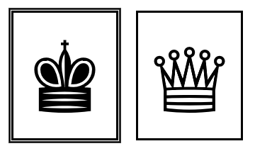
Figure 4: Two UWP XAML app buttons shown when the High Contrast White theme is active, with the button on the left showing keyboard focus feedback visuals.
The Ease of Access setting “Make the focus rectangle thicker” does not impact the UWP XAML visuals. But having said that, I don’t know what UI frameworks are affected by that setting these days. My UWP HTML app does seem to respect the setting by default, but I suspect few other UI frameworks respect it.
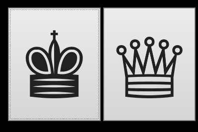
Figure 5: Two UWP HTML app buttons, with the button on the left showing subtle default keyboard focus feedback visuals.
Figure 6: Two UWP HTML app buttons, with the button on the left showing keyboard focus feedback visuals when the Ease of Access setting “Make the focus rectangle thicker” is turned on.
App devs can always provide their own custom keyboard focus feedback visuals for their UWP XAML and HTML apps if they want to. But I think it’s really great that the default visuals for standard controls in a UWP XAML app built for the Windows 10 Anniversary Update are so much easier to use for many customers.
Guy
P.S. If you’re ever interested in creating your own tool to spotlight where keyboard focus is, you may be interested in A real-world example of quickly building a simple assistive technology app with Windows UI Automation.
Posts in this series:
Follow-up #2: How do I have access keys shown on buttons in my UWP XAML app?