Azure Monitor Metrics aggregation and display explained
This article explains the aggregation of metrics in the Azure Monitor time-series database that back Azure Monitor platform metrics and custom metrics. This article also applies to standard Application Insights metrics.
This is a complex topic and not necessary to understand all the information in this article to use Azure Monitor metrics effectively.
Overview and terms
When you add a metric to a chart, metrics explorer automatically pre-selects its default aggregation. The default makes sense in the basic scenarios, but you can use different aggregations to gain more insights about the metric. Viewing different aggregations on a chart requires that you understand how metrics explorer handles them.
Let's define a few terms clearly first:
- Metric value – A single measurement value gathered for a specific resource.
- Time-Series database - A database optimized for the storage and retrieval of data points all containing a value and a corresponding time-stamp.
- Time period – A generic period of time.
- Time interval – The period of time between the gathering of two metric values.
- Time range – The time period displayed on a chart. Typical default is 24 hours. Only specific ranges are available.
- Time granularity or time grain – The time period used to aggregate values together to allow display on a chart. Only specific ranges are available. Current minimum is 1 minute. The time granularity value should be smaller than the selected time range to be useful, otherwise just one value is shown for the entire chart.
- Aggregation type – A type of statistic calculated from multiple metric values.
- Aggregate – The process of taking multiple input values and then using them to produce a single output value via the rules defined by the aggregation type. For example, taking an average of multiple values.
Summary of process
Metrics are a series of values stored with a time-stamp. In Azure, most metrics are stored in the Azure Metrics time-series database. When you plot a chart, the values of the selected metrics are retrieved from the database and then separately aggregated based on the chosen time granularity (also known as time grain). You select the size of the time granularity using the metrics explorer time picker. If you don’t make an explicit selection, the time granularity is automatically selected based on the currently selected time range. Once selected, the metric values that were captured during each time granularity interval are aggregated and placed onto the chart - one datapoint per interval.
Aggregation types
There are five basic aggregation types available in the metrics explorer. Metrics explorer hides the aggregations that are irrelevant and cannot be used for a given metric.
- Sum – the sum of all values captured over the aggregation interval. Sometimes referred to as the Total aggregation.
- Count – the number of measurements captured over the aggregation interval. Count doesn't look at the value of the measurement, only the number of records.
- Average – the average of the metric values captured over the aggregation interval. For most metrics, this value is Sum/Count.
- Min – the smallest value captured over the aggregation interval.
- Max – the largest value captured over the aggregation interval.
For example, suppose a chart is showing the Network Out Total metric for a VM using the SUM aggregation over the last 24-hour time span. The time range and granularity can be changed from the upper right of the chart as seen in the following screenshot.
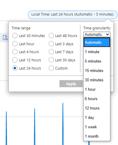
For time granularity = 30 minutes and the time range = 24 hours:
- The chart is drawn from 48 datapoints. That is 24 hours x 2 datapoints per hour (60min/30min) aggregated 1-minute datapoints.
- The line chart connects 48 dots in the chart plot area.
- Each datapoint represents the sum of all network out bytes sent out during each of the relevant 30-min time periods.

Click on the images in this section to see larger versions.
If you switch the time granularity to 15 minutes, the chart is drawn from 96 aggregated data points. That is, 60min/15min = 4 datapoints per hour x 24 hours.

For time granularity of 5 minutes, you get 24 x (60/5) = 288 points.
For time granularity of 1 minute (the smallest possible on the chart), you get 24 x 60/1 = 1440 points.

The charts look different for these summations as shown in the previous screenshots. Notice how this VM has a lot of output in a small time period relative to the rest of the time window.
The time granularity allows you to adjust the "signal-to-noise" ratio on a chart. Higher aggregations remove noise and smooth out spikes. Notice the variations at the bottom 1-minute chart and how they smooth out as you go to higher granularity values.
This smoothing behavior is important when you send this data to other systems--for example, alerts. Typically, you usually don't want to be alerted by very short spikes in CPU time over 90%. But if the CPU stays at 90% for 5 minutes, that's likely important. If you set up an alert rule on CPU (or any metric), making the time granularity larger can reduce the number of false alerts you receive.
It is important to establish what's "normal" for your workload to know what time interval is best. This is one of the benefits of dynamic alerts, which is a different topic not covered here.
How the system collects metrics
Data collection varies by metric.
Measurement collection frequency
There are two types of collection periods.
Regular - The metric is gathered at a consistent time interval that does not vary.
Activity-based - The metric is gathered based on when a transaction of a certain type occurs. Each transaction has a metric entry and a time stamp. They are not gathered at regular intervals so there are a varying number of records over a given time period.
Granularity
The minimum time granularity is 1 minute, but the underlying system may capture data faster depending on the metric. For example, CPU percentage for an Azure VM is captured at a time interval of 15 seconds. Because HTTP failures are tracked as transactions, they can easily exceed many more than one a minute. Other metrics such as SQL Storage are captured at a time interval of every 20 minutes. This choice is up to the individual resource provider and type. Most try to provide the smallest time interval possible.
Dimensions, splitting, and filtering
Metrics are captured for each individual resource. However, the level at which the metrics are collected, stored, and able to be charted may vary. This level is represented by additional metrics available in metrics dimensions. Each individual resource provider gets to define how detailed the data they collect is. Azure Monitor only defines how such detail should be presented and stored.
When you chart a metric in metric explorer, you have the option to "split" the chart by a dimension. Splitting a chart means that you are looking into the underlying data for more detail and seeing that data charted or filtered in metric explorer.
For example, Microsoft.ApiManagement/service has Location as a dimension for many metrics.
Capacity is one such metric. Having the Location dimension implies that the underlying system is storing a metric record for the capacity of each location, rather than just one for the aggregate amount. You can then retrieve or split out that information in a metric chart.
Looking at Overall Duration of Gateway Requests, there are 2 dimensions Location and Hostname, again letting you know the location of a duration and which hostname it came from.
One of the more flexible metrics, Requests, has 7 different dimensions.
Check the Azure Monitor metrics supported article for details on each metric and the dimensions available. In addition, the documentation for each resource provider and type may provide additional information on the dimensions and what they measure.
You can use splitting and filtering together to dig into a problem. Below is an example of a graphic showing the Avg Disk Write Bytes for a group of VMs in a resource group. We have a rollup of all the VMs with this metric, but we may want to dig into see which are actually responsible for the peaks around 6AM. Are they the same machine? How many machines are involved?

Click on the images in this section to see larger versions.
When we apply splitting, we can see the underlying data, but it's a bit of a mess. Turns out there are 20 VMs being aggregated into the chart above. In this case, we've used our mouse to hover over the large peak at 6AM that tells us that CH-DCVM11 is the cause. but it's hard to see the rest of the data associated with that VM because of other VMs cluttering the chart.

Using filtering allows us to clean up the chart to see what's really happening. You can check or uncheck the VMs you want to see. Notice the dotted lines. Those are mentioned in a later section.

For more information on how to show split dimension data on a metric explorer chart, see Advanced features of metrics explorer- filters and splitting.
NULL and zero values
When the system expects metric data from a resource but doesn't receive it, it records a NULL value. NULL is different than a zero value, which becomes important in the calculation of aggregations and charting. NULL values are not counted as valid measurements.
NULLs show up differently on different charts. Scatter plots skip showing a dot on the chart. Bar charts skip showing the bar. On line charts, NULL can show up as dotted or dashed lines like those shown in the screenshot in the previous section. When calculating averages that include NULLs, there are fewer data points to take the average from. This behavior can sometimes result in an unexpected drop in values on a chart, though usually less so than if the value was converted to a zero and used as a valid datapoint.
Custom metrics always use NULLs when no data is received. With platform metrics, each resource provider decides whether to use zeros or NULLs based on what makes the most sense for a given metric.
Azure Monitor alerts use the values the resource provider writes to the metric database, so it's important to know how the resource provider handles NULLs by viewing the data first.
How aggregation works
The metrics charts in the previous system show different types of aggregated data. The system pre-aggregates the data so that the requested charts can show quicker without a lot of repeated computation.
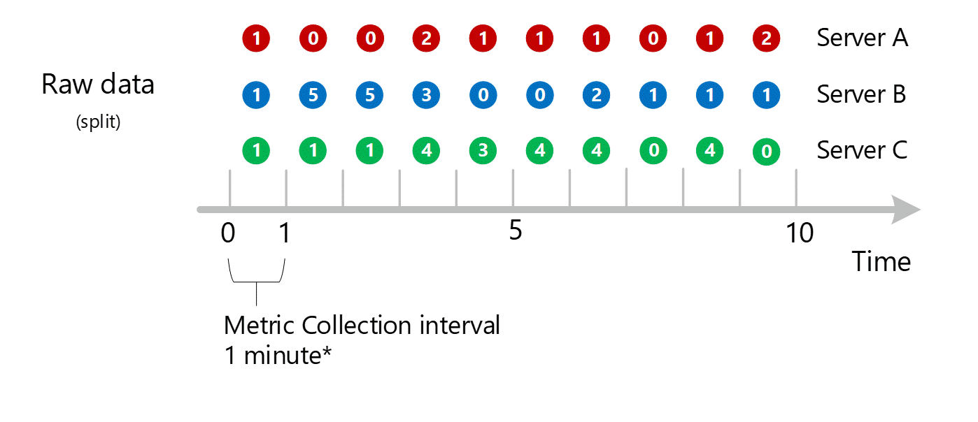
In this example:
- We are collecting a fictitious transactional metric called HTTP failures
- Server is a dimension for the HTTP failures metric.
- We have 3 servers - Server A, B, and C.
To simplify the explanation, we'll start with the SUM aggregation type only.
Sub minute to 1-minute aggregation
First raw metric data is collected and stored in the Azure Monitor metrics database. In this case, each server has transaction records stored with a timestamp because Server is a dimension. Given that the smallest time period you can view as a customer is 1 minute, those timestamps are first aggregated into 1-minute metric values for each individual server. The aggregation process for Server B is shown in the graphic below. Servers A and C are done in the same way and have different data.
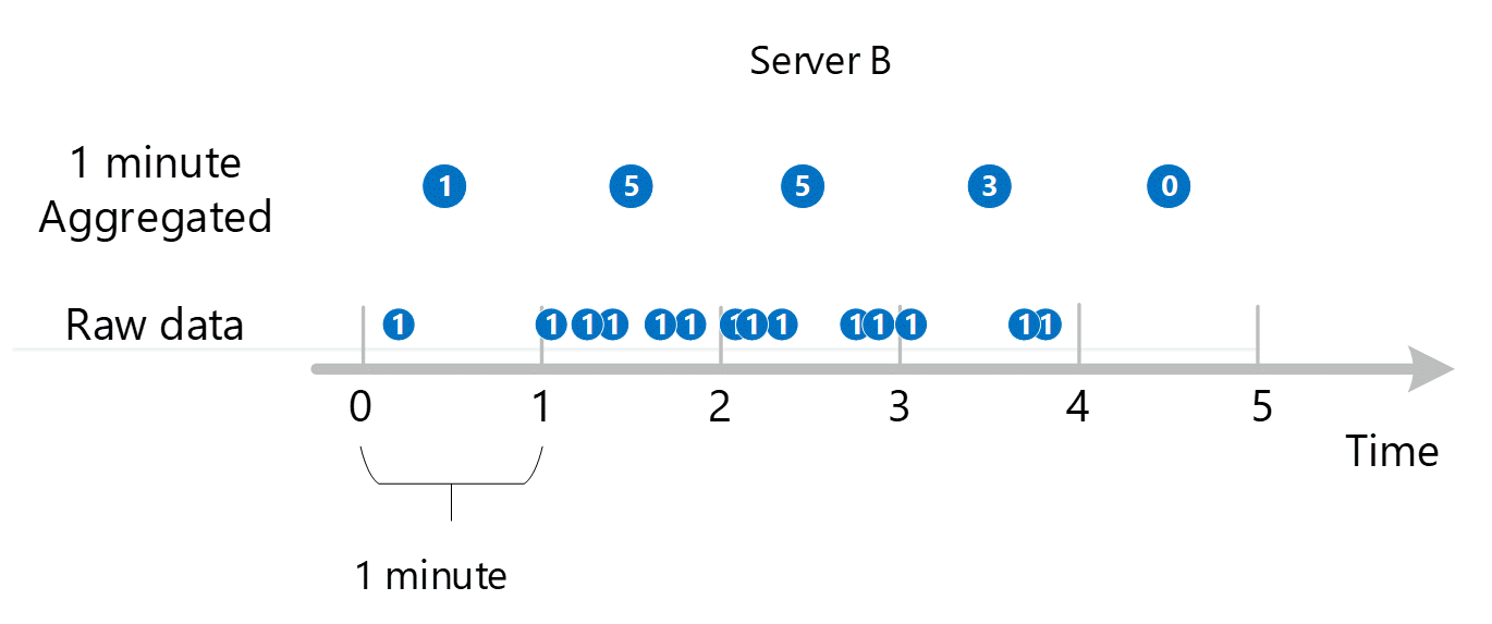
The resulting 1-minute aggregated values are stored as new entries in the metrics database so they can be gathered for later calculations.
Dimension aggregation
The 1-minute calculations are then collapsed by dimension and again stored as individual records. In this case, all the data from all the individual servers are aggregated into a 1-minute interval metric and stored in the metrics database for use in later aggregations.
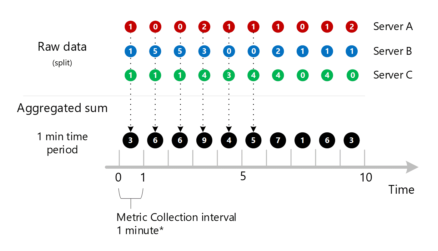
For clarity, the following table shows the method of aggregation.
| Period | Server A | Server B | Server C | Sum (A+B+C) |
|---|---|---|---|---|
| Minute 1 | 1 | 1 | 1 | 3 |
| Minute 2 | 0 | 5 | 1 | 6 |
| Minute 3 | 0 | 5 | 1 | 6 |
| Minute 4 | 2 | 3 | 4 | 9 |
| Minute 5 | 1 | 0 | 3 | 4 |
| Minute 6 | 1 | 0 | 4 | 5 |
| Minute 7 | 1 | 2 | 4 | 7 |
| Minute 8 | 0 | 1 | 0 | 1 |
| Minute 9 | 1 | 1 | 4 | 6 |
| Minute 10 | 2 | 1 | 0 | 3 |
Only one dimension is shown above, but this same aggregation and storage process occurs for all dimensions that a metric supports.
- Collect values into 1-minute aggregated set by that dimension. Store those values.
- Collapse the dimension into a 1-minute aggregated SUM. Store those values.
Let's introduce another dimension of HTTP failures called NetworkAdapter. Let's say we had a varying number of adapters per server.
- Server A has 1 adapter
- Server B has 2 adapters
- Server C has 3 adapters
We'd collect data for the following transactions separately. They would be marked with:
- A time
- A value
- The server the transaction came from
- The adapter that the transaction came from
Each of those subminute streams would then be aggregated into 1-minute time-series values and stored in the Azure Monitor metric database:
- Server A, Adapter 1
- Server B, Adapter 1
- Server B, Adapter 2
- Server C, Adapter 1
- Server C, Adapter 2
- Server C, Adapter 3
In addition, the following collapsed aggregations would also be stored:
- Server A, Adapter 1 (because there is nothing to collapse, it would be stored again)
- Server B, Adapter 1+2
- Server C, Adapter 1+2+3
- Servers ALL, Adapters ALL
This shows that metrics with large numbers of dimensions have a larger number of aggregations. It's not important to know all the permutations, just understand the reasoning. The system wants to have both the individual data and the aggregated data stored for quick retrieval for access on any chart. The system picks either the most relevant stored aggregation or the underlying raw data depending on what you choose to display.
Aggregation with no dimensions
Because this metric has a dimension Server, you can get to the underlying data for server A, B, and C above via splitting and filtering, as explained earlier in this article. If the metric didn't have Server as a dimension, you as a customer could only access the aggregated 1-minute sums shown in black on the diagram. That is, the values of 3, 6, 6, 9, etc. The system also would not do the underlying work to aggregate split values it would never use them in metric explorer or send them out via the metrics REST API.
Viewing time granularities above 1 minute
If you ask for metrics at a larger granularity, the system uses the 1-minute aggregated sums to calculate the sums for the larger time granularities. Below, dotted lines show the summation method for the 2-minute and 5-minute time granularities. Again, we are showing just the SUM aggregation type for simplicity.
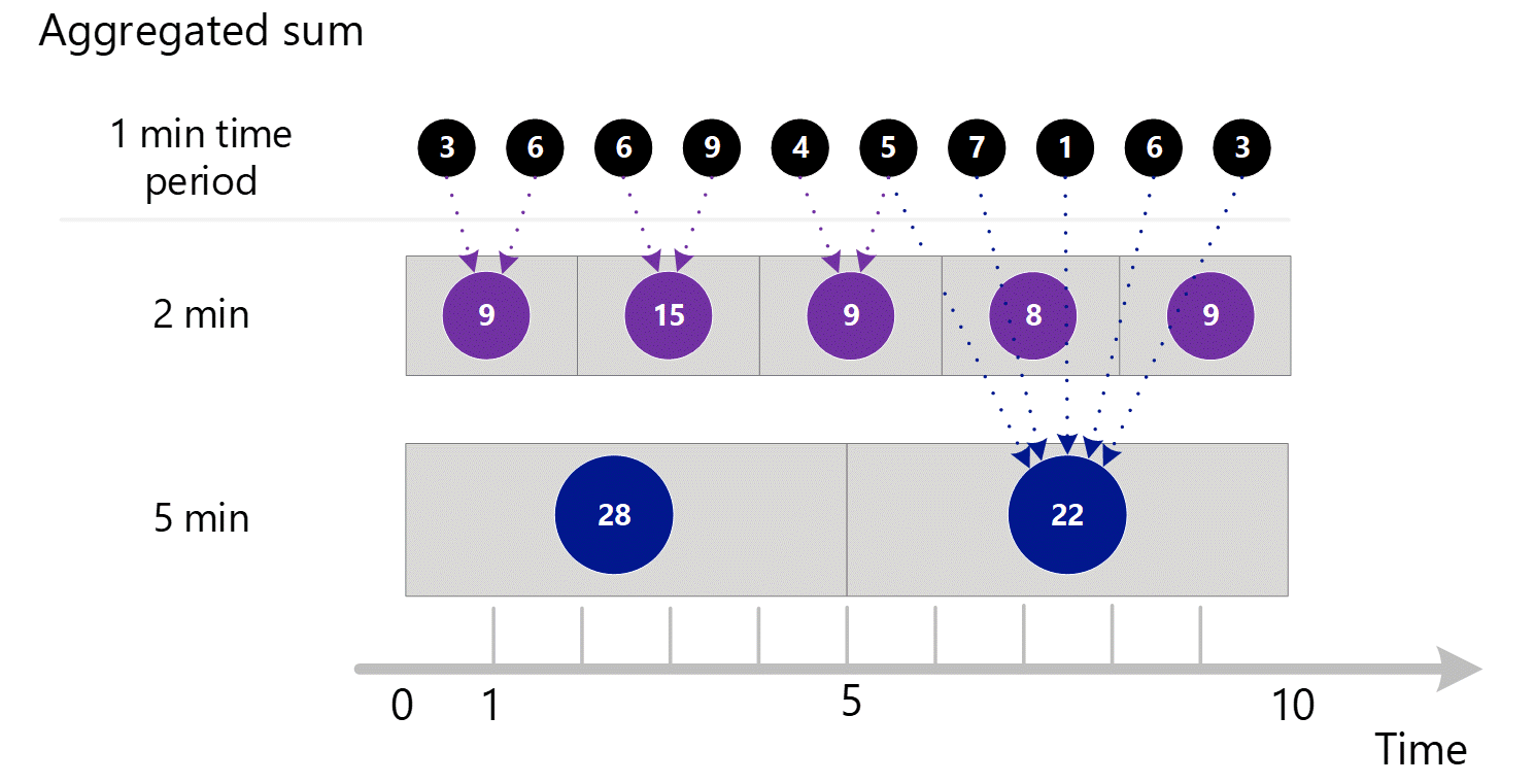
For the 2-minute time granularity.
| Period | Sums |
|---|---|
| Minute 1 & 2 | (3 + 6) = 9 |
| Minute 3 & 4 | (6 + 9) = 15 |
| Minute 4 & 5 | (4 + 5) = 9 |
| Minute 6 & 7 | (7 + 1) = 8 |
| Minute 8 & 9 | (6 + 3) = 9 |
For 5-minute time granularity.
| Period | Sums |
|---|---|
| Minute 1 through 5 | 3 + 6 + 6 + 9 + 4 = 28 |
| Minute 6 through 10 | 5 + 7 + 1 + 6 + 3 = 22 |
The system uses the stored aggregated data that gives the best performance.
Below is the larger diagram for the above 1-minute aggregation process, with some of the arrows left out to improve readability.
More complex example
Following is a larger example using values for a fictitious metric called HTTP Response time in milliseconds. Here we introduce additional levels of complexity.
- We show aggregation for Sum, Count, Min, and Max and the calculation for Average.
- We show NULL values and how they affect calculations.
Consider the following example. The boxes and arrows show examples of how the values are aggregated and calculated.
The same 1-minute preaggregation process as described in the previous section occurs for Sums, Count, Minimum, and Maximum. However, Average is NOT pre-aggregated. It is recalculated using aggregated data to avoid calculation errors.

Consider minute 6 for the 1-minute aggregation as highlighted above. This minute is the point where Server B went offline and stopped reporting data, perhaps due to a reboot.
From Minute 6 above, the calculated 1-minute aggregation types are:
| Aggregation type | Value | Notes |
|---|---|---|
| Sum | 53+20=73 | |
| Count | 2 | Shows the effect of NULLs. The value would have been 3 if the server had been online. |
| Minimum | 20 | |
| Maximum | 53 | |
| Average | 73 / 2 | Always the Sum divided by the Count. It's never stored and always recalculated for each time granularity using the aggregated numbers for that granularity. Notice the recalculation for the 5-minute and 10-minute time granularities as highlighted above. |
The red text color indicates values that might be considered out of the normal range and shows how they propagate (or fail to) as the time-granularity goes up. Notice how the Min and Max indicate there are underlying anomalies while the Average and Sums lose that information as your time granularity goes up.
You can also see that the NULLs give a better calculation of average than if zeros were used instead.
Note
Though not the case in this example, Count is equal to Sum in cases where a metric is always captured with the value of 1. This is common when a metric tracks the occurrence of a transactional event--for example, the number of HTTP failures mentioned in a previous example in this article.
Next steps
Feedback
Coming soon: Throughout 2024 we will be phasing out GitHub Issues as the feedback mechanism for content and replacing it with a new feedback system. For more information see: https://aka.ms/ContentUserFeedback.
Submit and view feedback for