Manage Azure Data Factory studio preview experience
APPLIES TO:  Azure Data Factory
  Azure Synapse Analytics
Tip
Try out Data Factory in Microsoft Fabric, an all-in-one analytics solution for enterprises. Microsoft Fabric covers everything from data movement to data science, real-time analytics, business intelligence, and reporting. Learn how to start a new trial for free!
You can choose whether you would like to enable preview experiences in your Azure Data Factory.
How to enable/disable preview experience
There are two ways to enable preview experiences.
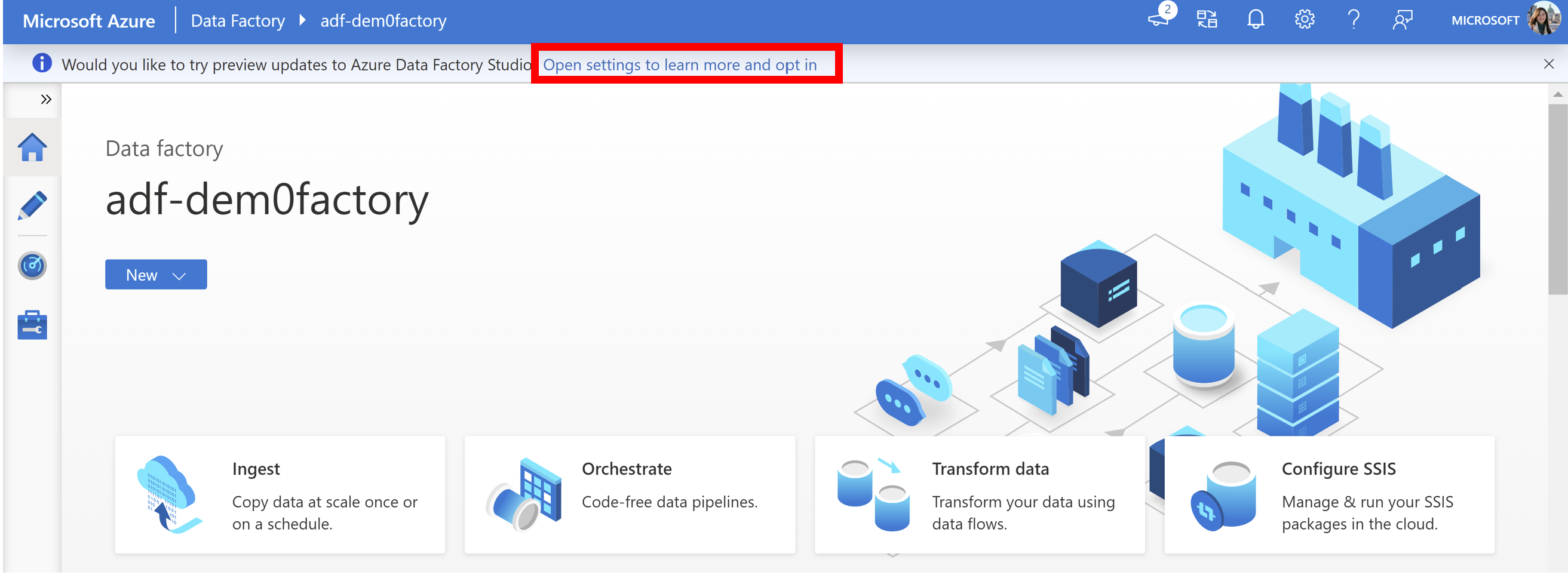
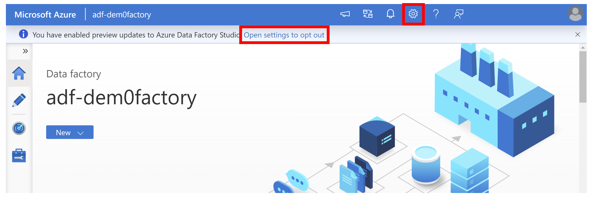
In the banner seen at the top of the screen, you can click Open settings to learn more and opt in.
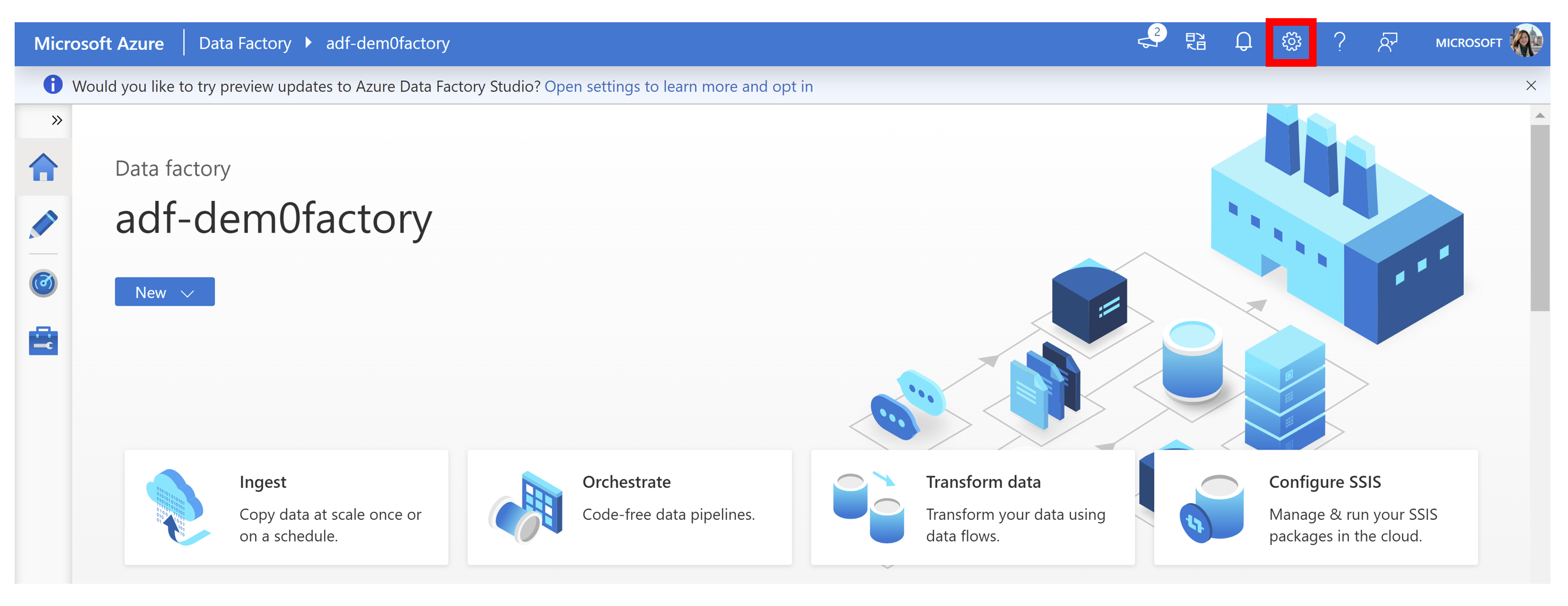
Alternatively, you can click the Settings button.
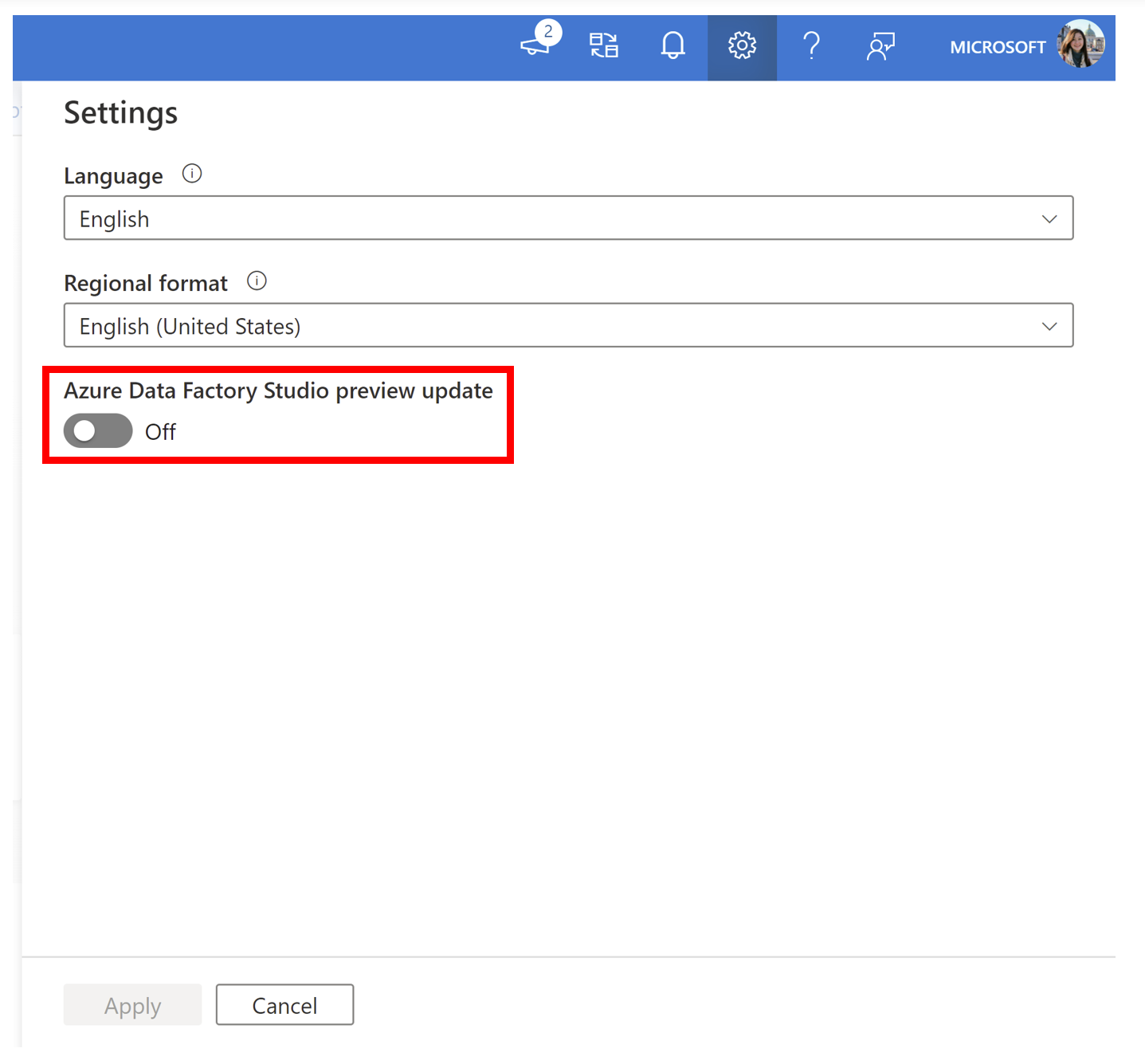
After opening Settings, you'll see an option to turn on Azure Data Factory Studio preview update.
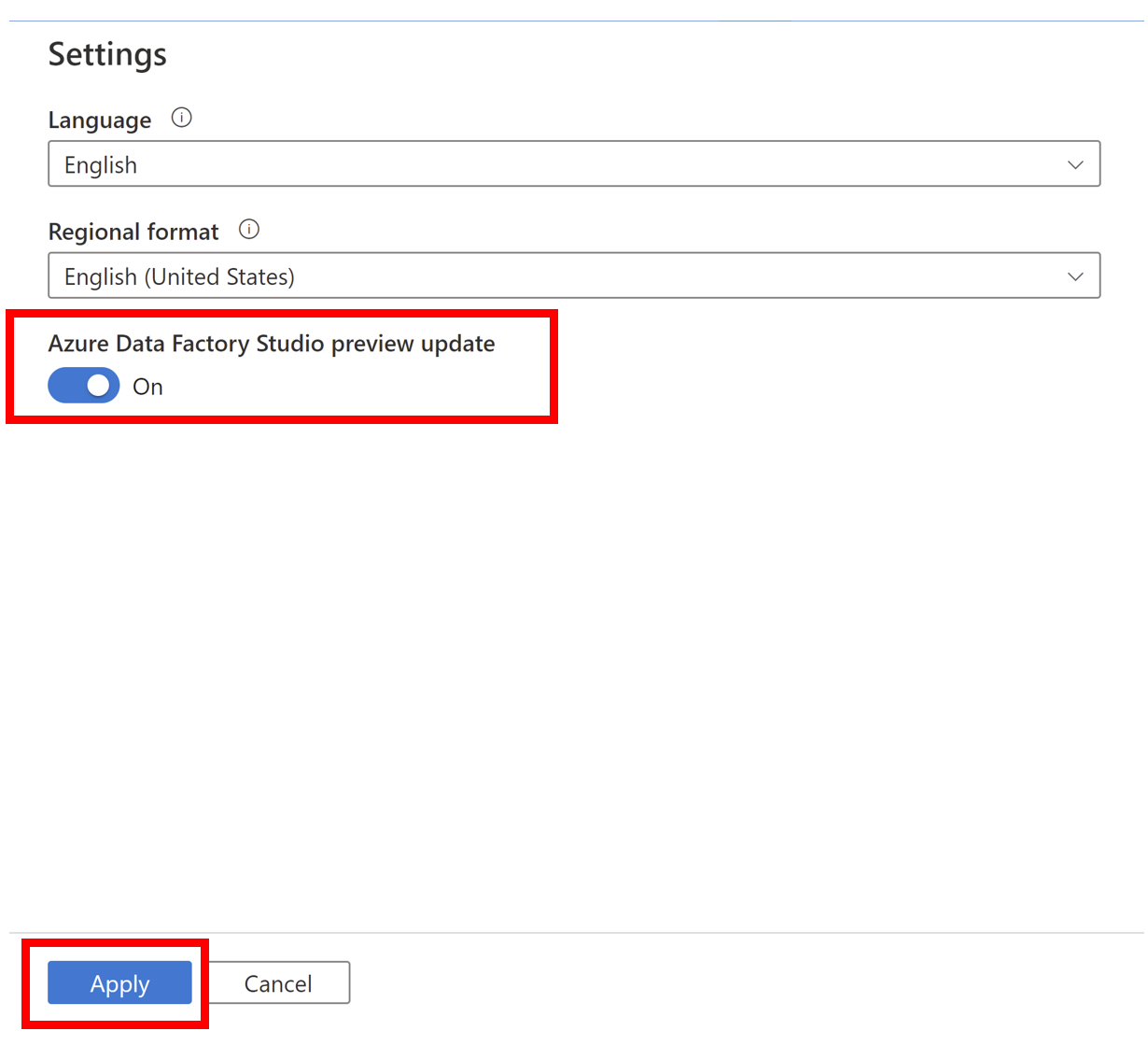
Toggle the button so that it shows On and click Apply.
Your data factory refreshes to show the preview features.
Similarly, you can disable preview features with the same steps. Click Open settings to opt out or click the Settings button and unselect Azure Data Factory Studio preview update.
Note
Enabling/disabling preview updates will discard any unsaved changes.
Current Preview Updates
Dataflow data first experimental view
- Dynamic content flyout
- [Linked service for Web activity] (#linked-service-web-activity)
Dataflow data-first experimental view
UI (user interfaces) changes have been made to mapping data flows. These changes were made to simplify and streamline the dataflow creation process so that you can focus on what your data looks like.
The dataflow authoring experience remains the same as detailed here, except for certain areas detailed below.
To see the data-first experimental view, you need to follow these steps to enable it. By default, users see the Classic style.
Note
To enable the data-first view, you'll need to enable the preview experience in your settings and you'll need an active Data flow debug session.
In your data flow editor, you can find several canvas tools on the right side like the Search tool, Zoom tool, and Multi-select tool.
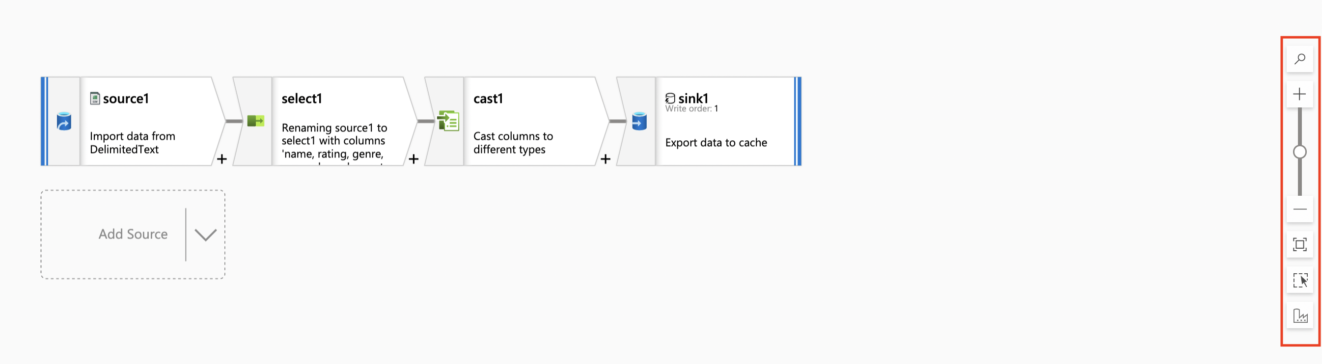
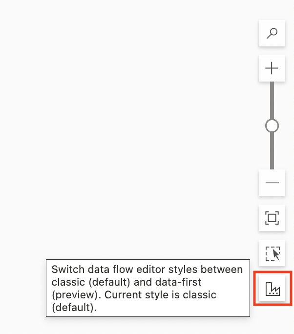
You'll see a new icon under the Multi-select tool. This is how you can toggle between the Classic and the Data-first views.
Configuration panel
The configuration panel for transformations has now been simplified. Previously, the configuration panel showed settings specific to the selected transformation. Now, for each transformation, the configuration panel will only have Data Preview that will automatically refresh when changes are made to transformations.
If no transformation is selected, the panel will show the pre-existing data flow configurations: Parameters and Settings.
Transformation settings
Settings specific to a transformation will now show in a pop-up instead of the configuration panel. With each new transformation, a corresponding pop-up will automatically appear.
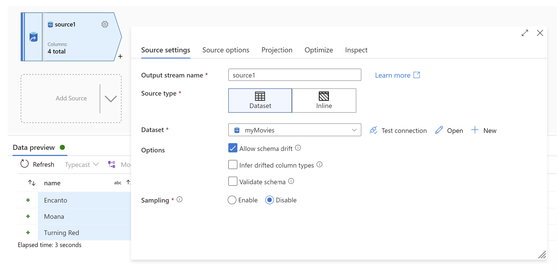
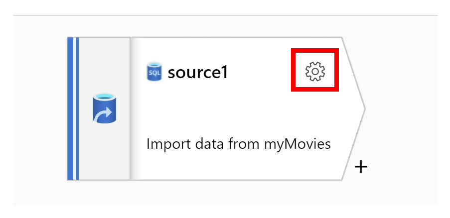
You can also find the settings by clicking the gear button in the top right corner of the transformation activity.
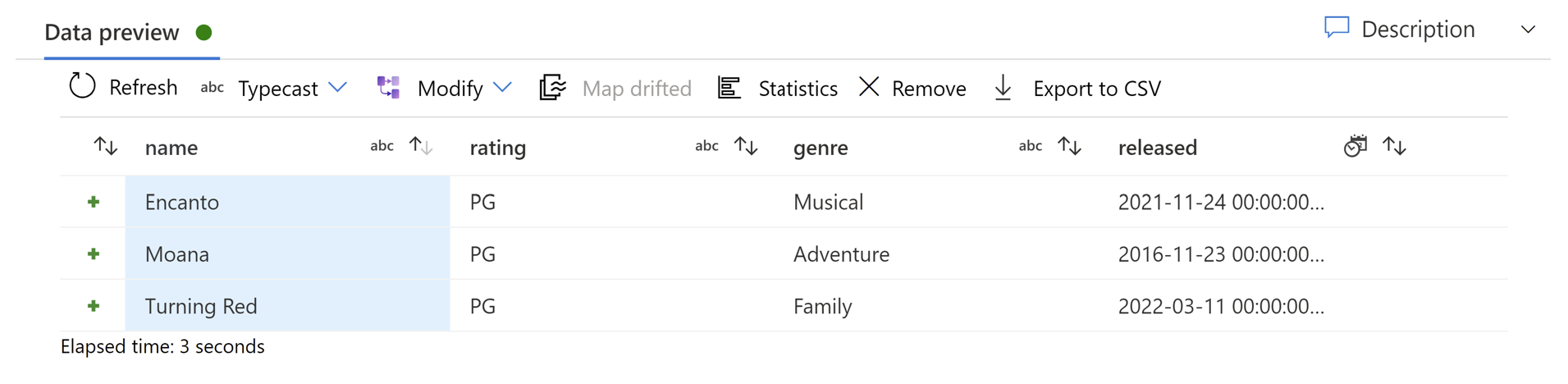
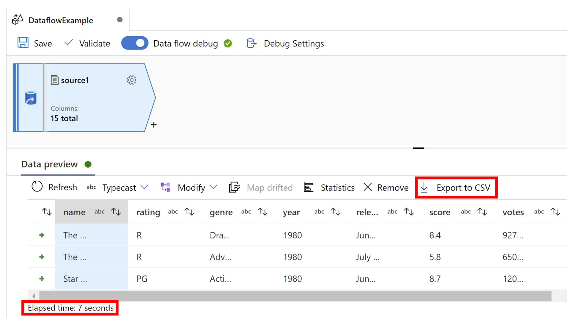
Data preview
If debug mode is on, Data Preview in the configuration panel will give you an interactive snapshot of the data at each transform. Data preview now includes Elapsed time (seconds) to show how long your data preview took to load. Columns can be rearranged by dragging a column by its header. You can also sort columns using the arrows next to the column titles and you can export data preview data using Export to CSV on the banner above column headers.
CI/CD experimental view
Auto Save
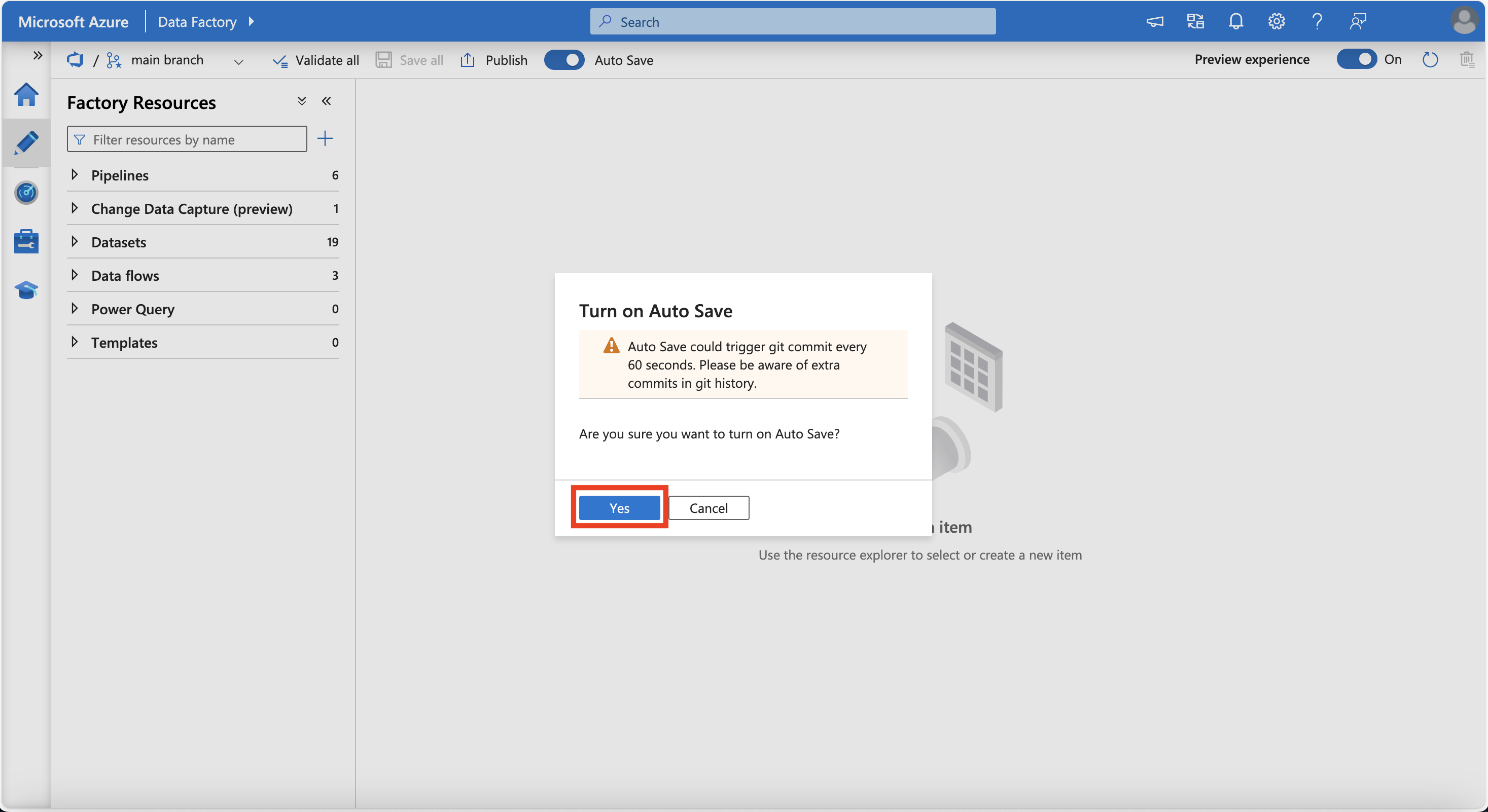
You now have the option to enable Auto Save when you have a Git repository configured for your factory. This allows you to save changes to your factory automatically while developing.
To enable Auto save, click the toggle button found in the top banner of your screen.
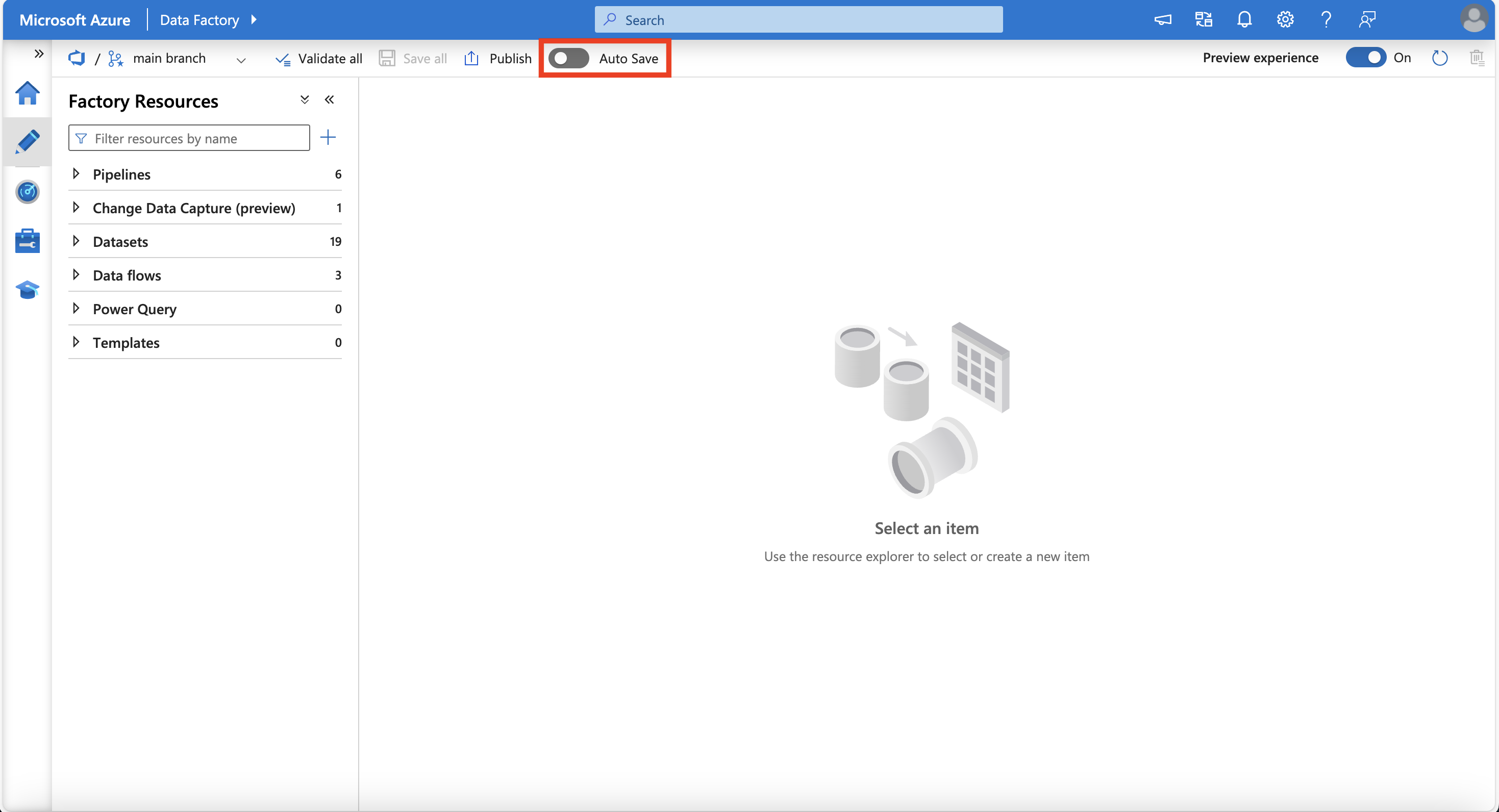
Review the pop-up and click Yes.
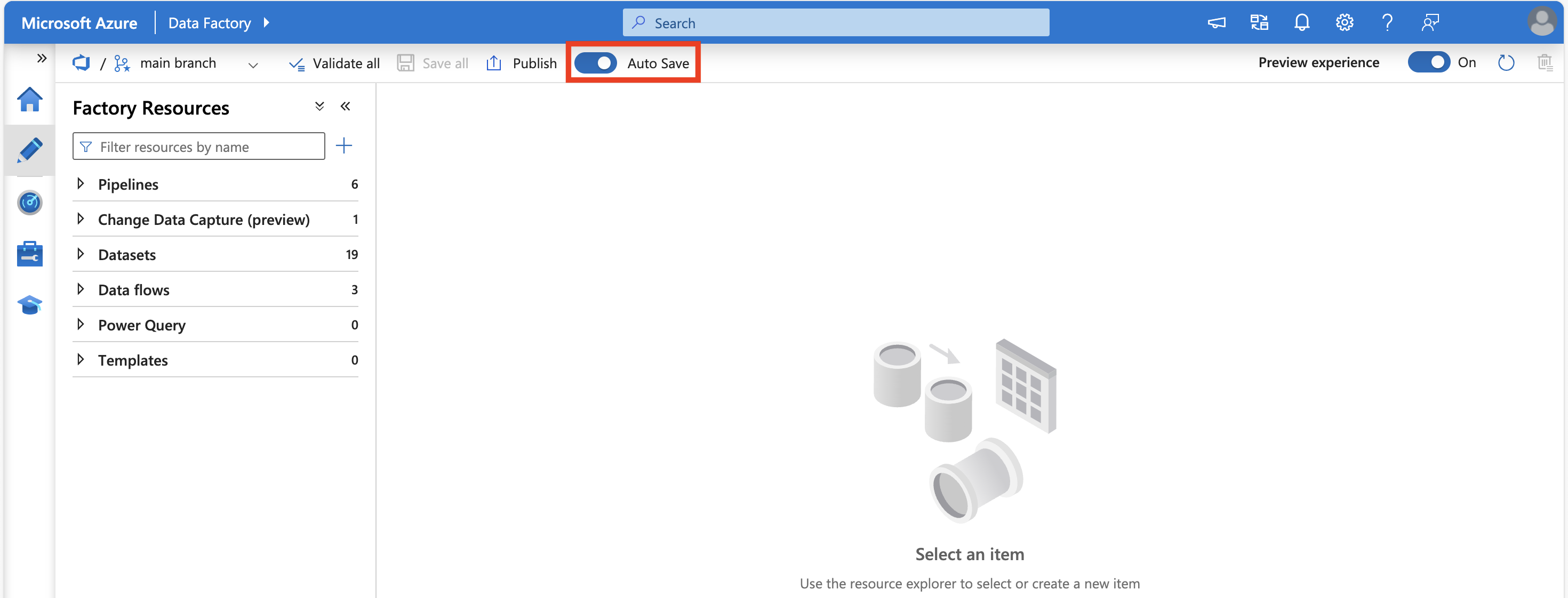
When Auto Save is enabled, the toggle button shows as blue.
Pipeline experimental view
UI (user interface) changes have been made to activities in the pipeline editor canvas. These changes were made to simplify and streamline the pipeline creation process.
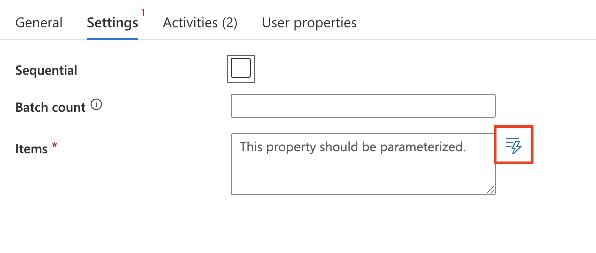
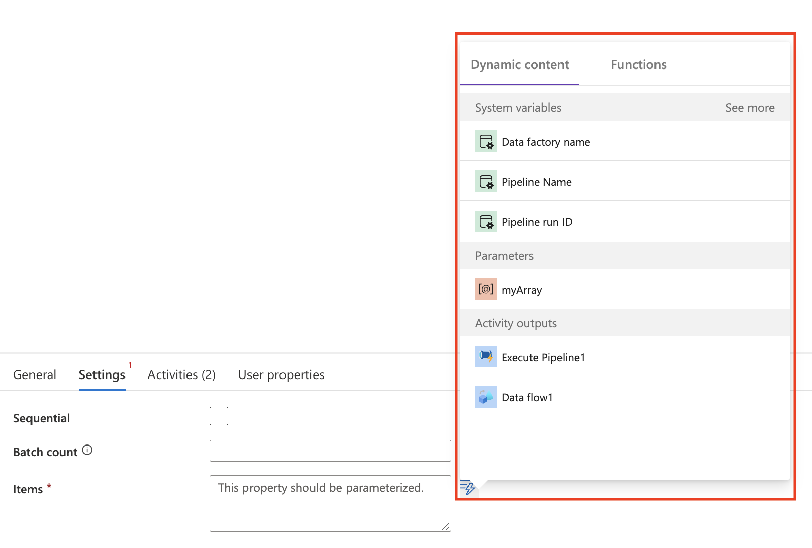
Dynamic content flyout
A new flyout has been added to make it easier to set dynamic content in your pipeline activities without having to use the expression builder. The dynamic content flyout is currently supported in these activities and settings:
| Activity | Setting name |
|---|---|
| Azure Function | Function Name |
| Databricks-Notebook | Notebook path |
| Databricks-Jar | Main class name |
| Databricks-Python | Python file |
| Fail | Fail message |
| Fail | Error code |
| Web | Url |
| Webhook | Url |
| Wait | Wait time in seconds |
| Filter | Items |
| Filter | Conditions |
| ForEach | Items |
| If/Switch/Until | Expression |
In supported activities, you'll see an icon next to the setting. Clicking this icon opens up the flyout where you can choose your dynamic content.
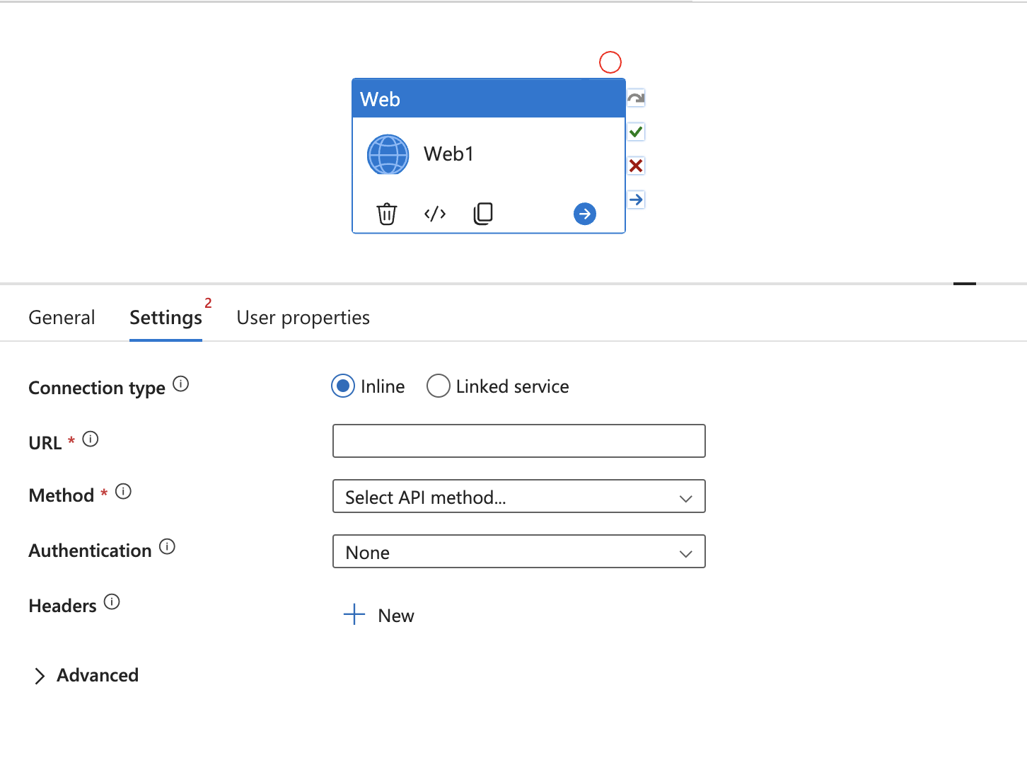
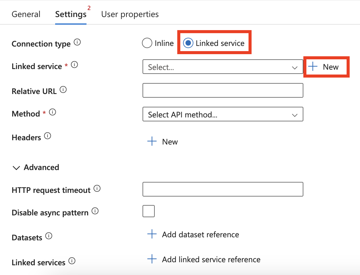
Linked service for Web activity
There are new settings available for the Web activity.
By default, the Connection type will be set to Inline, but you can choose to select Linked service. Doing so allows you to reference a REST linked service for authentication purposes.
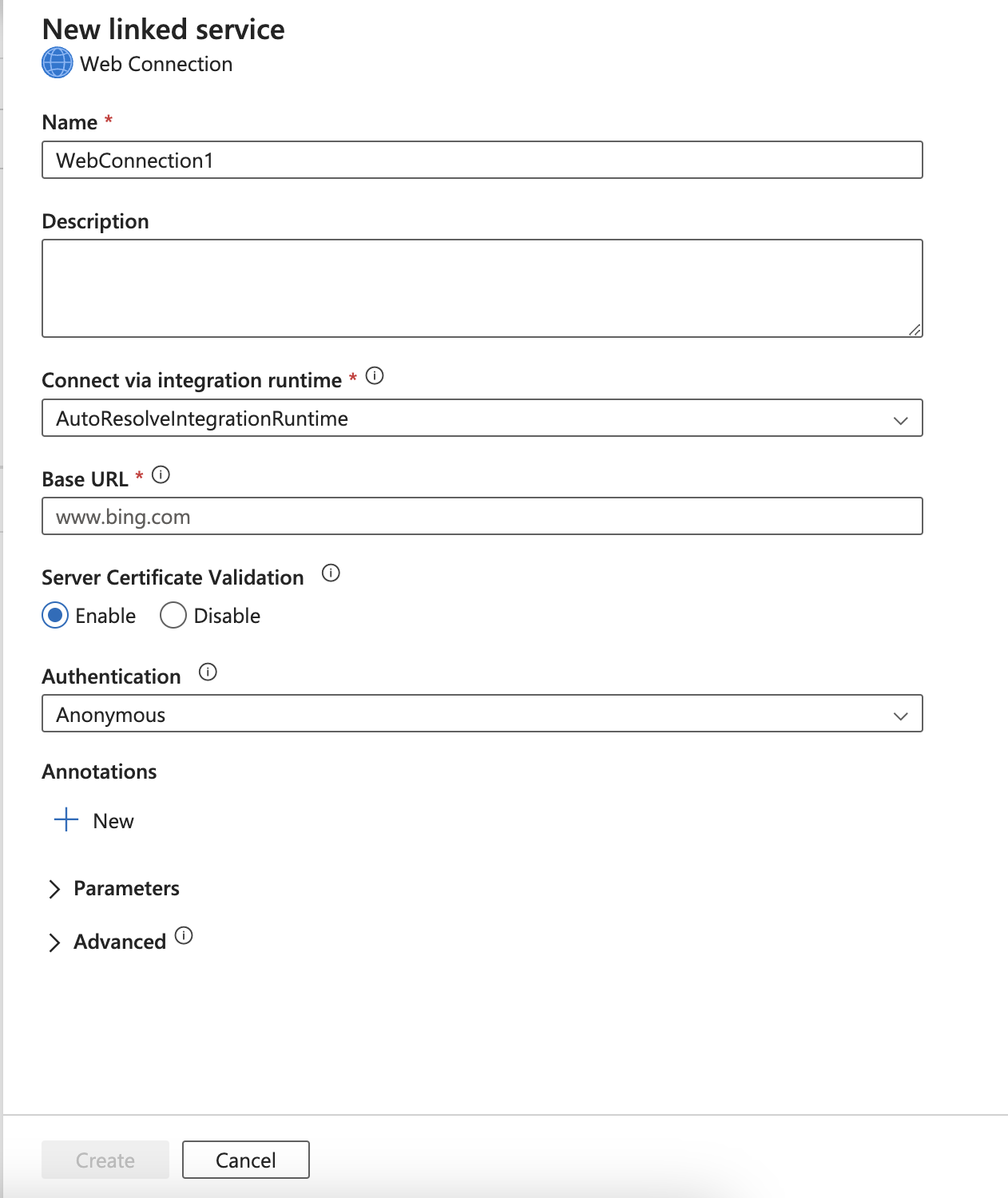
After selecting Linked service, use the drop-down menu to select an existing linked service or click New to create a new linked service.
Monitoring experimental view
UI (user interfaces) changes have been made to the monitoring page. These changes were made to simplify and streamline your monitoring experience. The monitoring experience remains the same as detailed here, except for items detailed in the following section.
Error message relocation to Status column
Note
This feature is now generally available in the ADF studio.
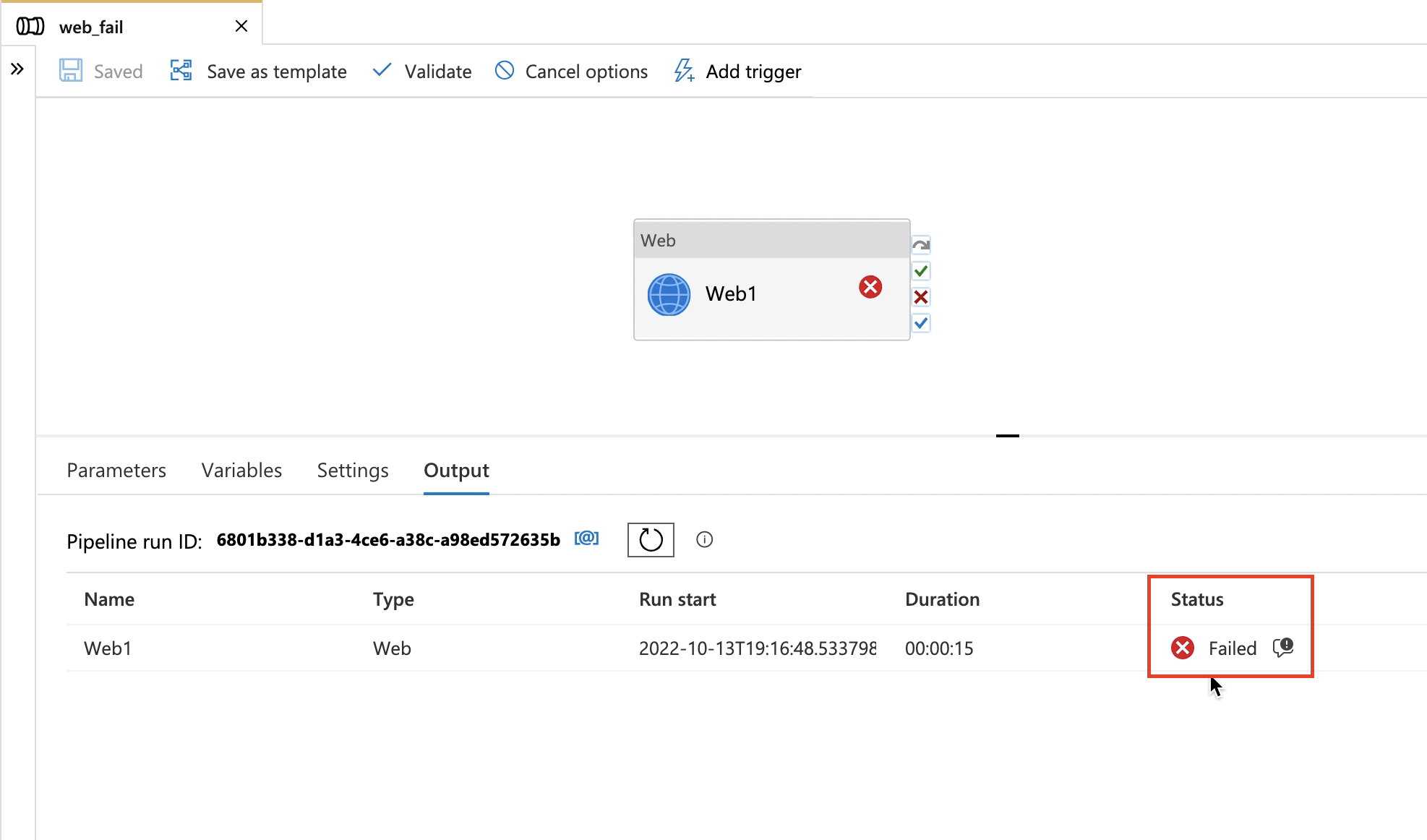
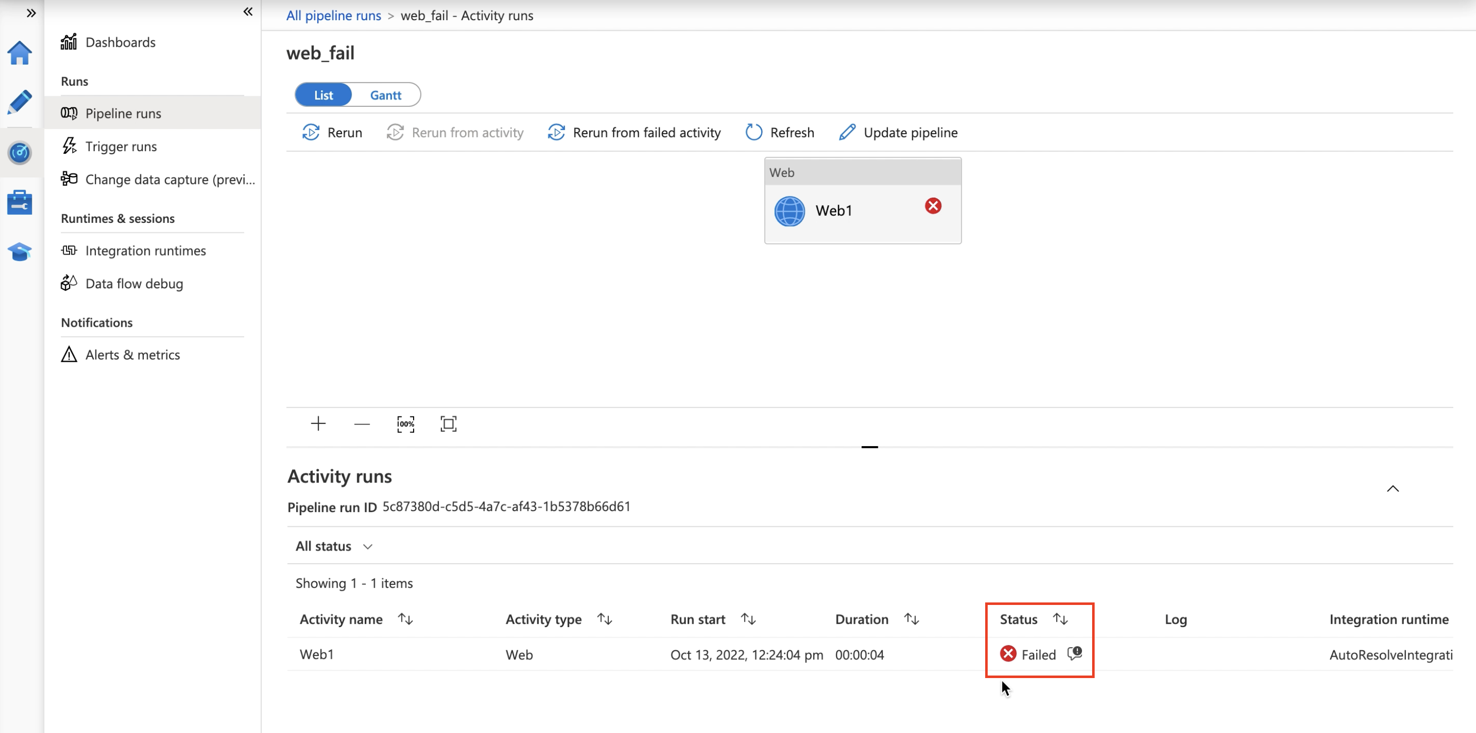
To make it easier for you to view errors when you see a Failed pipeline run, error messages have been relocated to the Status column.
Find the error icon in the pipeline monitoring page and in the pipeline Output tab after debugging your pipeline.
Container view
Note
This feature is now generally available in the ADF studio.
When monitoring your pipeline run, you have the option to enable the container view, which provides a consolidated view of the activities that ran. This view is available in the output of your pipeline debug run and in the detailed monitoring view found in the monitoring tab.
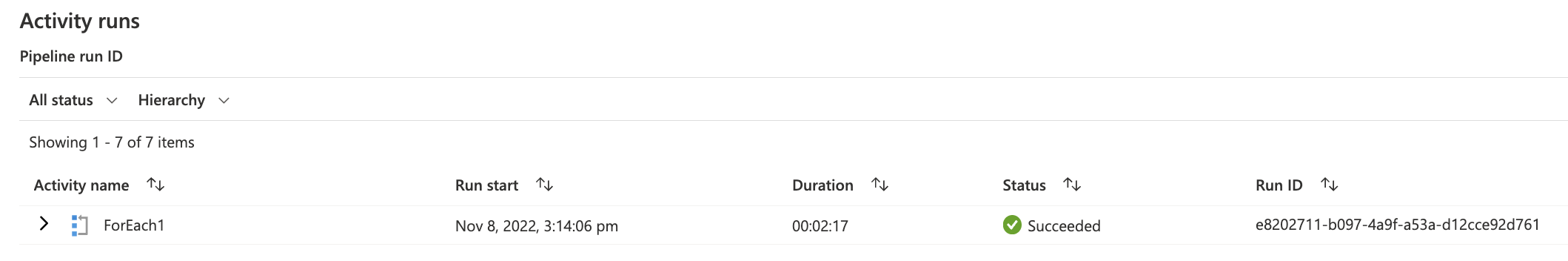
How to enable the container view in pipeline debug output
In the Output tab in your pipeline, there's a new dropdown to select your monitoring view.
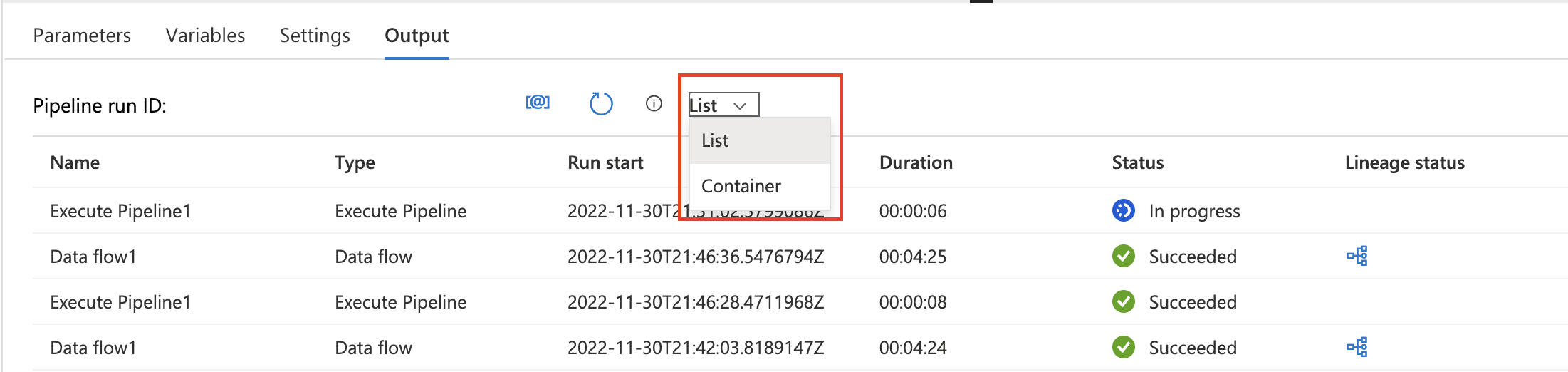
Select Hierarchy to see the new hierarchy view. If you have iteration or conditional activities, the nested activities are grouped under the parent activity.
Click the button next to the iteration or conditional activity to collapse the nested activities for a more consolidated view.
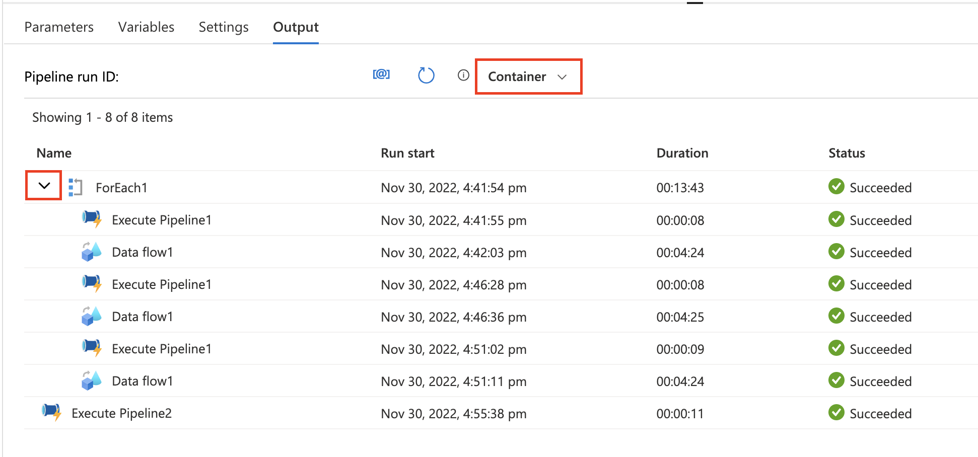
How to enable the container view in pipeline monitoring
In the detailed view of your pipeline run, there's a new dropdown to select your monitoring view next to the Status filter.
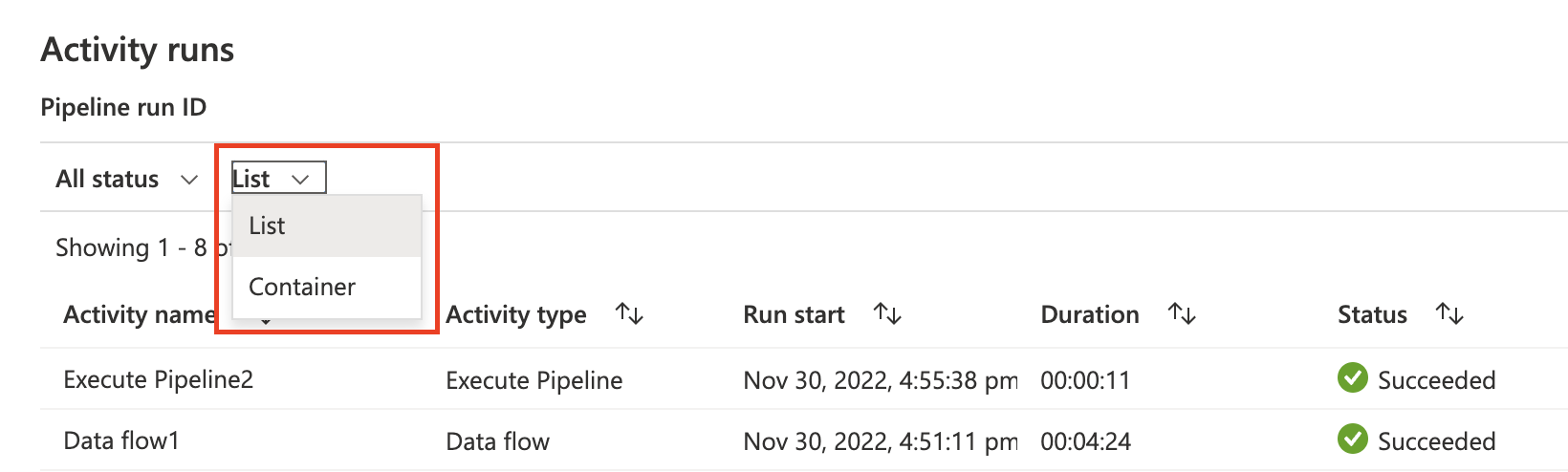
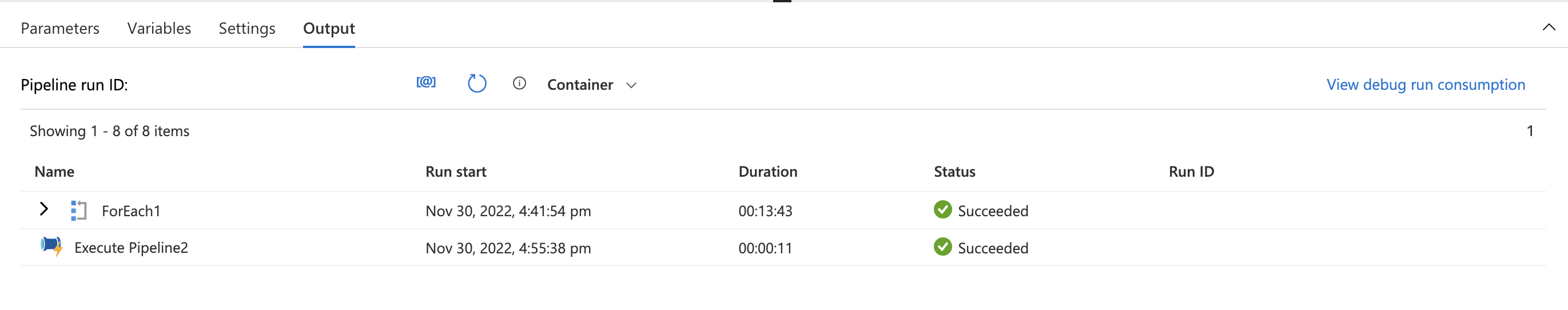
Select Container to see the new container view. If you have iteration or conditional activities, the nested activities are grouped under the parent activity.
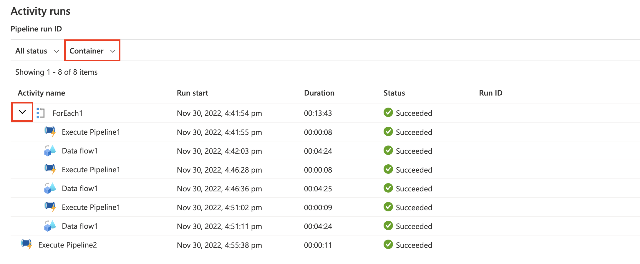
Click the button next to the iteration or conditional activity to collapse the nested activities for a more consolidated view.
Simplified default monitoring view
The default monitoring view has been simplified with fewer default columns. You can add/remove columns if you’d like to personalize your monitoring view. Changes to the default will be cached.
Default columns
| Column name | Description |
|---|---|
| Pipeline Name | Name of the pipeline |
| Run Start | Start date and time for the pipeline run (MM/DD/YYYY, HH:MM:SS AM/PM) |
| Duration | Run duration (HH:MM:SS) |
| Triggered By | The name of the trigger that started the pipeline |
| Status | Failed, Succeeded, In Progress, Cancelled, or Queued |
| Parameters | Parameters for the pipeline run (name/value pairs) |
| Error | If the pipeline failed, the run error |
| Run ID | ID of the pipeline run |
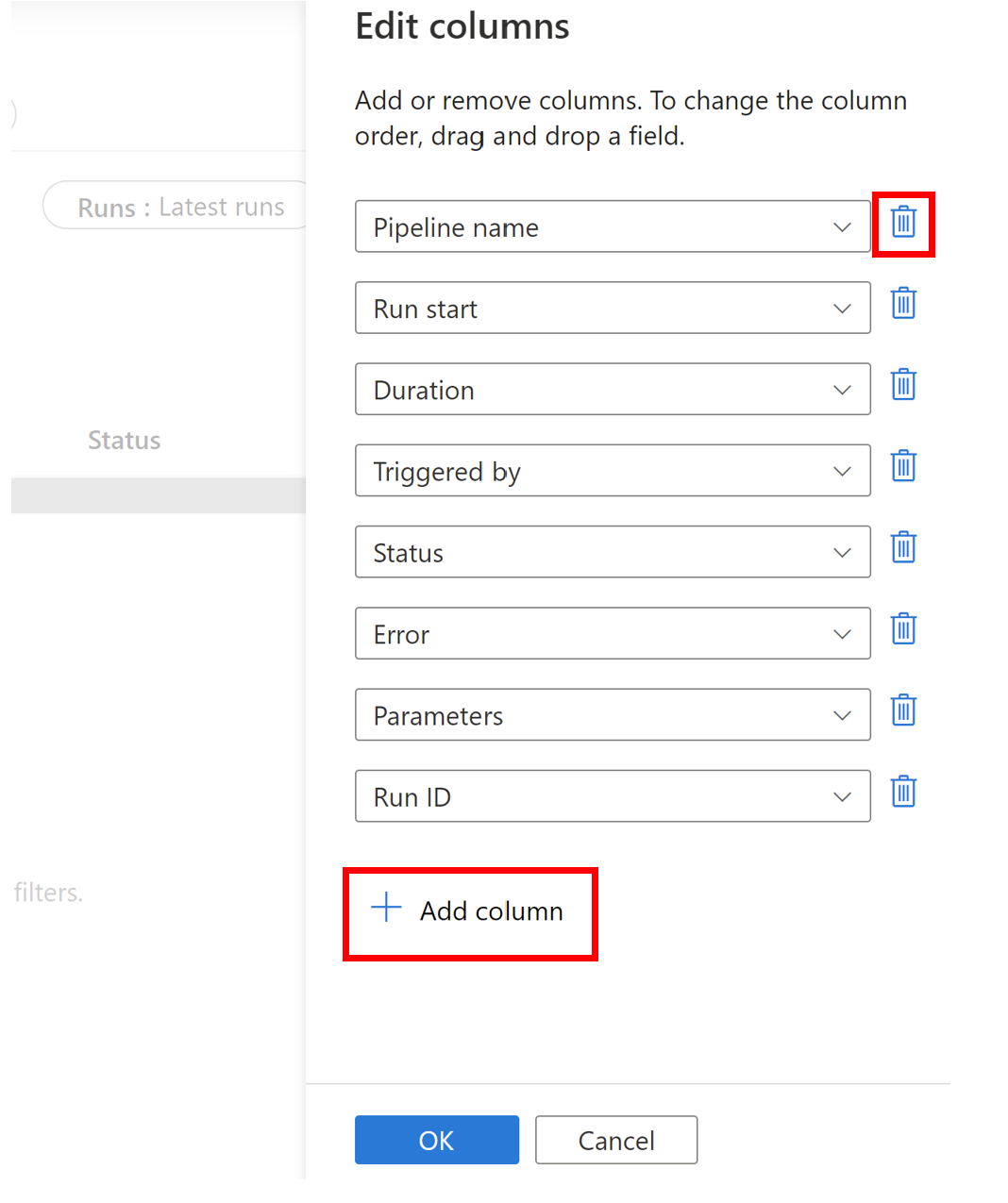
You can edit your default view by clicking Edit Columns.
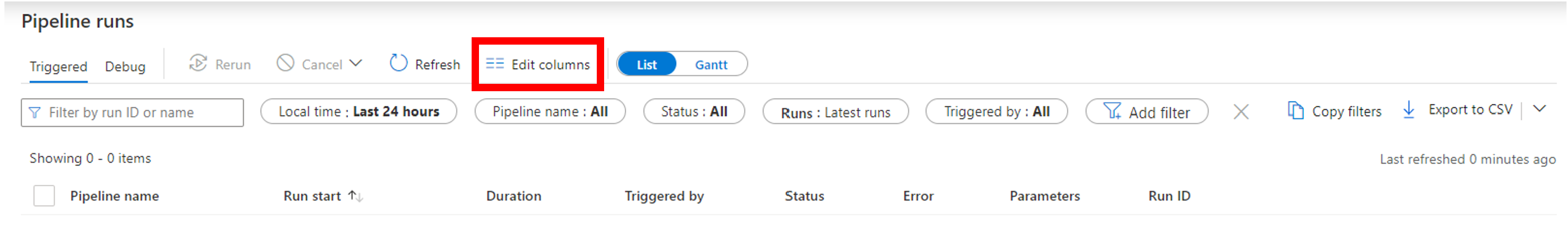
Add columns by clicking Add column or remove columns by clicking the trashcan icon.
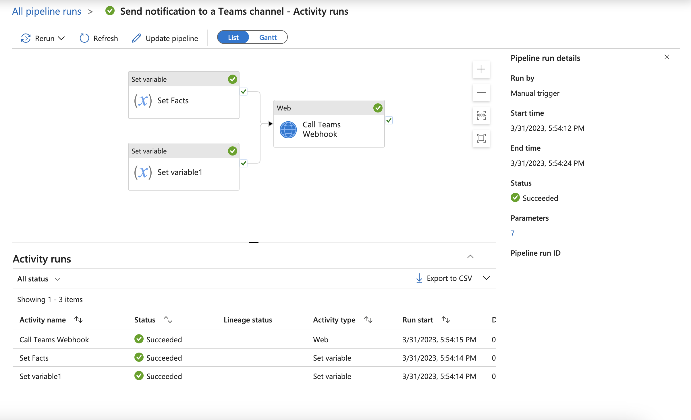
You can also now view Pipeline run details in a new pane in the detailed pipeline monitoring view by clicking View run detail.
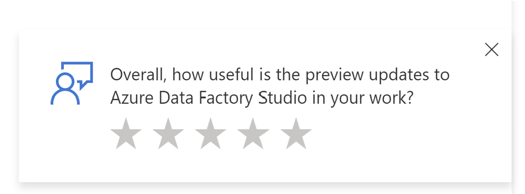
Provide feedback
We want to hear from you! If you see this pop-up, let us know your thoughts by providing feedback on the updates you tested.
Related content
Feedback
Coming soon: Throughout 2024 we will be phasing out GitHub Issues as the feedback mechanism for content and replacing it with a new feedback system. For more information see: https://aka.ms/ContentUserFeedback.
Submit and view feedback for