Expander Overview
An Expander control provides a way to provide content in an expandable area that resembles a window and includes a header.
Creating a Simple Expander
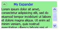
The following example shows how to create a simple Expander control. This example creates an Expander that looks like the previous illustration.
<Expander Name="myExpander" Background="Tan"
          HorizontalAlignment="Left" Header="My Expander"
          ExpandDirection="Down" IsExpanded="True" Width="100">
  <TextBlock TextWrapping="Wrap">
    Lorem ipsum dolor sit amet, consectetur
    adipisicing elit, sed do eiusmod tempor incididunt ut
    labore et dolore magna aliqua
  </TextBlock>
</Expander>
The Content and Header of an Expander can also contain complex content, such as RadioButton and Image objects.
Setting the Direction of the Expanding Content Area
You can set the content area of an Expander control to expand in one of four directions (Down, Up, Left, or Right) by using the ExpandDirection property. When the content area is collapsed, only the ExpanderHeader and its toggle button appear. A Button control that displays a directional arrow is used as a toggle button to expand or collapse the content area. When expanded, the Expander tries to display all of its content in a window-like area.
Controlling the Size of an Expander in a Panel
If an Expander control is inside a layout control that inherits from Panel, such as StackPanel, do not specify a Height on the Expander when the ExpandDirection property is set to Down or Up. Similarly, do not specify a Width on the Expander when the ExpandDirection property is set to Left or Right.
When you set a size dimension on an Expander control in the direction that the expanded content is displayed, the Expander takes control of the area that is used by the content and displays a border around it. The border shows even when the content is collapsed. To set the size of the expanded content area, set size dimensions on the content of the Expander, or if you want scrolling capability, on the ScrollViewer that encloses the content.
When an Expander control is the last element in a DockPanel, Windows Presentation Foundation (WPF) automatically sets the Expander dimensions to equal the remaining area of the DockPanel. To prevent this default behavior, set the LastChildFill property on the DockPanel object to false, or make sure that the Expander is not the last element in a DockPanel.
Creating Scrollable Content
If the content is too large for the size of the content area, you can wrap the content of an Expander in a ScrollViewer in order to provide scrollable content. The Expander control does not automatically provide scrolling capability. The following illustration shows an Expander control that contains a ScrollViewer control.
Expander in a ScrollViewer
When you place an Expander control in a ScrollViewer, set the ScrollViewer dimension property that corresponds to the direction in which the Expander content opens to the size of the Expander content area. For example, if you set the ExpandDirection property on the Expander to Down (the content area opens down), set the Height property on the ScrollViewer control to the required height for the content area. If you instead set the height dimension on the content itself, ScrollViewer does not recognize this setting and therefore, does not provide scrollable content.
The following example shows how to create an Expander control that has complex content and that contains a ScrollViewer control. This example creates an Expander that is like the illustration at the beginning of this section.
void MakeExpander()
{
  //Create containing stack panel and assign to Grid row/col
  StackPanel sp = new StackPanel();
  Grid.SetRow(sp, 0);
  Grid.SetColumn(sp, 1);
  sp.Background = Brushes.LightSalmon;

  //Create column title
  TextBlock colTitle = new TextBlock();
  colTitle.Text = "EXPANDER CREATED FROM CODE";
  colTitle.HorizontalAlignment= HorizontalAlignment.Center;
  colTitle.Margin.Bottom.Equals(20);
  sp.Children.Add(colTitle);

  //Create Expander object
  Expander exp = new Expander();

  //Create Bullet Panel for Expander Header
  BulletDecorator bp = new BulletDecorator();
  Image i = new Image();
  BitmapImage bi= new BitmapImage();
  bi.UriSource = new Uri(@"pack://application:,,/images/icon.jpg");
  i.Source = bi;
  i.Width = 10;
  bp.Bullet = i;
  TextBlock tb = new TextBlock();
  tb.Text = "My Expander";
  tb.Margin = new Thickness(20,0,0,0);
  bp.Child = tb;
  exp.Header = bp;

  //Create TextBlock with ScrollViewer for Expander Content
  StackPanel spScroll = new StackPanel();
  TextBlock tbc = new TextBlock();
  tbc.Text =
          "Lorem ipsum dolor sit amet, consectetur adipisicing elit," +
          "sed do eiusmod tempor incididunt ut labore et dolore magna" +
          "aliqua. Ut enim ad minim veniam, quis nostrud exercitation" +
          "ullamco laboris nisi ut aliquip ex ea commodo consequat." +
          "Duis aute irure dolor in reprehenderit in voluptate velit" +
          "esse cillum dolore eu fugiat nulla pariatur. Excepteur sint" +
          "occaecat cupidatat non proident, sunt in culpa qui officia" +
          "deserunt mollit anim id est laborum.";
  tbc.TextWrapping = TextWrapping.Wrap;

  spScroll.Children.Add(tbc);
  ScrollViewer scr = new ScrollViewer();
  scr.Content = spScroll;
  scr.Height = 50;
  exp.Content = scr;

  exp.Width=200;
  exp.HorizontalContentAlignment= HorizontalAlignment.Stretch;
  //Insert Expander into the StackPanel and add it to the
  //Grid
  sp.Children.Add(exp);
  myGrid.Children.Add(sp);
}
Sub MakeExpander()

    'Create containing stack panel and assign to Grid row/col
    Dim sp As StackPanel = New StackPanel()
    Grid.SetRow(sp, 0)
    Grid.SetColumn(sp, 1)
    sp.Background = Brushes.LightSalmon

    'Create column title
    Dim colTitle As TextBlock = New TextBlock()
    colTitle.Text = "EXPANDER CREATED FROM CODE"
    colTitle.HorizontalAlignment = HorizontalAlignment.Center
    colTitle.Margin.Bottom.Equals(20)
    sp.Children.Add(colTitle)

    'Create Expander object
    Dim exp As Expander = New Expander()

    'Create Bullet Panel for Expander Header
    Dim bp As BulletDecorator = New BulletDecorator()
    Dim i As Image = New Image()
    Dim bi As BitmapImage = New BitmapImage()
    bi.UriSource = New Uri("pack://application:,,./images/icon.jpg")
    i.Source = bi
    i.Width = 10
    bp.Bullet = i
    Dim tb As TextBlock = New TextBlock()
    tb.Text = "My Expander"
    tb.Margin = New Thickness(20, 0, 0, 0)
    bp.Child = tb
    exp.Header = bp

    'Create TextBlock with ScrollViewer for Expander Content
    Dim spScroll As StackPanel = New StackPanel()
    Dim tbc As TextBlock = New TextBlock()
    tbc.Text = _
            "Lorem ipsum dolor sit amet, consectetur adipisicing elit," + _
            "sed do eiusmod tempor incididunt ut labore et dolore magna" + _
            "aliqua. Ut enim ad minim veniam, quis nostrud exercitation" + _
            "ullamco laboris nisi ut aliquip ex ea commodo consequat." + _
            "Duis aute irure dolor in reprehenderit in voluptate velit" + _
            "esse cillum dolore eu fugiat nulla pariatur. Excepteur sint" + _
            "occaecat cupidatat non proident, sunt in culpa qui officia" + _
            "deserunt mollit anim id est laborum."
    tbc.TextWrapping = TextWrapping.Wrap

    spScroll.Children.Add(tbc)
    Dim scr As ScrollViewer = New ScrollViewer()
    scr.Content = spScroll
    scr.Height = 50
    exp.Content = scr

    'Insert Expander into the StackPanel and add it to the
    'Grid
    exp.Width = 200
    exp.HorizontalContentAlignment = HorizontalAlignment.Stretch
    sp.Children.Add(exp)
    myGrid.Children.Add(sp)
End Sub
<Expander Width="200" HorizontalContentAlignment="Stretch">
   <Expander.Header>
     <BulletDecorator>
       <BulletDecorator.Bullet>
         <Image Width="10" Source="images\icon.jpg"/>
       </BulletDecorator.Bullet>
       <TextBlock Margin="20,0,0,0">My Expander</TextBlock>
     </BulletDecorator>
   </Expander.Header>
   <Expander.Content>
     <ScrollViewer Height="50">
       <TextBlock TextWrapping="Wrap">
         Lorem ipsum dolor sit amet, consectetur adipisicing elit,
         sed do eiusmod tempor incididunt ut labore et dolore magna
         aliqua. Ut enim ad minim veniam, quis nostrud exercitation
         ullamco laboris nisi ut aliquip ex ea commodo consequat.
         Duis aute irure dolor in reprehenderit in voluptate velit
         esse cillum dolore eu fugiat nulla pariatur. Excepteur sint
         occaecat cupidatat non proident, sunt in culpa qui officia
         deserunt mollit anim id est laborum.
       </TextBlock>
     </ScrollViewer>
   </Expander.Content>
 </Expander>
Using the Alignment Properties
You can align content by setting the HorizontalContentAlignment and VerticalContentAlignment properties on the Expander control. When you set these properties, the alignment applies to the header and also to the expanded content.
See also
.NET Desktop feedback
Feedback
Coming soon: Throughout 2024 we will be phasing out GitHub Issues as the feedback mechanism for content and replacing it with a new feedback system. For more information see: https://aka.ms/ContentUserFeedback.
Submit and view feedback for