.NET MAUI Shell search
 Browse the sample
.NET Multi-platform App UI (.NET MAUI) Shell includes integrated search functionality that's provided by the SearchHandler class. Search capability can be added to a page by setting the Shell.SearchHandler attached property to a subclassed SearchHandler object. This results in a search box being added at the top of the page:

When a query is entered into the search box, the Query property is updated, and on each update the OnQueryChanged method is executed. This method can be overridden to populate the search suggestions area with data:
Then, when a result is selected from the search suggestions area, the OnItemSelected method is executed. This method can be overridden to respond appropriately, such as by navigating to a detail page.
Create a SearchHandler
Search functionality can be added to a Shell app by subclassing the SearchHandler class, and overriding the OnQueryChanged and OnItemSelected methods:
public class AnimalSearchHandler : SearchHandler
{
    public IList<Animal> Animals { get; set; }
    public Type SelectedItemNavigationTarget { get; set; }

    protected override void OnQueryChanged(string oldValue, string newValue)
    {
        base.OnQueryChanged(oldValue, newValue);

        if (string.IsNullOrWhiteSpace(newValue))
        {
            ItemsSource = null;
        }
        else
        {
            ItemsSource = Animals
                .Where(animal => animal.Name.ToLower().Contains(newValue.ToLower()))
                .ToList<Animal>();
        }
    }

    protected override async void OnItemSelected(object item)
    {
        base.OnItemSelected(item);

        // Let the animation complete
        await Task.Delay(1000);

        ShellNavigationState state = (App.Current.MainPage as Shell).CurrentState;
        // The following route works because route names are unique in this app.
        await Shell.Current.GoToAsync($"{GetNavigationTarget()}?name={((Animal)item).Name}");
    }

    string GetNavigationTarget()
    {
        return (Shell.Current as AppShell).Routes.FirstOrDefault(route => route.Value.Equals(SelectedItemNavigationTarget)).Key;
    }
}
The OnQueryChanged override has two arguments: oldValue, which contains the previous search query, and newValue, which contains the current search query. The search suggestions area can be updated by setting the SearchHandler.ItemsSource property to an IEnumerable collection that contains items that match the current search query.
When a search result is selected by the user, the OnItemSelected override is executed and the SelectedItem property is set. In this example, the method navigates to another page that displays data about the selected Animal. For more information about navigation, see Shell navigation.
Note
Additional SearchHandler properties can be set to control the search box appearance.
Consume a SearchHandler
The subclassed SearchHandler can be consumed by setting the Shell.SearchHandler attached property to an object of the subclassed type, on the consuming page:
<ContentPage ...
             xmlns:controls="clr-namespace:Xaminals.Controls">
    <Shell.SearchHandler>
        <controls:AnimalSearchHandler Placeholder="Enter search term"
                                      ShowsResults="true"
                                      DisplayMemberName="Name" />
    </Shell.SearchHandler>
    ...
</ContentPage>
The equivalent C# code is:
Shell.SetSearchHandler(this, new AnimalSearchHandler
{
    Placeholder = "Enter search term",
    ShowsResults = true,
    DisplayMemberName = "Name"
});
The AnimalSearchHandler.OnQueryChanged method returns a List of Animal objects. The DisplayMemberName property is set to the Name property of each Animal object, and so the data displayed in the suggestions area will be each animal name.
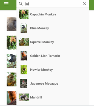
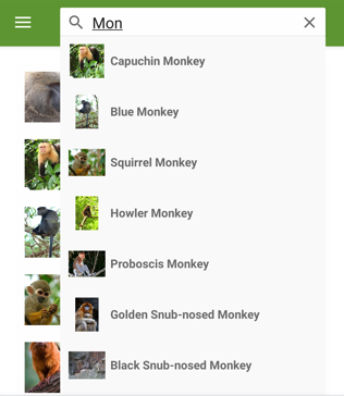
The ShowsResults property is set to true, so that search suggestions are displayed as the user enters a search query:
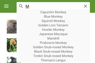
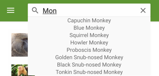
As the search query changes, the search suggestions area is updated:
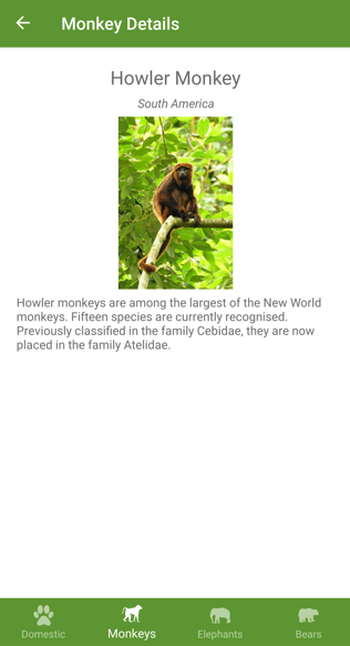
When a search result is selected, the MonkeyDetailPage is navigated to, and a detail page about the selected monkey is displayed:
Define search results item appearance
In addition to displaying string data in the search results, the appearance of each search result item can be defined by setting the SearchHandler.ItemTemplate property to a DataTemplate:
<ContentPage ...
             xmlns:controls="clr-namespace:Xaminals.Controls">
    <Shell.SearchHandler>
        <controls:AnimalSearchHandler Placeholder="Enter search term"
                                      ShowsResults="true">
            <controls:AnimalSearchHandler.ItemTemplate>
                <DataTemplate>
                    <Grid Padding="10"
                          ColumnDefinitions="0.15*,0.85*">
                        <Image Source="{Binding ImageUrl}"
                               HeightRequest="40"
                               WidthRequest="40" />
                        <Label Grid.Column="1"
                               Text="{Binding Name}"
                               FontAttributes="Bold"
                               VerticalOptions="Center" />
                    </Grid>
                </DataTemplate>
            </controls:AnimalSearchHandler.ItemTemplate>
       </controls:AnimalSearchHandler>
    </Shell.SearchHandler>
    ...
</ContentPage>
The elements specified in the DataTemplate define the appearance of each item in the suggestions area. In this example, layout within the DataTemplate is managed by a Grid. The Grid contains an Image object, and a Label object, that both bind to properties of each Monkey object.
The following screenshot shows the result of templating each item in the suggestions area:
For more information about data templates, see Data templates.
Search box visibility
By default, when a SearchHandler is added at the top of a page, the search box is visible and fully expanded. However, this behavior can be changed by setting the SearchHandler.SearchBoxVisibility property to one of the SearchBoxVisibility enumeration members:
Hidden– the search box is not visible or accessible.Collapsible– the search box is hidden until the user performs an action to reveal it. On iOS the search box is revealed by vertically bouncing the page content, and on Android the search box is revealed by tapping the question mark icon.Expanded– the search box is visible and fully expanded. This is the default value of theSearchBoxVisibilityproperty.
Important
On iOS, a collapsible search box requires iOS 11 or greater.
The following example shows to how to hide the search box:
<ContentPage ...
             xmlns:controls="clr-namespace:Xaminals.Controls">
    <Shell.SearchHandler>
        <controls:AnimalSearchHandler SearchBoxVisibility="Hidden"
                                      ... />
    </Shell.SearchHandler>
    ...
</ContentPage>
Search box focus
Tapping in a search box invokes the onscreen keyboard, with the search box gaining input focus. This can also be achieved programmatically by calling the Focus method, which attempts to set input focus on the search box, and returns true if successful. When a search box gains focus, the Focused event is fired and the overridable OnFocused method is called.
When a search box has input focus, tapping elsewhere on the screen dismisses the onscreen keyboard, and the search box loses input focus. This can also be achieved programmatically by calling the Unfocus method. When a search box loses focus, the Unfocused event is fired and the overridable OnUnfocus method is called.
The focus state of a search box can be retrieved through the IsFocused property, which returns true if a SearchHandler currently has input focus.
SearchHandler keyboard
The keyboard that's presented when users interact with a SearchHandler can be set programmatically via the Keyboard property, to one of the following properties from the Keyboard class:
Chat– used for texting and places where emoji are useful.Default– the default keyboard.Email– used when entering email addresses.Numeric– used when entering numbers.Plain– used when entering text, without anyKeyboardFlagsspecified.Telephone– used when entering telephone numbers.Text– used when entering text.Url– used for entering file paths & web addresses.
This can be accomplished in XAML as follows:
<SearchHandler Keyboard="Email" />
The Keyboard class also has a Create factory method that can be used to customize a keyboard by specifying capitalization, spellcheck, and suggestion behavior. KeyboardFlags enumeration values are specified as arguments to the method, with a customized Keyboard being returned. The KeyboardFlags enumeration contains the following values:
None– no features are added to the keyboard.CapitalizeSentence– indicates that the first letter of the first word of each entered sentence will be automatically capitalized.Spellcheck– indicates that spellcheck will be performed on entered text.Suggestions– indicates that word completions will be offered on entered text.CapitalizeWord– indicates that the first letter of each word will be automatically capitalized.CapitalizeCharacter– indicates that every character will be automatically capitalized.CapitalizeNone– indicates that no automatic capitalization will occur.All– indicates that spellcheck, word completions, and sentence capitalization will occur on entered text.
The following XAML code example shows how to customize the default Keyboard to offer word completions and capitalize every entered character:
<SearchHandler Placeholder="Enter search terms">
    <SearchHandler.Keyboard>
        <Keyboard x:FactoryMethod="Create">
            <x:Arguments>
                <KeyboardFlags>Suggestions,CapitalizeCharacter</KeyboardFlags>
            </x:Arguments>
        </Keyboard>
    </SearchHandler.Keyboard>
</SearchHandler>
Feedback
Coming soon: Throughout 2024 we will be phasing out GitHub Issues as the feedback mechanism for content and replacing it with a new feedback system. For more information see: https://aka.ms/ContentUserFeedback.
Submit and view feedback for