 Browse the sample
Events
Mar 17, 11 PM - Mar 21, 11 PM
Join the meetup series to build scalable AI solutions based on real-world use cases with fellow developers and experts.
Register nowThis browser is no longer supported.
Upgrade to Microsoft Edge to take advantage of the latest features, security updates, and technical support.
The .NET Multi-platform App UI (.NET MAUI) Label displays single-line and multi-line text. Text displayed by a Label can be colored, spaced, and can have text decorations.
Label defines the following properties:
CharacterSpacing, of type double, sets the spacing between characters in the displayed text.FontAttributes, of type FontAttributes, determines text style.FontAutoScalingEnabled, of type bool, defines whether the text will reflect scaling preferences set in the operating system. The default value of this property is true.FontFamily, of type string, defines the font family.FontSize, of type double, defines the font size.FormattedText, of type FormattedString, specifies the presentation of text with multiple presentation options such as fonts and colors.HorizontalTextAlignment, of type TextAlignment, defines the horizontal alignment of the displayed text.LineBreakMode, of type LineBreakMode, determines how text should be handled when it can't fit on one line.LineHeight, of type double, specifies the multiplier to apply to the default line height when displaying text.MaxLines, of type int, indicates the maximum number of lines allowed in the Label.Padding, of type Thickness, determines the label's padding.Text, of type string, defines the text displayed as the content of the label.TextColor, of type Color, defines the color of the displayed text.TextDecorations, of type TextDecorations, specifies the text decorations (underline and strikethrough) that can be applied.TextTransform, of type TextTransform, specifies the casing of the displayed text.TextType, of type TextType, determines whether the Label should display plain text or HTML text.VerticalTextAlignment, of type TextAlignment, defines the vertical alignment of the displayed text.These properties are backed by BindableProperty objects, which means that they can be targets of data bindings, and styled.
For information about specifying fonts on a Label, see Fonts.
The following example shows how to create a Label:
<Label Text="Hello world" />
The equivalent C# code is:
Label label = new Label { Text = "Hello world" };
Labels can be set to use a specific text color via the TextColor property.
The following example sets the text color of a Label:
<Label TextColor="#77d065"
       Text="This is a green label." />
For more information about colors, see Colors.
Character spacing can be applied to Label objects by setting the CharacterSpacing property to a double value:
<Label Text="Character spaced text"
       CharacterSpacing="10" />
The result is that characters in the text displayed by the Label are spaced CharacterSpacing device-independent units apart.
There are two main techniques for forcing text in a Label onto a new line, from XAML:
The following code shows an example of both techniques:
<!-- Unicode line feed character -->
<Label Text="First line Second line" />
<!-- Property element syntax -->
<Label>
<Label.Text>
First line
Second line
</Label.Text>
</Label>
In C#, text can be forced onto a new line with the "\n" character:
Label label = new Label { Text = "First line\nSecond line" };
Text wrapping and truncation can be controlled by setting the LineBreakMode property to a value of the LineBreakMode enumeration:
NoWrap — does not wrap text, displaying only as much text as can fit on one line. This is the default value of the LineBreakMode property.WordWrap — wraps text at the word boundary.CharacterWrap — wraps text onto a new line at a character boundary.HeadTruncation — truncates the head of the text, showing the end.MiddleTruncation — displays the beginning and end of the text, with the middle replace by an ellipsis.TailTruncation — shows the beginning of the text, truncating the end.The number of lines displayed by a Label can be specified by setting the MaxLines property to an int value:
MaxLines is -1, which is its default value, the Label respects the value of the LineBreakMode property to either show just one line, possibly truncated, or all lines with all text.MaxLines is 0, the Label isn't displayed.MaxLines is 1, the result is identical to setting the LineBreakMode property to NoWrap, HeadTruncation, MiddleTruncation, or TailTruncation. However, the Label will respect the value of the LineBreakMode property with regard to placement of an ellipsis, if applicable.MaxLines is greater than 1, the Label will display up to the specified number of lines, while respecting the value of the LineBreakMode property with regard to placement of an ellipsis, if applicable. However, setting the MaxLines property to a value greater than 1 has no effect if the LineBreakMode property is set to NoWrap.The following XAML example demonstrates setting the MaxLines property on a Label:
<Label Text="Lorem ipsum dolor sit amet, consectetur adipiscing elit. In facilisis nulla eu felis fringilla vulputate. Nullam porta eleifend lacinia. Donec at iaculis tellus."
       LineBreakMode="WordWrap"
       MaxLines="2" />
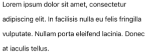
The vertical height of a Label can be customized by setting the Label.LineHeight property to a double value.
Note
Label.LineHeight property changes the line height of text that fits on a single line, and text that wraps onto multiple lines.Label.LineHeight property only changes the line height of text that wraps onto multiple lines.Label.LineHeight property changes the line height of text that wraps onto multiple lines.The following example demonstrates setting the LineHeight property on a Label:
<Label Text="Lorem ipsum dolor sit amet, consectetur adipiscing elit. In facilisis nulla eu felis fringilla vulputate. Nullam porta eleifend lacinia. Donec at iaculis tellus."
       LineBreakMode="WordWrap"
       LineHeight="1.8" />
The following screenshot shows the result of setting the Label.LineHeight property to 1.8:
Important
Displaying HTML in a Label is limited to the HTML tags that are supported by the underlying platform. For example, Android supports only a subset of HTML tags, focusing on basic styling and formatting for block level elements such as <span> and <p>. For more complex HTML rendering, consider using a WebView or FormattedText.
The Label class has a TextType property, which determines whether the Label object should display plain text, or HTML text. This property should be set to one of the members of the TextType enumeration:
Text indicates that the Label will display plain text, and is the default value of the TextType property.Html indicates that the Label will display HTML text.Therefore, Label objects can display HTML by setting the TextType property to Html, and the Text property to a HTML string:
Label label = new Label
{
    Text = "This is <span style=\"color:red;\"><strong>HTML</strong></span> text.",
    TextType = TextType.Html
};
In the example above, the double quote characters in the HTML have to be escaped using the \ symbol.
In XAML, HTML strings can become unreadable due to additionally escaping the < and > symbols:
<Label Text="This is <span style="color:red"><strong>HTML</strong></span> text."
TextType="Html" />
Alternatively, for greater readability the HTML can be inlined in a CDATA section:
<Label TextType="Html">
<![CDATA[
<Label Text="This is <span style="color:red"><strong>HTML</strong></span> text."
]]>
</Label>
In this example, the Text property is set to the HTML string that's inlined in the CDATA section. This works because the Text property is the ContentProperty for the Label class.
Underline and strikethrough text decorations can be applied to Label objects by setting the TextDecorations property to one or more TextDecorations enumeration members:
NoneUnderlineStrikethroughThe following example demonstrates setting the TextDecorations property:
<Label Text="This is underlined text." TextDecorations="Underline"  />
<Label Text="This is text with strikethrough." TextDecorations="Strikethrough" />
<Label Text="This is underlined text with strikethrough." TextDecorations="Underline, Strikethrough" />
The equivalent C# code is:
Label underlineLabel = new Label { Text = "This is underlined text.", TextDecorations = TextDecorations.Underline };
Label strikethroughLabel = new Label { Text = "This is text with strikethrough.", TextDecorations = TextDecorations.Strikethrough };
Label bothLabel = new Label { Text = "This is underlined text with strikethrough.", TextDecorations = TextDecorations.Underline | TextDecorations.Strikethrough };
The following screenshot shows the TextDecorations enumeration members applied to Label instances:

Note
Text decorations can also be applied to Span instances. For more information about the Span class, see Use formatted text.
A Label can transform the casing of its text, stored in the Text property, by setting the TextTransform property to a value of the TextTransform enumeration. This enumeration has four values:
None indicates that the text won't be transformed.Default indicates that the default behavior for the platform will be used. This is the default value of the TextTransform property.Lowercase indicates that the text will be transformed to lowercase.Uppercase indicates that the text will be transformed to uppercase.The following example shows transforming text to uppercase:
<Label Text="This text will be displayed in uppercase."
       TextTransform="Uppercase" />
Label exposes a FormattedText property that allows the presentation of text with multiple fonts and colors in the same view. The FormattedText property is of type FormattedString, which comprises one or more Span instances, set via the Spans property.
Note
It's not possible to display HTML in a Span.
Span defines the following properties:
BackgroundColor, of type Color, which represents the color of the span background.CharacterSpacing, of type double, sets the spacing between characters in the displayed text.FontAttributes, of type FontAttributes, determines text style.FontAutoScalingEnabled, of type bool, defines whether the text will reflect scaling preferences set in the operating system. The default value of this property is true.FontFamily, of type string, defines the font family.FontSize, of type double, defines the font size.LineHeight, of type double, specifies the multiplier to apply to the default line height when displaying text.Style, of type Style, which is the style to apply to the span.Text, of type string, defines the text displayed as the content of the Span.TextColor, of type Color, defines the color of the displayed text.TextDecorations, of type TextDecorations, specifies the text decorations (underline and strikethrough) that can be applied.TextTransform, of type TextTransform, specifies the casing of the displayed text.These properties are backed by BindableProperty objects, which means that they can be targets of data bindings, and styled.
Note
The Span.LineHeight property has no effect on Windows.
In addition, the GestureRecognizers property can be used to define a collection of gesture recognizers that will respond to gestures on the Span.
The following XAML example demonstrates a FormattedText property that consists of three Span instances:
<Label LineBreakMode="WordWrap">
    <Label.FormattedText>
        <FormattedString>
            <Span Text="Red Bold, " TextColor="Red" FontAttributes="Bold" />
            <Span Text="default, " FontSize="14">
                <Span.GestureRecognizers>
                    <TapGestureRecognizer Command="{Binding TapCommand}" />
                </Span.GestureRecognizers>
            </Span>
            <Span Text="italic small." FontAttributes="Italic" FontSize="12" />
        </FormattedString>
    </Label.FormattedText>
</Label>
The equivalent C# code is:
FormattedString formattedString = new FormattedString ();
formattedString.Spans.Add (new Span { Text = "Red bold, ", TextColor = Colors.Red, FontAttributes = FontAttributes.Bold });

Span span = new Span { Text = "default, " };
span.GestureRecognizers.Add(new TapGestureRecognizer { Command = new Command(async () => await DisplayAlert("Tapped", "This is a tapped Span.", "OK")) });
formattedString.Spans.Add(span);
formattedString.Spans.Add (new Span { Text = "italic small.", FontAttributes = FontAttributes.Italic, FontSize = 14 });

Label label = new Label { FormattedText = formattedString };
The following screenshot shows the resulting Label that contains three Span objects:

A Span can also respond to any gestures that are added to the span's GestureRecognizers collection. For example, a TapGestureRecognizer has been added to the second Span in the above examples. Therefore, when this Span is tapped the TapGestureRecognizer will respond by executing the ICommand defined by the Command property. For more information about tap gesture recognition, see Recognize a tap gesture.
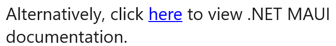
The text displayed by Label and Span instances can be turned into hyperlinks with the following approach:
TextColor and TextDecoration properties of the Label or Span.GestureRecognizers collection of the Label or Span, whose Command property binds to a ICommand, and whose CommandParameter property contains the URL to open.The following example, shows a Label whose content is set from multiple Span objects:
<Label>
    <Label.FormattedText>
        <FormattedString>
            <Span Text="Alternatively, click " />
            <Span Text="here"
                  TextColor="Blue"
                  TextDecorations="Underline">
                <Span.GestureRecognizers>
                    <TapGestureRecognizer Command="{Binding TapCommand}"
                                          CommandParameter="https://learn.microsoft.com/dotnet/maui/" />
                </Span.GestureRecognizers>
            </Span>
            <Span Text=" to view .NET MAUI documentation." />
        </FormattedString>
    </Label.FormattedText>
</Label>
In this example, the first and third Span instances contain text, while the second Span represents a tappable hyperlink. It has its text color set to blue, and has an underline text decoration. This creates the appearance of a hyperlink, as shown in the following screenshot:
When the hyperlink is tapped, the TapGestureRecognizer will respond by executing the ICommand defined by its Command property. In addition, the URL specified by the CommandParameter property will be passed to the ICommand as a parameter.
The code-behind for the XAML page contains the TapCommand implementation:
using System.Windows.Input;

public partial class MainPage : ContentPage
{
    // Launcher.OpenAsync is provided by Essentials.
    public ICommand TapCommand => new Command<string>(async (url) => await Launcher.OpenAsync(url));

    public MainPage()
    {
        InitializeComponent();
        BindingContext = this;
    }
}
The TapCommand executes the Launcher.OpenAsync method, passing the TapGestureRecognizer.CommandParameter property value as a parameter. The Launcher.OpenAsync method opens the URL in a web browser. Therefore, the overall effect is that when the hyperlink is tapped on the page, a web browser appears and the URL associated with the hyperlink is navigated to.
The previous approach to creating a hyperlink requires writing repetitive code every time you require a hyperlink in your app. However, both the Label and Span classes can be subclassed to create HyperlinkLabel and HyperlinkSpan classes, with the gesture recognizer and text formatting code added there.
The following example shows a HyperlinkSpan class:
public class HyperlinkSpan : Span
{
    public static readonly BindableProperty UrlProperty =
        BindableProperty.Create(nameof(Url), typeof(string), typeof(HyperlinkSpan), null);

    public string Url
    {
        get { return (string)GetValue(UrlProperty); }
        set { SetValue(UrlProperty, value); }
    }

    public HyperlinkSpan()
    {
        TextDecorations = TextDecorations.Underline;
        TextColor = Colors.Blue;
        GestureRecognizers.Add(new TapGestureRecognizer
        {
            // Launcher.OpenAsync is provided by Essentials.
            Command = new Command(async () => await Launcher.OpenAsync(Url))
        });
    }
}
The HyperlinkSpan class defines a Url property, and associated BindableProperty, and the constructor sets the hyperlink appearance and the TapGestureRecognizer that will respond when the hyperlink is tapped. When a HyperlinkSpan is tapped, the TapGestureRecognizer will respond by executing the Launcher.OpenAsync method to open the URL, specified by the Url property, in a web browser.
The HyperlinkSpan class can be consumed by adding an instance of the class to the XAML:
<ContentPage xmlns="http://schemas.microsoft.com/dotnet/2021/maui"
             xmlns:x="http://schemas.microsoft.com/winfx/2009/xaml"
             xmlns:local="clr-namespace:HyperlinkDemo"
             x:Class="HyperlinkDemo.MainPage">
    <StackLayout>
        ...
        <Label>
            <Label.FormattedText>
                <FormattedString>
                    <Span Text="Alternatively, click " />
                    <local:HyperlinkSpan Text="here"
                                         Url="https://learn.microsoft.com/dotnet/" />
                    <Span Text=" to view .NET documentation." />
                </FormattedString>
            </Label.FormattedText>
        </Label>
    </StackLayout>
</ContentPage>
.NET MAUI feedback
.NET MAUI is an open source project. Select a link to provide feedback:
Events
Mar 17, 11 PM - Mar 21, 11 PM
Join the meetup series to build scalable AI solutions based on real-world use cases with fellow developers and experts.
Register nowTraining
Module
Create a UI in a .NET MAUI app by using XAML - Training
Learn how to design a UI for a .NET MAUI app using XAML.