 Browse the sample
Events
Mar 17, 11 PM - Mar 21, 11 PM
Join the meetup series to build scalable AI solutions based on real-world use cases with fellow developers and experts.
Register nowThis browser is no longer supported.
Upgrade to Microsoft Edge to take advantage of the latest features, security updates, and technical support.
The .NET Multi-platform App UI (.NET MAUI) Switch control is a horizontal toggle button that can be manipulated by the user to toggle between on and off states, which are represented by a boolean value.
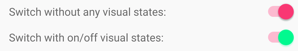
The following screenshot shows a Switch control in its on and off toggle states:

The Switch control defines the following properties:
IsToggled is a boolean value that indicates whether the Switch is on. The default value of this property is false.OnColor is a Color that affects how the Switch is rendered in the toggled, or on state.ThumbColor is the Color of the switch thumb.These properties are backed by BindableProperty objects, which means they can be styled and be the target of data bindings.
The Switch control defines a Toggled event that's raised when the IsToggled property changes, either through user manipulation or when an application sets the IsToggled property. The ToggledEventArgs object that accompanies the Toggled event has a single property named Value, of type bool. When the event is raised, the value of the Value property reflects the new value of the IsToggled property.
A Switch can be instantiated in XAML. Its IsToggled property can be set to toggle the Switch. By default, the IsToggled property is false. The following example shows how to instantiate a Switch in XAML with the optional IsToggled property set:
<Switch IsToggled="true"/>
A Switch can also be created in code:
Switch switchControl = new Switch { IsToggled = true };
In addition to the properties that Switch inherits from the View class, Switch also defines OnColor and ThumbColor properties. The OnColor property can be set to define the Switch color when it is toggled to its on state, and the ThumbColor property can be set to define the Color of the switch thumb. The following example shows how to instantiate a Switch in XAML with these properties set:
<Switch OnColor="Orange"
        ThumbColor="Green" />
The properties can also be set when creating a Switch in code:
Switch switch = new Switch { OnColor = Colors.Orange, ThumbColor = Colors.Green };
The following screenshot shows the Switch in its on and off toggle states, with the OnColor and ThumbColor properties set:

When the IsToggled property changes, either through user manipulation or when an application sets the IsToggled property, the Toggled event fires. An event handler for this event can be registered to respond to the change:
<Switch Toggled="OnToggled" />
The code-behind file contains the handler for the Toggled event:
void OnToggled(object sender, ToggledEventArgs e)
{
    // Perform an action after examining e.Value
}
The sender argument in the event handler is the Switch responsible for firing this event. You can use the sender property to access the Switch object, or to distinguish between multiple Switch objects sharing the same Toggled event handler.
The Toggled event handler can also be assigned in code:
Switch switchControl = new Switch {...};
switchControl.Toggled += (sender, e) =>
{
    // Perform an action after examining e.Value
};
The Toggled event handler can be eliminated by using data binding and triggers to respond to a Switch changing toggle states.
<Switch x:Name="styleSwitch" />
<Label Text="Lorem ipsum dolor sit amet, elit rutrum, enim hendrerit augue vitae praesent sed non, lorem aenean quis praesent pede.">
    <Label.Triggers>
        <DataTrigger TargetType="Label"
                     Binding="{Binding Source={x:Reference styleSwitch}, Path=IsToggled}"
                     Value="true">
            <Setter Property="FontAttributes"
                    Value="Italic, Bold" />
            <Setter Property="FontSize"
                    Value="18" />
        </DataTrigger>
    </Label.Triggers>
</Label>
In this example, the Label uses a binding expression in a DataTrigger to monitor the IsToggled property of the Switch named styleSwitch. When this property becomes true, the FontAttributes and FontSize properties of the Label are changed. When the IsToggled property returns to false, the FontAttributes and FontSize properties of the Label are reset to their initial state.
For information about triggers, see Triggers.
Switch has On and Off visual states that can be used to initiate a visual change when the IsToggled property changes.
The following XAML example shows how to define visual states for the On and Off states:
<Switch IsToggled="True">
    <VisualStateManager.VisualStateGroups>
        <VisualStateGroupList>
             <VisualStateGroup x:Name="CommonStates">
                 <VisualState x:Name="On">
                     <VisualState.Setters>
                         <Setter Property="ThumbColor"
                             Value="MediumSpringGreen" />
                     </VisualState.Setters>
                 </VisualState>
                 <VisualState x:Name="Off">
                     <VisualState.Setters>
                         <Setter Property="ThumbColor"
                             Value="Red" />
                     </VisualState.Setters>
                 </VisualState>
             </VisualStateGroup>
        </VisualStateGroupList>
    </VisualStateManager.VisualStateGroups>
</Switch>
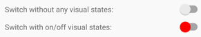
In this example, the On VisualState specifies that when the IsToggled property is true, the ThumbColor property will be set to medium spring green. The Off VisualState specifies that when the IsToggled property is false, the ThumbColor property will be set to red. Therefore, the overall effect is that when the Switch is in an off position its thumb is red, and its thumb is medium spring green when the Switch is in an on position:
For more information about visual states, see Visual states.
An app may enter a state where the Switch being toggled is not a valid operation. In such cases, the Switch can be disabled by setting its IsEnabled property to false. This will prevent users from being able to manipulate the Switch.
.NET MAUI feedback
.NET MAUI is an open source project. Select a link to provide feedback:
Events
Mar 17, 11 PM - Mar 21, 11 PM
Join the meetup series to build scalable AI solutions based on real-world use cases with fellow developers and experts.
Register nowTraining
Module
Create a UI that uses data binding in .NET MAUI. - Training
Create a UI with data binding. Your UI automatically updates based on the latest data, while the data updates in response to changes in the UI.