Add an app icon to a .NET MAUI app project
Every app has a logo icon that represents it, and that icon typically appears in multiple places. For example, on iOS the app icon appears on the Home screen and throughout the system, such as in Settings, notifications, and search results, and in the App Store. On Android, the app icon appears as a launcher icon and throughout the system, such as on the action bar, notifications, and in the Google Play Store. On Windows, the app icon appears in the app list in the start menu, the taskbar, the app's tile, and in the Microsoft Store.
In a .NET Multi-platform App UI (.NET MAUI) app project, an app icon can be specified in a single location in your app project. At build time, this icon can be automatically resized to the correct resolution for the target platform and device, and added to your app package. This avoids having to manually duplicate and name the app icon on a per platform basis. By default, bitmap (non-vector) image formats aren't automatically resized by .NET MAUI.
A .NET MAUI app icon can use any of the standard platform image formats, including Scalable Vector Graphics (SVG) files.
Important
.NET MAUI converts SVG files to Portable Network Graphic (PNG) files. Therefore, when adding an SVG file to your .NET MAUI app project, it should be referenced from XAML or C# with a .png extension. The only reference to the SVG file should be in your project file.
Change the icon
In your .NET MAUI project, the image with the MauiIcon build action designates the icon to use for your app. This is represented in your project file as the <MauiIcon> item. You may only have one icon defined for your app. Any subsequent <MauiIcon> items are ignored.
The icon defined by your app can be composed of a single image, by specifying the file as the Include attribute:
<ItemGroup>
    <MauiIcon Include="Resources\AppIcon\appicon.svg" />
</ItemGroup>
Only the first <MauiIcon> item defined in the project file is processed by .NET MAUI. If you want to use a different file as the icon, first delete the existing icon from your project, and then add the new icon by dragging it to the Resources\AppIcon folder of your project. Visual Studio will automatically set its build action to MauiIcon and will create a corresponding <MauiIcon> item in your project file.
Note
An app icon can also be added to other folders of your app project. However, in this scenario its build action must be manually set to MauiIcon in the Properties window.
To comply with Android resource naming rules, app icon filenames must be lowercase, start and end with a letter character, and contain only alphanumeric characters or underscores. For more information, see App resources overview on developer.android.com.
After changing the icon file, you may need to clean the project in Visual Studio. To clean the project, right-click on the project file in the Solution Explorer pane, and select Clean. You also may need to uninstall the app from the target platform you're testing with.
Caution
If you don't clean the project and uninstall the app from the target platform, you may not see your new icon.
After changing the icon, review the Platform specific configuration information.
Composed icon
Alternatively, the app icon can be composed of two images, one image representing the background and another representing the foreground. Since icons are transformed into PNG files, the composed app icon will be first layered with the background image, typically an image of a pattern or solid color, followed by the foreground image. In this case, the Include attribute represents the icon background image, and the Foreground attribute represents the foreground image:
<ItemGroup>
    <MauiIcon Include="Resources\AppIcon\appicon.svg" ForegroundFile="Resources\AppIcon\appiconfg.svg" />
</ItemGroup>
Important
The background image (Include attribute) must be specified for the <MauiIcon> item. The foreground image (ForegroundFile attribute) is optional.
Set the base size
.NET MAUI uses your icon across multiple platforms and devices, and attempts to resize the icon according for each platform and device. The app icon is also used for different purposes, such as a store entry for your app or the icon used to represent the app after it's installed on a device.
The base size of your icon represents baseline density of the image, and is effectively the 1.0 scale factor that all other sizes are derived from. If you don't specify the base size for a bitmap-based app icon, such as a PNG file, the image isn't resized. If you don't specify the base size for a vector-based app icon, such as an SVG file, the dimensions specified in the image are used as the base size. To stop a vector image from being resized, set the Resize attribute to false.
The following figure illustrates how base size affects an image:
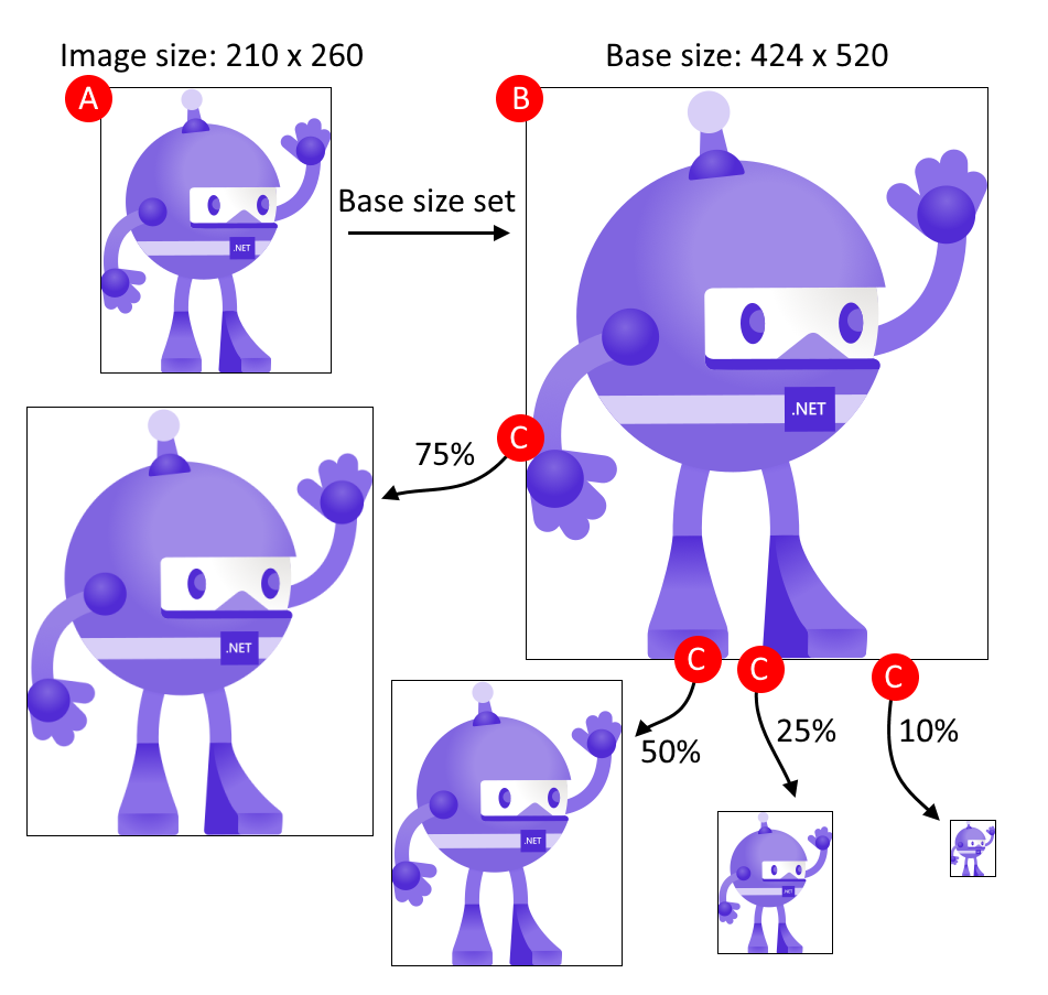
The process shown in the previous figure follows these steps:
- A: The image is added as the .NET MAUI icon and has dimensions of 210x260, and the base size is set to 424x520.
- B: .NET MAUI automatically scales the image to match the base size of 424x520.
- C: As different target platforms require different sizes of the image, .NET MAUI automatically scales the image from the base size to different sizes.
Tip
Use an SVG image as your icon. SVG images can upscale to larger sizes and still look crisp and clean. Bitmap-based images, such a PNG or JPG image, look blurry when upscaled.
The base size is specified with the BaseSize="W,H" attribute, where W is the width of the icon and H is the height of the icon. The following example sets the base size:
<ItemGroup>
    <MauiIcon Include="Resources\AppIcon\appicon.png" BaseSize="128,128" />
</ItemGroup>
And the following example stops the automatic resizing of a vector-based image:
<ItemGroup>
    <MauiIcon Include="Resources\AppIcon\appicon.svg" Resize="false" />
</ItemGroup>
Recolor the background
If the background image used in composing the app icon uses transparency, it can be recolored by specifying the Color attribute on the <MauiIcon>. The following example sets the background color of the app icon to red:
<ItemGroup>
    <MauiIcon Include="Resources\AppIcon\appicon.svg" Color="#FF0000" />
</ItemGroup>
Color values can be specified in hexadecimal, using the format: #RRGGBB or #AARRGGBB. The value of RR represents the red channel, GG the green channel, BB the blue channel, and AA the alpha channel. Instead of a hexadecimal value, you may use a named .NET MAUI color, such as Red or PaleVioletRed.
Caution
If you don't define a background color for your app icon the background is considered to be tranparent on iOS and Mac Catalyst. This will cause an error during App Store Connect verification and you won't be able to upload your app.
Recolor the foreground
If the app icon is composed of a background (Include) image and a foreground (ForegroundFile) image, the foreground image can be tinted. To tint the foreground image, specify a color with the TintColor attribute. The following example tints the foreground image yellow:
<ItemGroup>
    <MauiIcon Include="Resources\AppIcon\appicon.png" ForegroundFile="Resources\AppIcon\appiconfg.svg" TintColor="Yellow" />
</ItemGroup>
Color values can be specified in hexadecimal, using the format: #RRGGBB or #AARRGGBB. The value of RR represents the red channel, GG the green channel, BB the blue channel, and AA the alpha channel. Instead of a hexadecimal value, you may use a named .NET MAUI color, such as Red or PaleVioletRed.
Use a different icon per platform
If you want to use different icon resources or settings per platform, add the Condition attribute to the <MauiIcon> item, and query for the specific platform. If the condition is met, the <MauiIcon> item is processed. Only the first valid <MauiIcon> item is used by .NET MAUI, so all conditional items should be declared first, followed by a default <MauiIcon> item without a condition. The following XML demonstrates declaring a specific icon for Windows and a fallback icon for all other platforms:
<ItemGroup>
    <!-- App icon for Windows -->
    <MauiIcon Condition="$([MSBuild]::GetTargetPlatformIdentifier('$(TargetFramework)')) == 'windows'"
              Include="Resources\AppIcon\backicon.png" ForegroundFile="Resources\AppIcon\appiconfg.svg" TintColor="#40FF00FF" />

    <!-- App icon for all other platforms -->
    <MauiIcon Include="Resources\AppIcon\appicon.png" ForegroundFile="Resources\AppIcon\appiconfg.svg" TintColor="Yellow" />
</ItemGroup>
You can set the target platform by changing the value compared in the condition to one of the following values:
'ios''maccatalyst''android''windows'
For example, a condition that targets Android would be Condition="$([MSBuild]::GetTargetPlatformIdentifier('$(TargetFramework)')) == 'android'".
Platform-specific configuration
While the project file declares which resources the app icon is composed from, you're still required to update the individual platform configurations with reference to those app icons. The following information describes these platform-specific settings.
The icon Android uses is specified in the Android manifest, which is located at Platforms\Android\AndroidManifest.xml. The manifest/application node contains two attributes to define the icon: android:icon and android:roundIcon. The values of these two attributes follow this format: @mipmap/{name} and @mipmap/{name}_round, respectively. The value for {name} is derived from the .NET MAUI project file's <MauiIcon> item, specifically the file name defined by the Include attribute, without its path or extension.
Consider the following example, which defines the resource Resources\AppIcon\healthapp.png as the icon:
<ItemGroup>
    <MauiIcon Include="Resources\AppIcon\healthapp.png" ForegroundFile="Resources\AppIcon\appiconfg.svg" TintColor="Yellow" />
</ItemGroup>
The transformed name, the resource without the path or extension, is healthapp. The values for android:icon and android:roundIcon would be @mipmap/healthapp and @mipmap/healthapp_round, respectively. The android manifest should be updated to match healthapp as the icon:
<manifest xmlns:android="http://schemas.android.com/apk/res/android">
    <application android:allowBackup="true" android:icon="@mipmap/healthapp" android:roundIcon="@mipmap/healthapp_round" android:supportsRtl="true"></application>
    <uses-permission android:name="android.permission.ACCESS_NETWORK_STATE" />
    <uses-permission android:name="android.permission.INTERNET" />
</manifest>
Tip
Instead of creating new image files for the icon, simply replace the two image files provided by the .NET MAUI template: Resources\AppIcon\appicon.svg for the background and Resources\AppIcon\appiconfg.svg for the foreground.
Adaptive launcher
.NET MAUI supports creating an adaptive launcher icon on Android 8.0 and higher, from the app icon. Adaptive launcher icons can display as various shapes across different device models, including circular and square. For more information about adaptive icons, see the Android developer guide: Adaptive icons.
Adaptive launcher icons are composed icons, using a background layer and a foreground layer, and an optional scaling value. For more information, see the Composed icon section. If the composed icon is defined, by specifying the ForegroundFile attribute, an adaptive launcher icon will be generated. The following XML demonstrates defining an icon that is used as an adaptive launcher icon:
<ItemGroup>
    <MauiIcon Include="Resources\AppIcon\appicon.svg" ForegroundFile="Resources\AppIcon\appiconfg.svg" ForegroundScale="0.65" Color="#512BD4" />
</ItemGroup>
The ForegroundScale attribute can be optionally specified to change the scaling of the foreground layer being rendered over the background layer.
Feedback
Coming soon: Throughout 2024 we will be phasing out GitHub Issues as the feedback mechanism for content and replacing it with a new feedback system. For more information see: https://aka.ms/ContentUserFeedback.
Submit and view feedback for