Essential XAML syntax
 Browse the sample
XAML is mostly designed for instantiating and initializing objects. But often, properties must be set to complex objects that cannot easily be represented as XML strings, and sometimes properties defined by one class must be set on a child class. These two needs require the essential XAML syntax features of property elements and attached properties.
Property elements
In .NET Multi-platform App UI (.NET MAUI) XAML, properties of classes are normally set as XML attributes:
<Label Text="Hello, XAML!"
       VerticalOptions="Center"
       FontAttributes="Bold"
       FontSize="18"
       TextColor="Aqua" />
However, there is an alternative way to set a property in XAML:
<Label Text="Hello, XAML!"
       VerticalOptions="Center"
       FontAttributes="Bold"
       FontSize="18">
    <Label.TextColor>
        Aqua
    </Label.TextColor>
</Label>
These two examples that specify the TextColor property are functionally equivalent, and enable the introduction of some basic terminology:
- Label is an object element. It is a .NET MAUI object expressed as an XML element.
Text,VerticalOptions,FontAttributesandFontSizeare property attributes. They are .NET MAUI properties expressed as XML attributes.- In the second example,
TextColorhas become a property element. It is a .NET MAUI property expressed as an XML element.
Note
In a property element, the value of the property is always defined as the content between the property-element start and end tags.
Property-element syntax can also be used on more than one property of an object:
<Label Text="Hello, XAML!"
       VerticalOptions="Center">
    <Label.FontAttributes>
        Bold
    </Label.FontAttributes>
    <Label.FontSize>
        Large
    </Label.FontSize>
    <Label.TextColor>
        Aqua
    </Label.TextColor>
</Label>
While property-element syntax might seem unnecessary, it's essential when the value of a property is too complex to be expressed as a simple string. Within the property-element tags you can instantiate another object and set its properties. For example, the Grid layout has properties named RowDefinitions and ColumnDefinitions, which are of type RowDefinitionCollection and ColumnDefinitionCollection respectively. These types are collections of RowDefinition and ColumnDefinition objects, and you typically use property element syntax to set them:
<ContentPage xmlns="http://schemas.microsoft.com/dotnet/2021/maui"
             xmlns:x="http://schemas.microsoft.com/winfx/2009/xaml"
             x:Class="XamlSamples.GridDemoPage"
             Title="Grid Demo Page">
    <Grid>
        <Grid.RowDefinitions>
            <RowDefinition Height="Auto" />
            <RowDefinition Height="*" />
            <RowDefinition Height="100" />
        </Grid.RowDefinitions>
        <Grid.ColumnDefinitions>
            <ColumnDefinition Width="Auto" />
            <ColumnDefinition Width="*" />
            <ColumnDefinition Width="100" />
        </Grid.ColumnDefinitions>
        ...
    </Grid>
</ContentPage>
Attached properties
In the previous example you saw that the Grid requires property elements for the RowDefinitions and ColumnDefinitions collections to define the rows and columns. This suggests that there must be a technique for indicating the row and column where each child of the Grid resides.
Within the tag for each child of the Grid you specify the row and column of that child using the Grid.Row and Grid.Column attributes, which have default values of 0. You can also indicate if a child spans more than one row or column with the Grid.RowSpan and Grid.ColumnSpan attributes, which have default values of 1.
The following example demonstrates placing children within a Grid:
<ContentPage xmlns="http://schemas.microsoft.com/dotnet/2021/maui"
             xmlns:x="http://schemas.microsoft.com/winfx/2009/xaml"
             x:Class="XamlSamples.GridDemoPage"
             Title="Grid Demo Page">
    <Grid>
        <Grid.RowDefinitions>
            <RowDefinition Height="Auto" />
            <RowDefinition Height="*" />
            <RowDefinition Height="100" />
        </Grid.RowDefinitions>
        <Grid.ColumnDefinitions>
            <ColumnDefinition Width="Auto" />
            <ColumnDefinition Width="*" />
            <ColumnDefinition Width="100" />
        </Grid.ColumnDefinitions>

        <Label Text="Autosized cell"
               TextColor="White"
               BackgroundColor="Blue" />
        <BoxView Color="Silver"
                 Grid.Column="1" />
        <BoxView Color="Teal"
                 Grid.Row="1" />
        <Label Text="Leftover space"
               Grid.Row="1" Grid.Column="1"
               TextColor="Purple"
               BackgroundColor="Aqua"
               HorizontalTextAlignment="Center"
               VerticalTextAlignment="Center" />
        <Label Text="Span two rows (or more if you want)"
               Grid.Column="2" Grid.RowSpan="2"
               TextColor="Yellow"
               BackgroundColor="Blue"
               HorizontalTextAlignment="Center"
               VerticalTextAlignment="Center" />
        <Label Text="Span two columns"
               Grid.Row="2" Grid.ColumnSpan="2"
               TextColor="Blue"
               BackgroundColor="Yellow"
               HorizontalTextAlignment="Center"
               VerticalTextAlignment="Center" />
        <Label Text="Fixed 100x100"
               Grid.Row="2" Grid.Column="2"
               TextColor="Aqua"
               BackgroundColor="Red"
               HorizontalTextAlignment="Center"
               VerticalTextAlignment="Center" />

    </Grid>
</ContentPage>
This XAML results in the following layout:
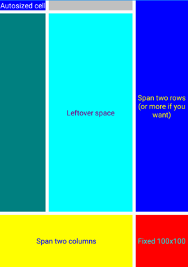
The Grid.Row, Grid.Column, Grid.RowSpan, and Grid.ColumnSpan attributes appear to be properties of the Grid class, but this class doesn't define anything named Row, Column, RowSpan, or ColumnSpan. Instead, the Grid class defines four bindable properties named RowProperty, ColumnProperty, RowSpanProperty, and ColumnSpanProperty, that are special types of bindable properties known as attached properties. They are defined by the Grid class but set on children of the Grid.
Note
When you wish to use these attached properties in code, the Grid class provides static methods named GetRow, SetRow, GetColumn, SetColumn, GetRowSpan, SetRowSpan, GetColumnSpan, and SetColumnSpan.
Attached properties are recognizable in XAML as attributes containing both a class and a property name separated by a period. They are called attached properties because they are defined by one class (in this case, Grid) but attached to other objects (in this case, children of the Grid). During layout, the Grid can interrogate the values of these attached properties to know where to place each child.
Content properties
In the previous example, the Grid object was set to the Content property of the ContentPage. However, the Content property wasn't referenced in the XAML but can be:
<ContentPage xmlns="http://schemas.microsoft.com/dotnet/2021/maui"
             xmlns:x="http://schemas.microsoft.com/winfx/2009/xaml"
             x:Class="XamlSamples.XamlPlusCodePage"
             Title="XAML + Code Page">
    <ContentPage.Content>
        <Grid>
            ...
        </Grid>
    </ContentPage.Content>
</ContentPage>
The Content property isn't required in XAML because elements defined for use in .NET MAUI XAML are allowed to have one property specified as the ContentProperty attribute on the class:
[ContentProperty("Content")]
public class ContentPage : TemplatedPage
{
    ...
}
Any property specified as the ContentProperty of a class means that the property-element tags for the property are not required. Therefore, the example above specifies that any XAML content that appears between the start and end ContentPage tags is assigned to the Content property.
Many classes also have ContentProperty attribute definitions. For example, the content property of Label is Text.
Platform differences
.NET MAUI apps can customize UI appearance on a per-platform basis. This can be achieved in XAML using the OnPlatform and On classes:
<ContentPage xmlns="http://schemas.microsoft.com/dotnet/2021/maui"
             xmlns:x="http://schemas.microsoft.com/winfx/2009/xaml"
             x:Class="...">
    <ContentPage.Padding>
        <OnPlatform x:TypeArguments="Thickness">
            <On Platform="iOS" Value="0,20,0,0" />
            <On Platform="Android" Value="10,20,20,10" />
        </OnPlatform>
    </ContentPage.Padding>
    ...
</ContentPage>
OnPlatform is a generic class and so you need to specify the generic type argument, in this case, Thickness, which is the type of Padding property. This is achieved with the x:TypeArguments XAML attribute. The OnPlatform class defines a Default property that can be set to a value that will be applied to all platforms:
<ContentPage xmlns="http://schemas.microsoft.com/dotnet/2021/maui"
             xmlns:x="http://schemas.microsoft.com/winfx/2009/xaml"
             x:Class="...">
    <ContentPage.Padding>
        <OnPlatform x:TypeArguments="Thickness" Default="20">
            <On Platform="iOS" Value="0,20,0,0" />
            <On Platform="Android" Value="10,20,20,10" />
        </OnPlatform>
    </ContentPage.Padding>
    ...
</ContentPage>
In this example, the Padding property is set to different values on iOS and Android, with the other platforms being set to the default value.
The OnPlatform class also defines a Platforms property, which is an IList of On objects. Each On object can set the Platform and Value property to define the Thickness value for a specific platform. In addition, the Platform property of On is of type IList<string>, so you can include multiple platforms if the values are the same:
<ContentPage xmlns="http://schemas.microsoft.com/dotnet/2021/maui"
             xmlns:x="http://schemas.microsoft.com/winfx/2009/xaml"
             x:Class="...">
    <ContentPage.Padding>
        <OnPlatform x:TypeArguments="Thickness" Default="20">
            <On Platform="iOS, Android" Value="10,20,20,10" />
        </OnPlatform>
    </ContentPage.Padding>
    ...
</ContentPage>
This is the standard way to set a platform-dependent Padding property in XAML.
Note
If the Value property of an On object can't be represented by a single string, you can define property elements for it.
For more information, see Customize UI appearance based on the platform.
Next steps
.NET MAUI XAML markup extensions enable properties to be set to objects or values that are referenced indirectly from other sources. XAML markup extensions are particularly important for sharing objects, and referencing constants used throughout an app.
Feedback
Coming soon: Throughout 2024 we will be phasing out GitHub Issues as the feedback mechanism for content and replacing it with a new feedback system. For more information see: https://aka.ms/ContentUserFeedback.
Submit and view feedback for