Incremental visual refresh of the Finance and Operations apps user experience
Important
This content is archived and is not being updated. For the latest documentation, go to What's new or changed in Finance and Operations apps home page. For the latest release plans, go to Dynamics 365, Power Platform, and Cloud for Industry release plans.
| Enabled for | Public preview | General availability |
|---|---|---|
| Users, automatically |  Feb 6, 2023
 |
 Apr 1, 2023
 |
Business value
The increased alignment in the look and feel of the user experience in Finance and Operations apps compared to other Microsoft apps in Office 365 and Dynamics 365 aims to make the Finance and Operations experiences easier to learn and use and ultimately improve user satisfaction.
Feature details
Design languages, like Microsoft Fluent, naturally evolve over time to not only increase the visual appeal of user experiences, but more importantly to make those experiences more intuitive and to help users be more comfortable and productive. Though the Finance and Operations user experience is currently based on an old version of Fluent, we've heard your feedback about that experience and will address this with another visual facelift of the product to better align to both the latest guidance from Fluent, which has already been adopted in other Microsoft apps like Word, PowerPoint, Outlook, Teams, and Azure, and the visuals in other Dynamics 365 apps.
The largest changes to the user experience are included in version 10.0.32, with smaller enhancements targeted for subsequent releases that will continue to evolve and improve the Finance and Operations interface for the benefit of end users.
Changes included in version 10.0.32
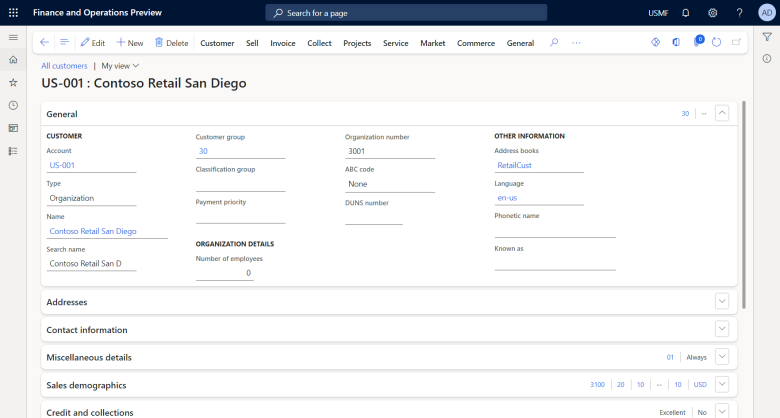
- Alignment to the Microsoft Fluent design language involves styling changes with rounding of containers and bringing attention to containers through visual elevation.
- Alignment to other Dynamics 365 apps involves relocation of the four system actions:
- The Close button, the last button in the Action pane, has been transformed into a Back button, which is now the first button in the Action pane.
- The Show list button, which exists only on certain page types, has been moved into the Action pane, just after the Back button.
- The Show filters button now resides in the new right rail. This action still causes the Filter pane to open, but it now opens on the right side of the page.
- The Related information button is now an icon-only button in the new right rail, just below the Show filters button.

See also
Navigation elements (learn)