Weather App
Important
This project is an experimental release. We hope you try out Experimental Mobile Blazor Bindings and provide feedback at https://github.com/xamarin/MobileBlazorBindings.
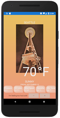
The completed Weather app sample is available here. The sample uses a 3rd party Xamarin.Forms component, the Grid component, two-way bindings, component initialization logic, dependency injection, CSS styles, and many more features.
The completed app looks like this:
Rather than write the app from scratch, let's take a look at the key components in this sample application.
Gridcomponent. The entire UI of the Weather App is contained in theWeatherAppcomponent, with its main layout established by aGridcomponent.The
Gridcomponent has two main sections to establish its structure: the row/column definitions and the grid cells<Grid RowDefinitions="..." ColumnDefinitions="..."> @* GridCell components *@ </Grid>The
RowDefinitionandColumnDefinitionproperties establish the structure of the grid:RowDefinitions="Auto, *, Auto, Auto, Auto, Auto, Auto"The properties are optional and if they are omitted imply a single row/column. Each comma-separated value specifies the relative, absolute, or automatic dimensions of that row/column.
Learn more about the properties here:
The content of the Grid contains several
<GridCell>components that can have aRow,Column,RowSpan, andColumnSpanproperty, and contain a single item representing the cells contents. All of these properties are optional. For example, thisGridCellwill be on row index 6, column index 0, and no row/column span:<GridCell Row="6"> <StackLayout Orientation="StackOrientation.Horizontal" HorizontalOptions="LayoutOptions.Center"> <Label Text="I'm feeling too hot/cold!" VerticalOptions="LayoutOptions.Center"/> <Stepper @bind-Value="Temperature" Minimum="0" Maximum="120" Increment="3" Opacity="0.6" VerticalOptions="LayoutOptions.Center" /> </StackLayout> </GridCell>
A popular 3rd party component often used in Xamarin.Forms apps is the
PancakeViewcomponent. The component has been wrapped to enable it to be used with Blazor syntax in a separate class library project: Microsoft.MobileBlazorBindings.PancakeView. To learn more about how to wrap Xamarin.Forms components for use with Blazor syntax, see Wrapping Xamarin.Forms components for use with Blazor topic.Dependency injection is used in the weather app with a
WeatherServicetype that is registered in the host and consumed in theWeatherApp.razorpage.- To learn more, read the dependency injection topic.
Component initialization enables running initialization code when a component is run. The weather app uses this to load the initial weather data when the app starts by overriding the
OnInitializedmethod:protected override void OnInitialized() { CurrentWeather = WeatherService.GetWeatherReport(); Temperature = CurrentWeather.Temperature; }To learn more, including how to do async initialization, check out the Blazor lifecycle methods documentation.
CSS styles are used to apply common properties by element type or by CSS class name. A CSS file is included as an embedded resource in the shared project (this is the default setting for CSS files). Learn more about using CSS in Mobile Blazor Bindings in the CSS Styles topic.
