Create and use filled maps (choropleth maps) in Power BI
APPLIES TO: ![]() Power BI Desktop
Power BI Desktop ![]() Power BI service
Power BI service
Note
The Azure Maps visual is now generally available. When you open a report with an existing map visual, if Azure Maps is enabled for your organization, you see a message encouraging you to upgrade your maps and filled maps to Azure Maps. In a future release, Power BI plans to deprecate older map visuals and migrate existing reports to Azure Maps. You can convert maps and filled maps to Azure Maps visuals now.
A filled, or choropleth, map uses shading, tinting, or patterns to display how a value differs in proportion across a geography or region. You can quickly display relative differences with shading that ranges from light (less frequent or lower) to dark (more frequent or greater).
What is sent to Bing?
Power BI integrates with Bing to provide default map coordinates (a process called geo-coding). When you create a map visual in the Power BI service or Power BI Desktop, the Location, Latitude, and Longitude data that's used to create the visualization is sent to Bing.
Important
Your firewall might require updates to allow access to the URLs that Bing uses for geocoding. Make sure your firewall allows access to the following URLs:
https://dev.virtualearth.net/REST/V1/Locationshttps://platform.bing.com/geo/spatial/v1/public/Geodatahttps://www.bing.com/api/maps/mapcontrol
For more information about the data sent to Bing, and for tips to increase your geo-coding success, see Tips and tricks for map visualizations.
When to use a filled map
Filled maps are a great choice in many scenarios:
- Display quantitative information on a map.
- Show spatial patterns and relationships.
- Support standardized data.
- Work with socioeconomic data.
- Support defined regions.
- Display an overview of distribution across geographic locations.
Prerequisites
Review the following prerequisites for using the filled map visual in Power BI Desktop or the Power BI service.
This tutorial uses the Sales and Marketing Sample .pbix file.
Download the Sales and Marketing Sample PBIX file to your desktop.
In Power BI Desktop, select File > Open report.
Browse to and select the Sales and Marketing Sample .pbix file, and then select Open.
The Sales and Marketing Sample .pbix file opens in report view.

At the bottom, select the green plus symbol
 to add a new page to the report.


Note
If you want to share your report with a colleague, you both need to have individual Power BI Pro licenses. If both parties don't have individual Power BI Pro licenses, the report needs to be saved in Premium capacity to enable sharing. For more information, see sharing reports.
Create a filled map
Let's create a filled map by using location data from the Sales and Marketing Sample.
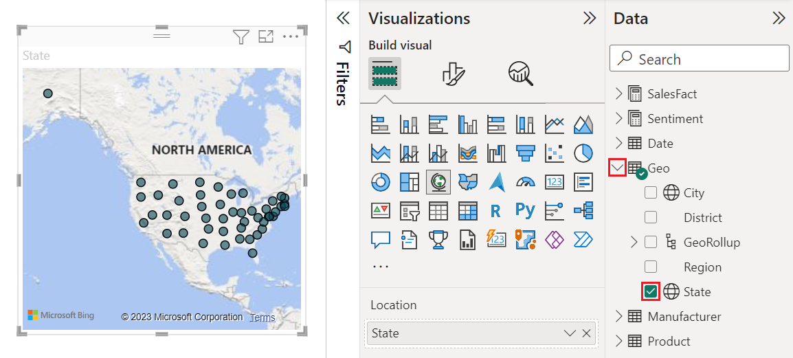
On the Data pane, expand Geo and select the State field.
By default, Power BI creates a map to display the data, and adds the State field under the Location option on the Visualizations pane.
You can now convert the visual into a filled map.
Select Filled map on the Visualizations pane to convert the visual.
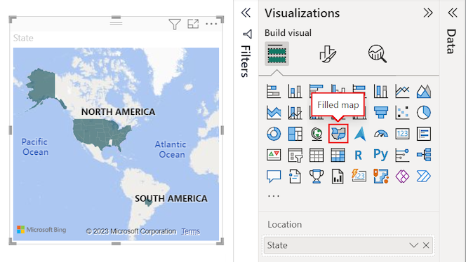
Bing Maps uses the State field for the Location option to create the filled map. Bing Maps provides filled map shapes for locations around the world.
Important
The Location option must contain a valid value for Power BI to create the filled map. Valid locations include countries/regions, states, counties, cities, zip codes, postal codes, and so on.
Add filters to a filled map
Now you can filter the map to display specific data and apply custom formatting. We want to concentrate the view for data in the continental United States.
Expand the Filters pane. On the pane, we see one filter for the visual based on the State field. The current value is set to State is (All).
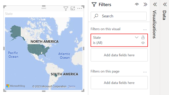
Expand the drop-down menu for the State filter and choose the Select all option. When you choose Select All, Power BI adds a checkmark next to every option in the list.
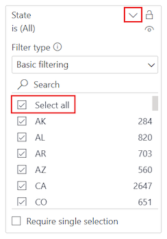
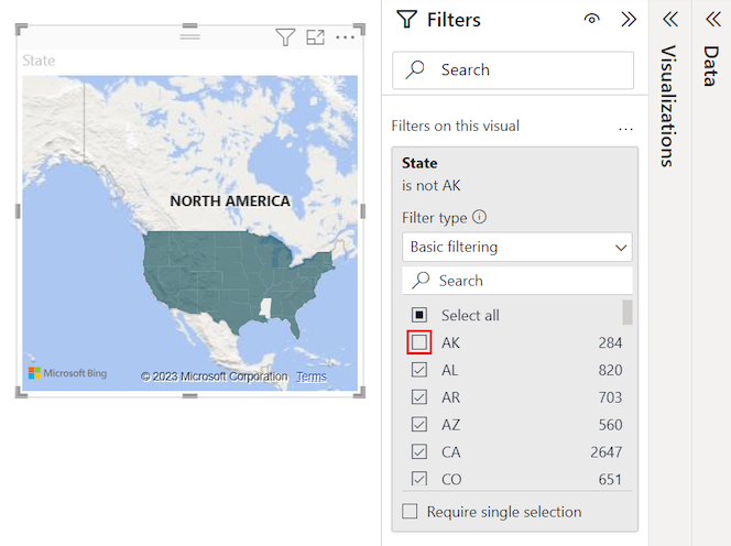
We can remove a specific state from the filtered data. In the State filter list, select AK to remove the data for the state of Alaska.
Power BI removes the checkmark for AK in the list and updates the map visual to remove the data for Alaska. The map now shows data for the continental United States only. (In this sample, there's no data for the state of Hawaii.) On the Filters pane, the value of the State filter updates to State is not AK.
Format a filled map
You can also apply various formatting options to a filled map visual.
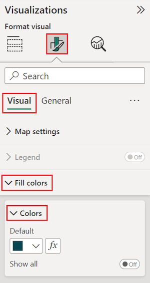
On the Visualizations pane, select the paint brush icon to open the Format visual section. Make sure the Visual tab is selected.
On the Format pane, expand the Fill colors section, and then expand the Colors options.
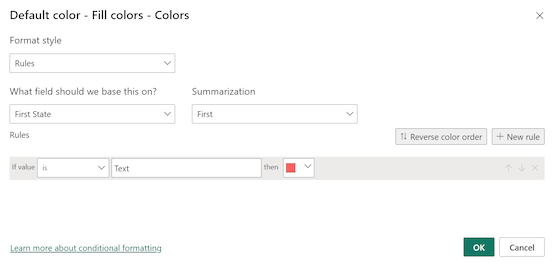
Select fx next to the Default color.
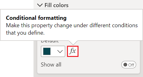
The Default color - Fill colors - Colors dialog opens. You can use the options on this dialog to configure shading for your filled map. Some of the available options include which field to use as the base for the shading, and how to apply the shading.
On the dialog, expand the Format style drop-down list and select Gradient. Power BI adds a color gradient to the dialog.
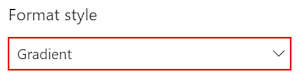
Power BI uses the colors in the gradient to select the color and shading for all values in your filled map. By default, the gradient has two primary colors as endpoints, the lowest value and the highest value. Values between the lowest and highest values are colored with shades of the primary colors.
On the What field should we base this on? drop-down list, expand SalesFact and select the Sentiment field.
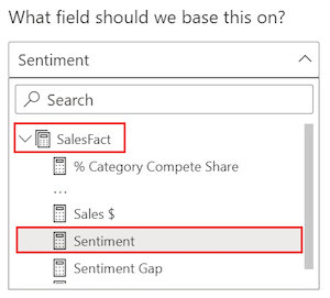
Power BI uses the data in the specified field as the base value for determining the color and shading for all values in your filled map.
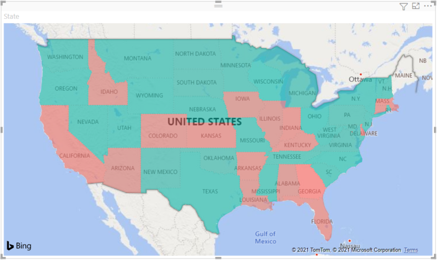
After you set the base field, set the Minimum and Maximum colors for data values based on the color gradient.
By default, the minimum (lowest) value for the base field is colored red, and the maximum (highest) value is colored green. Data values between the maximum and minimum are colored with shades of red or green. You can also set specific data values and assigned colors.
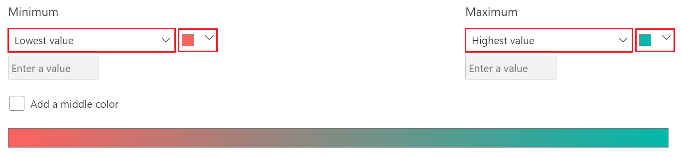
If your semantic model requires a third primary color in the gradient, select the Add a middle color option and configure the extra options.
When you're done setting the colors, select OK.
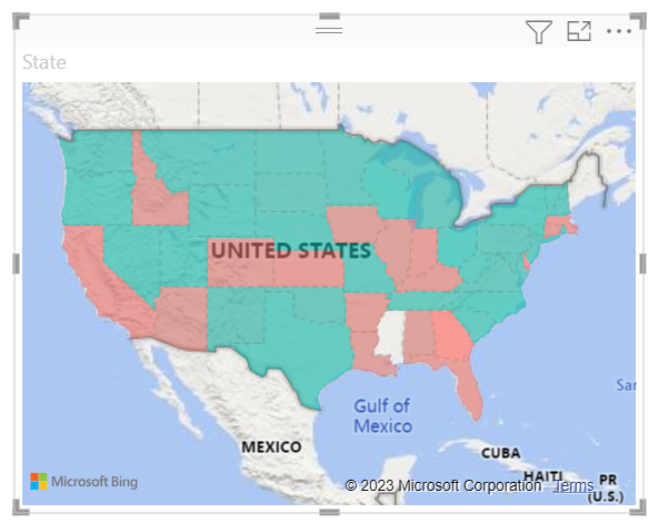
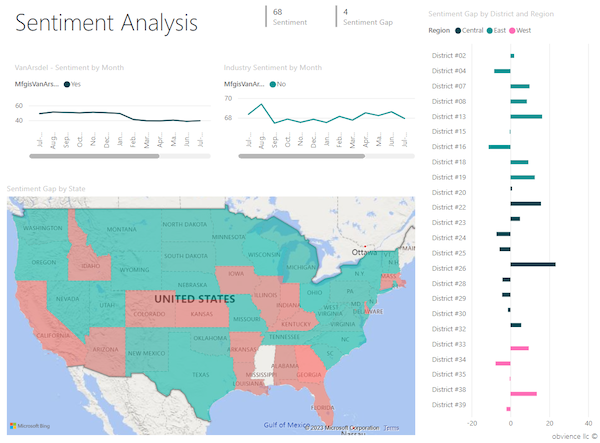
Power BI updates the filled map visual with data shaded red or green. The red-shaded states are areas with lower sentiment and the green-shaded states have higher, more-positive sentiment.

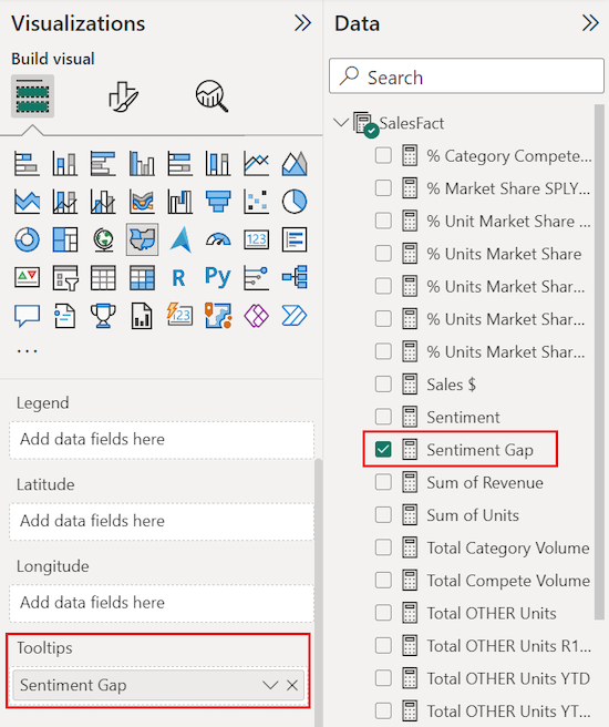
Get details for areas on a filled map
Power BI supports tooltips for areas on a filled map and for specific fields. When you configure tooltips, you can hover on areas on your map to see details about the underlying data.
Expand the Data and Visualizations panes, if they're collapsed.
On the Data pane, locate the SalesFact > Sentiment Gap field. Drag the field onto the Tooltips option on the Visualizations pane.
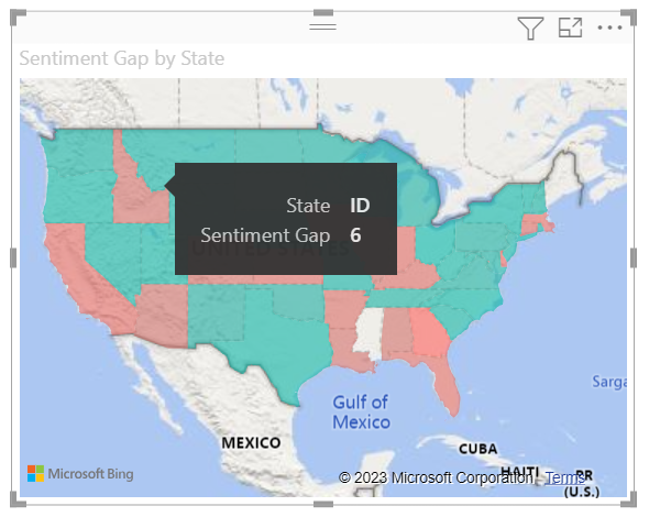
On the map visual, hover on a state to see the tooltip. In our example, we hover on the state of Idaho (ID).
The tooltip details show the sentiment gap for Idaho is low with a value of 6.
Save your report.
Power BI provides many options for configuring the appearance of your filled map. We reviewed only a subset. Take some time to explore the other data color and format controls.
Use cross-highlighting and cross-filtering
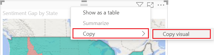
Power BI supports highlighting locations in a filled map to cross-filter related data in other visualizations on the same report page, and vice versa. To complete this exercise, we need several visuals on the same report page. We can copy our map visual to another page in the saved report that already has other visuals.
To create a copy of your filled map, select the map visual, then right-click and select Copy > Copy visual.
At the bottom of the report canvas, select the Sentiment tab to open the Sentiment report page.

On the Sentiment report page, move and resize the line chart visualizations to make room for the filled map. In our example, we resize and reposition the line charts so they appear side-by-side. The updated layout allows room to place the filled map visual under the two line charts.
Enter CTRL+V to paste the copy of the map visual onto the Sentiment report page.
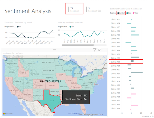
On the filled map, select a state to cross-highlight and cross-filter the other visualizations on the page.
In our example, we select Texas (TX). Power BI cross-filters the cards and cross-highlights the bar chart for the related data for Texas. At the top of the report page, the multi-row card visual shows the Sentiment as 75. In the clustered bar chart, we see Texas is located in Central District #23.
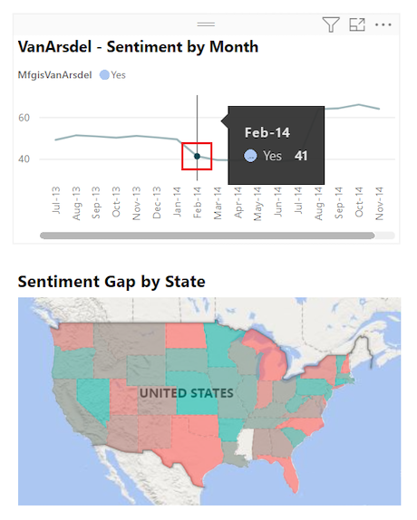
Select a data point on the VanArsdel - Sentiment by Month line chart.
When you select the data point, Power BI filters the filled map to show sentiment data for VanArsdel only and not for any other manufacturers.


For more information about using the Filters pane, see Add a filter to a report.
Considerations and troubleshooting
Map data can be ambiguous. For example, there's a Paris, France, but there's also a Paris, Texas. Geographic location data is often stored in separate columns with one column for city names and another column for the corresponding state or province. When you supply Bing with only one column of data, such as for the city name, Bing might not distinguish data for one city location from another of the same name.
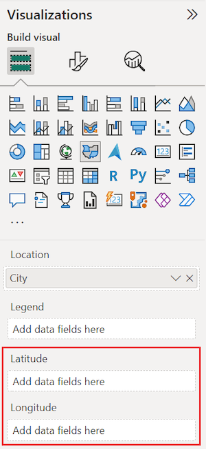
If your semantic model already contains latitude and longitude data, Power BI has special fields to help make the map data unambiguous. You can drag the field that contains your latitude data onto the Latitude section on the Visualizations > Build visual pane. You can use this same approach for your longitude data.
If you don't have access to latitude and longitude data, but you have edit access to the semantic model, follow the instructions in Maps in Power View to update your semantic model.
For more information about map visualizations in Power BI, see Tips and tricks for map visualizations.
Related content
- Create a shape map visualization in Power BI.
- Review visualization types in Power BI.
Feedback
Coming soon: Throughout 2024 we will be phasing out GitHub Issues as the feedback mechanism for content and replacing it with a new feedback system. For more information see: https://aka.ms/ContentUserFeedback.
Submit and view feedback for