Add visualizations to Reporting Services mobile reports
Note
SQL Server Mobile Report Publisher is deprecated for all releases of SQL Server Reporting Services after SQL Server Reporting Services 2019. It is discontinued starting in SQL Server Reporting Services 2022 and Power BI Report Server.
Charts are an essential part of data visualization. Learn about the charts you can use in Reporting Services mobile reports to cover a range of scenarios.
SQL Server Mobile Report Publisher has three basic chart types: time, category, and totals. These three chart types have corresponding comparison charts, which are useful for comparing two distinct sets of series.
Shared chart properties
Some properties apply to all charts, and others only to specific charts. Here are some of the shared properties.
Number format
You can assign various formats to numbers in a chart in Mobile Report Publisher. For example, you can assign formats like general, currency with or without decimals, percentages with and without decimals, and so on. In a chart, number formatting applies to axis annotations, and data point pop-ups. You set number formatting on each chart individually, not on the mobile report as a whole.
- To set the number format, select the Layout tab, choose a chart on the design surface, and in the Visual properties pane, select a Number format.
Legend
- To show the legend for a chart, select the Layout tab. Select a chart on the design surface, and in the Visual properties pane, set Show legend to On
Series
Each individual metric, or value, displayed on a chart is referred to as a series. Multiple series can, and do, share both a common x-axis and a common y-axis. Series are defined in the data properties panel of the data view by selecting one or more data tables and fields. Each field results in an individual series of data points on the chart visualization with its own color. Then, select a different aggregation.
Set or clear filters
If you add a navigator to filter your mobile report, you can decide which charts you want it to filter.
Select the Data tab, and in Data properties, select Options.
Under Filtered by, you see navigators you can select or clear.
For more information, see Adding navigators to filter a mobile report.
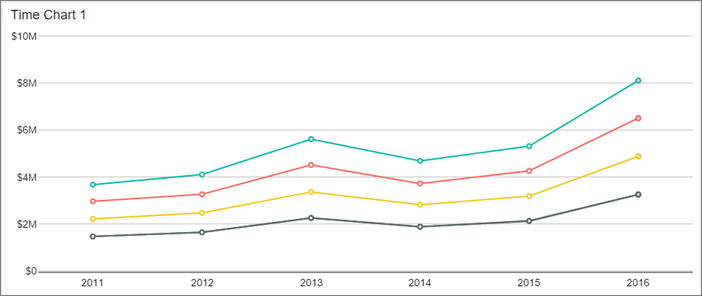
Time charts
The time chart is the most basic chart in Mobile Report Publisher. The time and date axis of the chart is automatically set to the first valid date/time field in the data table.
Drag a Time chart from the Layout tab to the design surface and resize it.
By default, it's a stacked bar chart. You can change that in Series visualization.
If the chart needs data that's not already in the report, select the Data tab > Add data to get data from Excel or a shared dataset.
In the Data properties pane, Main Series is SimulatedTable. Select the arrow in the box > select your table.
Set Data structure to By columns on the Layout tab by going to the Visual properties pane. In the Data properties pane, select multiple columns of numeric values.
If you set Data structure to By rows, here in the Data properties pane you can select one Series Name Field and one column of numeric values.
For more information, see Grouping data by columns or rows.
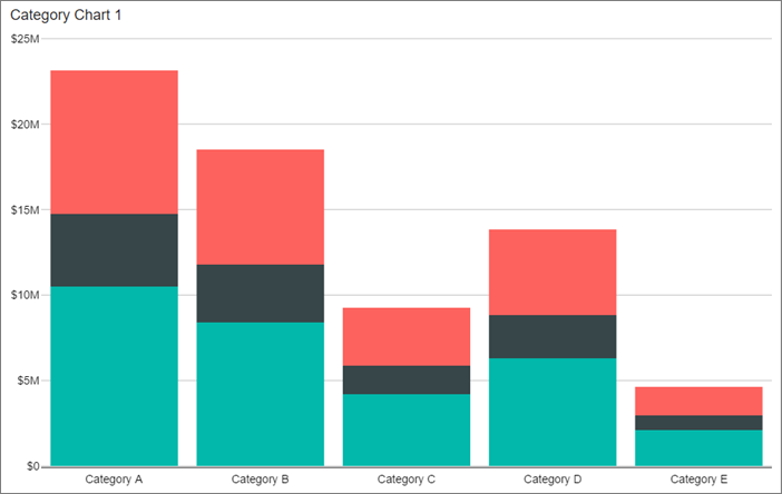
Category charts
Unlike in a time chart, in a category chart you group on a field other than a date/time field on the x-axis. This grouping is called the category coordinate. This grouping has to be on a string, not a numeric, field.
Drag a Category chart from the Layout tab to the design surface, resize it, and get data for it, if necessary.
Select the Data tab, and in the Data properties pane under Category Coordinate, choose a table and field to group on. This field is on the x axis of the resulting chart.
Under Main Series, select the table and numeric fields to be aggregated for each category.
Totals charts
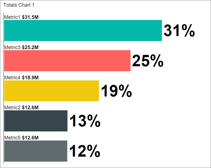
The totals chart accomplishes two separate things:
- It doesn't present multiple series. It represents only the sum, or total, of the defined main series.
- It gives the option to group data by columns or by rows. Grouping by columns can be useful when dealing with flattened data. When you group by columns, only the main series property is available. Only this property is available because the number of fields selected for the main series property automatically determines the category column.
For more information, see Grouping data by columns or rows.
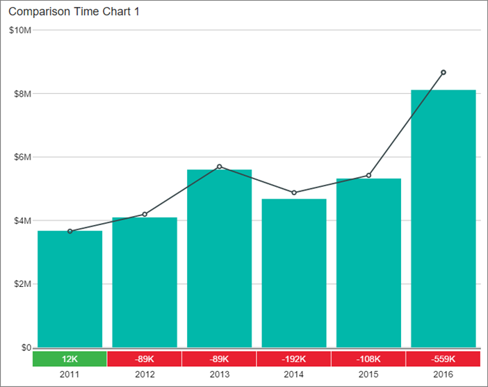
Comparison charts
Time, category, and totals charts are also available as comparison charts. In a comparison chart, you can specify not only a main series, but also a second comparison series. The main and comparison series can be displayed in three different ways.
Drag one of the Comparison charts from the Layout tab to the design surface, resize it, and get data for it, if necessary.
In the Visual properties pane, in Series visualization, select one of the following:
- Bar vs. thin bar
- Line vs. bar
- Bar vs. step area
In comparison charts, you can choose to have the same chart colors on the main and comparison values in a series.
In the Visual properties pane, set Reuse colors on comparison series to On.
If set to On, the color palette restarts between drawing the main and comparison series, so related values in the main and comparison series are the same.
If set to Off, the color palette continues its normal rotation when drawing the main series after the comparison series, preventing potentially misleading color coordination between the two sets of series.
Pie and funnel charts
Pie and funnel charts are among the simplest of visualizations. You can structure the data either by rows or by columns.
- Pie charts in Reporting Services mobile reports can be pies, donuts, or donuts with a total in the center. Pie charts are good for showing the relative size of different parts of a whole. Too many slices make them hard to read.
- Funnel charts are often used to show stages in a process, such as sales.

Structure pie and funnel chart data by rows or by columns
Drag a Pie chart or Funnel chart from the Layout tab to the design surface, resize it, and get data for it, if necessary.
In the Visual properties pane under Data structure, select either:
- By columns
- By rows
If you selected By columns, select the Data tab, and in the Data properties pane under Main Series, choose the table and all the fields you want to aggregate in the pie or funnel chart. The field names are used to label each area of the resulting chart.
If you selected By rows, select the Data tab, and in the Data properties pane under Category Column, select the table and column with the values to use for grouping and labels in the pie. Under Main Series Column, select a numeric field for the values in the chart.
For more information, see Grouping data by columns or rows.
Treemaps
Treemaps display metrics by applying their values to the size and color of tiles in a rectangular grid.
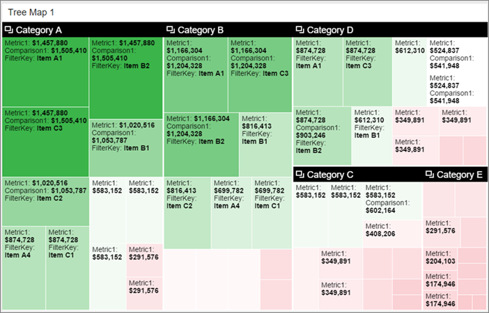
Drag a Treemap from the Layout tab to the design surface, resize it, and get data for it, if necessary.
Select the Data tab, and in the Data properties pane:
Under Size Represents, select a numeric field for the tiles' size.
Under Color Represents, select a numeric field for the tiles' color.
Optionally, set the Custom Center Value. You can only use Custom Center Value when the visualization type is
HeatMapWithCustomCenterValue.The center value decides the color of a box. The better the metric compared to center value, the greener it is. The worse the metric, the redder it is.
Optionally, to display a popup when viewers select a tile in the grid, under Popup Labels. select a field or fields. Treemap popups can display both text and numeric fields.
By default, treemaps are hierarchical, grouping the tiles by category first, then by size and color.
- Still on the Data tab, under Group by, select a table and field.
You can turn off grouping and arrange the tiles only by size and color.
- Select the Layout tab and set Two-level treemap to Off.
Waterfall charts
A waterfall chart shows a running total as values are added or subtracted. It's useful for understanding a series of positive and negative changes affect an initial value, for example, net income.
The columns are color coded green for increases and red for decreases so you can quickly see which is which. The initial and the final value columns often start at zero, while the intermediate values are floating columns. Because of this "look," waterfall charts are also called bridge charts.
When to use a waterfall chart
Waterfall charts are a good choice:
- When you have changes for the measure across time series or different categories to audit the major changes contributing to the total value
- To plot your company's annual profit by showing various sources of revenue and arrive at the total profit or loss
- To illustrate the beginning and the ending headcount for your company in a year
- To visualize how much money you make and spend each month, and the running balance for your account
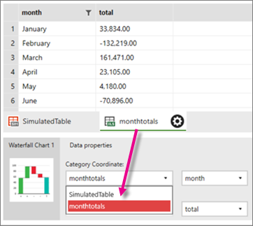
Create a waterfall chart
Drag a Waterfall chart from the Layout tab to the design surface, resize it, and get data for it, if necessary.
Select the Data tab, and in the Data properties pane, select a category field in your data for Category Coordinate, and a numeric field for Main Series:
Select the Layout tab to see the waterfall chart in preview.
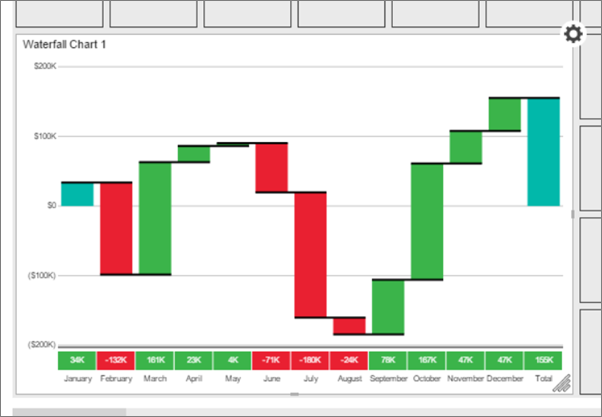
Months with a loss, like February, June, and July, are in red. Months with a gain, like September, October, and November, are in green.
Related content
Feedback
Coming soon: Throughout 2024 we will be phasing out GitHub Issues as the feedback mechanism for content and replacing it with a new feedback system. For more information see: https://aka.ms/ContentUserFeedback.
Submit and view feedback for