Tutorial: Map report (Report Builder)
In this Report Builder tutorial, you learn about map features you can use to display data on a geographic background in an Reporting Services paginated report.
Maps are based on spatial data that typically consists of points, lines, and polygons. For example, a polygon can represent the outline of a county, a line can represent a road, and a point can represent the location of a city. Each type of spatial data is displayed on a separate map layer as a set of map elements.
To vary the appearance of map elements, you specify a field that has values that match the map elements with analytical data from a dataset. You can also define rules that vary color, size, or other properties based on ranges of data.
In this tutorial, you build a map report that displays store locations in New York state counties.
Note
In this tutorial, the steps for the wizard are consolidated into two procedures: one to create the dataset and one to create a table. For step-by-step instructions about how to browse to a report server, choose a data source, create a dataset, and run the wizard, see the first tutorial in this series: Tutorial: Create a basic table report (Report Builder).
Estimated time to complete this tutorial: 30 minutes.
Requirements
For this tutorial, the report server must be configured to support Bing maps as a background. For more information, see Plan for Map Report Support.
For information about other requirements, see Prerequisites for tutorials (Report Builder).
1. Create a map with a polygon layer from the Map Wizard
In this section, you add a map to your report from the map gallery. The map has one layer that displays the counties in New York state. The shape of each county is a polygon based on spatial data that is embedded in the map from the map gallery.
Add a map with the map wizard in a new report
Start Report Builder either from your computer, the Reporting Services web portal, or SharePoint integrated mode.
The New Report or Dataset dialog box opens.
If you don't see the New Report or Dataset dialog box, on the File menu > New.
In the left pane, verify that New Report is selected.
In the right pane, select Map Wizard.
On the Choose a source of spatial data page, verify that Map gallery is selected.
In the Map Gallery box, expand States by County under USA, and select New York.
The Map Preview pane displays the New York county map.
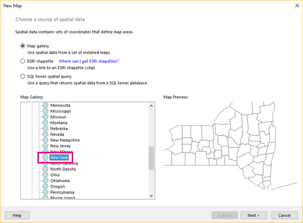
Select Next.
On the Choose spatial data and map view options page, accept the defaults and select Next.
By default, map elements from a map gallery are automatically embedded in the report definition.
On the Choose map visualization page, verify Basic Map is selected, and choose Next.
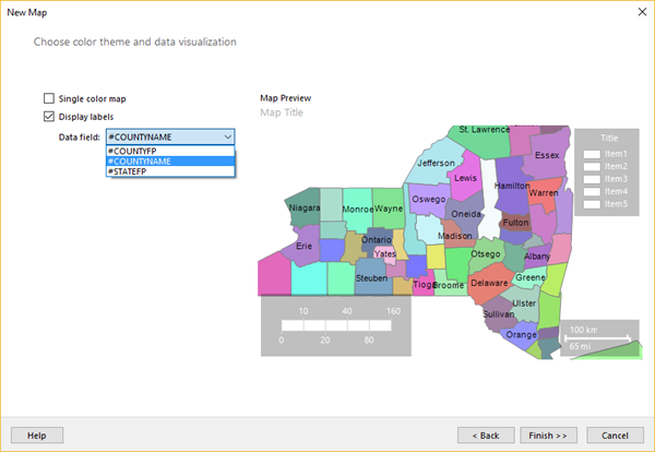
On the Choose color theme and data visualization page, select the Display labels option.
If the option is selected, clear the Single color map option.
From the Data field drop-down list, select #COUNTYNAME. The Map Preview pane in the wizard displays the following items:
A title with the text Map Title.
A map that displays counties in New York where each county is a different color and the county name appears wherever it fits over the county area.
A legend that contains a title and a list of items 1 through 5.
A color scale that contains values 0 to 160 and no color.
A distance scale that displays kilometers (km) and miles (mi).
Select Finish.
The map is added to the design surface.
Select the "Map Title" text and enter Sales by Store > ENTER.
Double-click the map to display the Map Layers Pane. The Map Layers Pane shows one polygon layer, PolygonLayer1, of layer type Embedded. Each county is an embedded map element on this layer.
Note
If you don't see the Map Layers pane, it might be displayed outside your current view. Use the scroll bar at the bottom of the Design view window to change your view. Alternatively, in the View tab, clear the Report Data option to provide more design surface area.
Select the arrow next to PolygonLayer1 > Polygon properties.
On the Font tab, change the color to Dim Gray.
On the Home tab > Run to preview the report.
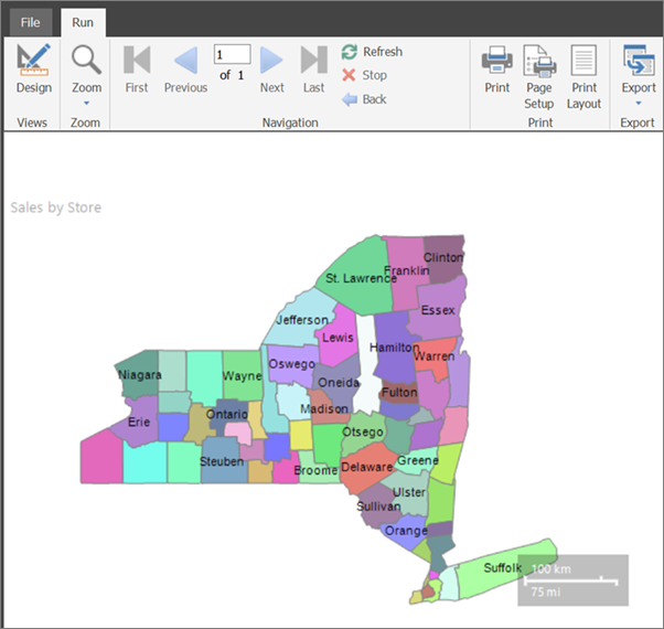
The rendered report displays the map title, the map, and the distance scale. The counties are on a map polygon layer. Each county is a polygon that varies by color from a color palette, but the colors aren't associated with any data. The distance scale displays distances in both kilometers and miles.
The map legend and color scale don't yet appear because there's no analytical data associated with each county. You add analytical data later in this tutorial.
2. Add a map point layer to display store locations
In this section, you use the map layer wizard to add a point layer that displays the locations of stores.
Note
In this tutorial, the query contains the data values, so it does not need an external data source. This makes the query quite long. In a business environment, a query would not contain the data. This is for learning purposes only.
Add a point layer based on a SQL Server spatial query
On the Run tab > Design to switch back to Design view.
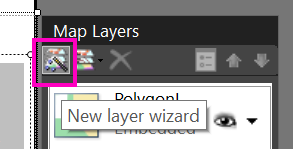
Double-click the map to display the Map Layers pane. On the toolbar, select the New layer wizard button
 .
.
On the Choose a source of spatial data page, select SQL Server spatial query, and choose Next.
On the Choose a dataset with SQL Server spatial data page, select Add a new dataset with SQL Server spatial data > Next.
On the Choose a connection to a SQL Server spatial data source page, select an existing data source or browse to the report server and choose a data source.
Note
The data source you choose is unimportant, as long as you have adequate permissions. You will not be getting data from the data source. For more information, see Alternative ways to get a data connection (Report Builder).
Select Next.
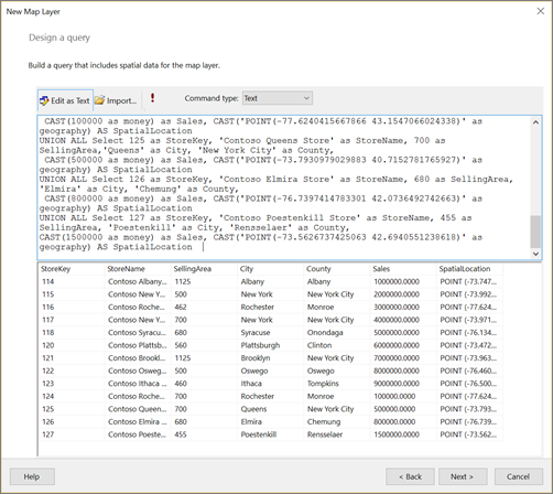
On the Design a Query page, select Edit as Text.
Copy the following text and paste it in the query pane:
Select 114 as StoreKey, 'Contoso Albany Store' as StoreName, 1125 as SellingArea, 'Albany' as City, 'Albany' as County,
 CAST(1000000 as money) as Sales, CAST('POINT(-73.7472924218681 42.6564617079878)' as geography) AS SpatialLocation
UNION ALL SELECT 115 AS StoreKey, 'Contoso New York No.1 Store' AS  StoreName, 500 as SellingArea, 'New York' AS City, 'New York City' as County,
 CAST('2000000' as money) as Sales, CAST('POINT(-73.9922069374483 40.7549638237402)' as geography) AS SpatialLocation
UNION ALL Select 116 as StoreKey, 'Contoso Rochester No.1 Store' as StoreName, 462 as SellingArea, 'Rochester' as City,  'Monroe' as County,
 CAST(3000000 as money) as Sales, CAST('POINT(-77.624041566786 43.1547066024338)' as geography)  AS SpatialLocation
UNION ALL Select 117 as StoreKey, 'Contoso New York No.2 Store' as StoreName, 700 as SellingArea, 'New York' as City,'New York City' as County,
  CAST(4000000 as money) as Sales, CAST('POINT(-73.9712488 40.7830603)' as geography) AS SpatialLocation
UNION ALL Select 118 as StoreKey, 'Contoso Syracuse Store' as StoreName, 680 as SellingArea, 'Syracuse' as City, 'Onondaga' as County,
 CAST(5000000 as money) as Sales, CAST('POINT(-76.1349120532546 43.0610223535974)' as geography) AS SpatialLocation
UNION ALL Select 120 as StoreKey, 'Contoso Plattsburgh Store' as StoreName, 560 as SellingArea, 'Plattsburgh' as City,  'Clinton' as County,
 CAST(6000000 as money) as Sales, CAST('POINT(-73.4728622833178 44.7028831413324)' as geography) AS SpatialLocation
UNION ALL Select 121 as StoreKey, 'Contoso Brooklyn Store' as StoreName, 1125 as SellingArea, 'Brooklyn' as City, 'New York City' as County,
 CAST(7000000 as money) as Sales, CAST('POINT (-73.9638533447143 40.6785123489351)' as geography) AS SpatialLocation
UNION ALL Select 122 as StoreKey, 'Contoso Oswego Store' as StoreName, 500 as SellingArea, 'Oswego' as City, 'Oswego' as County,
 CAST(8000000 as money) as Sales, CAST('POINT(-76.4602850815536 43.4353224527794)' as geography) AS SpatialLocation
UNION ALL Select 123 as StoreKey, 'Contoso Ithaca Store' as StoreName, 460 as SellingArea, 'Ithaca' as City, 'Tompkins' as County,
 CAST(9000000 as money) as Sales, CAST('POINT(-76.5001866085881 42.4310489934743)' as geography) AS SpatialLocation
UNION ALL Select 124 as StoreKey, 'Contoso Buffalo Store' as StoreName, 700 as SellingArea, 'Buffalo' as City, 'Erie' as County,
 CAST(100000 as money) as Sales, CAST('POINT(-78.8784 42.8864)' as geography) AS SpatialLocation
UNION ALL Select 125 as StoreKey, 'Contoso Queens Store' as StoreName, 700 as SellingArea,'Queens' as City, 'New York City' as County,
 CAST(500000 as money) as Sales, CAST('POINT(-73.7930979029883 40.7152781765927)' as geography) AS SpatialLocation
UNION ALL Select 126 as StoreKey, 'Contoso Elmira Store' as StoreName, 680 as SellingArea, 'Elmira' as City, 'Chemung' as County,
 CAST(800000 as money) as Sales, CAST('POINT(-76.7397414783301 42.0736492742663)' as geography) AS SpatialLocation
UNION ALL Select 127 as StoreKey, 'Contoso Poestenkill Store' as StoreName, 455 as SellingArea, 'Poestenkill' as City, 'Rensselaer' as County,
CAST(1500000 as money) as Sales, CAST('POINT(-73.5626737425063 42.6940551238618)' as geography) AS SpatialLocation
On the query designer toolbar, select Run (!).
The result set contains seven columns representing a set of stores in New York State that sell consumer goods. Here's a list, with explanations for the ones that might not be obvious:
- StoreKey: A store identifier.
- StoreName.
- SellingArea: The area available for product display, ranging from 455 square feet to 1125 square feet.
- City.
- County.
- Sales: Total sales.
- SpatialLocation: Location in longitude and latitude.
Select Next.
The report dataset named DataSet1 is created for you. After you complete the wizard, you can see its field collection in the Report Data pane.
On the Choose a spatial data and map view options page, verify that the Spatial field is SpatialLocation and that the Layer type is Point. Accept the other defaults on this page.
The map view displays circles to mark the location of each store.
Select Next.
On the Choose map visualization page, select Bubble Map for a map type that displays markers that vary in size, according to the data. Choose Next.
On the Choose the analytical dataset page, select DataSet1, and choose Next. This dataset contains both analytical data and spatial data displayed on the new point layer.
On the Choose color theme and data visualization page, select Use bubble sizes to visualize data.
In Data field, select
[Sum(SellingArea)]to vary bubble size by the size of the area a store sets aside to display the products.Select Display labels, and in Data field, choose
[City].Select Finish.
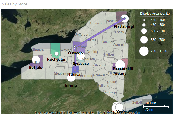
The map layer is added to the report. The legend displays bubble sizes based on SellingArea values.
Double-click the map to display the Map Layer pane. The Map Layer pane displays a new layer, PointLayer1, with spatial data source type DataRegion.
Add a legend title. In the legend, select the text Title, enter Display Area (sq. ft.) and press ENTER.
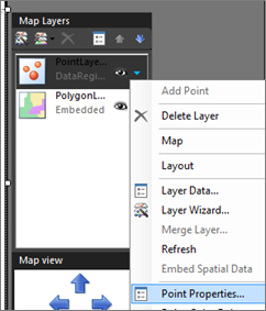
In the Map Layers Pane, select the arrow next to PointLayer1, and then choose Point Properties.
On the Font tab, make the style Bold and the size 10pt.
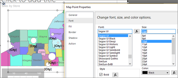
On the General tab, select Bottom for Placement.
Select OK.
Select Run to preview the report.
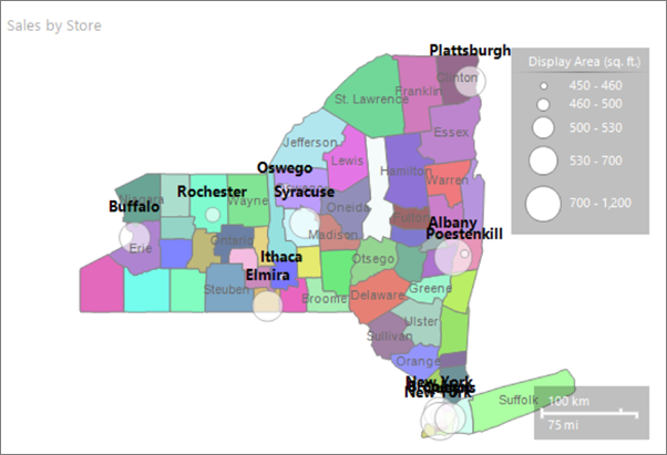
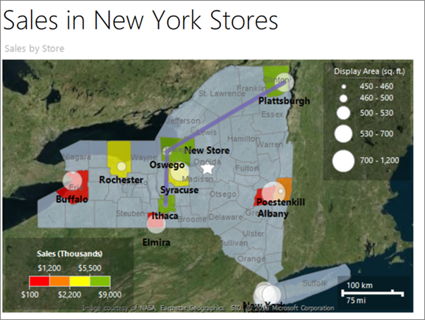
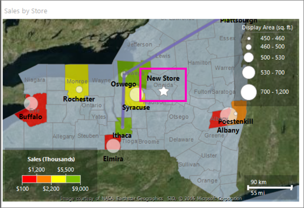
The map displays the locations of stores in New York state. The marker size for each store is based on the display area. Five ranges of display area were automatically calculated for you.
3. Add a map line layer to display a route
Use the map layer wizard to add a map layer that displays a route between two stores. In this tutorial, the path is created from three store locations. In a business application, the path might be the best route between stores.
Add a line layer to map
Switch to Design view.
Double-click the map to display the Map Layer pane. On the toolbar, select the New layer wizard button
.On the Choose a source of spatial data page, select SQL Server spatial query and choose Next.
On the Choose a dataset with SQL Server spatial data page, select Add a new dataset with SQL Server spatial data and choose Next.
On the Choose a connection to a SQL Server spatial data source, select the data source that you used in the first procedure.
Select Next.
On the Design a Query page, select Edit as Text. The query designer switches to text-based mode.
Paste the following text in the query pane:
SELECT N'Path' AS Name, CAST('LINESTRING(
   -76.5001866085881 42.4310489934743,
   -76.4602850815536 43.4353224527794,
   -73.4728622833178 44.7028831413324)' AS geography) as Route
Select Next.
A path appears on the map that connects three stores.
On the Choose spatial data and map view options page, verify that the Spatial field is Route and that the Layer type is Line. Accept the other defaults.
The map view displays a path from a store in the northern part of New York state to a store in the southern part of New York state.
Select Next.
On the Choose map visualization page, select Basic Line Map, and then choose Next.
On the Choose color theme and data visualization, select the option Single color map. The path appears as a single color based on the selected theme.
Select Finish.
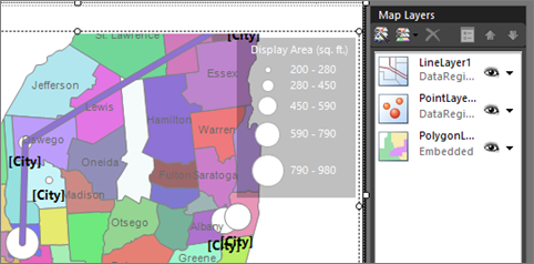
The map displays a new line layer with spatial data source type DataRegion. In this example, the spatial data comes from a dataset but no analytical data is associated with the line.
Adjust the zoom
If you can't see the whole state of New York, you can adjust the zoom. With the map selected, in the Properties pane you see MapViewport properties.
Expand the View section, then expand View so you can see the Zoom property. Set it to 125.
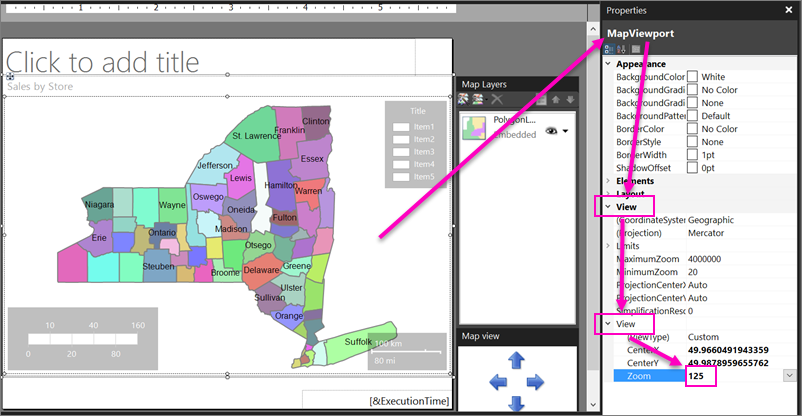
This number is the zoom percentage. At 125%, you should see the whole state.
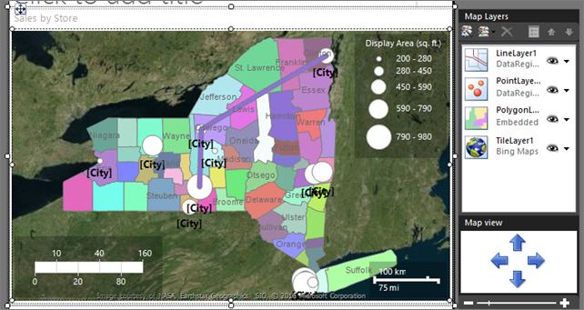
4. Add a Bing Maps tile background
In this section, you add a map layer that displays a Bing Maps tile background.
Switch to Design view.
Double-click the map to display the Map Layer pane. On the toolbar, select Add Layer
 .
.From the drop-down list, select Tile Layer.
The last layer in the Map Layer pane is TileLayer1. By default, the tile layer displays the road map style.
Note
In the wizard, you can also add a tile layer on the Choose spatial data and map view options page. To do this, select Add a Bing Maps background for this map view. In a rendered report, the tile background displays Bing Maps tiles for the current map viewport center and zoom level.
Select the arrow next to TileLayer1 > Tile Properties.
On the General tab, under Type, select Aerial. The aerial view doesn't contain text.
Select OK.
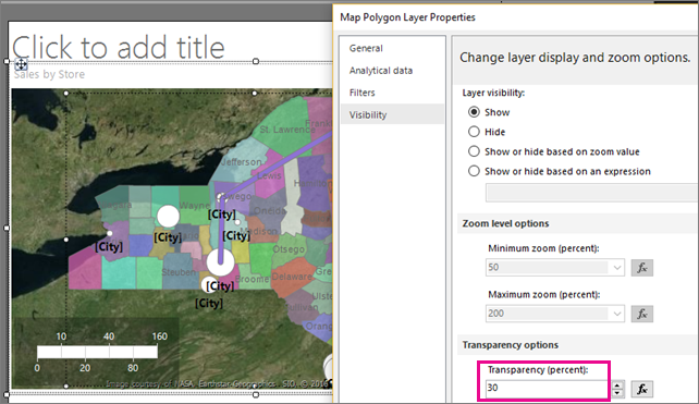
5. Make a layer transparent
In this section, to let the items on one layer show through another layer, you adjust the order and transparency of the layers for the effect that you want. You start with the first layer you created, PolygonLayer1.
Double-click the map to display the Map Layer pane.
Select the arrow next to PolygonLayer1 > Layer Data. The Map Polygon Layer Properties dialog box opens.
On the Visibility tab, under Transparency (percent), enter 30.
Select OK.
The design surface displays the counties as semi-transparent.
6. Vary county color based on sales
Each county on the polygon layer has a different color. The color report processor automatically assigns a color value to the counties from the color palette based on the theme that you chose on the last page of the map wizard.
In this section, you specify a color rule to associate specific colors with a range of store sales for each county. The colors red-yellow-green indicate relative high-middle-low sales. Format the color scale to show currency. Display the annual sales ranges in a new legend. For counties that don't contain stores, use no color to show that there's no associated data.
6a. Build a relationship between spatial and analytical data
To vary the county shapes by color based on analytical data, you first need to associate the analytical data with the spatial data. In this tutorial, you use the county name to match on.
Switch to Design view.
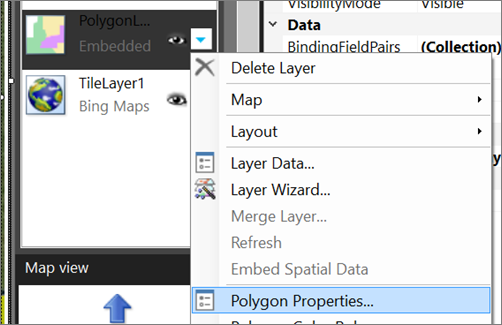
Double-click the map to display the Map Layers pane.
Select the arrow next to PolygonLayer1, then choose Layer Data. The Map Polygon Layer Properties dialog box opens.
On the Analytical data tab, under Analytical dataset, select DataSet1. The wizard created this dataset when you created the spatial data query for the counties.
Under Fields to match on, select Add. A new row is added.
Under From spatial dataset, select COUNTYNAME.
Under From analytical dataset, select [County].
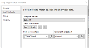
Select OK.
Preview the report.
By specifying a match field from the spatial data source and from the analytical dataset, you enable the report processor to group analytical data based on the map elements. A data-bound map element has a successful match for the values that you specified.
Each county that contains a store has a color that is based on the color palette for the style that you chose in the wizard. The other counties are gray.
6b. Specify color rules for polygons
To create a rule that varies the color of each county based store sales, you must specify the range values, the number of divisions within that range that you want to display, and the colors to use.
Specify color rules for all polygons that have associated data
Switch to Design view.
Select the arrow next to PolygonLayer1, then choose Polygon Color Rule. The Map Color Rules Properties dialog box opens. Notice that the color rule option Visualize data by using color palette is selected. The wizard sets this option.
Select Visualize data by using color ranges. Start color, middle color, and end color options replace the palette option.
Define range values for sales per county. In Data field, from the drop-down list, select
[Sum(Sales)].To change the format to display currency in thousands, change the expression to the following example:
=Sum(Fields!Sales.Value)/1000Change Start color to Red.
Change End color to Green.
Red represents low sales values, Yellow represents middle sales values, and Green represents high sales values. The report processor calculates a range of colors based on these values and the options that you choose on the Distribution page.
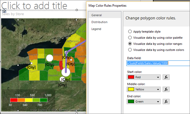
Select Distribution.
Verify that the distribution type is Optimal. For the expression from step 5, optimal distribution divides the values into subranges that balance the number of items in each range and the span for each range.
Accept the default values for other options on this page. When you select the optimal distribution type, the number of subranges are calculated when the report runs.
Select Legend.
In Color scale options, verify that Show in color scale is selected.
In Show in this legend, from the drop-down list, select the blank line. For now, you show the color ranges only in the color scale.
Select OK.
Preview the report.
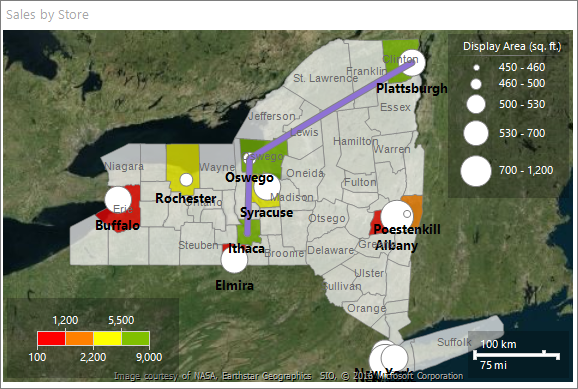
The color scale displays four colors: red, orange, yellow, and green. Each color represents a sales range that is automatically calculated based on the sales by county.
6c. Format the data in the color scale as currency
By default, data has a general format. In this section, you apply custom formats.
Switch to Design view.
Select the color scale. On the Home tab, go to the Number section. Choose Currency.
Still in the Number section, select the Decrease Decimal button two times.
The color scale displays annual sales in currency format for each range.
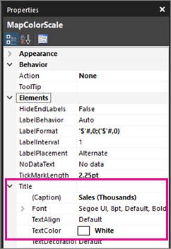
6d. Add a Legend Title
With the color scale still selected, in the Properties pane you see properties for MapColorScale.
Expand the Title section, and in the Caption property, enter Sales (Thousands).
Change the TextColor property to White.
Preview the report.
The counties that have associated stores and sales display according to the color rules. Counties that have no sales have no color.
6f. Change color for counties with no data
You can set the default display options for all map elements on a layer. Color rules take precedence over these display options.
Set the display properties for all elements on a layer
Switch to Design view.
Double-click the map to display the Map Layer pane.
Select the down arrow on PolygonLayer1, and then select Polygon Properties.
The Map Polygon Properties dialog box opens. Display options set in this dialog box apply to all polygons on the layer before rule-based display options are applied.
On the Fill tab, verify that the fill style is Solid. Gradients and patterns apply to all colors.
In Color, select Light Steel Blue.
Select OK.
Preview the report.
Counties with no associated data display as gray-blue. Only counties with associated analytical data have the Red through Green colors from the color rules that you specified.
7. Add a custom point
To represent a new store not built yet, in this section you specify a point with the Star marker type.
Switch to Design view.
Double-click the map to display the Map Layer pane. On the toolbar, select Add Layer
, then choose Point Layer.A new point layer is added to the map. By default, the point layer has spatial data type Embedded.
Select the arrow on PointLayer2 > Add Point.
Move the pointer over the map viewport. The cursor changes to crosshairs.
Select the location on the map where you want to add a point. In this tutorial, choose a location in Oneida county. A point marked by a circle is added to the layer at the spot where you clicked. By default, the point is selected.
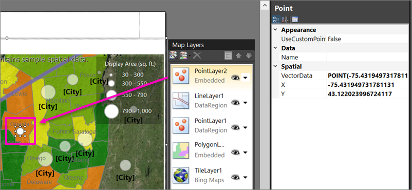
Right-click the point you added, and then select Embedded Point Properties.
Select Override point options for this layer. More pages appear in the dialog box. Values that you set here take precedence over display options for the layer or for color rules.
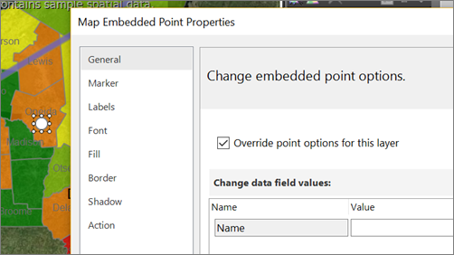
On the Marker tab, for Marker type, select Star.
Change Marker size to 18pt.
On the Labels tab, in Label text, enter New Store.
In Placement, select Top.
On the Font tab, make the font size 10pt and Bold.
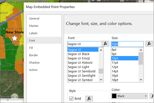
Select OK.
Preview the report.
The label appears above the store location.
8. Center and resize the map
In this section, you learn to change the map center, and another way to change the zoom level.
Switch to Design view.
Select the map, then right-click and choose Viewport Properties.
On the Center and Zoom tab, make sure Set a view center and zoom level is selected.
Set Zoom level (percent) to 125.
Select OK.
Select the map, and drag to center it where you want it.
You can also use the mouse wheel to change the zoom level.
Preview the report.
In Design view, the map on the display surface and the view is based on sample data. In the rendered report, the map view is centered on the view that you specified.
9. Add a report title
Switch to Design view.
On the design surface, select Click to add title.
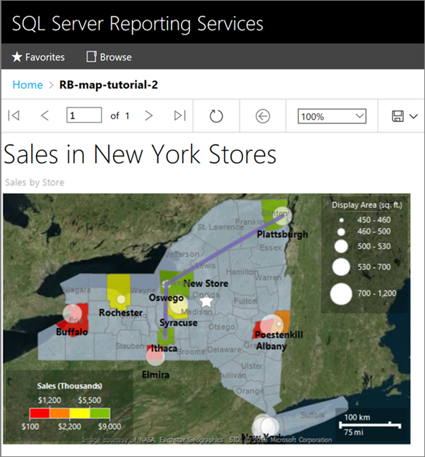
Enter Sales in New York Stores and then select outside the text box.
This title appears at the top of the report. Items at the top of the report body when there's no page header defined are the equivalent of a report header.
10. Save the report
In Design view or Preview, on the File menu > Save As.
In Name, enter Store Sales in New York.
Save it to your local computer or to a Reporting Services server.
Select Save.
If you save it to a report server, you can view it there.
Next step
You successfully completed the tutorial for how to add a map to your report.
For more information, see Maps in a paginated report (Report Builder).
Related content
Feedback
Coming soon: Throughout 2024 we will be phasing out GitHub Issues as the feedback mechanism for content and replacing it with a new feedback system. For more information see: https://aka.ms/ContentUserFeedback.
Submit and view feedback for