Analytical options overview
Analytics represent a key element in many organizations, but they're especially important in sales organizations. Through analytics, organizations can gain a better understanding of themselves by diving deeper into information like:
- Opportunities won and lost
- Average time to close
- The most effective lead sources
- Other demographic data
They can use this information to build long-term strategies that will help them grow their business, based on factors like strengths and weaknesses. By its nature, Microsoft Dynamics 365 lends itself well to analytics.
When they dive deeper into information about leads, opportunities, quotations, and so on, organizations can answer questions like:
- What areas are we strong in?
- What areas are we weak in?
- What do our numbers look like geographically?
- How do we compare with our competitors?
- What does our win rate look like by region, demographic, product, and so on?
Out of the box, Microsoft Dynamics 365 Sales provides several tools that can help answer many of these questions. Here are some of the most common tools that are available:
Lists and views- Lists and views provide one of the easiest ways to do basic analysis of data. They include multiple options for filtering and sorting data. Each record type has several predefined views. More views can be added, based on individual needs.
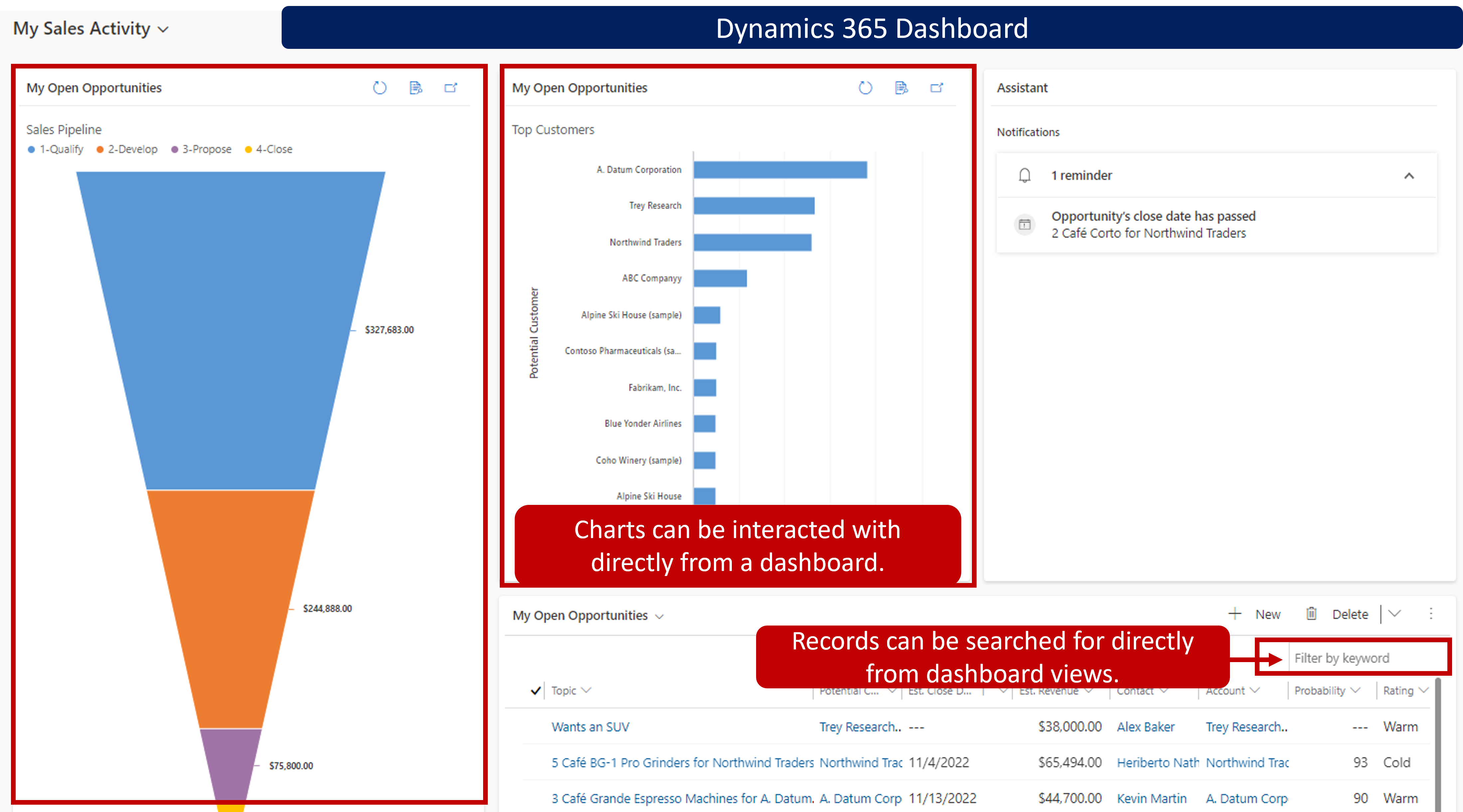
Charts- Charts provide a visual representation of information in real time, based on the lists and views that are associated with specific row record types, like leads and opportunities. Dynamics 365 includes several interactive charts.
Dashboards- Dashboards are used to consolidate data from multiple record types into a single interactive area. Dashboards can include charts, lists, and data from custom HTML pages, external websites, and other resources. Dynamics 365 includes multiple dashboards.
Advanced Find feature- Advanced Find lets users run complex and comprehensive searches for all types of information. For example, users can search for information from different types of records and view the combined data. Searches and results can be saved as personal views for later use.
Microsoft Excel- Users can export data from Dynamics 365 to Excel to take advantage of the analysis tools that Excel offers, like more detailed charting capabilities and PivotTables. Dynamics 365 data can be exported to Excel as a static worksheet, a dynamic worksheet, or a dynamic PivotTable. Organizations that use Microsoft Excel Online can open Dynamics 365 views in Excel Online and edit them directly in the Dynamics 365 user interface.
As we've seen, Dynamics 365 offers many out-of-box reporting and analysis options. In addition, business intelligence (BI) applications can use Dynamics 365 as a data source for more detailed analytics. One of the most common BI applications that can interact with Dynamics 365 is Microsoft Power BI. Power BI is part of Microsoft Power Platform.
Many organizations use Power BI to do more complex BI reporting. Power BI can pull data from multiple data sources to support more advanced analytical needs. Dynamics 365 can be one of those data sources. Power BI automatically updates the data that's shown in Dynamics 365. By using Power BI Desktop or Microsoft Power Query for Excel to write reports, and by using Power BI to share dashboards and update data from Dynamics 365, sales, marketing, and service personnel in your organization have a powerful new way to work with Dynamics 365 data.
Visualize a view with Power BI
Power BI is one of the most popular analytic tools available today. It provides powerful data analysis and rich visualizations. You can now easily leverage Power BI to create powerful visualizations without leaving Dynamics 365 apps. The Visualize this view button automatically generates a set of Power BI visuals for you to explore and find insights within your data.

A dialog opens with an automatically generated report with a few fields selected for you in the Your data pane on the right. The visuals within the report will use some or all of your selected fields and potentially other fields from the table that work well with chosen fields.
Changing the data displayed in the report is easy. In the Your data pane, you can easily add or remove fields that you’re interested in visualizing. Once you’ve finished your exploration and are ready to save, just select the Save button in the app bar, give it a name, and pick a workspace.
To learn more about the visualize a view feature, see: Visualize your data quickly from Power Apps and Dynamics 365 apps.