Arrange views with StackLayout
Note
.NET MAUI is the next evolution of Xamarin and what we recommend you develop mobile and desktop apps with, and you can learn more about .NET MAUI in several training modules. This Xamarin training module will not be maintained going forward.
Stacking views in a vertical or horizontal list is a common design for user interfaces. Think about some common pages in applications. Examples include sign-in, register, and settings pages. All these pages typically contain stacked content. In this unit, we'll learn how to arrange views in a vertical or horizontal list by using StackLayout.
What is a StackLayout?
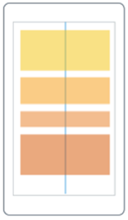
StackLayout is a layout container that organizes its children left-to-right or top-to-bottom. The direction is based on its Orientation property, and the default value is top-to-bottom. The following illustration shows a conceptual view of a vertical StackLayout.
StackLayout has a list of Children that it inherits from its base class Layout<T>. The list stores views, which is good because most UI elements you'll work with in Xamarin.Forms derive from View. Layout panels are also derived from View, which means you can nest panels if you need to.
How to add views to a StackLayout
In Xamarin.Forms, you can add views to a StackLayout in C# code or in XAML. Here's an example of three views added using code:
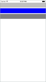
var a = new BoxView() { BackgroundColor = Color.Silver };
var b = new BoxView() { BackgroundColor = Color.Blue };
var c = new BoxView() { BackgroundColor = Color.Gray };

stack.Children.Add(a);
stack.Children.Add(b);
stack.Children.Add(c);
We add the views to the Children collection and StackLayout automatically sizes and positions the views in a vertical list. Here's what it will look like on an iOS device:
Now let's look at how we would do the same thing in XAML. Here's an example of the same three views being added to a StackLayout in XAML:
<StackLayout>
    <BoxView Color="Silver" />
    <BoxView Color="Blue" />
    <BoxView Color="Gray" />
</StackLayout>
Notice how in XAML we simply nest the children inside the StackLayout tags. The XAML parser adds the nested views to the Children collection automatically because Children is the ContentProperty for all layout panels.
How views are ordered in a StackLayout
The order of the views in the Children collection determines their layout order when they're rendered. For views added in XAML, the textual order is used. For children added in code, the layout order is determined by the order in which you called the Add method.
How to change the space between views in a StackLayout
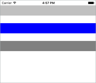
It's common to want some space between the children of a StackLayout. StackLayout automatically adds a bit of room between each child, but you can control the space by using the Spacing property. The default value is six units, but you can set it to whatever looks good to you. Here's an example of setting the Spacing property to 30 in XAML:
<StackLayout Spacing="30">
    <BoxView Color="Silver" />
    <BoxView Color="Blue" />
    <BoxView Color="Gray" />
</StackLayout>
The following screenshot shows how the UI would render on iOS:
How to set the orientation of a StackLayout
StackLayout lets you arrange children in either a column or a row. You control this behavior by setting its Orientation property. So far, we've been showing only a vertical StackLayout.
Vertical is the default. Whether you explicitly set the Orientation to Vertical is up to you. Some programmers prefer an explicit setting to make the code more self-documenting.
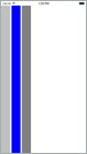
Here's an example of setting the Orientation to Horizontal in XAML:
<StackLayout Orientation="Horizontal">
    <BoxView Color="Silver" />
    <BoxView Color="Blue" />
    <BoxView Color="Gray" />
</StackLayout>
The following screenshot shows how the UI would render on iOS:
Set a view's LayoutOptions in a StackLayout
Now that we've seen how to add views to a StackLayout, we need to look at how StackLayout handles a view's LayoutOptions. Recall that every view has a VerticalOptions and HorizontalOptions property. You use these properties to set the position of the view within the rectangle the layout panel gave it.
With StackLayout, the behavior of the LayoutOptions properties depends on the Orientation property of the StackLayout. StackLayout uses the LayoutOptions property in the direction opposite to its Orientation. For example, if the StackLayout Orientation property is set to vertical, only the view's HorizontalOptions property is respected. If the StackLayout's Orientation property is set to horizontal, only the view's VerticalOptions property is respected.
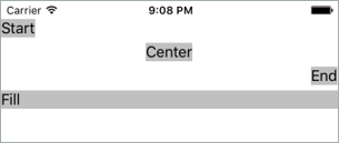
Let's look at two examples to illustrate this point. In this first example, we have a StackLayout with a vertical Orientation where all the children use HorizontalOptions. Because horizontal is the opposite of vertical, the StackLayout will respect these settings.
<StackLayout Orientation="Vertical">
    <Label ... HorizontalOptions="Start" />
    <Label ... HorizontalOptions="Center" />
    <Label ... HorizontalOptions="End" />
    <Label ... HorizontalOptions="Fill" />
</StackLayout>
Here's how the rendered iOS screen would look:
For the second example, look at this code:
<StackLayout Orientation="Vertical">
    <Label ... VerticalOptions="Start" />
    <Label ... VerticalOptions="Center" />
    <Label ... VerticalOptions="End" />
    <Label ... VerticalOptions="Fill" />
</StackLayout>
Notice that the StackLayout's Orientation property is set to vertical and its child views are using VerticalOptions. By default, an element in a stack layout will not be allocated any additional space in the same direction as the Orientation of the stack layout. Assigning a position for that direction in this default case will not change the rendering of the element. There is a change in the rendering, though, when position is combined with expansion.
What is expansion?
Recall from an earlier unit that the LayoutOptions struct contains a bool property called Expands. This property is designed specifically for StackLayout and allows a child view to request extra space if there's any available. Here's an example of how the Expands property works:
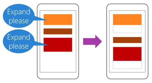
Notice that there's extra space available in the StackLayout. The extra space will be divided evenly among all views that request additional space.
How to request additional space
Remember that every view has two LayoutOptions properties called VerticalOptions and HorizontalOptions. So far, we've talked about four values for these properties: Start, Center, End, and Fill. If you want to request additional space, you replace the LayoutOptions value with one of these values: StartAndExpand, CenterAndExpand, EndAndExpand, or FillAndExpand.
Here's how each of these values works:
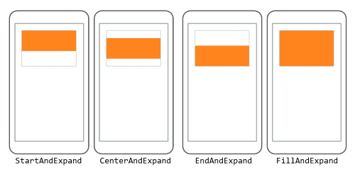
The orange box is the view and the gray rectangle represents the extra space given to it by the Expands property. The view fills the extra space only when you use the FillAndExpand value. When you use the other values, the extra space remains empty, but it can't be used by other views in the StackLayout.