Exercise - Use Grid to build a user interface
Note
.NET MAUI is the next evolution of Xamarin and what we recommend you develop mobile and desktop apps with, and you can learn more about .NET MAUI in several training modules. This Xamarin training module will not be maintained going forward.
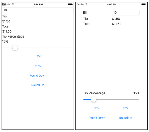
In this exercise, you'll use a Grid to arrange the views in your UI. The first screenshot shows the starter project, and the second one shows the completed project. Your job is to use a Grid to turn the starter project into the completed version.
Open the starter solution
The starter solution contains a fully functional tip calculator app.
Open the TipCalculator project from the exercise3 > start folder in your cloned or downloaded exercise repo.
Open MainPage.xaml. Notice that all the views are in one vertical
StackLayout.
Create a Grid layout
Let's create a Grid to hold our views.
Add
40units of padding to theContentPageto avoid overlap of the UI and the iOS status bar.<ContentPage ... Padding="40">Change the layout panel from
StackLayouttoGrid.Define seven rows and two columns for the
Grid. Make all the rowsAutosize except the fourth row. The fourth row should useStarso it will get all the extra space. UseStarsizing for both columns.<Grid.RowDefinitions> <RowDefinition Height="Auto" /> <RowDefinition Height="Auto" /> <RowDefinition Height="Auto" /> <RowDefinition Height="*" /> <RowDefinition Height="Auto" /> <RowDefinition Height="Auto" /> <RowDefinition Height="Auto" /> </Grid.RowDefinitions> <Grid.ColumnDefinitions> <ColumnDefinition Width="*" /> <ColumnDefinition Width="*" /> </Grid.ColumnDefinitions>
Position the views in the cells
We've defined the Grid structure. Now we need to add our views to the Grid. We'll do that by using the Grid.Row and Grid.Column attached properties.
Add settings for
Grid.RowandGrid.Columnto each of the views to assign them to the appropriate cell in theGrid. Use the following screenshot to help you determine where each view should be placed: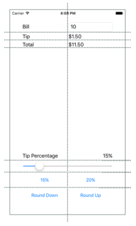
Align the Bill
LabelandEntryby settingVerticalOptionstoCenteron the Label.Add a setting for
Grid.ColumnSpanto theSliderso it spans two columns:<Slider ... Grid.ColumnSpan="2" ... />Locate the
Labelwith text Tip Percentage. Set it so it will occupy the lower-left position in its rectangle:<Label Text="Tip Percentage" VerticalOptions="End" HorizontalOptions="Start" ... />Locate the
Labelnamed tipPercent. Set it so it will occupy the lower-right position in its rectangle:<Label x:Name="tipPercent" VerticalOptions="End" HorizontalOptions="End" ... />
Examine the results
Run the application and look at the differences in the UI. You used a Grid to improve the aesthetics of an existing UI. Grid is more powerful than StackLayout. In particular, Grid makes it easy to align views across rows.