App development
The importance of accessibility extends to all forms of technology, including digital software and applications. There are two key factors to consider when designing an app: the user interface (UI) and the programmatic access. UI is the means by which a user and a computer system interact, such as the links and graphics used for navigation. Programmatic access relates to how one app can programmatically access information in another app, such as by calling code. For example, if someone is using a screen reader to access an app, the screen reader calls code to communicate what is going on in the UI of that app.
There are many steps to making an app accessible, but some critical points to remember are:
- Expose your UI elements to programmatic access.
- Ensure that your app supports keyboard navigation for people who are unable to use a mouse or touchscreen.
- Make sure that your app supports accessible color and contrast settings.
Keyboard navigation
For users who are blind or have mobility issues, being able to navigate an app with a keyboard is critical. However, only controls that require user interaction to function should be given keyboard focus, such as links, buttons, and form controls. Components that don't require an action, such as static images, don't need keyboard focus. For example, the Microsoft logo is a static image that doesn't require an action.
Unlike navigating with a mouse or touch screen, keyboard navigation is linear. When considering keyboard navigation, think about how the user interacts with your product and what the logical navigation is. In Western cultures, people typically read from left to right, top to bottom. It's therefore common practice to follow this pattern for keyboard navigation.
When designing keyboard navigation, examine your UI and think about these questions:
- How are the controls laid out or grouped in the UI?
- Are there a few significant groups of controls?
- If yes, do those groups contain another level of groups? For example, do menu items have sublists nested within them?
- Among peer controls, are users able to navigate by tabbing around, or does your UI require special navigation, such as arrow keys?
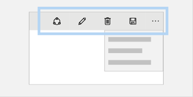
Group of app menu elements/controls
The goal is to help the user understand how the UI is laid out, and identify the controls that are actionable. If too much tabbing is required before the user completes the navigation loop, consider grouping related controls together. Some controls that are related, such as a hybrid controls, might need to be addressed at the early exploration stage of developing your app. After you begin to develop your product, it's difficult to rework the keyboard navigation, so plan carefully and plan early!
To learn more about keyboard navigation among UI elements, explore the Windows Dev Center documentation about Keyboard accessibility.
The Engineering Software for Accessibility eBook has a helpful chapter on this subject titled "Designing the Logical Hierarchy."
Color and contrast
One of the built-in accessibility features in Windows is high contrast mode, which heightens the color contrast of text and images on the computer screen. For some people, increasing the contrast in colors reduces eyestrain, and makes it easier to read.
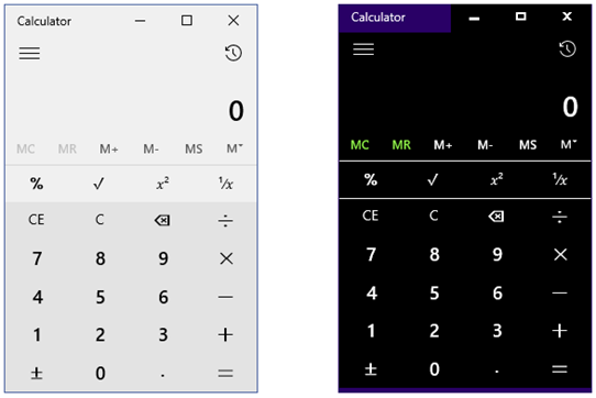
Calculators shown in light theme and high-contrast black theme
The UI for your app must be designed to work equally well when viewed with or without high contrast mode. For example, when you verify your UI in high contrast, check that the controls are coded consistently, and that you use system colors and not hard-coded colors. Ensure that a high contrast user is able to see all the controls on the screen that a user who isn't using high contrast would see.
As long as you don't override system colors, a Universal Windows Platform (UWP) app that works on all Windows-based platforms and devices supports high-contrast themes by default. If a user selects a high-contrast theme from their device's system settings or accessibility tools, the UWP framework automatically uses colors and style settings that produce a high-contrast layout and rendering for controls and components in the UI.
For more information, see this Windows support article about High-contrast.
If you prefer to use your own color theme for design purposes instead of system colors, consider these guidelines:
Color contrast ratio: The updated Section 508 of the Rehabilitation Act, and other legislation, requires that the default color contrast between text and its background must be at least 4.5:1. The ratio specifically refers to the luminance contrast of the text and background. One way to think of luminance contrast is the difference between the lightness and darkness of the text and background colors. For example, white text on a black background has a ratio of 21:1. More colorful schemes for text and backgrounds can be used, but the ratio should be at least 4.5:1 or better.
The ratios for large text don't have to be as great. For large text, the required default contrast is 3:1. Large text is defined as font size 18-point and larger, or 14-point and bold (and larger).
Color combinations: About 7 percent of males (and less than 1 percent of females) have some form of color deficiency. Users with colorblindness have problems distinguishing between certain colors, so color alone should never be used to convey status or meaning in an application. In other words, don't refer to the "red dot" on a screen. Instead, you can include an icon with a distinctive marking or shape that a person with colorblindness can easily identify. As for decorative images such as icons or backgrounds, color combinations should be chosen in a manner that maximizes the perception of the image by colorblind users.

Examples of an icon with high color contrast (21:1 ratio) and an icon with low color contrast (1:5 ratio)
Programmatic access
Programmatic access is necessary to create accessibility in apps. Programmatic access ensures that UI controls are exposed to assistive technology or alternative output devices.
Without programmatic access, the APIs for assistive technology can't interpret information correctly, leaving the user unable to effectively use or interact with the app. The assistive technology that someone uses determines what actions and options are available to them. Therefore, if an app doesn't have accessible names and descriptions, several parts might be deemed unavailable by the assistive technology.
For example, accessible names and descriptions for content and interactive UI controls are critical elements to achieve programmatic access in your app. For people who use Microsoft Narrator or a Braille display to use an app, the descriptive names for images or buttons help them understand and navigate the app.
For more information about making app UI elements available to assistive technologies, review the Windows Dev Center documentation about how to expose basic accessibility information.
For more information about assistive technology applications, explore the list of Microsoft assistive technology partners.
Accessibility checklists
As we covered in this module, there are several steps required to make your app accessible. You might find it helpful to follow a checklist to keep track of each requirement as you develop your app. Here's an abbreviated version of an accessibility checklist you might find useful:
- Set the accessible name (required) and description (optional) for content and interactive elements in your app.
- Implement keyboard accessibility.
- Visually verify your UI to ensure that the text contrast is adequate, elements render correctly in the high-contrast themes, and colors are used correctly.
- Run accessibility tools, address reported issues, and verify the screen reading experience.
- Make sure all the features of your app follow accessibility guidelines.
- Declare your app as accessible in the Microsoft Store.