Exercise - Build custom property pane fields
- 21 minutes
In this exercise, you'll extend the property pane by creating your own custom field control.
Update the solution dependencies
Custom property pane controls should be created using React and Fabric React to look and feel like native controls. Install the Fluent UI React controls and the React TypeScript type declarations by executing the following statement on the command line:
npm install @fluentui/react@8.106.4 -PE
npm install @types/react@17 -DE
Create folders to contain the files for the control and associated React component
Open Visual Studio Code and then open the SharePoint Framework web part project you created in the previous exercise. Locate the src folder and create a subfolder named controls.
Create a new subfolder PropertyPaneContinentSelector within the controls folder.
Create a new subfolder components within the PropertyPaneContinentSelector folder.
Create the React component that implements the user interface for the control
The files that implement the React component will go in the components folder.
Create an interface for the component properties
Create a new file IContinentSelectorProps.ts in the ./src/controls/PropertyPaneContinentSelector/components folder.
Add the following code to the IContinentSelectorProps.ts file:
import { IDropdownOption } from '@fluentui/react';

export interface IContinentSelectorProps {
  label: string;
  onChanged: (option: IDropdownOption, index?: number) => void;
  selectedKey: string | number;
  disabled: boolean;
  stateKey: string;
}
Create an interface for the component state
Create a new file IContinentSelectorState.ts in the ./src/controls/PropertyPaneContinentSelector/components folder. Add the following code to the IContinentSelectorState.ts file:
import { IDropdownOption } from '@fluentui/react';

export interface IContinentSelectorState {
  options: IDropdownOption[];
}
Create the class that implements the component
Create a new file ContinentSelector.tsx in the ./src/controls/PropertyPaneContinentSelector/components folder. Add the following code to the ContinentSelector.tsx file:
import * as React from 'react';
import {
  Dropdown,
  IDropdownOption
} from '@fluentui/react';
import { IContinentSelectorProps } from './IContinentSelectorProps';
import { IContinentSelectorState } from './IContinentSelectorState';

export default class ContinentSelector extends React.Component<IContinentSelectorProps, IContinentSelectorState> {
  private selectedKey: React.ReactText;

  constructor(props: IContinentSelectorProps, state: IContinentSelectorState) {
    super(props);
    this.selectedKey = props.selectedKey;
    this.state = { options: [] };
  }

  public componentDidMount(): void {
    this.loadOptions();
  }

  public loadOptions(): void {
    const continents: IDropdownOption[] = [
      { "key": "Africa", "text": "Africa" },
      { "key": "Antarctica", "text": "Antarctica" },
      { "key": "Asia", "text": "Asia" },
      { "key": "Australia", "text": "Australia" },
      { "key": "Europe", "text": "Europe" },
      { "key": "North America", "text": "North America" },
      { "key": "South America", "text": "South America" },
    ];
    this.setState({ options: continents });
  }

  public render(): JSX.Element {
    return (
      <div>
        <Dropdown label={this.props.label}
                  disabled={this.props.disabled}
                  selectedKey={this.selectedKey}
                  options={this.state.options}
                  onChanged={this.onChanged.bind(this)} />
      </div>
    );
  }

  private onChanged(option: IDropdownOption, index?: number): void {
    this.selectedKey = option.key;
    const options: IDropdownOption[] = this.state.options;
    options.forEach((opt: IDropdownOption): void => {
      if (opt.key !== option.key) {
        opt.selected = false;
      }
    });
    this.setState((prevState: IContinentSelectorState, props: IContinentSelectorProps): IContinentSelectorState => {
      prevState.options = options;
      return prevState;
    });
    if (this.props.onChanged) {
      this.props.onChanged(option, index);
    }
  }

}
Create the custom property pane control
The files that implement the custom property pane control will go in the PropertyPaneContinentSelector folder.
Create an interface for the custom control properties
Create a new file IPropertyPaneContinentSelectorProps.ts in the ./src/controls/PropertyPaneContinentSelector folder. Add the following code to the IPropertyPaneContinentSelectorProps.ts file:
/* eslint-disable @typescript-eslint/no-explicit-any */
export interface IPropertyPaneContinentSelectorProps {
  label: string;
  onPropertyChange: (propertyPath: string, newValue: any) => void;
  selectedKey: string | number;
  disabled: boolean;
}
Create a merged interface for the control properties
This interface merges the custom properties (defined earlier) with the standard properties defined by the SharePoint Framework.
Create a new file IPropertyPaneContinentSelectorInternalProps.ts in the ./src/controls/PropertyPaneContinentSelector folder. Add the following code to the IPropertyPaneContinentSelectorInternalProps.ts file:
import { IPropertyPaneCustomFieldProps } from '@microsoft/sp-property-pane';
import { IPropertyPaneContinentSelectorProps } from './IPropertyPaneContinentSelectorProps';

export interface IPropertyPaneContinentSelectorInternalProps extends IPropertyPaneCustomFieldProps, IPropertyPaneContinentSelectorProps { }
Create a barrel for the custom property pane control
The barrel exports all public types used in the implementation of the custom property pane control. This makes it easy to import these types in web parts where the control will be used.
Create a new file index.ts in the ./src/controls/PropertyPaneContinentSelector folder. Add the following code to the file:
export * from './IPropertyPaneContinentSelectorProps';
export * from './IPropertyPaneContinentSelectorInternalProps';
export * from './PropertyPaneContentSelector';
Create the class that implements the custom property pane control
This control will load the React component and pass the properties values entered by the user to it.
Create a new file named PropertyPaneContentSelector.ts in the ./src/controls/PropertyPaneContinentSelector folder. Add the following import statements to the top of the file:
import * as React from 'react';
import * as ReactDom from 'react-dom';
import {
  IPropertyPaneField,
  PropertyPaneFieldType
} from '@microsoft/sp-property-pane';
import { IDropdownOption } from '@fluentui/react';
import { IContinentSelectorProps } from './components/IContinentSelectorProps';
import ContinentSelector from './components/ContinentSelector';
import {
  IPropertyPaneContinentSelectorProps,
  IPropertyPaneContinentSelectorInternalProps,
} from './';
Next, declare the new class that implements the IPropertyPaneField interface provided by the SPFx API with a few class members.
export class PropertyPaneContinentSelector implements IPropertyPaneField<IPropertyPaneContinentSelectorProps> {
  public type: PropertyPaneFieldType = PropertyPaneFieldType.Custom;
  public properties: IPropertyPaneContinentSelectorInternalProps;
  private element: HTMLElement;

  constructor(public targetProperty: string, properties: IPropertyPaneContinentSelectorProps) {
    this.properties = {
      key: properties.label,
      label: properties.label,
      disabled: properties.disabled,
      selectedKey: properties.selectedKey,
      onPropertyChange: properties.onPropertyChange,
      onRender: this.onRender.bind(this),
      onDispose: this.onDispose.bind(this)
    };
  }

  public render(): void {
    if (!this.element) {
      return;
    }
  }
}
Add the following methods to the PropertyPaneContinentSelector class that will create the React component and render it on the page and wire up the change event when the selection changes.
private onRender(element: HTMLElement): void {
  if (!this.element) {
    this.element = element;
  }

  const reactElement: React.ReactElement<IContinentSelectorProps> = React.createElement(ContinentSelector, <IContinentSelectorProps>{
    label: this.properties.label,
    onChanged: this.onChanged.bind(this),
    selectedKey: this.properties.selectedKey,
    disabled: this.properties.disabled,
    stateKey: new Date().toString() // hack to allow for externally triggered re-rendering
  });
  ReactDom.render(reactElement, element);
}

private onDispose(element: HTMLElement): void {
  ReactDom.unmountComponentAtNode(element);
}

private onChanged(option: IDropdownOption, index?: number): void {
  this.properties.onPropertyChange(this.targetProperty, option.key);
}
Implement the custom property pane control
With the custom property pane control created, you can now replace the existing text box control with the new control.
Locate and open the ./src/webparts/helloPropertyPane/HelloPropertyPaneWebPart.ts file. Add the following import statement to the top of the file after the existing import statements:
import {
  PropertyPaneContinentSelector,
  IPropertyPaneContinentSelectorProps
} from '../../controls/PropertyPaneContinentSelector';
Locate the following line:
import { escape } from '@microsoft/sp-lodash-subset';
Update this line to the following:
import { escape, update } from '@microsoft/sp-lodash-subset';
Locate the getPropertyPaneConfiguration() method in the web part, then find the existing PropertyPaneTextField that's bound to the myContinent property. Comment out this control and add the following custom control to the property pane:
new PropertyPaneContinentSelector('myContinent', <IPropertyPaneContinentSelectorProps>{
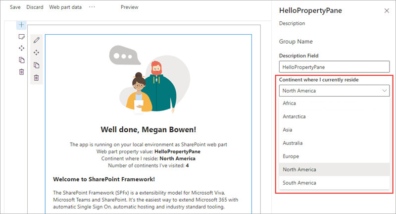
label: 'Continent where I currently reside',
disabled: false,
selectedKey: this.properties.myContinent,
onPropertyChange: this.onContinentSelectionChange.bind(this),
}),
Locate and comment out the validateContinents method in the web part as it's no longer used.
Add the following method to the HelloPropertyPaneWebPart class to handle the event when a user changes the selection in the control. This will update the property on the web part.
/* eslint-disable @typescript-eslint/no-explicit-any */
private onContinentSelectionChange(propertyPath: string, newValue: any): void {
  update(this.properties, propertyPath, (): any => {return newValue});
  this.render();
}
/* eslint-enable @typescript-eslint/no-explicit-any */
Now test the web part by executing gulp serve (if the local web server isn't already running). You'll see the new control selector and notice the values change in the web part when you change the selection.
Summary
In this exercise, you'll extend the property pane by creating your own custom field control.