Use Workplace Analytics to measure change
In addition to the in-product metrics found through features such as Workplace Analytics plans and Viva Insights for people managers, you can measure change with queries or by creating custom dashboards. Queries and dashboards help you measure the before and after impact of your change initiatives.
Prepare the Ways of working tracker dashboard
The Ways of working tracker dashboard uses a prebuilt Power BI template populated by output (OData) from a Workplace Analytics query.

To set up the dashboard:
- Set up the template.
- Download the template and load the query output.
- Select the dashboard settings.
After the data is loaded the dashboard reports generate automatically, resulting in advanced insights about how collaboration in your organization has changed over time. This data provides views into where you can improve employee wellbeing, meeting culture, and manager effectiveness.
1. Set up the template
The Ways of working tracker dashboard requires output from Workplace Analytics. In Query designer, select the Ways of working tracker template and follow the on-screen instructions to set it up.
Important
Be sure to download and install the most recent version of Power BI to avoid issues setting up and loading data into the dashboard.
For the query, give it a descriptive name and select your date range and meeting exclusions. To create a report that updates weekly, select Auto-refresh.
- The Last six-month time period is selected by default. For best results, select the Last one year for the time period to see before and after any shifts.
- In Select metrics, keep all preselected metrics, and don't delete any. The dashboard uses them to create the charts, graphs, and insights in the report pages.
- In Select filters, filter using the attributes from the organizational data to further refine the population for your analysis.
- In Select Organizational attributes, you can leave the default attributes (Organization, LevelDesignation) selected, and then select other ones you would like to filter by when using the reports.
2. Download the template and load the query output
After the query has finished running, you can access the Ways of working tracker Power BI template and data with the OData URL in Query designer > Results.

To load the data into the Ways of working tracker Power BI template:
- In Query designer > My results, download the Power BI template from the Ways of working tracker result.
- When prompted to copy the OData link, select OK.
- Open the downloaded Power BI template.
- When prompted, paste the OData link into the Ways of Working tracker Query URL field.
- Select Load to load the data.
The dashboard visualizations on each page of the report will populate with Workplace Analytics data from Viva Insights, starting with the Settings page.
3. Select the dashboard settings
After you've loaded the data and the report is generated, the dashboard will open to the Settings page, where you can confirm or change settings for your analysis.
- Select a date range to use. This is the time period you'll use to track collaborative behavior over time.
- Select from the list of organizational attributes you chose to include in your query. Default attributes are Organization and LevelDesignation, but the list will also include any other organizational attributes selected when you ran the queries.
- To filter the reports further, select any of the available organizational attributes filter values for the data you'd like to include.

After you've selected the settings for the population you'd like to analyze, you can start using the dashboard. The populated Ways of working tracker dashboard includes report pages on how KPIs have changed and evolved over time, and in the last week, differences in collaboration between groups, manager effectiveness, after hours and meeting trends, a wellbeing scorecard, and key opportunity areas.
Dashboard features
The Ways of working tracker contains key components that you can replicate when creating custom dashboards to track change over time.
- Line graphs to identify overall trends across KPIs
- Scorecards to track key change initiatives
- Visualizations to identify trends before and after actions have been taken
These outputs can be used to create executive presentations and business-intelligence tools to further drive transformation.
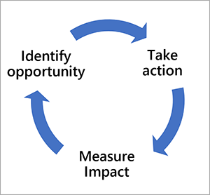
It's important to note that driving change is often a journey that consists by using Workplace Analytics to identify the opportunity, designing tactics to take action, and measuring impact. These steps allow you to continuously make progress on realizing your key business outcomes.
Learn more
See Ways of working tracker dashboard for documentation about template updates, setup instructions, things to remember when sharing the dashboard, FAQs, and troubleshooting.