ItemsControl.ItemContainerStyle Property
Definition
Important
Some information relates to prerelease product that may be substantially modified before it’s released. Microsoft makes no warranties, express or implied, with respect to the information provided here.
Gets or sets the style that is used when rendering the item containers for an ItemsControl.
public:
 property Style ^ ItemContainerStyle { Style ^ get(); void set(Style ^ value); };
Style ItemContainerStyle();
void ItemContainerStyle(Style value);public Style ItemContainerStyle { get; set; }var style = itemsControl.itemContainerStyle;
itemsControl.itemContainerStyle = style;Public Property ItemContainerStyle As Style<ItemsControl>
<ItemsControl.ItemContainerStyle>
inlineStyle
</ItemsControl.ItemContainerStyle>
</ItemsControl>
- or -
<ItemsControl ItemContainerStyle="resourceReferenceToStyle"/>
Property Value
The style applied to the item containers. The default is null.
Examples
This example demonstrates how to create a ListView that holds a list of String objects. With the use of the ItemContainerStyle class, the String objects have their own border and styling while the ListViewItem objects have their own set of styles and properties. Note that the item container type in a ListView is a ListViewItem, and so that is used as the style's TargetType.
 <ListView ItemsSource="{x:Bind tempList}" Height="500">
    <ListView.ItemTemplate>
        <DataTemplate x:DataType="x:String">
            <Border BorderBrush="Crimson" BorderThickness="2" CornerRadius="25" Margin="10">
            <TextBlock Text="{x:Bind}"
                       FontSize="24"
                       FontFamily="Arial"
                       FontWeight="Bold"
                       Foreground="Crimson"
                       Margin="10"
                       Padding="5"/>
            </Border>
        </DataTemplate>
    </ListView.ItemTemplate>

    <ListView.ItemContainerStyle>
        <Style TargetType="ListViewItem">
            <Setter Property="HorizontalAlignment" Value="Right"/>
            <Setter Property="Margin" Value="15"/>
            <Setter Property="BorderBrush" Value="CornflowerBlue"/>
            <Setter Property="BorderThickness" Value="5"/>
        </Style>
    </ListView.ItemContainerStyle>
</ListView>
The above code produces the following:
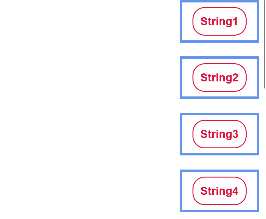
As you can see in the above example, the data objects (strings) have their own styling provided in a DataTemplate - this styling includes their rounded crimson border, their crimson font color, font size, and margin from outer elements.
Each element generated by the ListView (each ListViewItem) is horizontally aligned to the right, has a thick blue border, and a large margin to separate it from the other elements. Although the data objects inside the ListViewItems are centered, the items themselves are able to be right-aligned. And, although the data objects (strings) only have a small amount of space separating them from other elements, each ListViewItem element is able to be separated by a large amount of space.
These customizations are performed by creating a ListViewItem style, as shown above. The style element targets ListViewItem type elements, and will be applied to all elements of that type within the scope that the style is defined in - in this case, just the ListView displayed. Setters are then used to give each style property a value - i.e. set the HorizontalAlignment to Right. These properties and values are what affects the outer ListViewItem element.
This example demonstrates how to use the ItemContainerStyle property on a simple ItemsControl. Note that in this case the item container type is a ContentPresenter.
<ItemsControl>
    <ItemsControl.ItemContainerStyle>
        <Style TargetType="ContentPresenter">
            <Setter Property="FontSize" Value="42" />
        </Style>
    </ItemsControl.ItemContainerStyle>

    <x:String>Hello</x:String>
    <x:String>World</x:String>
</ItemsControl>
Remarks
Derived classes of ItemsControl include Selector and MenuFlyoutPresenter. Derived classes from Selector include ComboBox, FlipView, ListBox, and ListViewBase (which ListView and GridView are derived from). Therefore the ItemContainerStyle class can be used to edit the Style of a ListViewItem, GridViewItem, and so on.
For every item in an ItemsControl, an item container element is used to display the item. By default the item container is a ContentPresenter. But subclasses of ItemsControl can override this, for example the container type in a ListView is a ListViewItem. The value of the ItemContainerStyle is set as the FrameworkElement.Style property of the container.
ItemContainerStyle can then be used to change the style of every element generated by an ItemsControl, and provides a lot of flexibility and customization options in that area. Although many styling options are available within the ItemContainerStyle class, it is most useful when trying to edit how the elements containing the data are displayed in comparison to one another - changing their spacing, their horizontal alignment, etc. To change the visualization of the data objects themselves, such as their background color or font-size, use an ItemTemplate. To change the overall layout or orientation of your ItemsControl/its items, look into editing its ItemsPanel.
Applies to
See also
Feedback
Coming soon: Throughout 2024 we will be phasing out GitHub Issues as the feedback mechanism for content and replacing it with a new feedback system. For more information see: https://aka.ms/ContentUserFeedback.
Submit and view feedback for