Xamarin.Forms Style Classes
 Download the sample
Xamarin.Forms style classes enable multiple styles to be applied to a control, without resorting to style inheritance.
Create style classes
A style class can be created by setting the Class property on a Style to a string that represents the class name. The advantage this offers, over defining an explicit style using the x:Key attribute, is that multiple style classes can be applied to a VisualElement.
Important
Multiple styles can share the same class name, provided they target different types. This enables multiple style classes, that are identically named, to target different types.
The following example shows three BoxView style classes, and a VisualElement style class:
<ContentPage ...>
    <ContentPage.Resources>
        <Style TargetType="BoxView"
               Class="Separator">
            <Setter Property="BackgroundColor"
                    Value="#CCCCCC" />
            <Setter Property="HeightRequest"
                    Value="1" />
        </Style>

        <Style TargetType="BoxView"
               Class="Rounded">
            <Setter Property="BackgroundColor"
                    Value="#1FAECE" />
            <Setter Property="HorizontalOptions"
                    Value="Start" />
            <Setter Property="CornerRadius"
                    Value="10" />
        </Style>

        <Style TargetType="BoxView"
               Class="Circle">
            <Setter Property="BackgroundColor"
                    Value="#1FAECE" />
            <Setter Property="WidthRequest"
                    Value="100" />
            <Setter Property="HeightRequest"
                    Value="100" />
            <Setter Property="HorizontalOptions"
                    Value="Start" />
            <Setter Property="CornerRadius"
                    Value="50" />
        </Style>

        <Style TargetType="VisualElement"
               Class="Rotated"
               ApplyToDerivedTypes="true">
            <Setter Property="Rotation"
                    Value="45" />
        </Style>
    </ContentPage.Resources>
</ContentPage>
The Separator, Rounded, and Circle style classes each set BoxView properties to specific values.
The Rotated style class has a TargetType of VisualElement, which means it can only be applied to VisualElement instances. However, its ApplyToDerivedTypes property is set to true, which ensures that it can be applied to any controls that derive from VisualElement, such as BoxView. For more information about applying a style to a derived type, see Apply a style to derived types.
The equivalent C# code is:
var separatorBoxViewStyle = new Style(typeof(BoxView))
{
    Class = "Separator",
    Setters =
    {
        new Setter
        {
            Property = VisualElement.BackgroundColorProperty,
            Value = Color.FromHex("#CCCCCC")
        },
        new Setter
        {
            Property = VisualElement.HeightRequestProperty,
            Value = 1
        }
    }
};

var roundedBoxViewStyle = new Style(typeof(BoxView))
{
    Class = "Rounded",
    Setters =
    {
        new Setter
        {
            Property = VisualElement.BackgroundColorProperty,
            Value = Color.FromHex("#1FAECE")
        },
        new Setter
        {
            Property = View.HorizontalOptionsProperty,
            Value = LayoutOptions.Start
        },
        new Setter
        {
            Property = BoxView.CornerRadiusProperty,
            Value = 10
        }
    }
};

var circleBoxViewStyle = new Style(typeof(BoxView))
{
    Class = "Circle",
    Setters =
    {
        new Setter
        {
            Property = VisualElement.BackgroundColorProperty,
            Value = Color.FromHex("#1FAECE")
        },
        new Setter
        {
            Property = VisualElement.WidthRequestProperty,
            Value = 100
        },
        new Setter
        {
            Property = VisualElement.HeightRequestProperty,
            Value = 100
        },
        new Setter
        {
            Property = View.HorizontalOptionsProperty,
            Value = LayoutOptions.Start
        },
        new Setter
        {
            Property = BoxView.CornerRadiusProperty,
            Value = 50
        }
    }
};

var rotatedVisualElementStyle = new Style(typeof(VisualElement))
{
    Class = "Rotated",
    ApplyToDerivedTypes = true,
    Setters =
    {
        new Setter
        {
            Property = VisualElement.RotationProperty,
            Value = 45
        }
    }
};

Resources = new ResourceDictionary
{
    separatorBoxViewStyle,
    roundedBoxViewStyle,
    circleBoxViewStyle,
    rotatedVisualElementStyle
};
Consume style classes
Style classes can be consumed by setting the StyleClass property of the control, which is of type IList<string>, to a list of style class names. The style classes will be applied, provided that the type of the control matches the TargetType of the style classes.
The following example shows three BoxView instances, each set to different style classes:
<ContentPage ...>
    <ContentPage.Resources>
        ...
    </ContentPage.Resources>
    <StackLayout Margin="20">
        <BoxView StyleClass="Separator" />
        <BoxView WidthRequest="100"
                 HeightRequest="100"
                 HorizontalOptions="Center"
                 StyleClass="Rounded, Rotated" />
        <BoxView HorizontalOptions="Center"
                 StyleClass="Circle" />
    </StackLayout>
</ContentPage>
In this example, the first BoxView is styled to be a line separator, while the third BoxView is circular. The second BoxView has two style classes applied to it, which give it rounded corners and rotate it 45 degrees:
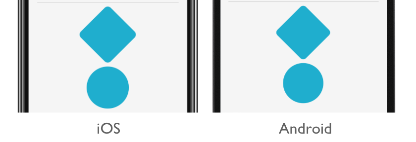
Important
Multiple style classes can be applied to a control because the StyleClass property is of type IList<string>. When this occurs, style classes are applied in ascending list order. Therefore, when multiple style classes set identical properties, the property in the style class that's in the highest list position will take precedence.
The equivalent C# code is:
...
Content = new StackLayout
{
    Children =
    {
        new BoxView { StyleClass = new [] { "Separator" } },
        new BoxView { WidthRequest = 100, HeightRequest = 100, HorizontalOptions = LayoutOptions.Center, StyleClass = new [] { "Rounded", "Rotated" } },
        new BoxView { HorizontalOptions = LayoutOptions.Center, StyleClass = new [] { "Circle" } }
    }
};