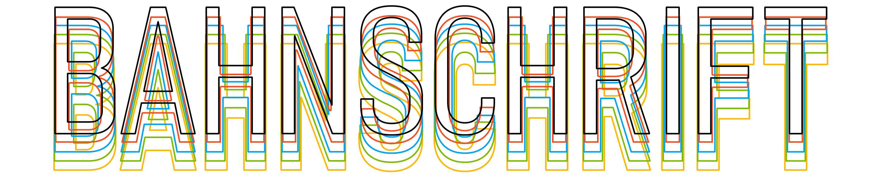
Bahnschrift font family
Overview
| Description | |
|---|---|
| File name | Bahnschrift.ttf |
| Styles & Weights | Variable font |
| Designer | Aaron Bell |
| Copyright | © 2019 Microsoft Corporation. All rights reserved. |
| Font vendor | Microsoft Corporation |
| Script Lang Tag 'dlng' and 'slng'** | Latn, Cyrl, Grek, Vi-Latn, mk-Cyrl, bg-Cyrl, sr-Cyrl |
| Code pages** | 1252 Latin 1 1250 Latin 2: Eastern Europe 1251 Cyrillic 1253 Greek 1254 Turkish 1257 Windows Baltic 1258 Vietnamese Mac Roman Macintosh Character Set (US Roman) |
| Fixed pitch | False |
Products that supply this font
| Product name | Font version |
|---|---|
| Windows 11 | See the Windows 11 page. |
| Windows 10 | See the Windows 10 page. |
Brief history of Bahnschrift design and production
Bahnschrift is a brand new digitization of the famous DIN 1451 character design standard and was released as a variable font for Windows in 2017.
DIN 1451 is a standardization for letterforms designs created by the German standards body Deutsches Institut für Normung (German Institute for Standardization) in 1931, and was intended for use on road signs and other technical implementations. The design was particularly optimized for legibility, simplicity, and ease in replication. Over the years, DIN has become a popular typeface for a wide range of design applications.

Figure: Example of DIN Mittelschrift (standard) and Engschrift (Condensed) on the Autobahn. Photo by Tage Olsin (licensed under CC BY-SA 2.0).
The Microsoft Typography Team began development on a custom version of the font in 2013 in response to the ongoing interest in DIN among designers at Microsoft. Working from the original spec (design and metrics), a Mittelschrift and Engschrift version were created. This version was fairly limited in character set and was used internally for a few projects, but wasn’t shipped for public use.
The current version of Bahnschrift began development in 2016. At the time, Google, Apple, Adobe, and Microsoft partnered to develop a common implementation of variable font technology and Bahnschrift was chosen to become Microsoft’s first variable font. To prepare for the transition from static to variable, the Bahnschrift source was completely rebuilt from the ground up by Aaron Bell of Saja Typeworks and was expanded in weight, character set (adding Extended Latin, Greek, and Cyrillic) and manual hinting to ensure high quality rendering on a wide range of devices.
Please enjoy using Bahnschrift in your projects!
Variation in Bahnschrift
Bahnschrift’s premiere feature is its implementation of Font Variations along two axis—weight and width. With five pre-set ‘instances’ along the weight axis, and three ‘instances’ along the width axis, Bahnschrift can accommodate a wide range of styles and applications even in applications that don’t fully support variable fonts.
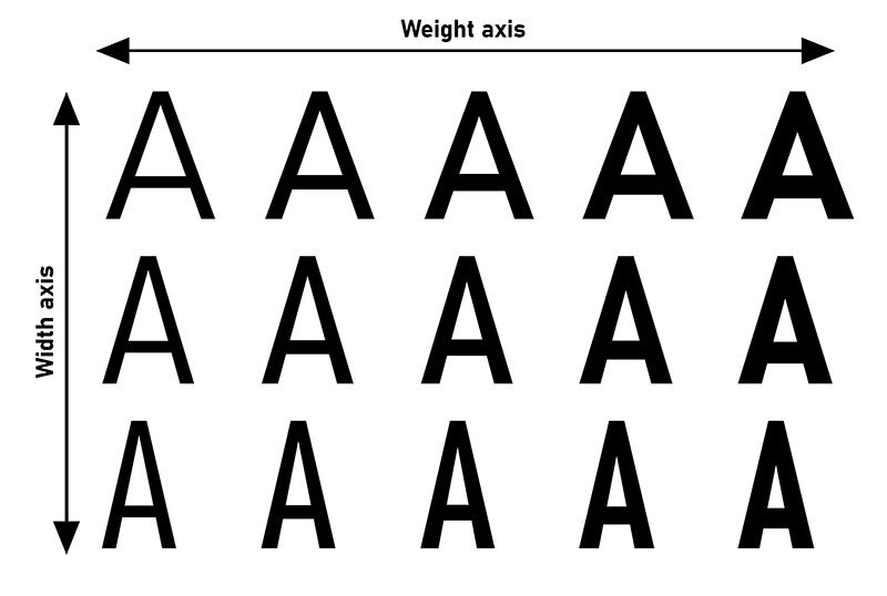

Figure: Example of Bahnschrift’s pre-set styles within the width / weight axis space.
For those applications which do fully support variable fonts, Bahnschrift becomes a virtual playground of weight and width. Find the SemiBold is too light? Make it a little darker. Text slightly too wide for the text block? Make it a little narrower. With Bahnschrift’s powerful variation technology, you can fully customize the design to create exactly the style you need.
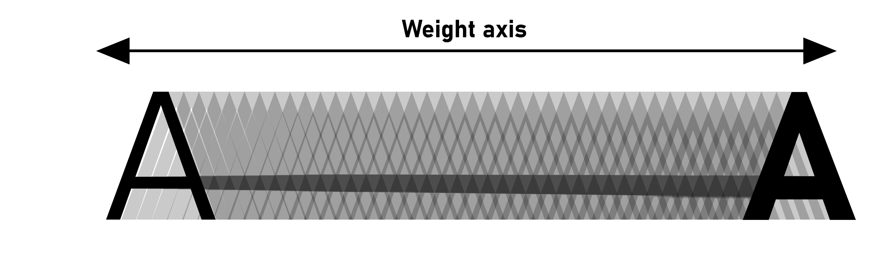
Figure: Pick the perfect version of Bahnschrift for your project.
Other features of Bahnschrift
Aside from the variable font technology, Bahnschrift also has some other tricks up its sleeves.
- Duplexing: The weight axis of Bahnschrift is fully duplexed—that is to say, the width of each letter is exactly the same whether in Light, Bold, or any weight in-between! This is pretty unusual in the world of fonts and makes Bahnschrift particularly useful for tabular data where everything needs to align, or in applications where line lengths are locked.
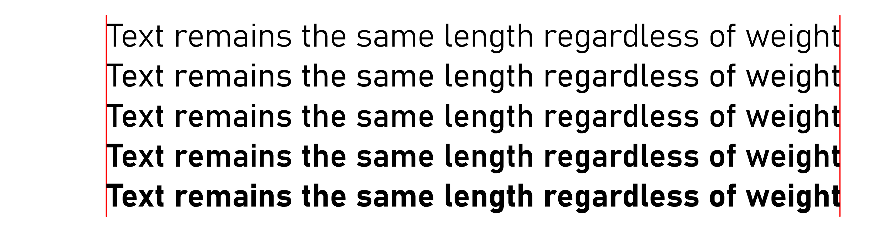
Figure: Character length is exactly the same across the weight axis, ensuring text lines up perfectly!
- Character sets: Bahnschrift includes support for over 200 Latin languages (including Vietnamese!), Greek and Cyrillic (with localized forms for Macedonian, Serbian, and Bulgarian).

Figure: Bahnschrift in Vietnamese, Greek, Russian, and Bulgarian.
- Manual hinting: Bahnschrift is hand-hinted (special code added to each character) to ensure that it can render sharply, and clearly, across a wide range of Windows devices and point sizes.
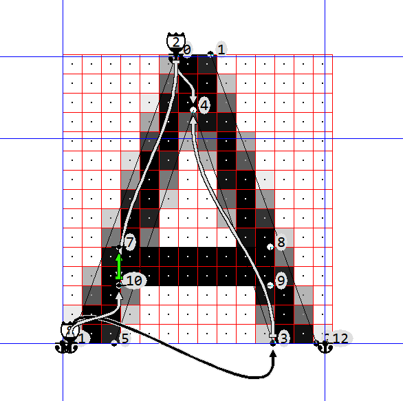
Figure: All glyphs have manual hinting
About Aaron Bell & Saja Typeworks
 |
Aaron Bell is the owner of Saja Typeworks, an independent type foundry based in Seattle, WA. He previously obtained a MA in Typeface Design from the University of Reading and worked on the Microsoft Typography team for 5.5 years. Aaron’s particular area of expertise is in Latin and Korean letter design. He also works in Greek and Cyrillic design, and in manual hinting for TTF fonts. |
Changelist
Windows 10 version 1709 release on October 17, 2017
- Bahnschrift is introduced as a new addition to the Windows font family.
Windows 10 version 1803 release on April 30, 2018
- Width axes added in.
- Fixes errors in spacing/kerning for a few characters.
- Changes improved consistent spacing across the condensed through regular width.
Windows 10 version 1809 release on November 13, 2018
- Extending the character set to include Eastern and Central European languages which includes extended Latin characters, Greek and Cyrillic.
Commenti e suggerimenti
Presto disponibile: Nel corso del 2024 verranno gradualmente disattivati i problemi di GitHub come meccanismo di feedback per il contenuto e ciò verrà sostituito con un nuovo sistema di feedback. Per altre informazioni, vedere https://aka.ms/ContentUserFeedback.
Invia e visualizza il feedback per