Xamarin.Forms のデュアル画面の設計パターン
 サンプルのダウンロード
このガイドでは、魅力的で便利なユーザー エクスペリエンスを提供するインターフェイスの作成に役立つコードとサンプルが含まれる、デュアル画面デバイス向けに推奨される設計パターンについて説明します。
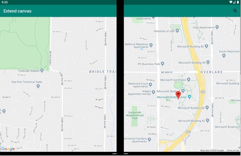
拡張キャンバス パターン
拡張キャンバス パターンでは、両方の画面を、マップ、イメージ、スプレッドシート、最大限のスペースを活用することで利点が得られるその他のコンテンツを表示するための 1 つの大きなキャンバスとして扱います。
<ContentPage xmlns:local="clr-namespace:Xamarin.Duo.Forms.Samples"
             xmlns="http://xamarin.com/schemas/2014/forms"
             xmlns:x="http://schemas.microsoft.com/winfx/2009/xaml"
             xmlns:d="http://xamarin.com/schemas/2014/forms/design"
             xmlns:mc="http://schemas.openxmlformats.org/markup-compatibility/2006"
             mc:Ignorable="d"
             x:Class="Xamarin.Duo.Forms.Samples.ExtendCanvas">
    <Grid>
        <WebView x:Name="webView"
                 HorizontalOptions="FillAndExpand"
                 VerticalOptions="FillAndExpand" />
        <SearchBar x:Name="searchBar"
                   Placeholder="Find a place..."
                   BackgroundColor="DarkGray"
                   Opacity="0.8"
                   HorizontalOptions="FillAndExpand"
                   VerticalOptions="Start" />
    </Grid>
</ContentPage>
この例では、 Grid と内部コンテンツが拡張され、使用可能なすべての画面を、1 画面での表示でも、2 画面にわたる表示でも使用できるようになります。
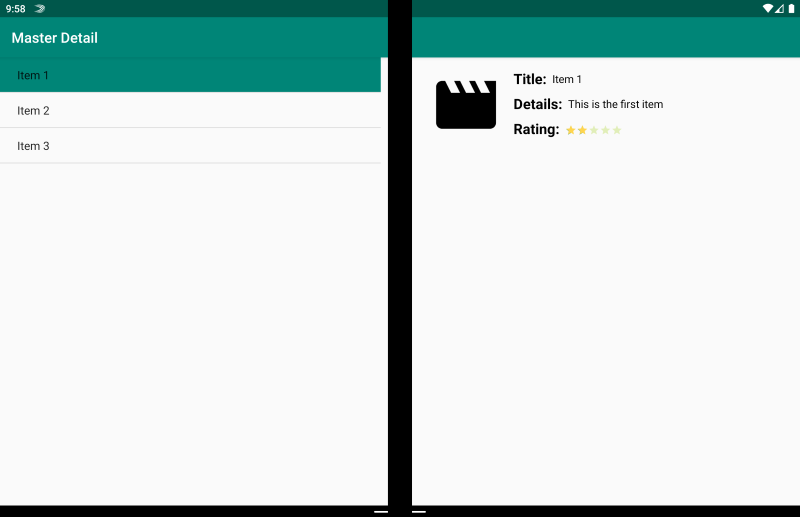
マスター/詳細のパターン
マスター/詳細のパターンは、マスター ビュー (通常は左側のリスト) にユーザーが選択したコンテンツが提供され、その項目の詳細が右側に表示される場合です。
<ContentPage xmlns:local="clr-namespace:Xamarin.Duo.Forms.Samples"
             xmlns="http://xamarin.com/schemas/2014/forms"
             xmlns:x="http://schemas.microsoft.com/winfx/2009/xaml"
             xmlns:dualScreen="clr-namespace:Xamarin.Forms.DualScreen;assembly=Xamarin.Forms.DualScreen"
             x:Class="Xamarin.Duo.Forms.Samples.MasterDetail">
    <dualScreen:TwoPaneView MinWideModeWidth="4000"
                            MinTallModeHeight="4000">
        <dualScreen:TwoPaneView.Pane1>
            <local:Master x:Name="masterPage" />
        </dualScreen:TwoPaneView.Pane1>
        <dualScreen:TwoPaneView.Pane2>
            <local:Details x:Name="detailsPage" />
        </dualScreen:TwoPaneView.Pane2>
    </dualScreen:TwoPaneView>
</ContentPage>
この例では、TwoPaneView を使用して、1 つのペインにリストを設定し、もう一方に詳細ビューを設定できます。
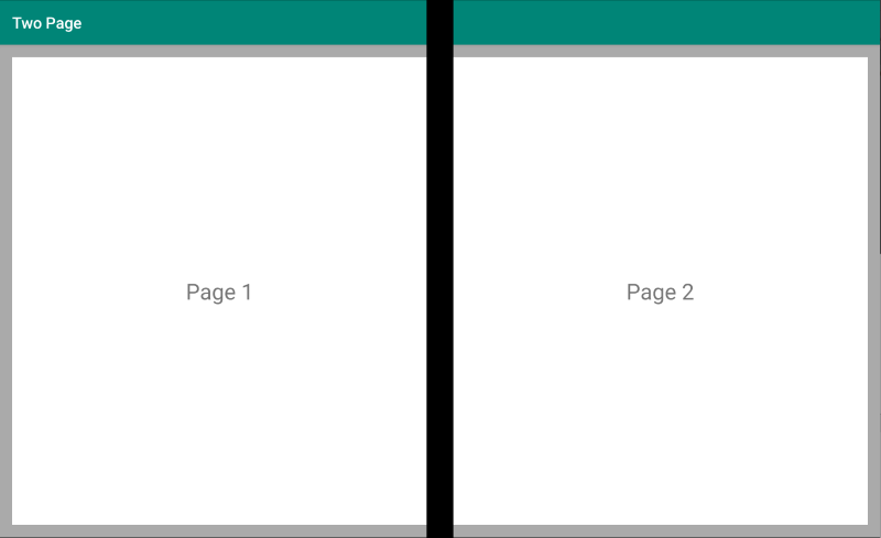
2 ページのパターン
2 ページのパターンは、ドキュメント リーダー、メモ、アートボードなどの 2 アップのレイアウトにするコンテンツに適しています。
<Grid x:Name="layout">
    <CollectionView x:Name="cv"
                    BackgroundColor="LightGray">
        <CollectionView.ItemsLayout>
            <GridItemsLayout SnapPointsAlignment="Start"
                             SnapPointsType="MandatorySingle"
                             Orientation="Horizontal"
                             HorizontalItemSpacing="{Binding Source={x:Reference mainPage}, Path=HingeWidth}" />
        </CollectionView.ItemsLayout>
        <CollectionView.ItemTemplate>
            <DataTemplate>
                <Frame BackgroundColor="LightGray"
                       Padding="0"
                       Margin="0"
                       WidthRequest="{Binding Source={x:Reference mainPage}, Path=ContentWidth}"
                       HeightRequest="{Binding Source={x:Reference mainPage}, Path=ContentHeight}">
                    <Frame Margin="20"
                           BackgroundColor="White">
                        <Label FontSize="Large"
                               Text="{Binding .}"
                               VerticalTextAlignment="Center"
                               HorizontalTextAlignment="Center"
                               HorizontalOptions="Center"
                               VerticalOptions="Center" />
                    </Frame>
                </Frame>
            </DataTemplate>
        </CollectionView.ItemTemplate>
    </CollectionView>
</Grid>
このデュアル画面エクスペリエンスを実現するための最適な方法が、ヒンジ幅で分割されたグリッド レイアウトを使用する CollectionView です。
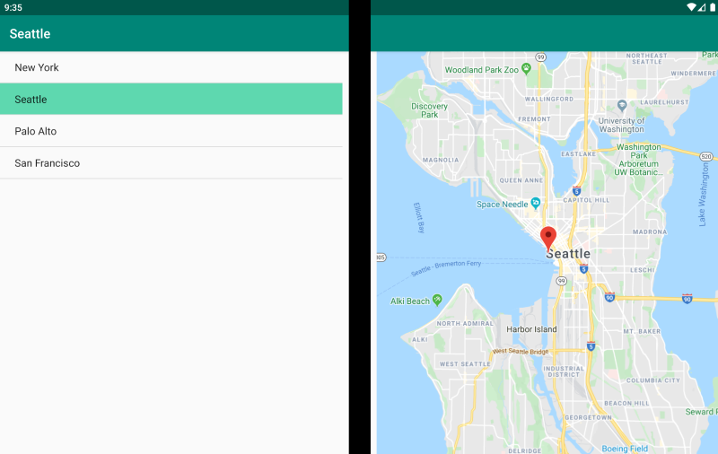
デュアル ビューのパターン
デュアル ビューのパターンは、"2 ページ" ビューと同じように見えますが、コンテンツとユーザーのシナリオで違いがあります。 このパターンでは、コンテンツを並べて比較して、ドキュメントや写真を編集したり、さまざまなレストランのメニューを比較したり、コード ファイルのマージ競合の差分を確認したりします。
<ContentPage xmlns:local="clr-namespace:Xamarin.Duo.Forms.Samples"
             xmlns="http://xamarin.com/schemas/2014/forms"
             xmlns:x="http://schemas.microsoft.com/winfx/2009/xaml"
             xmlns:dualScreen="clr-namespace:Xamarin.Forms.DualScreen;assembly=Xamarin.Forms.DualScreen"
             x:Class="Xamarin.Duo.Forms.Samples.DualViewListPage">
    <dualScreen:TwoPaneView>
        <dualScreen:TwoPaneView.Pane1>
            <CollectionView x:Name="mapList"
                            SelectionMode="Single">
                <CollectionView.ItemTemplate>
                    <DataTemplate>
                        <Grid Padding="10,5,10,5">
                            <Frame Visual="Material"
                                   BorderColor="LightGray">
                                <StackLayout Padding="5">
                                    <Label FontSize="Title"
                                           Text="{Binding Title}" />
                                </StackLayout>
                            </Frame>
                        </Grid>
                    </DataTemplate>
                </CollectionView.ItemTemplate>
            </CollectionView>
        </dualScreen:TwoPaneView.Pane1>
        <dualScreen:TwoPaneView.Pane2>
            <local:DualViewMap x:Name="mapPage" />
        </dualScreen:TwoPaneView.Pane2>
    </dualScreen:TwoPaneView>
</ContentPage>
コンパニオンのパターン
コンパニオンのパターンは、2 番目の画面を使用して、描画アプリ、ゲーム、メディア編集などでプライマリ ビューに関連するコンテンツの 2 番目のレベルをどのように提供するかを示します。

<ContentPage xmlns:local="clr-namespace:Xamarin.Duo.Forms.Samples"
             xmlns="http://xamarin.com/schemas/2014/forms"
             xmlns:x="http://schemas.microsoft.com/winfx/2009/xaml"
             xmlns:dualscreen="clr-namespace:Xamarin.Forms.DualScreen;assembly=Xamarin.Forms.DualScreen"
             x:Name="mainPage"
             x:Class="Xamarin.Duo.Forms.Samples.CompanionPane"
             BackgroundColor="LightGray"
             Visual="Material">
    <dualscreen:TwoPaneView x:Name="twoPaneView"
                            MinWideModeWidth="4000"
                            MinTallModeHeight="4000">
        <dualscreen:TwoPaneView.Pane1>
            <CarouselView x:Name="cv"
                          BackgroundColor="LightGray"
                          IsScrollAnimated="False" >
                <CarouselView.ItemTemplate>
                    <DataTemplate>
                        <Frame BackgroundColor="LightGray"
                               Padding="0"
                               Margin="0"
                               WidthRequest="{Binding Source={x:Reference twoPaneView}, Path=Pane1.Width}"
                               HeightRequest="{Binding Source={x:Reference twoPaneView}, Path=Pane1.Height}">
                            <Frame Margin="20"
                                   BackgroundColor="White">
                                <Label FontSize="Large"
                                       Text="{Binding ., StringFormat='Slide Content {0}'}"
                                       VerticalTextAlignment="Center"
                                       HorizontalTextAlignment="Center"
                                       HorizontalOptions="Center"
                                       VerticalOptions="Center" />
                            </Frame>
                        </Frame>
                    </DataTemplate>
                </CarouselView.ItemTemplate>
            </CarouselView>
        </dualscreen:TwoPaneView.Pane1>
        <dualscreen:TwoPaneView.Pane2>
            <CollectionView x:Name="indicators"
                            SelectionMode="Single"
                            Margin="20, 20, 20, 20"
                            BackgroundColor="LightGray"
                            WidthRequest="{Binding Source={x:Reference twoPaneView}, Path=Pane2.Width}"
                            ItemsSource="{Binding Source={x:Reference cv}, Path=ItemsSource}">
                <CollectionView.Resources>
                    <ResourceDictionary>
                        <Style TargetType="Frame">
                            <Setter Property="VisualStateManager.VisualStateGroups">
                                <VisualStateGroupList>
                                    <VisualStateGroup x:Name="CommonStates">
                                        <VisualState x:Name="Normal">
                                            <VisualState.Setters>
                                                <Setter Property="Padding"
                                                        Value="0" />
                                            </VisualState.Setters>
                                        </VisualState>
                                        <VisualState x:Name="Selected">
                                            <VisualState.Setters>
                                                <Setter Property="BorderColor"
                                                        Value="Green" />
                                                <Setter Property="Padding"
                                                        Value="1" />
                                            </VisualState.Setters>
                                        </VisualState>
                                    </VisualStateGroup>
                                </VisualStateGroupList>
                            </Setter>
                        </Style>
                    </ResourceDictionary>
                </CollectionView.Resources>
                <CollectionView.ItemsLayout>
                    <LinearItemsLayout Orientation="Vertical"
                                       ItemSpacing="10" />
                </CollectionView.ItemsLayout>
                <CollectionView.ItemTemplate>
                    <DataTemplate>
                        <Frame WidthRequest="{Binding Source={x:Reference twoPaneView}, Path=Pane2.Width}"
                               CornerRadius="10"
                               HeightRequest="60"
                               BackgroundColor="White"
                               Margin="0">
                            <StackLayout HorizontalOptions="Fill"
                                         VerticalOptions="Fill"
                                         Orientation="Horizontal">
                                <Label FontSize="Micro"
                                       Padding="20,0,20,0"
                                       VerticalTextAlignment="Center"
                                       WidthRequest="140" Text="{Binding ., StringFormat='Slide Content {0}'}" />
                                <Label FontSize="Small"
                                       Padding="20,0,20,0"
                                       VerticalTextAlignment="Center"
                                       HorizontalOptions="FillAndExpand"
                                       BackgroundColor="DarkGray"
                                       Grid.Column="1"
                                       Text="{Binding ., StringFormat='Slide {0}'}" />
                            </StackLayout>
                        </Frame>
                    </DataTemplate>
                </CollectionView.ItemTemplate>
            </CollectionView>
        </dualscreen:TwoPaneView.Pane2>
    </dualscreen:TwoPaneView>
</ContentPage>