Advanced Basics
Using RibbonX from Visual Basic
Ken Getz
Contents
Getting Ready
Creating a Sample Add-In
Create a Custom Color Gallery
Create GetEnabled
Create GetItemCount
Create GetItemHeight and GetItemWidth
Create the Images
Create the Screen Tip and Test the Add-In
Add Action Callbacks
Adding Ribbon Control Interaction
In the February 2007 issue of MSDN Magazine, Eric Faller demonstrated how to create extensions for the 2007 Microsoft® Office system using the RibbonX API and XML markup (see msdn.microsoft.com/msdnmag/issues/07/02/RibbonX). In the same issue, Paul Stubbs introduced managed add-ins for 2007 Office system applications (specifically, for PowerPoint® 2007) and showed how you can create them using Visual Studio® 2005 Tools for Office Second Edition. In this column, I’ll continue their excellent work, trying to anticipate some questions you’ll likely encounter as you work with RibbonX and create your own Ribbon customizations.
Keep in mind that because neither the 2007 Office system nor Visual Studio 2005 provides a real designer for the Ribbon, creating customizations for it requires a little extra effort. There’s no pretty user interface for creating your Ribbon customizations, and everything you do happens in XML, plus either .NET-compatible or Visual Basic® for Applications (VBA) code. (The next release of Visual Studio Tools for Office does provide a designer for the Ribbon. For more information, see the article by Steve Fox and Paul Stubbs in this issue.) For more on the 2007 Office system Ribbon in general, stop by msdn.microsoft.com/office/tool/ribbon. Here you’ll find the most up-to-date information available from Microsoft on working with and customizing, the 2007 Office system Ribbon.
Getting Ready
To work with the various controls on the Ribbon, you need to know the identifier (that is, the msoID attribute) corresponding to each Ribbon element. Download "2007 Office System Document: List of Control IDs". This download (available in either Excel® 2003 or Excel 2007 format) includes a series of spreadsheets containing full disclosure for each Ribbon element. Without this information, modifying the existing Ribbon is next to impossible. Note that it is also possible to get the ID of any control by hovering over it in the Customization pane in the Options dialog.
Make sure you have a copy of the XML schema that describes RibbonX on your development computer. With this schema (named customUI.xsd), the Visual Studio 2005 XML editor can provide IntelliSense® as you create the Ribbon customization markup. You can download the "2007 Office System: XML Schema Reference". The download includes both the customUI.xsd file and the reference materials for this and other schemas that the 2007 Office system uses. Once you’ve downloaded and extracted customUI.xsd, copy it into the %Program Files%\Microsoft Visual Studio 8\Xml\Schemas folder. (Replace %Program Files% in the previous path with the location of the Program Files folder on your own computer.) With the schema file installed in this folder, Visual Studio 2005 can make the schema available to you when you create a new Ribbon customization file.
If you want to store the Ribbon customization as part of a Word 2007, Excel 2007, or PowerPoint 2007 document, handling Ribbon callbacks in VBA code, you generally must crack open the document using a ZIP file-handling tool, create the customization part, and set up the necessary relations to the part. This is a lot of work, and you can avoid it by downloading the Custom UI Editor Tool from OpenXMLDeveloper.org. Although the tool won’t help you create Ribbon customizations, it will help you in several important ways: it handles inserting the customization into a Word, Excel, or PowerPoint document or template, setting up the necessary parts and relations; it can insert icons into the document for your customization; it validates the RibbonX markup against customUI.xsd; and it can generate VBA-style callback handler stubs so you don’t need to look up the exact format of the callback procedures. Even if you’re creating a Visual Studio Tools for Office (VSTO) add-in, or a shared Visual Studio COM add-in, the last two features can be useful.
Of course you’ll need documentation. MSDN® supplies a set of three articles online, coauthored by Frank Rice and me, that offer examples, references, and answers to frequently asked questions. These articles provide a good start until Microsoft supplies complete help files for RibbonX in one place. You’ll find the articles at Part 1, Part 2, and Part 3.
Finally, you need to consider where you’re going to store your Ribbon customization. As described in the first of the three articles, you have several options. You can store the RibbonX markup in a Word, Excel, or PowerPoint document directly, creating a custom UI part and setting up relations to the part; and you can use the CustomUI Editor Tool I mentioned earlier to help insert the custom UI into the document. For customizations to the Access™ 2007 Ribbon, you can store the XML markup in a table, and you can retrieve and activate the customization using code. You can also store the customization in the USysRibbons table, and Access can load it as your database loads. Each of these alternatives creates a document or template-based customization.
If you want to create an application-based customization, you’ll need to think about creating a COM add-in for 2007 Office system applications; to do so, you can either create an add-in using the Visual Studio 2005 Shared Add-in template, or with Visual Studio 2005 Tools for Office Second Edition (this is the simpler, more robust approach). Again, the first MSDN article demonstrates how to use both of these techniques.
Given all the tools and documentation, you’re ready to create your own RibbonX customizations. Though you may not use them all as you work through this column, they’ll prove invaluable when you create your own customizations.
Because the XML markup is the same no matter where you store the content, I’ve chosen the simplest solution that allows you to handle Ribbon callbacks using managed code—that is, I’ll create an add-in for Excel 2007 using VSTO 2005 SE. (If you don’t have VSTO 2005 SE installed, you can download it and get more information from the product’s portal at msdn2.microsoft.com/aa905543.aspx.)
Creating a Sample Add-In
To get started, you’ll need to create and test a simple add-in using VSTO 2005 SE. I’ll quickly summarize the instructions provided in the first of the three MSDN articles I mentioned, creating an Excel add-in rather than a Word add-in. For more detailed explanations, see the full article.
First, create a new project in Visual Studio 2005. In the New Project dialog box, in the Project Types pane, expand the Office node and select 2007 Add-ins. In the Templates pane, select Excel Add-in. Name the new add-in RibbonAddin, and then click OK to create it. (Note that the add-in template creates both the add-in project, and a setup project. For now, disregard the setup project. It makes it easier for you to deploy your add-in but won’t be necessary for this demonstration.)
On the Project menu, click Add New Item and in the dialog box, select Ribbon Support. Click Add to accept the default name, Ribbon1.vb. In addition to the Ribbon1.vb file, the template adds an XML file named Ribbon1.xml, which you’ll modify later. On the Project menu, click RibbonAddin Properties. Click the Resources tab and, from Solution Explorer, drag Ribbon1.xml onto the Resources design surface. Close the Resources window and save the resources.
In Solution Explorer, double-click Ribbon1.xml to view its contents. The default markup, shown in Figure 1, creates a new group labeled My Group on the AddIns tab. The group contains a toggle button labeled My Button. Pressing the button calls the OnToggleButton1 callback procedure.
Figure 1 Ribbon1.xml
<customUI
  xmlns=https://schemas.microsoft.com/office/2006/01/customui
  onLoad=”OnLoad”>
  <ribbon>
    <tabs>
      <tab idMso=”TabAddIns”>
        <group id=”MyGroup”
               label=”My Group”>
          <toggleButton id=”toggleButton1”
                        size=”large”
                        label=”My Button”
                        screentip=”My Button Screentip”
                        onAction=”OnToggleButton1”
                        imageMso=”HappyFace” />
        </group>
      </tab>
    </tabs>
  </ribbon>
</customUI>
In Solution Explorer, within the Ribbon1.vb file, uncomment the ThisAddIn partial class. In the Ribbon1 class, modify the GetCustomUI procedure so it returns the value of the new resource like so:
Return My.Resources.Ribbon1
The provided GetResourceText helper procedure opens the XML content manually and retrieves the text using a reader. You can remove the procedure at this point, if you want.
In most cases, you’ll need to be able to refer to the host application from within the Ribbon customization, so in the Ribbon1 class, add the following declaration:
Public Application As Excel.Application
You also need to initialize this variable, so in the ThisAddIn class’s RequestService method, add the following line of code immediately after the procedure creates the instance of the Ribbon1 class:
ribbon.Application = Application
Expand the Ribbon Callbacks region in the code, and examine the OnLoad callback procedure:
Public Sub OnLoad(ByVal ribbonUI As Office.IRibbonUI)
    Me.ribbon = ribbonUI
End Sub
This procedure takes the Office.IRibbonUI value passed to the Ribbon1 instance and stores it away so that later callbacks can interact with the Ribbon as well. Without this step, you wouldn’t be able to perform important operations, such as refreshing the Ribbon after you change the contents of an item.
In addition, you’ll find the sample callback procedure that handles pressing and releasing the toggle button created by the XML markup. It simply displays an appropriate alert each time you press or release the new toggle button:
Public Sub OnToggleButton1( _
  ByVal control As Office.IRibbonControl, _
  ByVal isPressed As Boolean)
    If isPressed Then
        MessageBox.Show(“Pressed”)
    Else
        MessageBox.Show(“Released”)
    End If
End Sub
Although I’ve modified the instructions slightly, you should be able to follow along with the original article if you want a more complete explanation. For now, save and run your project, verifying that Visual Studio launches Excel 2007. Select the Add-Ins tab, and press and then release the My Button toggle button. You’ll see the alert displayed by the add-in, in each case.
For the rest of the demonstrations in this column, you’ll modify the content in Ribbon1.xml and add more complex callback procedures to the Ribbon1 class. Though there are probably an infinite number of things you can do with the Ribbon, we have space limitations so I’ll demonstrate just two fun uses of the API.
First, I’ll assume you want to display your own gallery, containing a subset of the available colors, so that users can fill the background of a cell. To do so you’ll create your own color gallery. Figure 2 shows how it will look. Second, I’ll show how you can control whether your color gallery is available using a checkbox, as in the upper-left hand corner of Figure 2.
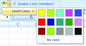
Figure 2** Create Your Own Gallery Using RibbonX **
Create a Custom Color Gallery
Although users can select fill colors from the Excel FillColor gallery, as shown in Figure 3, you might want to limit the color choices to a specific subset. To accomplish this, you can create your own color gallery. If you examine the Excel FillColor gallery, however, you might notice that getting to the gallery is simpler than the one in Figure 2; the difference is that the Excel gallery appears when you click the SplitButton control, but the gallery you create must hang off a menu. It would be nice if you could create a gallery directly as a child of a split button, but based on the customui.xsd schema, a SplitButton control can only contain a button or a toggle button, along with a menu. The sample you’ll create hangs the gallery control off a simple menu.
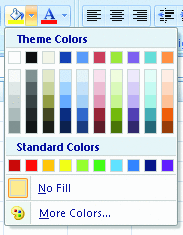
Figure 3** Excel FillColor Gallery **
To get started using the add-in you created, replace the content of Ribbon1.xml with the markup in Figure 4. You may find it instructive to actually type this code from scratch, rather than copying it in from the online version of this column. It’s useful to become familiar with the way IntelliSense helps you as you create RibbonX markup. This code creates the customization, calling the onLoad procedure you already created as it starts. In addition, this markup creates a new tab named demoTab, displaying the text "Ribbon Customization". Within the tab, the markup creates a group labeled "gallery Control", and within the group, a splitButton control containing a button and a menu. The button uses the built-in CellFillColorPicker ID to provide the image. I got the actual ID for this control by perusing the workbook containing Excel Ribbon control IDs I downloaded from the Microsoft site mentioned earlier. At this point, save and run the add-in to verify the behavior.
Figure 4 New Contents of Ribbon1.xml
<?xml version=”1.0” encoding=”utf-8” ?>
<customUI
   xmlns=https://schemas.microsoft.com/office/2006/01/customui
   onLoad=”onLoad”>
  <ribbon>
    <tabs>
      <tab id=”demoTab” label=”Ribbon Customization” >
        <group id=”galleryGroup” label=”gallery Control”>
            <splitButton id=”highlightSplitButton” >
              <button id=”highlightButton”
                imageMso=”CellFillColorPicker”/>
              <menu id=”highlightMenu” >
              </menu>
            </splitButton>
        </group>
      </tab>
    </tabs>
  </ribbon>
</customUI>
Continue the modification of the markup by inserting the element in Figure 5 into the body of the <menu> element. This markup creates the gallery control and makes use of almost all of the control’s available callback procedures. First, the markup specifies the label, and indicates that the control shouldn’t display item labels (you just want the colors to appear without labels for this example). In addition, the code specifies the number of rows and columns to be displayed within the gallery. The markup designates the remainder of the gallery’s properties by specifying callback procedures—as Excel 2007 renders the Ribbon customization, it calls each of the procedures listed here as it needs to retrieve data. (For example, it calls the GetItemWidth method when it needs to determine the width of an item.) In addition, the markup specifies a button to be displayed at the bottom of the gallery. You can have as many of these buttons as you like, but this example requires only one.
Figure 5 Gallery Control
<gallery id=”highlightGallery”
  label=”Select Color”
  showItemLabel=”false”
  columns=”5” rows=”3”
  onAction=”InsertFillColor”
  getEnabled=”GetEnabled”
  getItemCount=”GetItemCount”
  getItemHeight=”GetItemHeight”
  getItemWidth=”GetItemWidth”
  getItemImage=”GetItemImage”
  getItemScreentip=”GetItemScreenTip”>
  <button id=”noColorButton”
    label=”No color”
    onAction=”RemoveFillColor”
    screentip=”Remove color”
    supertip=”Remove any applied color.”/>
</gallery>
In order to implement the gallery control’s behavior, you must now supply each of the callback procedures listed in the markup. To do this, open Ribbon1.vb in the code editor window and find the Ribbon Callbacks region. While you don’t have to place the code in this region, it helps organize your code. In the following paragraphs I’ll walk you through the creation of each of the required callback procedures.
Note that you don’t need to use any of these callback procedures. You can, instead, supply static values for each of the various gallery control properties. That is, rather than specifying the getItemHeight attribute in the markup, you can instead supply the itemHeight attribute along with a fixed value. This example uses code for each of these properties, so you can dynamically vary the layout of the gallery.
In order to display the gallery, you’ll need a list of colors, so insert the following code into the Ribbon1 class:
Private image As New Bitmap(25, 25)
Private colors As Color() = _
  {Color.Yellow, Color.GreenYellow, Color.Turquoise, _
   Color.Magenta, Color.Blue, Color.Red, Color.DarkBlue, _
   Color.Teal, Color.Green, Color.Violet, Color.DarkRed, _
   Color.YellowGreen, Color.Gray, Color.DarkGray, Color.Black}
This code creates a class-level Bitmap instance that you’ll use to create the various images and an array of Color values that represent the various fill colors. Make sure you insert this and the remainder of the code in the Ribbon1 class, not in the ThisAddIn partial class.
Create GetEnabled
In the Ribbon1.vb class, add the following callback procedure. This procedure matches the required signature for this particular callback. If your callback doesn’t match the right signature, 2007 Office system applications won’t be able to call the procedure:
Public Function GetEnabled( _
       ByVal control As Office.IRibbonControl) As _
           Boolean

     Dim returnValue As Boolean = False
     Select Case control.Id
       Case “highlightGallery”
         returnValue = True
     End Select
     Return returnValue
   End Function
To find the signature for this (and all the other) callback procedures, refer to the documentation in the third article of the three-part set mentioned earlier.
The 2007 Office system passes a reference to the control that triggered the callback as a parameter to the GetEnabled method, and the sample code uses that information to create a Select Case statement based on the caller’s Id property. Using a design pattern like this, you can create a single GetEnabled callback procedure that can work with any Ribbon control that shares the same callback procedure signature. In this case, the procedure simply returns True, indicating that the gallery should be enabled.
Create GetItemCount
The getItemCount callback allows you to calculate the number of items to display in the gallery, and you must specify this callback procedure for each gallery that you create, if you want to specify the number of items to be displayed. In your add-in, insert the following procedure in the Ribbon1 class:
Public Function GetItemCount( _
 ByVal control As Office.IRibbonControl) As Integer
  Dim returnValue As Integer = 0

  Select Case control.Id
    Case “highlightGallery”
      returnValue = 15
  End Select
  Return returnValue
End Function
As before, this callback receives a reference to the control that triggered it and returns a scalar value indicating the number of items to be displayed in the gallery.
If you don’t like the technique of including a Select Case block in each callback, using the Id property of the calling control to determine the behavior of the procedure, you can just as easily create a separate callback procedure for each control that shares a callback. I like consolidating behavior this way, but it’s certainly not required.
Create GetItemHeight and GetItemWidth
Your code specifies the height and width of each item in the gallery. Each item must be the same size, and the Bitmap instance you created earlier controls that size. Therefore, add the callback procedures in Figure 6 to the Ribbon1 class to return the correct dimensions to Excel.
Figure 6 GetItemHeight and GetItemWidth
Public Function GetItemHeight( _
 ByVal control As Office.IRibbonControl) As Integer

  Dim returnValue As Integer = 0
  Select Case control.Id
    Case “highlightGallery”
      returnValue = image.Height
  End Select
  Return returnValue
End Function

Public Function GetItemWidth( _
 ByVal control As Office.IRibbonControl) As Integer

  Dim returnValue As Integer = 0
  Select Case control.Id
    Case “highlightGallery”
      returnValue = image.Width
  End Select
  Return returnValue
End Function
Create the Images
Although you could easily load images from disk or from a resource file for each of the gallery items, this example simply needs blocks of color. The GetItemImage callback procedure thus needs to draw a solid block of the appropriate color for each gallery item. The GetItemImage callback procedure receives not only a reference to the control that triggered the callback, but also an index, indicating which image it should return. Insert the callback procedure shown in Figure 7 into the Ribbon1 class.
Figure 7 GetItemImage
Public Function GetItemImage( _
 ByVal control As Office.IRibbonControl, _
 ByVal index As Integer) As Object

  Select Case control.Id
    Case “highlightGallery”
      Using g As Graphics = Graphics.FromImage(image)
        Using brush As New SolidBrush(colors(index))
          g.DrawRectangle(Pens.Gray, _
            New Rectangle(0, 0, image.Width - 1, image.Height - 1))
          g.FillRectangle(brush, _
            New Rectangle(1, 1, image.Width - 2, image.Height - 2))
        End Using
      End Using
  End Select
  Return image
End Function
The GetItemImage procedure creates a Graphics object from the Bitmap you created earlier and creates a new solid brush using the supplied value to index into the array of colors. The code draws a gray rectangle a little smaller than the bitmap, and then fills the rectangle with the appropriate color.
Create the Screen Tip and Test the Add-In
As you hover the mouse over each of the images, Excel should display the name of the color. The GetItemScreenTip callback procedure requests the text to be displayed for each image, and your job is to simply return the name for each color. While for simplicity I’ve chosen to use GetItemScreenTip, GetItemLabel might actually be a better option as it would allow visually impaired users to get the labels of the gallery items, even though the labels are visually hidden with the showItemLabel attribute. Items will automatically use their labels as their screen tips if no screen tips are explicitly provided. Add the following procedure to the Ribbon1 class to add this behavior:
Public Function GetItemScreenTip( _
 ByVal control As Office.IRibbonControl, _
 ByVal index As Integer) As String

  Dim returnValue As String = String.Empty
  Select Case (control.Id)
    Case “highlightGallery”
      returnValue = colors(index).Name
  End Select
  Return returnValue
End Function
At this point, you’ve provided all the callback procedures you need in order to display the gallery. Save and run your project. Visual Studio loads Excel 2007, and when you select the Ribbon Customization tab on the Ribbon, you’ll find your splitButton control. Click the dropdown arrow, select the menu item, and your gallery appears. Click any button on the gallery, however, and you’ll receive an error—you haven’t yet supplied the callback procedure that handles button clicks in the gallery. You have to quit Excel and return to Visual Studio to complete this portion of the add-in.
Add Action Callbacks
The markup for your customization includes two "action" callbacks: InsertFillColor for the gallery itself, and RemoveFillColor for the button at the bottom of the gallery. In order to avoid the errors that occur when you select a button on the gallery, or the button at the bottom of the gallery, add the following callback procedures to the Ribbon1 class:
Public Sub InsertFillColor( _
 ByVal control As Office.IRibbonControl, _
 ByVal selectedId As String, ByVal index As Integer)

  CType(Application.Selection, Excel.Range).Interior.Color = _
        ColorTranslator.ToOle(colors(index))
End Sub

Public Sub RemoveFillColor( _
 ByVal control As Office.IRibbonControl)

  CType(Application.Selection, Excel.Range). _
       Interior.Color = Excel.Constants.xlNone
End Sub
Note that the two procedures use different signatures: the first procedure handles the gallery control’s OnAction callback, and the second handles the button control’s OnAction callback. The gallery’s OnAction callback supplies not only a reference to the control and the index of the item within the gallery that you selected, but also a string containing an ID. This selectedId parameter is the ID of the selected item, whereas the control’s Id property is the property of the gallery itself.
The InsertFillColor and RemoveFillColor callback procedures are specific to this gallery, so I haven’t bothered using a Select Case block within the procedures. In addition, the two procedures convert the Application.Selection value to an Excel.Range, and set the Interior.Color property to either the selected color, or to no color at all. The ColorTranslator.ToOle method handles converting colors from the System.Drawing.Color managed type to colors that VBA and Excel understand.
To test your add-in, once again save and run the project. When you select an item from the gallery, your add-in sets the fill color for the selected range to the color you’ve selected. Clicking the button at the bottom of the gallery removes all color from the selected range.
At this point, you’ve created a simple Ribbon customization that shows off a number of the different callbacks that are available. What if you want to enable and disable the gallery, based on user input? For example, what if you want a checkbox control on the Ribbon that allows you to control the availability of the gallery? I’ll add this slightly more complex feature next.
Adding Ribbon Control Interaction
If you’re creating a Windows application, it’s simple to have a checkbox change the enabled status of another control. From the appropriate event handler, set the Enabled property of the control, and the runtime environment takes care of the details. Even when building Web applications using ASP.NET, you don’t need to worry about the details of exactly how a control’s enabled status changes—you set a property, and the ASP.NET runtime manages the control’s rendering the next time you force the page to redraw.
Unlike many other environments, however, programming Ribbon controls doesn’t allow you to interact directly with properties of controls. Instead, the best you can do is set the status of a local variable, invalidate the control whose property you want to change, and have the control’s callback procedures render the control as you request.
To demonstrate this sort of behavior, add a checkbox control to your Ribbon customization and have the checked status of the checkbox determine the enabled status of the gallery control. In the Ribbon1.xml file, within the existing group element, beneath the existing splitButton element, add the following markup:
<checkBox id=”enableColorsCheckBox” label=”Enable Color Selection?”
  screentip=”Enable color selection”
  onAction=”HandlePressedAction”
  supertip=”Select to enable or disable color selection.”
  getPressed=”GetPressed”/>
The onAction attribute indicates which callback procedure you want to call when the user checks or unchecks the checkbox, and the getPressed attribute specifies the callback to be called as the Ribbon initializes the value of the checkbox.
In the Ribbon1 class, add a variable that can maintain the current checked state of the checkbox:
Private enableColors As Boolean = False
Modify the existing GetEnabled procedure, so that rather than simply returning True, the method returns the value of the enableColors variable:
returnValue = enableColors
In order to ensure that the state of the checkbox control reflects the value of the enableColors variable, add the following callback procedure. The 2007 Office system Ribbon calls this code as it initializes the state of the checkbox control:
Public Function GetPressed( _
 ByVal control As Office.IRibbonControl) As Boolean

  Dim returnValue As Boolean = True
  Select Case control.Id
    Case “enableColorsCheckBox”
      returnValue = enableColors
  End Select
  Return returnValue
End Function
Finally, you need some way to handle what happens when the user checks or unchecks the checkbox. The trick is to both set the value of the enableColors variable and force the Ribbon to invalidate the gallery control. By invalidating the control, you force it to reinitialize, setting the enabled status of the control appropriately:
Public Sub HandlePressedAction( _
 ByVal control As Office.IRibbonControl, _
 ByVal pressed As Boolean)

  Select Case control.Id
    Case “enableColorsCheckBox”
      enableColors = pressed
      ribbon.InvalidateControl(“highlightGallery”)
  End Select
End Sub
The line of code that invalidates the gallery control shows off two important aspects of automating the Ribbon: First, if the add-in hadn’t stored away the reference to the Ribbon that it was passed when it was initialized, you wouldn’t have any way to interact with the Ribbon in later procedures. That’s why it’s crucial that your Ribbon code handle the OnLoad callback, storing the reference to the Ribbon it has passed into a class-level variable. In addition, the sample code demonstrates the InvalidateControl method of the IRibbonUI interface. You can call the InvalidateControl method, passing a specific control to invalidate, or you can call the Invalidate method (and invalidate the entire Ribbon). Either way, you must call one of these procedures in order to tip off the Ribbon to the fact that it must redraw one or all controls.
As before, save and run the project. In Excel 2007, select the Ribbon Customization tab on the Ribbon, and you’ll find the new checkbox in addition to the existing splitbutton control. Attempt to display the gallery, and you’ll find the menu item disabled. Check the checkbox, try again to display the gallery, and this time it’s available.
As you can see, interactions between Ribbon controls require a little more work than you might expect, based on the architecture of the Ribbon itself. You can reduce the size of your code if you don’t intend to add any other controls to the Ribbon—the Select Case statement in each callback procedure makes it easy to extend the code later, but it’s not required.
You can use this same technique for many different Ribbon-based scenarios. In any situation in which you need to modify the layout, behavior, or content of any control based on an "event" of a different control, use class-level variables to maintain the state, and invalidate the control or the entire Ribbon.
As much as I thought I wouldn’t like the new user interface, I’ve found I was wrong—the Ribbon provides an excellent way to present choices to users, and the declarative model is far easier to program than the old Office CommandBar model.
Send your questions and comments for Ken to basics@microsoft.com.
Ken Getz is a senior consultant with MCW Technologies, and a courseware author for AppDev. He is coauthor of ASP .NET Developers Jumpstart (Addison-Wesley, 2002), Access Developer’s Handbook (Sybex, 2002), and VBA Developer’s Handbook, 2nd Edition (Sybex, 2001). Reach him at keng@mcwtech.com.