Sales business continuity
Important
This article is for the legacy Workplace Analytics app and does not reflect functionality available on the updated Viva Insights platform. Access current documentation for Viva Insights advanced insights here: advanced insights documentation.
You can use the Sales business continuity dashboard uses a Template that’s populated by Viva Insights data to gain insights into how your Sales organization and your sellers are being impacted by the shift to remote work.
This dashboard directionally highlights where the shift to remote work might have the largest impacts, offering a measurable starting point for helping leaders understand where they might use tools and processes to support and sustain new ways of working.
The dashboard enables you to visualize and explore the following top-level business questions asked by Sales leaders:
- How are collaboration activities with external and internal stakeholders changing?
- Are external relationships being maintained?
- How are the engagement models with external stakeholders evolving?
- How have relationships with key customers changed?
To populate the dashboard in Power BI, you must set up and successfully run the predefined “Sales business continuity” and “Domain collaboration” queries in the advanced insights app. The results of these queries will refresh your downloaded Power BI dashboard on a weekly basis.
After you successfully run these queries, you'll see the Template as an available download option for the Business Continuity query. This template is required to create the dashboard in Power BI. After you download the Template, you can then connect the query data from the app to the dashboard in Power BI.
When the Sales business continuity dashboard is populated with data, you can use it to visualize, explore, and report about your organization's workplace patterns and trends.
Demonstration
This uses sample data that is only representative of the dashboard and might not be exactly what you see in a live dashboard specific to your organization's unique data.
To find the template for the Sales business continuity dashboard, go to the Query designer. (If that link doesn't work, try this link instead.) For complete steps, see Set up the dashboard.
Prerequisites
Before you can run the queries and populate the dashboard in Power BI, you must:
- Be assigned the role of Analyst for advanced insights.
- Have the latest version of Power BI Desktop installed. If you have an earlier version of Power BI installed, uninstall it before installing the new version. Then go to Get Power BI Desktop to download and install the latest version.
Set up the dashboard
Note
This dashboard is currently only available in English and will only work with data generated from the English version of the app. Before running the required queries, confirm the browser language in the app's URL includes en-us, or change it to include en-us: ...office.com/en-us/...
In the app(if that link doesn't work, try this link instead), select Analyze > Query designer.
In Create > Other templates, select Sales business continuity to see the required setup steps, and then in step 2, select Set up next to Sales business continuity (or Domain collaboration per Step 7).
When prompted, select or confirm the following query settings:
- Name - Customize or keep the default name
- Group by – Week
- Time period - Last 1 year
- Auto-refresh - Enable the setting
- Meeting exclusions - Select the preferred rule for your tenant
Important
- The dashboard is designed to show you how a disruption can change your organization's work patterns. For best results, select Last 1 year for the Time period to include time before and after the disruption.
- If you try to delete a predefined metric, you'll see a warning that the deletion might disable portions of the Power BI dashboard and reduce query results. In turn, this can limit your ability to visualize collaboration patterns. Depending on the metric you delete, you might disable a single Power BI chart, several charts, or all the charts. Select Cancel to retain the metric.
In Select filters, select Active only for "Which measured employees do you want to include?" You can use the filters to select employees from Sales organization only. For more details about filter and metric options, see Create a Person Query.
Important
You can run the query for entire company, and then filter the Sales population in the Power BI. However, it is advised to filter Sales employees to improve the efficiency of running the report.
In Organizational data, keep the preselected Organization, LevelDesignation, and TimeZone attributes that the dashboard requires. You can then select any other attributes (columns) to include in the dashboard.
Important
LevelDesignation is a reserved optional attribute when uploading your organizational data. If this attribute was not uploaded and is unavailable in the app, charts and data relating to LevelDesignation will not show in query output or in Power BI reports.
Select Run to run the query, which might take a few minutes to complete.
When prompted, select to return to the Query designer, and then repeat Steps 2-6 for the Domain collaboration query, which requires the same selections as for Sales business continuity.
When prompted, continue to Results. After both queries successfully run, select the Download icon for the Sales business continuity query results, select PBI template, and then select OK to download the template.
Open the downloaded Sales business continuity template.
If prompted to select a program, select Power BI.
When prompted by Power BI, copy and paste the OData links for both queries into their respective fields.
- In Query designer > Results, select the Link icon for each query, and select to copy the generated OData URL link.
- In Power BI, paste each copied link into its respective field.
- Set the Minimum group size for data aggregation within this report's visualizations in accordance with your company's policy for viewing data.
- Select Load to import the query results into Power BI. Loading these large files may take some time to complete.
If you're already signed in to Power BI with your organizational account, the dashboard visualizations will populate with your data. You are done and can skip the following steps. If not, proceed to the next step.
If you're not signed in to Power BI, or if an error occurs when updating the data, sign in to your organizational account again. In the OData feeddialog box, select Organizational account, and then select Sign in. See Troubleshooting for more details.
Select and enter credentials for the organizational account that you use to sign in to the app, and then select Save.
Important
You must sign in to Power BI with the same account you use to access the advanced insights app.
Select Connect to prepare and load the data, which can take a few minutes to complete.
If you have preexisting query results that the dashboard is no longer using, a best practice that reduces processing time is to turn off the auto-refresh or delete the queries that the dashboard is no longer using. See Stop auto-refresh option for details.
Dashboard settings
After the Sales business continuity dashboard is set up and populated with the Viva Insights data, the following guidelines help you set up and use the Power BI visualization charts to analyze your organization's collaboration patterns.
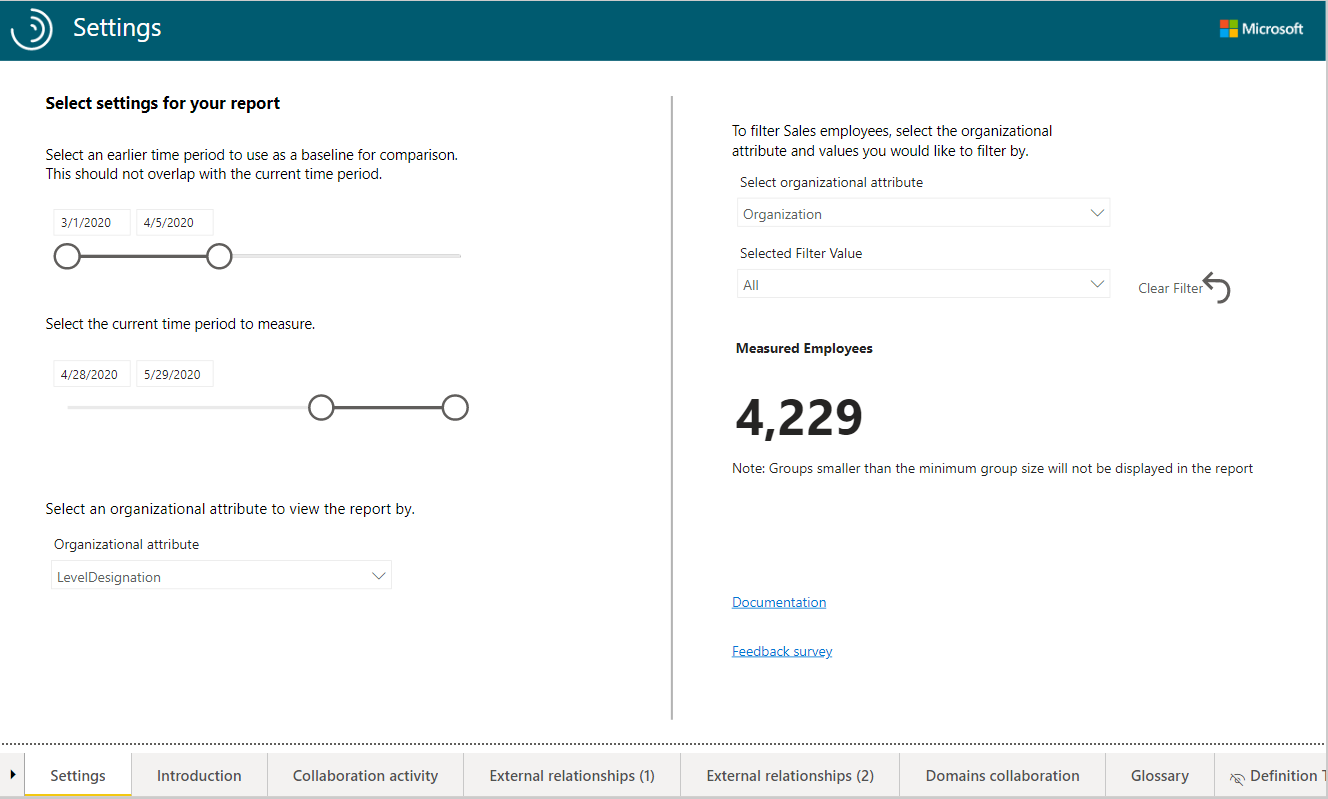
Earlier time period - This is the baseline for your analysis and all changes will be compared with this time period.
Note
The Earlier time period must precede and not overlap with the Current time period. If the two timeframes overlap, you'll get a warning about the timelines overlapping.
Current time period - This is the time frame you want to compare with the earlier time period.
Organizational attribute to view the report by - The primary “group-by” attribute shown in all subsequent reports. You can change this attribute at any time and all subsequent report pages will show group values by the new attribute.
Organizational attribute to filter by – To filter the measured employee population to choose Sales employees, you can filter by any selected Organizational attribute, and then filter by any of the values for these attributes. If you filter, the measured employees count will reflect a reduced number. To clear an existing filter, select Ctrl while clicking the Clear filter arrow (or with a touchscreen, select the Clear filter arrow). Measured employees reflect the number of employees in the filtered population who were active in the specified time period. Active employees are those who sent at least one email or instant message in the work week included in the current time period.
After confirming the settings, check the number of measured employees to confirm this is the population you want to analyze.
Important
As new data is processed on a weekly basis, select Refresh in the Power BI Home ribbon to view the most recent data.
About the dashboard reports
The dashboard reports directionally highlight where a shift to remote work is having the largest impact. They also give you a measurable starting point for identifying where leaders can use tools and processes to support employees in a new way of working. All metrics are defined in the Glossary. A “why it matters” interpretation is also included in a text box for each report.
The following describes each report with specific nuances to consider for each.
- How are collaboration activities with external and internal stakeholders changing? - Shows how employee collaboration patterns are changing in response to a shift in work patterns, and which collaboration tools people are substituting for in-person interactions.
- Are external relationships being maintained? - Quantifies changes in communication with customers, partners, and other people outside the organization. The switch to remote work can impact specific groups more than others. Check in with employees on how they're adjusting to this change, and give them resources for prioritizing work, as necessary.
- How are engagement models with external stakeholders evolving? – Shows how relationships with customers are changing. You can evaluate whether sellers are devoting extra time and effort in prospecting and lead generation, as compared to focusing on existing customers. Use this analysis to see how you can best support your employees.
- How have relationships with key customers changed? – Shows how the collaboration with top domains in the company are changing. It also highlights domains that have gained or lost traction in the current time frame. Help employees navigate current trends with their customers to keep partnerships and sales strong.
Power BI tips, troubleshooting, and FAQs
For details about how to share the dashboard and other Power BI tips, troubleshoot any issues, or review the FAQ, see Power BI tips, FAQ, and troubleshooting.