Add a heat map layer to a map
Heat maps, also known as point density maps, are a type of data visualization. They're used to represent the density of data using a range of colors and show the data "hot spots" on a map. Heat maps are a great way to render datasets with large number of points.
Rendering tens of thousands of points as symbols can cover most of the map area. This case likely results in many symbols overlapping. Making it difficult to gain a better understanding of the data. However, visualizing this same dataset as a heat map makes it easy to see the density and the relative density of each data point.
You can use heat maps in many different scenarios, including:
- Temperature data: Provides approximations for what the temperature is between two data points.
- Data for noise sensors: Shows not only the intensity of the noise where the sensor is, but it can also provide insight into the dissipation over a distance. The noise level at any one site might not be high. If the noise coverage area from multiple sensors overlaps, it's possible that this overlapping area might experience higher noise levels. As such, the overlapped area would be visible in the heat map.
- GPS trace: Includes the speed as a weighted height map, where the intensity of each data point is based on the speed. For example, this functionality provides a way to see where a vehicle was speeding.
Tip
Heat map layers by default render the coordinates of all geometries in a data source. To limit the layer so that it only renders point geometry features, set the filter property of the layer to ['==', ['geometry-type'], 'Point']. If you want to include MultiPoint features as well, set the filter property of the layer to ['any', ['==', ['geometry-type'], 'Point'], ['==', ['geometry-type'], 'MultiPoint']].
Add a heat map layer
To render a data source of points as a heat map, pass your data source into an instance of the HeatMapLayer class, and add it to the map.
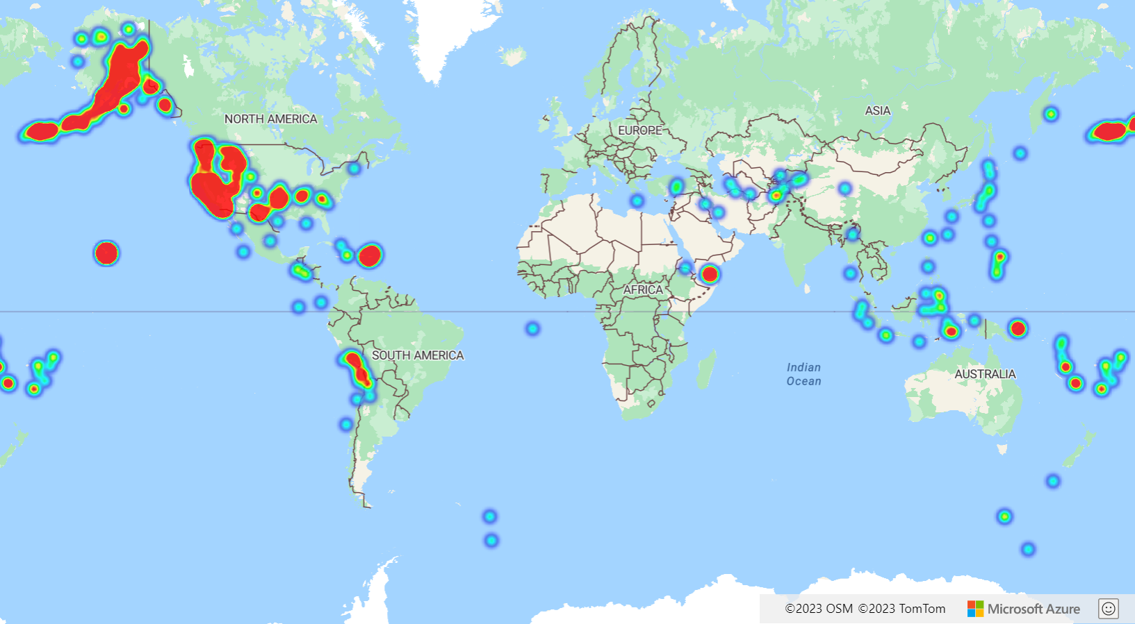
In the following code, each heat point has a radius of 10 pixels at all zoom levels. To ensure a better user experience, the heat map is below the label layer. The labels stay clearly visible. The data in this sample is from the USGS Earthquake Hazards Program. It is for significant earthquakes that have occurred in the last 30 days.
//Create a data source and add it to the map.
var datasource = new atlas.source.DataSource();
map.sources.add(datasource);

//Load a dataset of points, in this case earthquake data from the USGS.
datasource.importDataFromUrl('https://earthquake.usgs.gov/earthquakes/feed/v1.0/summary/all_week.geojson');

//Create a heat map and add it to the map.
map.layers.add(new atlas.layer.HeatMapLayer(datasource, null, {
  radius: 10,
  opacity: 0.8
}), 'labels');
The Simple Heat Map Layer sample demonstrates how to create a simple heat map from a data set of point features. For the source code for this sample, see Simple Heat Map Layer source code.
Customize the heat map layer
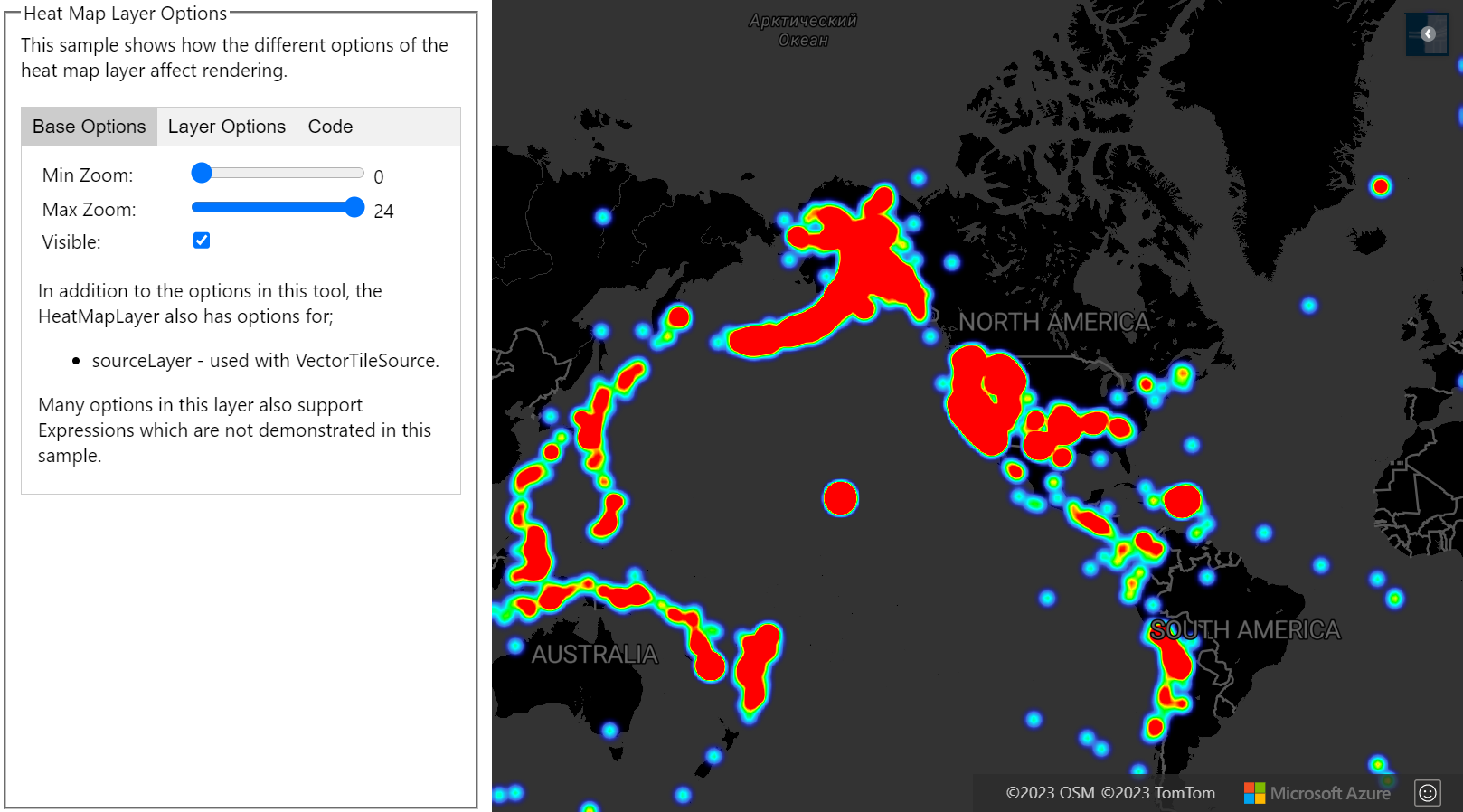
The previous example customized the heat map by setting the radius and opacity options. The heat map layer provides several options for customization, including:
radius: Defines a pixel radius in which to render each data point. You can set the radius as a fixed number or as an expression. By using an expression, you can scale the radius based on the zoom level, and represent a consistent spatial area on the map (for example, a 5-mile radius).color: Specifies how the heat map is colorized. A color gradient is a common feature of heat maps. You can achieve the effect with aninterpolateexpression. You can also use astepexpression for colorizing the heat map, breaking up the density visually into ranges that resemble a contour or radar style map. These color palettes define the colors from the minimum to the maximum density value.You specify color values for heat maps as an expression on the
heatmap-densityvalue. The color of area where there's no data is defined at index 0 of the "Interpolation" expression, or the default color of a "Stepped" expression. You can use this value to define a background color. Often, this value is set to transparent, or a semi-transparent black.Here are examples of color expressions:
Interpolation color expression Stepped color expression [
'interpolate',
['linear'],
['heatmap-density'],
0, 'transparent',
0.01, 'purple',
0.5, '#fb00fb',
1, '#00c3ff'
][
'step',
['heatmap-density'],
'transparent',
0.01, 'navy',
0.25, 'green',
0.50, 'yellow',
0.75, 'red'
]opacity: Specifies how opaque or transparent the heat map layer is.intensity: Applies a multiplier to the weight of each data point to increase the overall intensity of the heatmap. It causes a difference in the weight of data points, making it easier to visualize.weight: By default, all data points have a weight of 1, and are weighted equally. The weight option acts as a multiplier, and you can set it as a number or an expression. If a number is set as the weight, it's the equivalence of placing each data point on the map twice. For instance, if the weight is 2, then the density doubles. Setting the weight option to a number renders the heat map in a similar way to using the intensity option.However, if you use an expression, the weight of each data point can be based on the properties of each data point. For example, suppose each data point represents an earthquake. The magnitude value has been an important metric for each earthquake data point. Earthquakes happen all the time, but most have a low magnitude, and aren't noticed. Use the magnitude value in an expression to assign the weight to each data point. By using the magnitude value to assign the weight, you get a better representation of the significance of earthquakes within the heat map.
sourceandsource-layer: Enable you to update the data source.
The Heat Map Layer Options sample shows how the different options of the heat map layer that affects rendering. For the source code for this sample, see Heat Map Layer Options source code.
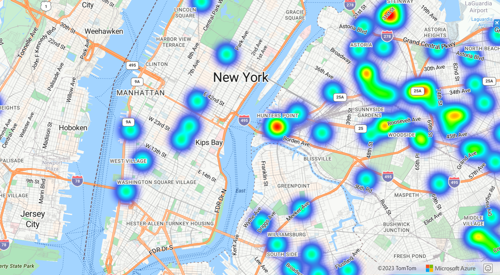
Consistent zoomable heat map
By default, the radii of data points rendered in the heat map layer have a fixed pixel radius for all zoom levels. As you zoom the map, the data aggregates together and the heat map layer looks different.
Use a zoom expression to scale the radius for each zoom level, such that each data point covers the same physical area of the map. This expression makes the heat map layer look more static and consistent. Each zoom level of the map has twice as many pixels vertically and horizontally as the previous zoom level.
Scaling the radius so that it doubles with each zoom level creates a heat map that looks consistent on all zoom levels. To apply this scaling, use zoom with a base 2 exponential interpolation expression, with the pixel radius set for the minimum zoom level and a scaled radius for the maximum zoom level calculated as 2 * Math.pow(2, minZoom - maxZoom) as shown in the following sample. Zoom the map to see how the heat map scales with the zoom level.
The Consistent zoomable Heat Map sample shows how to create a heat map where the radius of each data point covers the same physical area on the ground, creating a more consistent user experience when zooming the map. The heat map in this sample scales consistently between zoom levels 10 and 22. Each zoom level of the map has twice as many pixels vertically and horizontally as the previous zoom level. Doubling the radius with each zoom level creates a heat map that looks consistent across all zoom levels. For the source code for this sample, see Consistent zoomable Heat Map source code.
The zoom expression can only be used in step and interpolate expressions. The following expression can be used to approximate a radius in meters. This expression uses a placeholder radiusMeters, which you should replace with your desired radius. This expression calculates the approximate pixel radius for a zoom level at the equator for zoom levels 0 and 24, and uses an exponential interpolation expression to scale between these values the same way the tiling system in the map works.
[
    `'interpolate',
    ['exponential', 2],
    ['zoom'],
    0, ['*', radiusMeters, 0.000012776039596366526],
    24, [`'*', radiusMeters, 214.34637593279402]
]
Tip
When you enable clustering on the data source, points that are close to one another are grouped together as a clustered point. You can use the point count of each cluster as the weight expression for the heat map. This can significantly reduce the number of points to be rendered. The point count of a cluster is stored in a point_count property of the point feature:
var layer = new atlas.layer.HeatMapLayer(datasource, null, {
   weight: ['get', 'point_count']
});
If the clustering radius is only a few pixels, there would be a small visual difference in the rendering. A larger radius groups more points into each cluster, and improves the performance of the heatmap.
Next steps
Learn more about the classes and methods used in this article:
For more code examples to add to your maps, see the following articles:
Pripomienky
Pripravujeme: V priebehu roka 2024 postupne zrušíme službu Problémy v službe GitHub ako mechanizmus pripomienok týkajúcich sa obsahu a nahradíme ju novým systémom pripomienok. Ďalšie informácie nájdete na stránke: https://aka.ms/ContentUserFeedback.
Odoslať a zobraziť pripomienky pre