Exercise - Work with external data in a canvas app
In this exercise, you work with external data in your canvas app, by adding a data source to your app, creating/modifying data by using collections, and modifying data via the Patch function.
You need to download the spreadsheet to complete this exercise. Select download once the link opens. Extract the Excel spreadsheet and upload the spreadsheet to your own OneDrive.
Add a data source
Sign into Power Apps.
Create a new Power Apps Canvas app from blank and call it ExternalData. Select the Tablet format.
Make sure that you’ve added the Excel sheet (link above) to your OneDrive.
From the Insert button in the header ribbon, select Vertical gallery.
In the Select a data source pane at your gallery, type "OneDrive" in the search field, then select OneDrive for Business from the list. Alternatively, you could also expand Connectors and scroll through the available connectors until you find OneDrive for Business.
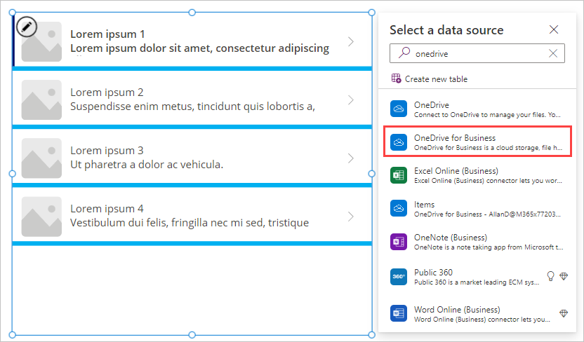
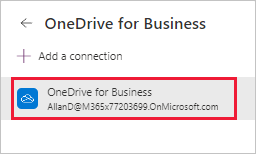
Under Add a connection, select the connection you wish to use for OneDrive for Business (it has an email address listed under it).
At the bottom of OneDrive for Business, select Connect.
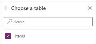
When prompted to Choose an Excel file, search for or scroll to the Excel file you downloaded in Step 3 and select it.
Check the Items table and then select Connect.
Your gallery is now connected to your Excel table in OneDrive for Business, and you can display the data in the gallery control.
Display and interact with your data in a gallery
Select the gallery you’ve added.
In the properties pane on the right, select the drop-down menu for the Layout property.
Select the Image, title, subtitle, and body layout.
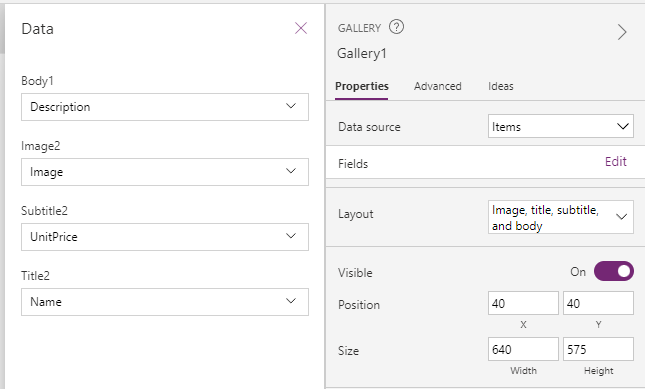
In the properties pane on the right, select the Edit button for the Fields property and set the fields as follows (note that the controls have numbers behind them so, for example Body will be "Body1", see image below for reference):
Body: Description
Image: Image
Subtitle: UnitPrice
Title: Name
Close the Data dialog box (select the X at the top right).
In the gallery, select the price in the first row.
In the formula bar, make sure the Text property is selected and type the following:
"$" & ThisItem.UnitPrice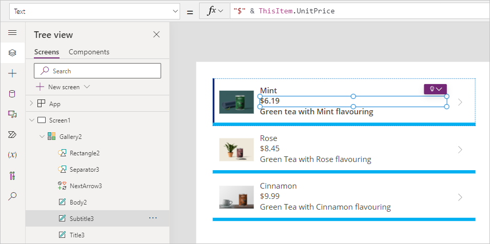
In the gallery, select the image in the first row.
In the properties pane on the right, select the drop-down menu for the Image Position property.
Change the property from Fit to Fill and you see that the picture expands to fill the dimensions of the image control.
You’ve now added, customized and configured data in your gallery.
Moving data between collections and data sources
Select Screen1 (anywhere outside of the gallery).
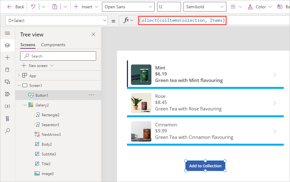
Let's add a button by selecting the Insert button in the app ribbon. Select Button and position the new button control underneath your gallery.
Change the Text on the button to Add to Collection, and adjust Font size from 15 to 12 so that the text fits the button in a single line.
Select the button, and in the formula bar, replace OnSelect value of false with this expression:
Collect(colItemsCollection, Items)`colItemsCollection: Refers to the Collection name
Items: Refers to the Data Source name
Collect: Will copy all records from the Items into the colItemsCollection collection
Select the Preview button in the top right of the Power Apps editor (or press F5) to enter preview mode. Select the Add to Collection button, and exit preview mode. Alternatively, press and hold Alt and select the Add to collection button.
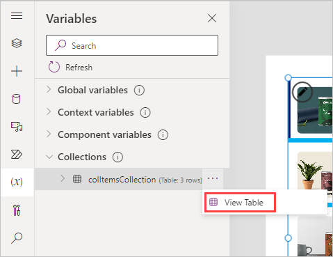
In the left-side rail select the Variables button, expand the Collections option, and select the ellipsis next to colItemsCollection that you created. Select the View Table option.
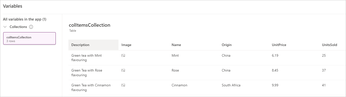
You should now see a pop-up window showing the table stored in your collection. Notice that the three records from the Items data source have been added to the colItemsCollection collection. You can view any of your app's collections and other variables using this technique.
Select Cancel to close the pop-up view and return to your app canvas.
Explore other functions that can be used with Collections
From the Tree view, select New Screen > Blank.
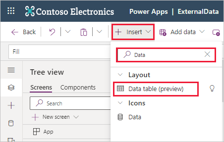
Select the Insert button and search for Data and select Data table.
In the Select a data source dialog pane for your new data table, select colItemsCollection.
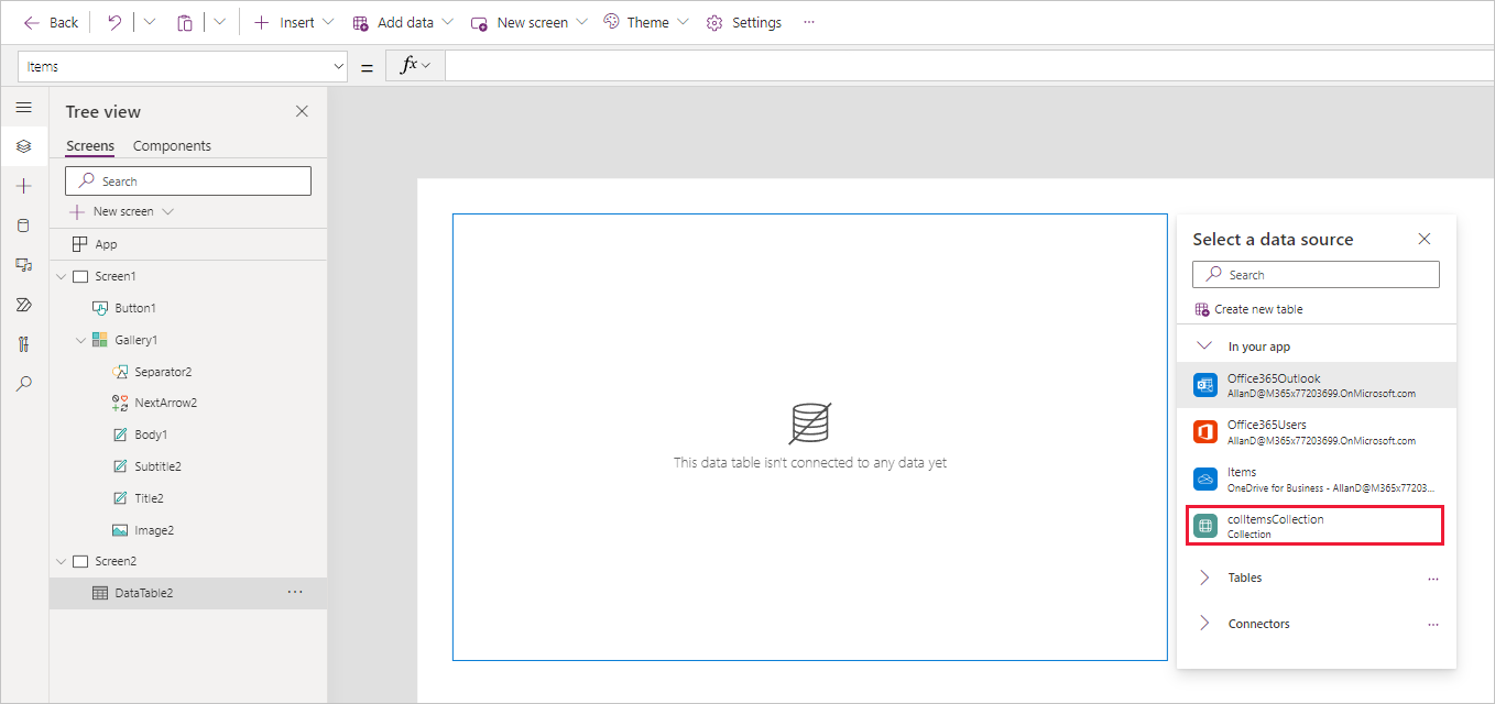
We've now made our collection colItemsCollection as the data source for this control and not the Items table in the Excel sheet. The next step is to define the fields we want to display.
In the properties pane on the right, select the Edit fields button for the Fields property.
Select Add field.
Select all available fields and then select Add.
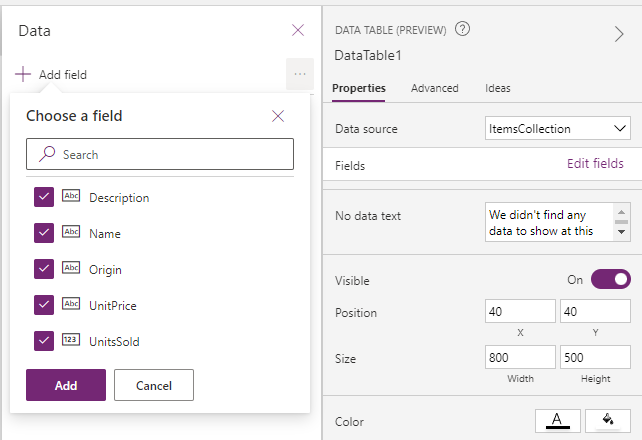
Close the Data pane (select the X towards the right of Data).
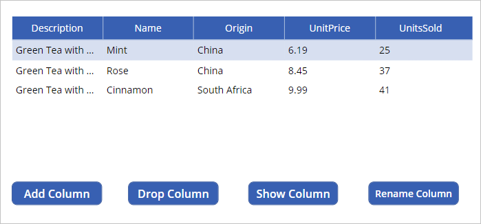
Insert a button by selecting Insert from the ribbon, select Button and position your button underneath your table. Add three more buttons from left to right under the data table control on your screen.
Change the text on all four buttons to Add Column, Drop Column, Show Column, Rename Column respectively. You can do this simply by double-clicking on each button and typing the new name. Adjust the font size of the Rename Column button to 12, so that it fits in a single line.
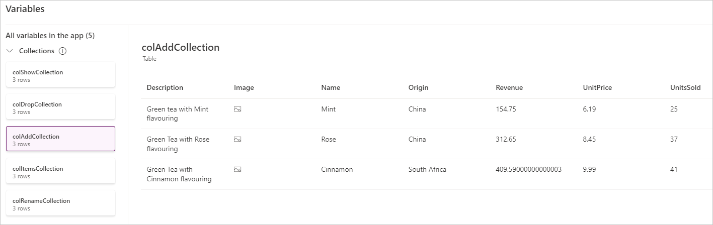
Select the Add Column button and update the OnSelect property to this expression:
Collect(colAddCollection, AddColumns(colItemsCollection, "Revenue", UnitPrice * UnitsSold))Selecting this button creates a new collection called colAddCollection, taking the data from the colItemsCollection collection and, by using the AddColumns function, adds a new column called Revenue, which is calculated as UnitPrice * UnitsSold.
Select the Drop Column button on the canvas, and update the OnSelect property to this expression:
Collect(colDropCollection, DropColumns(colItemsCollection, "UnitPrice"))Selecting this button creates a new collection called colDropCollection, which copies all data from the colItemsCollection collection, but by using the DropColumns function it removes the UnitPrice Column.
Select the Show Column button and update the OnSelect property to this expression:
Collect(colShowCollection, ShowColumns(colItemsCollection, "Name"))Selecting this button creates a new collection called *colShowCollection, which includes all data from the colItemsCollection collection, but it uses the ShowColumns function to only show the Name column.
Select the Rename Column button and update the OnSelect property to this expression:
Collect(colRenameCollection, RenameColumns(colItemsCollection, "Name", "Product"))Selecting this button creates a new collection called colRenameCollection, which includes all data from the colItemsCollection collection, but by using the RenameColumns function changes the Name column to Product.
When completed your buttons should look like this:
Select the Preview (or Play) button in the top right of the Power Apps editor to enter preview mode. Select all four buttons. Then exit preview mode. What we just did was to create four additional collections.
Let's take a look at the four new collections we created. Select Variables>Collections, then select the ellipsis next to colAddCollection, and then View Table. Notice how your Variables pop-up window has a menu on the left side showing all four of the new collections we created, along with the original collection. You can select through each of them to see the effect on the original collection that was displayed in our data table.
colAddCollection
colDropCollection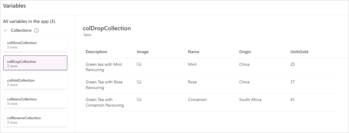 colShowCollection
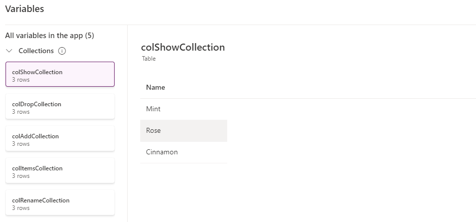 colRenameCollection
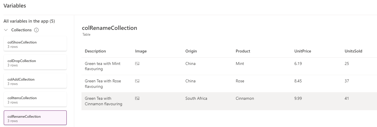
Close the Variables pop-up window after you've taken a look. Remember that collections are tables of temporary data only available while using the app and only available to the current user. So, once you close the app they're gone.

Work with the Patch function
Return to Screen 1 in your app.
Add a Text label control (select the Insert button and select Text label). Rename the Text property to Product Name. You can do this by double clicking the label and typing directly in the control. Then position the label next to the gallery.
Tip
An easy technique to copy and paste a control quickly is to select the control, press and hold the Ctrl key and press C; then (while holding the Ctrl key) press V. You'll see your item paste slightly below and to the right of the control you just copied.
With the label selected, copy it, and make the Text of the copied label New Description.
Use the Insert button again to insert a Text input control. Clear the default property to make it blank. Then copy this control and position both text inputs next to the labels you made in the steps above. Your screen should now look similar to this:
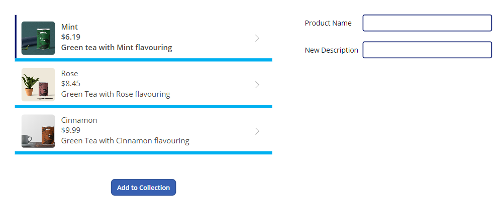
Next insert a Button control and position it beneath your Labels. Change the Text property to Update.
Select the text input to the right of the Product Name label.
In the formula bar, make sure you have the Default property selected and then change the expression to the following (keep in mind your gallery control might have a different name than Gallery1; change the formula accordingly):
Gallery1.Selected.NameThis label will now display the Name of the selected record from the gallery. You can test this by putting the app in Preview mode (alternatively, press and hold the Alt key) and selecting different items from the gallery. Notice how the displayed Product Name changes as you select different gallery items.
Repeat this process for the text input control to the right of the New Description label. Make the Default formula as below:
Gallery1.Selected.DescriptionAnother thing to note is the dark vertical bar that displays on the left side of the gallery item that is selected.
Select the Update button.
Change the OnSelect property of the button to this expression:
Patch(Items,LookUp(Items, Name = TextInput1.Text), { Description: TextInput1_1.Text })Note
Your text input controls may have different names than this example. Adjust your formula accordingly.
Let's recap what we've done. We've created a way to update our product description.
Patch - Provides the means to modify or create a record in your data source, in this case we're modifying a record.
LookUp - Uses our product name to find the record we want to modify. It returns the first record that matches our condition: Name = TextInput1.Text.
Once Power Apps finds the matching record (via LookUp), it updates the Description of the item in the data source based on what you have typed in the New Description text input.
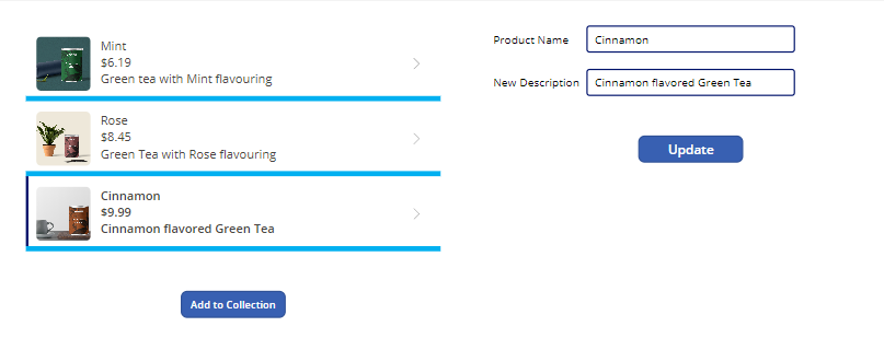
Test this by previewing your app. Select the Cinnamon item in the gallery and then replace the current description with "Cinnamon flavored Green Tea", then select Update. The description in the gallery changes to the new description.
Congratulations! You've learned a technique to update your data source.