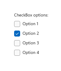
選項按鈕
選項按鈕可讓使用者從兩個或多個互斥但相關的選項集合中選取一個選項。 選項按鈕一律會在群組中使用,而且每個選項都會由群組中的一個選項按鈕來表示。
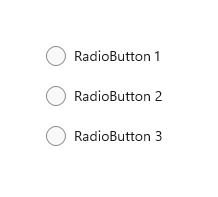
在預設狀態下,不會選取 RadioButtons 群組中的任何選項按鈕。 也就是說,清除所有選項按鈕。 不過,一旦使用者選取了選項按鈕,就無法取消選取按鈕而讓群組還原到其初始清除狀態。
RadioButtons 群組的單一行為會與核取方塊 (可支援多重選取和取消選取或清除) 的單一行為有所區別。
這是正確的控制項嗎?
使用選項按鈕可讓使用者從兩個或更多互斥選項中選取。
當使用者需要先查看所有選項再做選擇時,請使用選項按鈕。 選項按鈕同等地強調所有選項,這表示有些選項可能會引起不必要或不想要的注意。
除非所有選項都值得同等注意,否則請考慮使用其他控制項。 例如,若要為大多數使用者以及在大部分情況下建議單一最佳選項,請使用下拉式方塊,將該最佳選項顯示為預設選項。
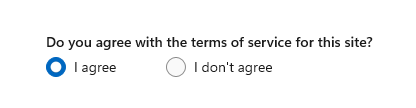
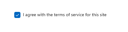
如果只有兩個可以明確表達為單一二元選擇的可能選項 (例如「開啟/關閉」或「是/否」),請將這兩個選項結合成單一的核取方塊或切換開關控制項。 例如,使用「我同意」的單一核取方塊來代替「我同意」和「我不同意」兩個選項按鈕。
請勿對單一的二元選擇使用兩個選項按鈕:
請改為使用核取方塊:
使用者可以選取多個選項時,請使用核取方塊。
當使用者的選項位於值範圍內時(例如 10、20、30...100),使用 滑桿 控件。
如果有超過 8 個選項,請使用下拉式方塊。
如果可用的選項取決於應用程式目前的內容,或者可能會不斷地變化,請使用清單控制項。
建議
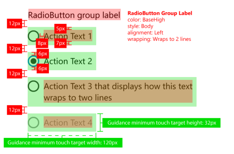
- 確定一組選項按鈕的目的和目前狀態明確。
- 將選項按鈕的文字標籤限制為單行。
- 如果文字標籤是動態的,請考慮按鈕將如何自動調整大小以及調整後周圍的任何視覺效果會發生什麼變化。
- 除非您的品牌指導方針指示您使用其他字型,否則使用預設字型。
- 不要將兩個 RadioButtons 群組並排。 當兩個 RadioButtons 群組並列時,使用者很難判斷哪個按鈕屬於哪個群組。
RadioButtons 概觀
RadioButtons 與 RadioButton
有兩種方式可以建立單選按鈕群組:RadioButtons 和 RadioButton。
- 我們建議使用 RadioButtons 控制件。 此控制項可簡化版面配置、處理鍵盤瀏覽和協助工具,以及支援繫結至資料來源。
- 您可以使用個別 RadioButton 控制項的群組。
RadioButtons 控制項已將鍵盤存取和瀏覽行為最佳化。 這些改善可同時協助鍵盤和協助工具進階使用者在選項清單中更快速且輕鬆地移動。
除了這些改善之外,RadioButtons 群組中個別選項按鈕的預設視覺版面配置也已透過自動化方向、間距和邊界設定進行最佳化。 此最佳化消除了指定這些屬性的需求,因為您在使用更基本的群組控制項 例如 StackPanel 或 Gird 時可能必須這麼做。
瀏覽 RadioButtons 群組
RadioButtons 控制項具有特殊的瀏覽行為,可協助鍵盤使用者更快速且更輕鬆地瀏覽清單。
鍵盤焦點
RadioButtons 控制項支援兩種狀態:
- 未選取任何選項按鈕
- 已選取一個選項按鈕
後面幾節將說明控制項在這兩種狀態中各自的焦點行為。
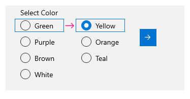
未選取任何選項按鈕
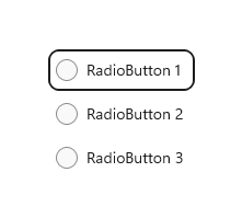
未選取任何選項按鈕時,清單中的第一個選項按鈕會取得焦點。
注意
不會選取從初始 Tab 瀏覽接收 Tab 焦點的項目。
不具 Tab 焦點,且沒有選取項目的清單
不具初始 Tab 焦點,且沒有選取項目的清單
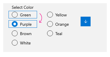
已選取一個選項按鈕
當使用者透過 Tab 鍵進入已選取選項按鈕的清單時,選取的選項按鈕就會取得焦點。
沒有索引標籤焦點的清單
具有初始索引標籤焦點的清單

鍵盤導覽
如需一般鍵盤瀏覽行為的詳細資訊,請參閱鍵盤互動 - 瀏覽。
當 RadioButtons 群組中的項目已有焦點時,使用者可以使用方向鍵在群組內的項目之間進行「內部瀏覽」。 向上鍵和向下鍵會移至 XAML 標記中所定義的「下一個」或「上一個」邏輯項目。 向左鍵和向右鍵則會進行空間上的移動。
單欄或單列版面配置內的瀏覽
在單欄或單列的版面配置中,鍵盤瀏覽會產生下列行為:
單一數據行
向上鍵和向下鍵會在項目之間移動。向左鍵和向右鍵不會執行任何動作。
單一數據列
向左鍵和向上鍵會移至上一個項目,向右鍵和向下鍵則會移至下一個項目。
多欄、多列版面配置內的瀏覽
在多欄、多列的格狀版面配置中,鍵盤瀏覽會產生以下行為:
向左/向右鍵
向左鍵和向右鍵會在某列的項目之間水平移動焦點。

當焦點位於某欄最後一個項目上,並按下向右鍵或向左鍵時,焦點會移至下一欄或上一欄的最後一個項目 (如果有的話)。
向上/向下鍵
向上鍵和向下鍵會在某欄的項目之間垂直移動焦點。
當焦點位於某欄最後一個項目上,並按下向下鍵時,焦點會移至下一欄的第一個項目 (如果有的話)。 當焦點位於某欄第一個項目上,並按下向上鍵時,焦點會移至上一欄的最後一個項目 (如果有的話)
如需詳細資訊,請參閱鍵盤互動。
換行
RadioButtons 群組不會將焦點從第一列或第一欄換行至最後一列或最後一欄,也不會從最後一列或最後一欄換行至第一列或第一欄。 這是因為當使用螢幕助讀程式時,界限的意義以及開始和結束的清楚指示會遺失,這使得視力受損的使用者難以瀏覽清單。
RadioButtons 控制項也不支援列舉,因為控制項的用意是要包含合理的項目數 (請參閱這是正確的控制項嗎?)。
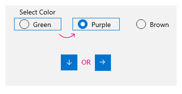
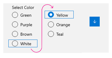
選取項目追隨焦點
當您使用鍵盤在 RadioButtons 群組中的項目之間瀏覽時,當焦點從某個項目移至下一個項目時,就會選取新聚焦的項目,並清除先前聚焦的項目。
鍵盤流覽之前
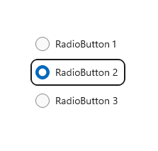
鍵盤瀏覽之前的焦點和選取項目。
鍵盤瀏覽之後
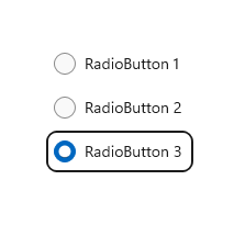
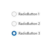
鍵盤瀏覽之後的焦點和選取項目,其中的向下鍵會將焦點移至選項按鈕 3,選取此選項按鈕,然後清除選項按鈕 2。
您可以使用「Ctrl+方向鍵」來進行瀏覽,以便移動焦點而不變更選取項目。 焦點移動之後,您可以使用空格鍵來選取焦點目前所在的項目。
使用遊戲板和遙控器流覽
如果您使用遊戲板或遙控器在單選按鈕之間移動,則會停用「選取後焦點」行為,而且用戶必須按下 「A」 按鈕來選取目前具有焦點的單選按鈕。
協助工具行為
下表描述朗讀程式如何處理 RadioButtons 群組和宣告的內容。 這種行為取決於使用者如何設定朗讀程式詳細資料喜好設定。
| 動作 | 朗讀程式公告 |
|---|---|
| 焦點移至選取的項目 | 「名稱 RadioButton 已選取第 x 項,共 N 項」 |
| 焦點移至未選取的項目 (如果使用 Ctrl 鍵或 Xbox 遊戲板流覽, 表示選取項目未關注焦點。) |
「名稱 RadioButton 未選取第 x 項,共 N 項」 |
注意
朗讀程式針對每個項目所公告的名稱是 AutomationProperties.Name 已連結屬性的值 (如果可供項目使用);否則,該名稱會是項目的 ToString 方法所傳回的值。
x 是目前項目的編號。 N 是群組中的項目總數。
UWP 和 WinUI 2
重要
本文中的資訊和範例已針對使用 Windows 應用程式 SDK 和 WinUI 3 的應用程式進行優化,但通常適用於使用 WinUI 2 的 UWP 應用程式。 如需平臺特定資訊和範例,請參閱 UWP API 參考。
本節包含您在 UWP 或 WinUI 2 應用程式中使用控件所需的資訊。
UWP app 的 RadioButtons 控制件包含在 Windows UI 連結庫 2 中。 如需詳細資訊 (包括安裝指示),請參閱 Windows UI 程式庫。 這些控件的 API 同時存在於 Windows.UI.Xaml.Controls 和 Microsoft.UI.Xaml.Controls 命名空間中。
- UWP API: RadioButton 類別、 IsChecked 屬性、 Checked 事件
- WinUI 2 Apis:RadioButtons 類別、SelectedItem 屬性、SelectedIndex 属性、SelectionChanged 事件
WinUI 2 資源庫應用程式包含大部分 WinUI 2 控制項、特性和功能的互動式範例。 從 Microsoft Store 取得應用程式,或在 Github 上取得原始程式碼。
有兩種方式可建立選項按鈕群組。
- 從 WinUI 2.3 開始,我們建議使用 RadioButtons 控制項。 此控制項可簡化版面配置、處理鍵盤瀏覽和協助工具,以及支援繫結至資料來源。
- 您可以使用個別 RadioButton 控制項的群組。 如果您的應用程式未使用 WinUI 2.3 或更新版本,則這是唯一的選項。
我們建議使用最新的 WinUI 2 來取得所有控制件的最新樣式和範本。
若要搭配 WinUI 2 使用本文中的程式代碼,請使用 XAML 中的別名 (我們使用 muxc) 來代表專案中所包含的 Windows UI 連結庫 API。 如需詳細資訊,請參閱 開始使用 WinUI 2 。
xmlns:muxc="using:Microsoft.UI.Xaml.Controls"

<muxc:RadioButtons />
建立 WinUI RadioButtons 群組
- 重要 API:RadioButtons 類別、SelectedItem 屬性、SelectedIndex 屬性、SelectionChanged 事件、RadioButton 類別、IsChecked 屬性、Checked 事件
- 開啟 WinUI 2 資源庫應用程式,並查看 RadioButton 運作情形。 WinUI 2 資源庫應用程式包含大部分 WinUI 2 控制項、特性和功能的互動式範例。 從 Microsoft Store 取得應用程式,或在 Github 上取得原始程式碼。
RadioButtons 控制項會使用類似 ItemsControl 的內容模型。 這表示您可以:
- 將項目直接新增至 Items 集合,或將資料繫結至其 ItemsSource 屬性,來進行填入作業。
- 使用 SelectedIndex 或 SelectedItem 屬性,以取得並設定要選取的選項。
- 處理要在選擇了選項時採取動作的 SelectionChanged 事件。
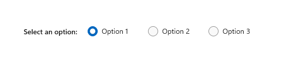
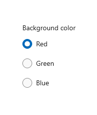
在這裡,您將宣告有三個選項的簡單 RadioButtons 控制項。 您可以設定 Header 屬性來為群組提供標籤,以及設定 SelectedIndex 屬性來提供預設選項。
<RadioButtons Header="Background color"
              SelectedIndex="0"
              SelectionChanged="BackgroundColor_SelectionChanged">
    <x:String>Red</x:String>
    <x:String>Green</x:String>
    <x:String>Blue</x:String>
</RadioButtons>
結果如下所示:
若要在使用者選取選項時採取動作,請處理 SelectionChanged 事件。 在這裡,您會變更名為 "ExampleBorder" (<Border x:Name="ExampleBorder" Width="100" Height="100"/>) 的 Border 元素背景色彩。
private void BackgroundColor_SelectionChanged(object sender, SelectionChangedEventArgs e)
{
    if (ExampleBorder != null && sender is RadioButtons rb)
    {
        string colorName = rb.SelectedItem as string;
        switch (colorName)
        {
            case "Red":
                ExampleBorder.Background = new SolidColorBrush(Colors.Red);
                break;
            case "Green":
                ExampleBorder.Background = new SolidColorBrush(Colors.Green);
                break;
            case "Blue":
                ExampleBorder.Background = new SolidColorBrush(Colors.Blue);
                break;
        }
    }
}
提示
您也可以從 SelectionChangedEventArgs.AddedItems 屬性取得所選的項目。 只會有一個位於索引 0 的已選取項目,因此您可以獲得如下的已選取項目:string colorName = e.AddedItems[0] as string;。
選取狀態
選項按鈕有兩個狀態:已選取或已清除。 在 RadioButtons 群組中選取了選項時,您可以從 SelectedItem 屬性獲得其值,並從 SelectedIndex 屬性獲得其在集合中的位置。 如果使用者選取同一個群組中的另一個選項按鈕,則可清除選項按鈕,但如果使用者再次選取,則無法將其清除。 不過,您可以將選項按鈕群組設定為 SelectedItem = null 或 SelectedIndex = -1,以程式設計方式清除該選項按鈕。 (將 SelectedIndex 設定為 Items 集合範圍以外的任何值,會產生未選取任何項目的狀態)。
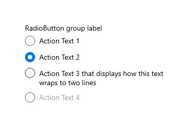
RadioButtons 內容
在上述範例中,您已使用簡單的字串填入 RadioButtons 控制項。 此控制項會提供幾個選項按鈕,並使用字串作為每一個選項按鈕的標籤。
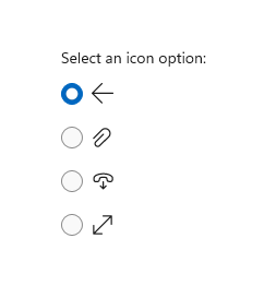
不過,您可以使用任何物件來填入 RadioButtons 控制項。 一般來說,您會希望物件提供可作為文字標籤的字串標記法。 在某些情況下,可能適合使用影像來取代文字。
在這裡,我們使用 SymbolIcon 元素來填入控制項。
<RadioButtons Header="Select an icon option:">
    <SymbolIcon Symbol="Back"/>
    <SymbolIcon Symbol="Attach"/>
    <SymbolIcon Symbol="HangUp"/>
    <SymbolIcon Symbol="FullScreen"/>
</RadioButtons>
您也可以使用個別的 RadioButton 控制項來填入 RadioButtons 項目。 我們稍後會討論這個特殊案例。 請參閱 RadioButtons 群組中的 RadioButton 控制項。
能夠使用任何物件的優點是,您可以將 RadioButtons 控制項繫結至資料模型中的自訂類型。 下一節將示範這種情況。
資料繫結
RadioButtons 控制項支援將資料繫結至其 ItemsSource 屬性。 這個範例會示範如何將控制項繫結至自訂資料來源。 這個範例的外觀和功能與先前的背景色彩範例相同,但在這裡,色彩筆刷會儲存在資料模型中,而不會建立在 SelectionChanged 事件處理常式中。
<RadioButtons Header="Background color"
              SelectedIndex="0"
              SelectionChanged="BackgroundColor_SelectionChanged"
              ItemsSource="{x:Bind colorOptionItems}"/>
public sealed partial class MainPage : Page
{
    // Custom data item.
    public class ColorOptionDataModel
    {
        public string Label { get; set; }
        public SolidColorBrush ColorBrush { get; set; }

        public override string ToString()
        {
            return Label;
        }
    }

    List<ColorOptionDataModel> colorOptionItems;

    public MainPage1()
    {
        this.InitializeComponent();

        colorOptionItems = new List<ColorOptionDataModel>();
        colorOptionItems.Add(new ColorOptionDataModel()
            { Label = "Red", ColorBrush = new SolidColorBrush(Colors.Red) });
        colorOptionItems.Add(new ColorOptionDataModel()
            { Label = "Green", ColorBrush = new SolidColorBrush(Colors.Green) });
        colorOptionItems.Add(new ColorOptionDataModel()
            { Label = "Blue", ColorBrush = new SolidColorBrush(Colors.Blue) });
    }

    private void BackgroundColor_SelectionChanged(object sender, SelectionChangedEventArgs e)
    {
        var option = e.AddedItems[0] as ColorOptionDataModel;
        ExampleBorder.Background = option?.ColorBrush;
    }
}
RadioButtons 群組中的 RadioButton 控制項
您可以使用個別的 RadioButton 控制項來填入 RadioButtons 項目。 您可以執行此動作來存取某些屬性,例如 AutomationProperties.Name;或者,您可能有現有的 RadioButton 程式碼,但想要利用 RadioButtons 的版面配置和瀏覽。
<RadioButtons Header="Background color">
    <RadioButton Content="Red" Tag="red" AutomationProperties.Name="red"/>
    <RadioButton Content="Green" Tag="green" AutomationProperties.Name="green"/>
    <RadioButton Content="Blue" Tag="blue" AutomationProperties.Name="blue"/>
</RadioButtons>
當您使用 RadioButtons 群組中的 RadioButton 控制項時,RadioButtons 控制項會知道如何呈現 RadioButton,所以您最後不會得到兩個選取項目圓形。
不過,有一些您應該注意的行為。 我們建議您在個別控制項或 RadioButtons 上處理狀態和事件,但不要同時在兩者上進行,以免發生衝突。
下表顯示這兩個控制項的相關事件和屬性。
| RadioButton | RadioButtons |
|---|---|
| 已核取、未核取、按一下 | SelectionChanged \(英文\) |
| IsChecked | SelectedItem、 SelectedIndex |
如果您在個別 RadioButton 上處理事件 (例如 Checked 或 Unchecked),同時也處理 RadioButtons.SelectionChanged 事件,則這兩個事件都會引發。 RadioButton 事件會先發生,然後 RadioButtons.SelectionChanged 事件再發生,這可能會導致衝突。
IsChecked、SelectedItem 和 SelectedIndex 屬性會保持同步。 變更其中一個屬性會更新其他兩個屬性。
RadioButton.GroupName 屬性會遭到忽略。 此群組是由 RadioButtons 控制項建立的。
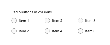
定義多欄
根據預設,RadioButtons 控制項會在單欄中垂直排列其選項按鈕。 您可以設定 MaxColumns 屬性,讓控制項將選項按鈕排列在多欄中。 (當您這麼做時,選項按鈕會按照以欄為主的順序進行配置,項目會由上往下填入,然後由左往右填入)。
<RadioButtons Header="RadioButtons in columns" MaxColumns="3">
    <x:String>Item 1</x:String>
    <x:String>Item 2</x:String>
    <x:String>Item 3</x:String>
    <x:String>Item 4</x:String>
    <x:String>Item 5</x:String>
    <x:String>Item 6</x:String>
</RadioButtons>
提示
若要讓項目排列在單一水平列中,請將 MaxColumns 設定為等於群組中的項目數。
建立您自己的 RadioButton 群組
重要
我們建議使用 RadioButtons 控件來將專案分組 RadioButton 。
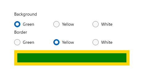
單選按鈕會在群組中運作。 您可以透過下列兩種方式之一,將個別 RadioButton 控制項分組:
- 將它們放在相同的父容器內。
- 將 每個單選按鈕上的 GroupName 屬性設定為相同的值。
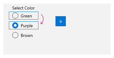
在此範例中,第一組單選按鈕會透過位於相同的堆棧面板中來隱含分組。 第二個群組會分割成兩個堆疊面板,因此會使用 GroupName 來將其明確地分組到單一群組中。
<StackPanel>
    <StackPanel>
        <TextBlock Text="Background" Style="{ThemeResource BaseTextBlockStyle}"/>
        <!-- Group 1 - implicit grouping -->
        <StackPanel Orientation="Horizontal">
            <RadioButton Content="Green" Tag="green" Checked="BGRadioButton_Checked"/>
            <RadioButton Content="Yellow" Tag="yellow" Checked="BGRadioButton_Checked"/>
            <RadioButton Content="White" Tag="white" Checked="BGRadioButton_Checked"
                         IsChecked="True"/>
        </StackPanel>
    </StackPanel>

    <StackPanel>
        <TextBlock Text="BorderBrush" Style="{ThemeResource BaseTextBlockStyle}"/>
        <!-- Group 2 - grouped by GroupName -->
        <StackPanel Orientation="Horizontal">
            <StackPanel>
                <RadioButton Content="Green" Tag="green" GroupName="BorderBrush"
                             Checked="BorderRadioButton_Checked"/>
                <RadioButton Content="Yellow" Tag="yellow" GroupName="BorderBrush"
                             Checked="BorderRadioButton_Checked" IsChecked="True"/>
                <RadioButton Content="White" Tag="white"  GroupName="BorderBrush"
                             Checked="BorderRadioButton_Checked"/>
            </StackPanel>
        </StackPanel>
    </StackPanel>
    <Border x:Name="ExampleBorder"
            BorderBrush="#FFFFD700" Background="#FFFFFFFF"
            BorderThickness="10" Height="50" Margin="0,10"/>
</StackPanel>
private void BGRadioButton_Checked(object sender, RoutedEventArgs e)
{
    RadioButton rb = sender as RadioButton;

    if (rb != null && ExampleBorder != null)
    {
        string colorName = rb.Tag.ToString();
        switch (colorName)
        {
            case "yellow":
                ExampleBorder.Background = new SolidColorBrush(Colors.Yellow);
                break;
            case "green":
                ExampleBorder.Background = new SolidColorBrush(Colors.Green);
                break;
            case "white":
                ExampleBorder.Background = new SolidColorBrush(Colors.White);
                break;
        }
    }
}

private void BorderRadioButton_Checked(object sender, RoutedEventArgs e)
{
    RadioButton rb = sender as RadioButton;

    if (rb != null && ExampleBorder != null)
    {
        string colorName = rb.Tag.ToString();
        switch (colorName)
        {
            case "yellow":
                ExampleBorder.BorderBrush = new SolidColorBrush(Colors.Gold);
                break;
            case "green":
                ExampleBorder.BorderBrush = new SolidColorBrush(Colors.DarkGreen);
                break;
            case "white":
                ExampleBorder.BorderBrush = new SolidColorBrush(Colors.White);
                break;
        }
    }
}
這兩個 RadioButton 控制項群組看起來像這樣:
廣播按鈕狀態
選項按鈕有兩個狀態:已選取或已清除。 已選取選項按鈕時,其 IsChecked 屬性為 true。 已選取選項按鈕時,其 IsChecked 屬性為 false。 如果使用者選取同一個群組中的另一個選項按鈕,則可清除選項按鈕,但如果使用者再次選取,則無法將其清除。 不過,您可以將選項按鈕的 IsChecked 屬性設定為 false,以程式設計方式清除該選項按鈕。
要考慮的視覺效果
個別 RadioButton 控制項的預設間距與 RadioButtons 群組所提供的間距不同。 若要將 RadioButtons 間距套用到個別 RadioButton 控制項,請使用 0,0,7,3 的 Margin 值,如下所示。
<StackPanel>
    <StackPanel.Resources>
        <Style TargetType="RadioButton">
            <Setter Property="Margin" Value="0,0,7,3"/>
        </Style>
    </StackPanel.Resources>
    <TextBlock Text="Background"/>
    <RadioButton Content="Item 1"/>
    <RadioButton Content="Item 2"/>
    <RadioButton Content="Item 3"/>
</StackPanel>
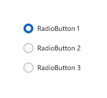
下列影像顯示群組中的選項按鈕慣用間距。
注意
如果您使用 WinUI RadioButtons 控制項,則間距、邊界和方向均已最佳化。
取得範例程式碼
- WinUI 資源庫:此範例會以互動式格式顯示所有 XAML 控制件。
相關主題

意見反應
即將登場:在 2024 年,我們將逐步淘汰 GitHub 問題作為內容的意見反應機制,並將它取代為新的意見反應系統。 如需詳細資訊,請參閱:https://aka.ms/ContentUserFeedback。
提交並檢視相關的意見反應