如何为控件创建模板 (WPF.NET)
使用 Windows Presentation Foundation (WPF),可以使用自己的可重用模板自定义现有控件的可视结构和行为。 可以对应用程序、窗口和页面全局应用模板,也可以将模板直接应用于控件。 需要新建控件的大多数场景均可改为为现有控件创建新模板。
重要
面向 .NET 7 和 .NET 6 的桌面指南文档正在撰写中。
本文将介绍如何为 Button 控件创建新的 ControlTemplate。
何时创建 ControlTemplate
控件有许多属性,例如 Background、Foreground 和 FontFamily。 这些属性控制控件外观的不同方面,但可通过设置这些属性进行的更改有限。 例如,可以从 CheckBox 中将 Foreground 属性设置为蓝色,并将 FontStyle 设置为斜体。 要自定义设置控件中其他属性无法实现的控件外观时,则创建 ControlTemplate。
在多数用户界面中,按钮的总体外观相同:即一个包含某些文本的矩形。 若想要创建一个圆形的按钮,可以创建一个继承自该按钮或重新创建该按钮功能的新控件。 此外,新用户控件还会提供圆形视觉对象。
通过自定义现有控件的可视布局,可以避免创建新控件。 借助圆形按钮,可创建具有所需可视布局的 ControlTemplate。
另一方面,如果你需要具有新功能、其他属性和新设置的控件,可创建新的 UserControl。
先决条件
创建新的 WPF 应用程序,在 MainWindow.xaml(或选择的其他窗口)的 <Window> 元素中设置以下属性:
| 属性 | Value |
|---|---|
| Title | Template Intro Sample |
| SizeToContent | WidthAndHeight |
| MinWidth | 250 |
将 <Window> 元素的内容设置为以下 XAML:
<StackPanel Margin="10">
    <Label>Unstyled Button</Label>
    <Button>Button 1</Button>
    <Label>Rounded Button</Label>
    <Button>Button 2</Button>
</StackPanel>
最后,MainWindow.xaml 文件应如下所示:
<Window x:Class="IntroToStylingAndTemplating.Window1"
        xmlns="http://schemas.microsoft.com/winfx/2006/xaml/presentation"
        xmlns:x="http://schemas.microsoft.com/winfx/2006/xaml"
        xmlns:d="http://schemas.microsoft.com/expression/blend/2008"
        xmlns:mc="http://schemas.openxmlformats.org/markup-compatibility/2006"
        xmlns:local="clr-namespace:IntroToStylingAndTemplating"
        mc:Ignorable="d"
        Title="Template Intro Sample" SizeToContent="WidthAndHeight" MinWidth="250">
    <StackPanel Margin="10">
        <Label>Unstyled Button</Label>
        <Button>Button 1</Button>
        <Label>Rounded Button</Label>
        <Button>Button 2</Button>
    </StackPanel>
</Window>
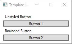
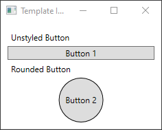
如果你运行应用程序,它将如下所示:
创建 ControlTemplate
声明 ControlTemplate 的最常见方法是在 XAML 文件的 Resources 部分中声明为资源。 模板是资源,因此它们遵从适用于所有资源的相同范围规则。 简言之,声明模板的位置会影响模板的应用范围。 例如,如果在应用程序定义 XAML 文件的根元素中声明模板,则该模板可以在应用程序中的任何位置使用。 如果在窗口中定义模板,则仅该窗口中的控件可以使用该模板。
首先,将 Window.Resources 元素添加到 MainWindow.xaml 文件:
<Window x:Class="IntroToStylingAndTemplating.Window2"
        xmlns="http://schemas.microsoft.com/winfx/2006/xaml/presentation"
        xmlns:x="http://schemas.microsoft.com/winfx/2006/xaml"
        xmlns:d="http://schemas.microsoft.com/expression/blend/2008"
        xmlns:mc="http://schemas.openxmlformats.org/markup-compatibility/2006"
        xmlns:local="clr-namespace:IntroToStylingAndTemplating"
        mc:Ignorable="d"
        Title="Template Intro Sample" SizeToContent="WidthAndHeight" MinWidth="250">
    <Window.Resources>

    </Window.Resources>
    <StackPanel Margin="10">
        <Label>Unstyled Button</Label>
        <Button>Button 1</Button>
        <Label>Rounded Button</Label>
        <Button>Button 2</Button>
    </StackPanel>
</Window>
使用以下属性集创建新的 <ControlTemplate>:
| 属性 | Value |
|---|---|
| x:Key | roundbutton |
| TargetType | Button |
此控制模板很简单:
- 控件的根元素 Grid
- 用于绘制按钮圆形外观的 Ellipse
- 用于显示用户指定的按钮内容的 ContentPresenter
<ControlTemplate x:Key="roundbutton" TargetType="Button">
    <Grid>
        <Ellipse Fill="{TemplateBinding Background}" Stroke="{TemplateBinding Foreground}" />
        <ContentPresenter HorizontalAlignment="Center" VerticalAlignment="Center" />
    </Grid>
</ControlTemplate>
TemplateBinding
创建新的 ControlTemplate 时,可能仍然想要使用公共属性更改控件外观。 TemplateBinding 标记扩展将 ControlTemplate 中元素的属性绑定到由控件定义的公共属性。 使用 TemplateBinding 时,可让控件属性用作模板参数。 换言之,设置控件属性后,该值将传递到包含 TemplateBinding 的元素。
椭圆形
请注意,<Ellipse> 元素的 Fill 和 Stroke 属性绑定到了控件的 Foreground 和 Background 属性。
ContentPresenter
此外,还将 <ContentPresenter> 元素添加到了模板。 此模板专为按钮设计,因此请注意该按钮继承自 ContentControl。 此按钮会显示该元素的内容。 可以在该按钮中设置任何内容,例如纯文本,甚至其他控件。 以下两个按钮均有效:
<Button>My Text</Button>

<!-- and -->

<Button>
    <CheckBox>Checkbox in a button</CheckBox>
</Button>
在前面的两个示例中,将文本和复选框设置为 Button.Content 属性。 设置为内容的任何内容都可通过 <ContentPresenter> 显示,这是模板的功能。
若将 ControlTemplate 应用到 ContentControl 类型(例如 Button),将在元素树中搜索 ContentPresenter。 若找到了 ContentPresenter,模板会自动将控件的 Content 属性绑定到 ContentPresenter。
使用模板
找到本文开头声明的按钮。
<StackPanel Margin="10">
    <Label>Unstyled Button</Label>
    <Button>Button 1</Button>
    <Label>Rounded Button</Label>
    <Button>Button 2</Button>
</StackPanel>
将第二个按钮的 Template 属性设置为 roundbutton 资源:
<StackPanel Margin="10">
    <Label>Unstyled Button</Label>
    <Button>Button 1</Button>
    <Label>Rounded Button</Label>
    <Button Template="{StaticResource roundbutton}">Button 2</Button>
</StackPanel>
若运行项目并查看结果,将看到此按钮具有圆形背景。
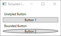
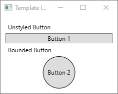
你可能已注意到,此按钮不是一个圆形,而是倾斜的。 由于 <Ellipse> 元素的工作方式,它始终会扩展并填充可用空间。 将此按钮的 width 和 height 属性更改为同一个值,以使圆形均衡:
<StackPanel Margin="10">
    <Label>Unstyled Button</Label>
    <Button>Button 1</Button>
    <Label>Rounded Button</Label>
    <Button Template="{StaticResource roundbutton}" Width="65" Height="65">Button 2</Button>
</StackPanel>
添加触发器
即使已应用模板的按钮看上去与众不同,但它的行为与任何其他按钮相同。 若按下此按钮,将触发 Click 事件。 不过,你可能已注意到,当你将鼠标移到此按钮上方时,此按钮的视觉对象不会改变。 这些视觉对象交互均由模板定义。
通过 WPF 提供的动态事件和属性系统,你可以监视特定属性是否是某个值,必要时还可重新设置模板样式。 在此示例中,你将监视按钮的 IsMouseOver 属性。 当鼠标位于控件上方时,使用新颜色设置 <Ellipse> 的样式。 此触发器类型称为 PropertyTrigger。
必须为 <Ellipse> 添加一个可引用的名称,以便于触发器起作用。 将其命名为“backgroundElement”。
<Ellipse x:Name="backgroundElement" Fill="{TemplateBinding Background}" Stroke="{TemplateBinding Foreground}" />
接下来,将新的 Trigger 添加到 ControlTemplate.Triggers 集合。 此触发器将监视 IsMouseOver 事件是否为值 true。
<ControlTemplate x:Key="roundbutton" TargetType="Button">
    <Grid>
        <Ellipse x:Name="backgroundElement" Fill="{TemplateBinding Background}" Stroke="{TemplateBinding Foreground}" />
        <ContentPresenter HorizontalAlignment="Center" VerticalAlignment="Center" />
    </Grid>
    <ControlTemplate.Triggers>
        <Trigger Property="IsMouseOver" Value="true">

        </Trigger>
    </ControlTemplate.Triggers>
</ControlTemplate>
接下来,将 <Setter> 添加到 <Trigger>,后者会将 <Ellipse> 的 Fill 属性更改为一种新颜色。
<Trigger Property="IsMouseOver" Value="true">
    <Setter Property="Fill" TargetName="backgroundElement" Value="AliceBlue"/>
</Trigger>
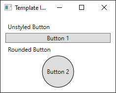
运行该项目。 请注意,当你将鼠标移到按钮上方时,<Ellipse> 的颜色会改变。
使用 VisualState
视觉状态由控件定义和触发。 例如,当鼠标移到控件上方时,将触发 CommonStates.MouseOver 状态。 可以基于控件的当前状态对属性更改进行动画处理。 在上一部分中,当 IsMouseOver 属性为 true 时,使用 <PropertyTrigger> 将按钮的背景更改为 AliceBlue。 可改为创建一个视觉状态,来对此颜色的更改进行动画处理,以实现平稳过过渡。 有关 VisualStates 的详细信息,请参阅 WPF 中的样式和模板。
若要将 <PropertyTrigger> 转换为动画效果的可视状态,首先要从模板删除 <ControlTemplate.Triggers> 元素。
<ControlTemplate x:Key="roundbutton" TargetType="Button">
    <Grid>
        <Ellipse x:Name="backgroundElement" Fill="{TemplateBinding Background}" Stroke="{TemplateBinding Foreground}" />
        <ContentPresenter HorizontalAlignment="Center" VerticalAlignment="Center" />
    </Grid>
</ControlTemplate>
接下来,在控件模板的 <Grid> 根中,添加 <VisualStateManager.VisualStateGroups>,其中包含 CommonStates 的 <VisualStateGroup>。 定义两种状态:Normal 和 MouseOver。
<ControlTemplate x:Key="roundbutton" TargetType="Button">
    <Grid>
        <VisualStateManager.VisualStateGroups>
            <VisualStateGroup Name="CommonStates">
                <VisualState Name="Normal">
                </VisualState>
                <VisualState Name="MouseOver">
                </VisualState>
            </VisualStateGroup>
        </VisualStateManager.VisualStateGroups>
        <Ellipse x:Name="backgroundElement" Fill="{TemplateBinding Background}" Stroke="{TemplateBinding Foreground}" />
        <ContentPresenter HorizontalAlignment="Center" VerticalAlignment="Center" />
    </Grid>
</ControlTemplate>
触发 <VisualState> 时,将应用该状态中定义的任何动画。 为每种状态创建动画。 动画位于 <Storyboard> 元素中。 有关情节提要的详细信息,请参阅情节提要概述。
正文
此状态对椭圆填充进行动画处理,将其还原为控件的
Background颜色。<Storyboard> <ColorAnimation Storyboard.TargetName="backgroundElement" Storyboard.TargetProperty="(Shape.Fill).(SolidColorBrush.Color)" To="{TemplateBinding Background}" Duration="0:0:0.3"/> </Storyboard>MouseOver
此状态对椭圆
Background颜色进行动画处理,将其更改为新颜色Yellow。<Storyboard> <ColorAnimation Storyboard.TargetName="backgroundElement" Storyboard.TargetProperty="(Shape.Fill).(SolidColorBrush.Color)" To="Yellow" Duration="0:0:0.3"/> </Storyboard>
现在,<ControlTemplate> 应如下所示。
<ControlTemplate x:Key="roundbutton" TargetType="Button">
<Grid>
<VisualStateManager.VisualStateGroups>
<VisualStateGroup Name="CommonStates">
<VisualState Name="Normal">
<Storyboard>
    <ColorAnimation Storyboard.TargetName="backgroundElement"
        Storyboard.TargetProperty="(Shape.Fill).(SolidColorBrush.Color)"
        To="{TemplateBinding Background}"
        Duration="0:0:0.3"/>
</Storyboard>
</VisualState>
<VisualState Name="MouseOver">
<Storyboard>
    <ColorAnimation Storyboard.TargetName="backgroundElement"
        Storyboard.TargetProperty="(Shape.Fill).(SolidColorBrush.Color)"
        To="Yellow"
        Duration="0:0:0.3"/>
</Storyboard>
</VisualState>
</VisualStateGroup>
</VisualStateManager.VisualStateGroups>
<Ellipse Name="backgroundElement" Fill="{TemplateBinding Background}" Stroke="{TemplateBinding Foreground}" />
<ContentPresenter x:Name="contentPresenter" HorizontalAlignment="Center" VerticalAlignment="Center" />
</Grid>
</ControlTemplate>
运行该项目。 请注意,当你将鼠标移到按钮上方时,<Ellipse> 的颜色会进行动画处理。
后续步骤
反馈
即将推出:在整个 2024 年,我们将逐步取消以“GitHub 问题”作为内容的反馈机制,并将其替换为新的反馈系统。 有关详细信息,请参阅:https://aka.ms/ContentUserFeedback。
提交和查看相关反馈