Xamarin.Forms FlyoutPage
 下载示例
下载示例浮出控件页通常会显示项列表,如以下屏幕截图中所示:

每个平台上的项列表的位置是相同的,选择某一项将导航到相关的详细信息页。 此外,浮出控件页还提导航栏功能,包含一个可用于导航到活动详细信息页的按钮:
- 在 iOS 中,导航栏位于页面顶部,并有一个导航到详细信息页的按钮。 此外,可通过向左滑动浮出控件来导航到活动的详细信息页。
- 在 Android 中,导航栏位于页面顶部,显示标题、图标和导航到详细信息页的按钮。 在
[Activity]属性中定义图标,该属性修饰特定于 Android 平台的项目中的MainActivity类。 此外,可以通过向左滑动浮出控件页、点击最右侧的详细信息页或点击屏幕底部的“返回”按钮来导航到活动详细信息页。 - 在通用 Windows 平台 (UWP) 中,导航栏位于页面顶部,并有一个可以导航到详细信息页的按钮。
详细信息页显示与浮出控件页上选择的项相关的数据,详细信息页的主要组件如以下屏幕截图所示:
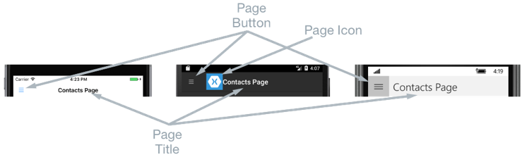
详细信息页包含内容依赖于平台的导航栏:
- 在 iOS 中,导航栏位于页面顶部并显示标题,并且有一个返回浮出控件页的按钮,前提是详细信息页实例包含在
NavigationPage实例中。 此外,还可以通过向右滑动详细信息页返回浮出控件页。 - 在 Android 中,导航栏位于页面顶部,显示标题、图标和返回浮出控件页的按钮。 在
[Activity]属性中定义图标,该属性修饰特定于 Android 平台的项目中的MainActivity类。 - 在 UWP 中,导航栏位于页面顶部,显示标题,并有一个返回浮出控件页的按钮。
导航行为
浮出控件页和详细信息页之间的导航体验行为取决于平台:
- 在 iOS 中,当浮出控件页从左侧滑动时,详细信息页向右滑动,并且详细信息页的左侧部分仍然可见。
- 在 Android 中,详细信息和浮出控件页相互叠加。
- 在 UWP 上,如果
FlyoutLayoutBehavior属性设置为Popover,浮出控件页会从左侧滑动到部分详细信息页上方。
在横向模式下将观察到类似的行为,除了 iOS 和 Android 中的浮出控件页在纵向模式下具有与浮出控件页类似的宽度,因此将显示更多详细信息页。
有关如何控制导航行为的信息,请参阅控制详细信息页面布局行为。
创建 FlyoutPage
FlyoutPage 包含同为类型 Page 的 Flyout 和 Detail,用于分别获取和设置浮出控件页和详细信息页。
重要
FlyoutPage 旨在作为根页,且在其他页面类型中将其作为子页使用时可能导致意外和不一致行为。 此外,建议 的浮出控件页 FlyoutPage 应始终为 ContentPage 实例,并且详细信息页应仅填充 TabbedPage、 NavigationPage和 ContentPage 实例。 这将有助于确保在所有平台上都有一致的用户体验。
以下 XAML 代码示例显示了设置 Flyout 和 Detail 属性的 FlyoutPage:
<FlyoutPage xmlns="http://xamarin.com/schemas/2014/forms"
            xmlns:x="http://schemas.microsoft.com/winfx/2009/xaml"
            xmlns:local="clr-namespace:FlyoutPageNavigation;assembly=FlyoutPageNavigation"
            x:Class="FlyoutPageNavigation.MainPage">
    <FlyoutPage.Flyout>
        <local:FlyoutMenuPage x:Name="flyoutPage" />
    </FlyoutPage.Flyout>
    <FlyoutPage.Detail>
        <NavigationPage>
            <x:Arguments>
                <local:ContactsPage />
            </x:Arguments>
        </NavigationPage>
    </FlyoutPage.Detail>
</FlyoutPage>
以下代码示例演示了在 C# 中创建的等效 FlyoutPage:
public class MainPageCS : FlyoutPage
{
    FlyoutMenuPageCS flyoutPage;

    public MainPageCS()
    {
        flyoutPage = new FlyoutMenuPageCS();
        Flyout = flyoutPage;
        Detail = new NavigationPage(new ContactsPageCS());
        ...
    }
    ...
}
Flyout 属性设置为 ContentPage 实例。 Detail 属性设置为包含 实例的 ContentPageNavigationPage。
创建浮出控件页面
以下 XAML 代码示例演示了 FlyoutMenuPage 对象的声明,通过 Flyout 属性引用该声明:
<ContentPage xmlns="http://xamarin.com/schemas/2014/forms"
             xmlns:x="http://schemas.microsoft.com/winfx/2009/xaml"
             xmlns:local="using:FlyoutPageNavigation"
             x:Class="FlyoutPageNavigation.FlyoutMenuPage"
             Padding="0,40,0,0"
             IconImageSource="hamburger.png"
             Title="Personal Organiser">
    <StackLayout>
        <ListView x:Name="listView" x:FieldModifier="public">
            <ListView.ItemsSource>
                <x:Array Type="{x:Type local:FlyoutPageItem}">
                    <local:FlyoutPageItem Title="Contacts" IconSource="contacts.png" TargetType="{x:Type local:ContactsPage}" />
                    <local:FlyoutPageItem Title="TodoList" IconSource="todo.png" TargetType="{x:Type local:TodoListPage}" />
                    <local:FlyoutPageItem Title="Reminders" IconSource="reminders.png" TargetType="{x:Type local:ReminderPage}" />
                </x:Array>
            </ListView.ItemsSource>
            <ListView.ItemTemplate>
                <DataTemplate>
                    <ViewCell>
                        <Grid Padding="5,10">
                            <Grid.ColumnDefinitions>
                                <ColumnDefinition Width="30"/>
                                <ColumnDefinition Width="*" />
                            </Grid.ColumnDefinitions>
                            <Image Source="{Binding IconSource}" />
                            <Label Grid.Column="1" Text="{Binding Title}" />
                        </Grid>
                    </ViewCell>
                </DataTemplate>
            </ListView.ItemTemplate>
        </ListView>
    </StackLayout>
</ContentPage>
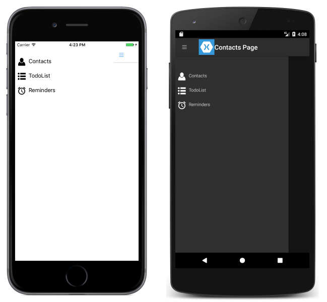
该页面由 ListView 组成且通过将其 ItemsSource 属性设置为 FlyoutPageItem 对象数组来填充 XAML 中的数据。 每个 FlyoutPageItem 定义 Title、IconSource 和 TargetType 属性。
DataTemplate 指定为 ListView.ItemTemplate 属性以显示每个 FlyoutPageItem。 DataTemplate 包含由 Image 和 Label 组成的 ViewCell。 Image 显示 IconSource 属性值,Label 显示每个 FlyoutPageItem 的 Title 属性值。
该页面有 Title 和 IconImageSource 属性集。 如果详细信息页有标题栏,则图标将显示在详细信息页上。 必须在 iOS 上通过将详细信息页面实例包装在 NavigationPage 实例中来启用此功能。
以下代码示例演示了在 C# 中创建的等效页:
public class FlyoutMenuPageCS : ContentPage
{
    ListView listView;
    public ListView ListView { get { return listView; } }

    public FlyoutMenuPageCS()
    {
        var flyoutPageItems = new List<FlyoutPageItem>();
        flyoutPageItems.Add(new FlyoutPageItem
        {
            Title = "Contacts",
            IconSource = "contacts.png",
            TargetType = typeof(ContactsPageCS)
        });
        flyoutPageItems.Add(new FlyoutPageItem
        {
            Title = "TodoList",
            IconSource = "todo.png",
            TargetType = typeof(TodoListPageCS)
        });
        flyoutPageItems.Add(new FlyoutPageItem
        {
            Title = "Reminders",
            IconSource = "reminders.png",
            TargetType = typeof(ReminderPageCS)
        });

        listView = new ListView
        {
            ItemsSource = flyoutPageItems,
            ItemTemplate = new DataTemplate(() =>
            {
                var grid = new Grid { Padding = new Thickness(5, 10) };
                grid.ColumnDefinitions.Add(new ColumnDefinition { Width = new GridLength(30) });
                grid.ColumnDefinitions.Add(new ColumnDefinition { Width = GridLength.Star });

                var image = new Image();
                image.SetBinding(Image.SourceProperty, "IconSource");
                var label = new Label { VerticalOptions = LayoutOptions.FillAndExpand };
                label.SetBinding(Label.TextProperty, "Title");

                grid.Children.Add(image);
                grid.Children.Add(label, 1, 0);

                return new ViewCell { View = grid };
            }),
            SeparatorVisibility = SeparatorVisibility.None
        };

        IconImageSource = "hamburger.png";
        Title = "Personal Organiser";
        Padding = new Thickness(0, 40, 0, 0);
        Content = new StackLayout
        {
            Children = { listView }
        };
    }
}
以下屏幕截图显示每个平台上的浮出控件页:
创建并显示详细信息页
FlyoutMenuPage 实例包含公开其 ListView 实例的 ListView 属性,以便 MainPageFlyoutPage 实例可以注册事件处理程序以处理 ItemSelected 事件。 这使 MainPage 实例能够将 Detail 属性设置为表示所选 ListView 项的页面。 以下代码示例演示事件处理程序:
public partial class MainPage : FlyoutPage
{
    public MainPage()
    {
        ...
        flyoutPage.listView.ItemSelected += OnItemSelected;
    }

    void OnItemSelected(object sender, SelectedItemChangedEventArgs e)
    {
        var item = e.SelectedItem as FlyoutPageItem;
        if (item != null)
        {
            Detail = new NavigationPage((Page)Activator.CreateInstance(item.TargetType));
            flyoutPage.listView.SelectedItem = null;
            IsPresented = false;
        }
    }
}
OnItemSelected 方法执行以下操作:
- 它检索来自
ListView实例的SelectedItem,并假设其不是null,则将详细信息页设置为存储在FlyoutPageItem的TargetType属性中的页面类型的新实例。 页面类型包装在NavigationPage实例中以确保通过 上的FlyoutMenuPageIconImageSource属性引用的图标能够显示在 iOS 中的详细信息页上。 ListView中所选的项设置为null,以确保下次显示FlyoutMenuPage时不会选择任何ListView中的项。- 通过将
FlyoutPage.IsPresented属性设置为false以将详细信息页显示给用户。 此属性控制是显示浮出控件页还是详细信息页。 应将其设置为true以显示浮出控件页,设置为false以显示详细信息页。
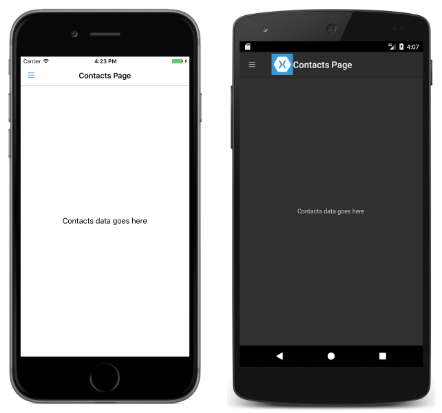
以下屏幕截图显示了 ContactPage 详细信息页,只有在浮出控件页上选中了该页面才会显示:
控制详细信息页面布局行为
FlyoutPage 管理浮出控件页和详细信息页的方式取决于应用程序是在手机还是平板电脑上运行、设备的方向以及 FlyoutLayoutBehavior 属性的值。 此属性决定详细信息页的显示方式。 可能的值为:
Default- 使用平台默认值显示页面。Popover- 详细信息页覆盖或部分覆盖浮出控件页。Split- 浮出控件页显示在左侧,详细信息页显示在右侧。SplitOnLandscape- 当设备处于横向时使用分屏。SplitOnPortrait- 当设备处于纵向时使用分屏。
以下 XAML 代码示例演示如何在 FlyoutPage 上设置 FlyoutLayoutBehavior 属性:
<FlyoutPage xmlns="http://xamarin.com/schemas/2014/forms"
            xmlns:x="http://schemas.microsoft.com/winfx/2009/xaml"
            x:Class="FlyoutPageNavigation.MainPage"
            FlyoutLayoutBehavior="Popover">
  ...
</FlyoutPage>
以下代码示例演示了在 C# 中创建的等效 FlyoutPage:
public class MainPageCS : FlyoutPage
{
    FlyoutMenuPageCS flyoutPage;

    public MainPageCS()
    {
        ...
        FlyoutLayoutBehavior = FlyoutLayoutBehavior.Popover;
    }
}
重要
FlyoutLayoutBehavior 属性的值只影响在平板电脑或桌面上运行的应用程序。 在手机上运行的应用程序始终具有 Popover 行为。