How to view evaluation results in Azure AI Studio
Note
Azure AI Studio is currently in public preview. This preview is provided without a service-level agreement, and we don't recommend it for production workloads. Certain features might not be supported or might have constrained capabilities. For more information, see Supplemental Terms of Use for Microsoft Azure Previews.
The Azure AI Studio evaluation page is a versatile hub that not only allows you to visualize and assess your results but also serves as a control center for optimizing, troubleshooting, and selecting the ideal AI model for your deployment needs. It's a one-stop solution for data-driven decision-making and performance enhancement in your AI projects. You can seamlessly access and interpret the results from various sources, including your flow, the playground quick test session, evaluation submission UI, generative SDK, and CLI. This flexibility ensures that you can interact with your results in a way that best suits your workflow and preferences.
Once you've visualized your evaluation results, you can dive into a thorough examination. This includes the ability to not only view individual results but also to compare these results across multiple evaluation runs. By doing so, you can identify trends, patterns, and discrepancies, gaining invaluable insights into the performance of your AI system under various conditions.
In this article you learn to:
- View the evaluation result and metrics.
- Compare the evaluation results.
- Understand the built-in evaluation metrics.
- Improve the performance.
- View the evaluation results and metrics.
Find your evaluation results
Upon submitting your evaluation, you can locate the submitted evaluation run within the run list by navigating to the Evaluation page.
You can monitor and manage your evaluation runs within the run list. With the flexibility to modify the columns using the column editor and implement filters, you can customize and create your own version of the run list. Additionally, you can swiftly review the aggregated evaluation metrics across the runs, enabling you to perform quick comparisons.

For a deeper understanding of how the evaluation metrics are derived, you can access a comprehensive explanation by selecting the 'Understand more about metrics' option. This detailed resource provides valuable insights into the calculation and interpretation of the metrics used in the evaluation process.

You can choose a specific run, which will take you to the run detail page. Here, you can access comprehensive information, including evaluation details such as task type, prompt, temperature, and more. Furthermore, you can view the metrics associated with each data sample. The metrics scores charts provide a visual representation of how scores are distributed for each metric throughout your dataset.
Within the metrics detail table, you can conduct a comprehensive examination of each individual data sample. Here, you have the ability to scrutinize both the generated output and its corresponding evaluation metric score. This level of detail enables you to make data-driven decisions and take specific actions to improve your model's performance.
Some potential action items based on the evaluation metrics could include:
- Pattern Recognition: By filtering for numerical values and metrics, you can drill down to samples with lower scores. Investigate these samples to identify recurring patterns or issues in your model's responses. For instance, you might notice that low scores often occur when the model generates content on a certain topic.
- Model Refinement: Use the insights from lower-scoring samples to improve the system prompt instruction or fine-tune your model. If you observe consistent issues with, for example, coherence or relevance, you can also adjust the model's training data or parameters accordingly.
- Column Customization: The column editor empowers you to create a customized view of the table, focusing on the metrics and data that are most relevant to your evaluation goals. This can streamline your analysis and help you spot trends more effectively.
- Keyword Search: The search box allows you to look for specific words or phrases in the generated output. This can be useful for pinpointing issues or patterns related to particular topics or keywords and addressing them specifically.
The metrics detail table offers a wealth of data that can guide your model improvement efforts, from recognizing patterns to customizing your view for efficient analysis and refining your model based on identified issues.
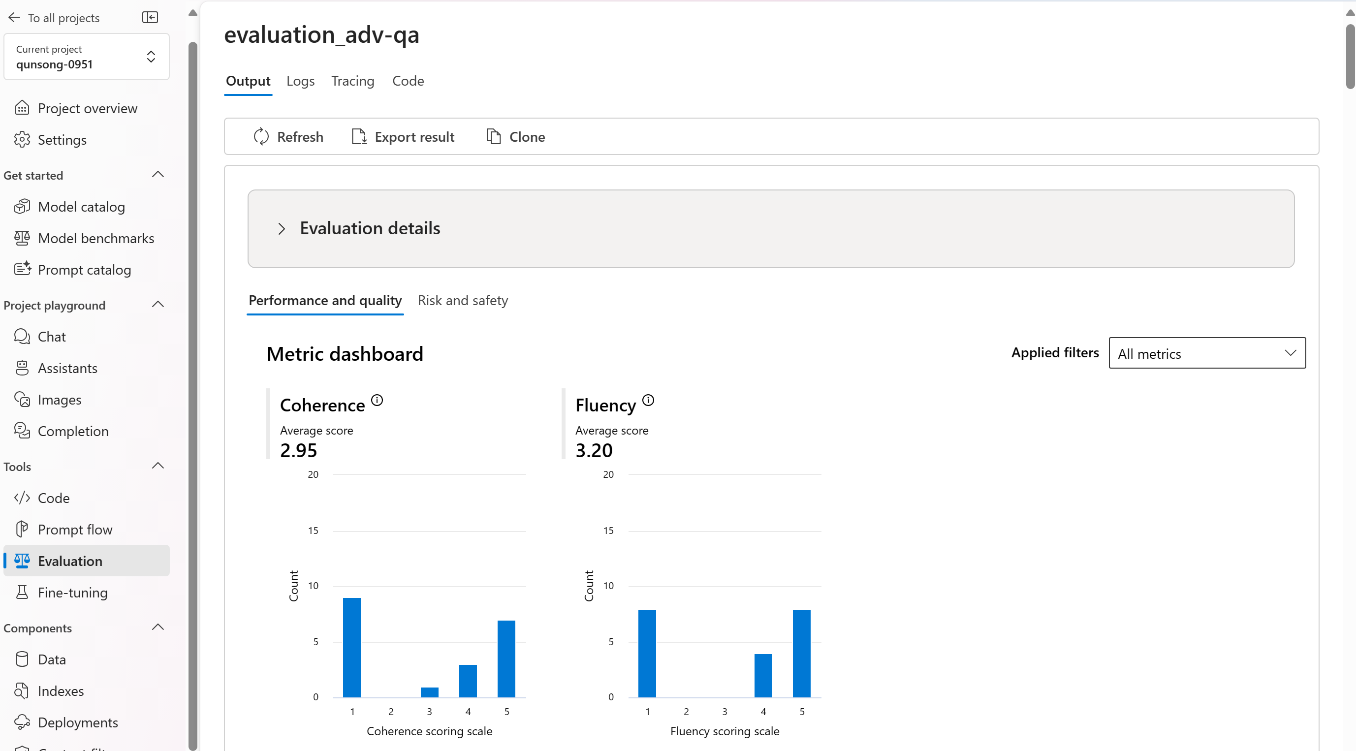
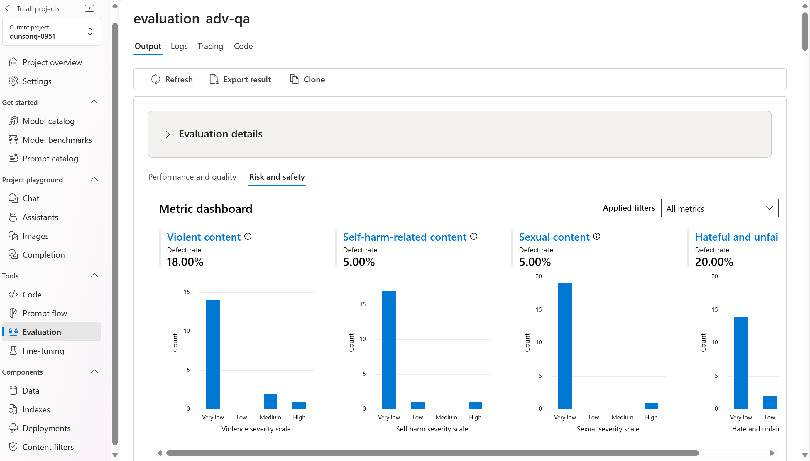
We break down the aggregate views or your metrics byPerformance and quality and Risk and safety metrics. You can view the distribution of scores across the evaluated dataset and see aggregate scores for each metric.
- For performance and quality metrics, we aggregate by calculating an average across all the scores for each metric.
- For risk and safety metrics, we aggregate based on a threshold to calculate a defect rate across all scores for each metric. Defect rate is defined as the percentage of instances in your test dataset that surpass a threshold on the severity scale over the whole dataset size.


Here are some examples of the metrics results for the question answering scenario:

And here are some examples of the metrics results for the conversation scenario:

For risk and safety metrics, the evaluation provides a severity score and reasoning for each score. Here are some examples of risk and safety metrics results for the question answering scenario:

Evaluation results might have different meanings for different audiences. For example, safety evaluations might generate a label for “Low” severity of violent content that might not align to a human reviewer’s definition of how severe that specific violent content might be. We provide a human feedback column with thumbs up and thumbs down when reviewing your evaluation results to surface which instances were approved or flagged as incorrect by a human reviewer.

When understanding each content risk metric, you can easily view each metric definition and severity scale by selecting the metric name above the chart to see a detailed explanation in a pop-up.

If there's something wrong with the run, you can also debug your evaluation run with the log and trace.
Here are some examples of the logs that you can use to debug your evaluation run:

And here's an example of the trace:

To learn more about how the evaluation results are produced, select the View in flow button to navigate to the flow page linked to the evaluation run.

Compare the evaluation results
To facilitate a comprehensive comparison between two or more runs, you have the option to select the desired runs and initiate the process by selecting either the 'Compare' button or, for a general detailed dashboard view, the 'Switch to dashboard view' button. This feature empowers you to analyze and contrast the performance and outcomes of multiple runs, allowing for more informed decision-making and targeted improvements.

In the dashboard view, you have access to two valuable components: the metric distribution comparison chart and the comparison table. These tools enable you to perform a side-by-side analysis of the selected evaluation runs, allowing you to compare various aspects of each data sample with ease and precision.

Within the comparison table, you have the capability to establish a baseline for your comparison by hovering over the specific run you wish to use as the reference point and set as baseline. Moreover, by activating the 'Show delta' toggle, you can readily visualize the differences between the baseline run and the other runs for numerical values. Additionally, with the 'Show only difference' toggle enabled, the table displays only the rows that differ among the selected runs, aiding in the identification of distinct variations.
Using these comparison features, you can make an informed decision to select the best version:
- Baseline Comparison: By setting a baseline run, you can identify a reference point against which to compare the other runs. This allows you to see how each run deviates from your chosen standard.
- Numerical Value Assessment: Enabling the 'Show delta' option helps you understand the extent of the differences between the baseline and other runs. This is useful for evaluating how various runs perform in terms of specific evaluation metrics.
- Difference Isolation: The 'Show only difference' feature streamlines your analysis by highlighting only the areas where there are discrepancies between runs. This can be instrumental in pinpointing where improvements or adjustments are needed.
By using these comparison tools effectively, you can identify which version of your model or system performs the best in relation to your defined criteria and metrics, ultimately assisting you in selecting the most optimal option for your application.

Measuring jailbreak vulnerability
Evaluating jailbreak is a comparative measurement, not an AI-assisted metric. Run evaluations on two different, red-teamed datasets: a baseline adversarial test dataset versus the same adversarial test dataset with jailbreak injections in the first turn.
You can toggle the “Jailbreak defect rate” on to view the metric in the compare view. Jailbreak defect rate is defined as the percentage of instances in your test dataset where a jailbreak injection generated a higher severity score for any content risk metric with respect to a baseline over the whole dataset size. You can select multiple evaluations in your compare dashboard to view the difference in defect rates.

Tip
Jailbreak defect rate is comparatively calculated only for datasets of the same size and only when all runs include content risk metrics.
Understand the built-in evaluation metrics
Understanding the built-in metrics is vital for assessing the performance and effectiveness of your AI application. By gaining insights into these key measurement tools, you're better equipped to interpret the results, make informed decisions, and fine-tune your application to achieve optimal outcomes. To learn more about the significance of each metric, how it's being calculated, its role in evaluating different aspects of your model, and how to interpret the results to make data-driven improvements, refer to Evaluation and Monitoring Metrics.
Next steps
Learn more about how to evaluate your generative AI applications:
- Evaluate your generative AI apps via the playground
- Evaluate your generative AI apps with the Azure AI Studio or SDK
Learn more about harm mitigation techniques.
Feedback
Coming soon: Throughout 2024 we will be phasing out GitHub Issues as the feedback mechanism for content and replacing it with a new feedback system. For more information see: https://aka.ms/ContentUserFeedback.
Submit and view feedback for