Azure Cost Management
A Microsoft offering that enables tracking of cloud usage and expenditures for Azure and other cloud providers.
3,615 questions
This browser is no longer supported.
Upgrade to Microsoft Edge to take advantage of the latest features, security updates, and technical support.
' cx='32' cy='32' r='32' /%3E%3Ctext x='50%25' y='55%25' dominant-baseline='middle' text-anchor='middle' fill='%23FFF' %3EAM%3C/text%3E%3C/svg%3E)
Hello,
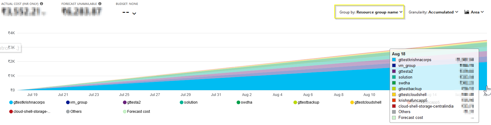
I'm trying to create an Azure dashboard to show the cost of resources in several different resource groups.
For each resource group, I can see the chart I want in the Cost Analysis blade:
However, I don't see any method to pin this chart to my dashboard.
I tried to look this up online, and came across this video: https://youtu.be/WJOI3Jym_84?t=200
At the time this video was created, there was a "pin" icon available on this chart that allowed you to pin the chart to a dashboard. Where did this "pin" button go?
Thanks!
-Anthony

Hi @Anthony Mapes ,
As explained in this Azure document, currently you could pin the cost analysis main chart by selecting the pin icon in the upper-right corner or just after the "<Subscription Name> | Cost analysis". The pivot charts under the main chart show different groupings, which give you a broader picture of your overall costs for the selected time period and filters.
Illustration:
Select "Group by" as "Resource group name" and then select the pin icon in the upper-right corner or just after the "<Subscription Name> | Cost analysis" and then pin to dashboard.