إشعار
يتطلب الوصول إلى هذه الصفحة تخويلاً. يمكنك محاولة تسجيل الدخول أو تغيير الدلائل.
يتطلب الوصول إلى هذه الصفحة تخويلاً. يمكنك محاولة تغيير الدلائل.
Azure DevOps Services | Azure DevOps Server | Azure DevOps Server 2022
Custom controls allow you to change how users view and interact with a field on the work item form. The following article walks you through how this sample custom control was built. This article shows you how to build your own custom control.
Tip
For the latest extension development guidance, including theming and migration from VSS.SDK, see the Azure DevOps Extension SDK developer portal.
Prerequisites
Include the azure-devops-extension-sdk in your project:
Install the SDK via npm:
npm install azure-devops-extension-sdk.Initialize it in your JavaScript code:
import * as SDK from "azure-devops-extension-sdk";
SDK.init();
Add the control contribution
Add a contribution to your extension manifest with type ms.vss-work-web.work-item-form-control targeting ms.vss-work-web.work-item-form:
"contributions": [
    {
        "id": "sample-work-item-form-control",
        "type": "ms.vss-work-web.work-item-form-control",
        "description": "Custom work item form control",
        "targets": [
            "ms.vss-work-web.work-item-form"
        ],
        "properties": {
            "name": "My Control",
            "uri": "workItemControl.html",
            "height": 600
        }
    }
],
"manifestVersion": 1.0,
    "scopes": [
        "vso.work"
    ]
The work item form loads the custom control in an IFrame.
Control properties
| Property | Description |
|---|---|
name |
Text that appears on the group. |
uri |
URI to the HTML page loaded in the IFrame. |
height |
(Optional) Height of the IFrame in pixels. Default is 50. |
inputs |
Values that users provide when adding the control to the form. |
To dynamically resize the IFrame, use the resize method in the SDK.
A custom control is a type of contribution similar to group and page contributions. The key difference is that control contributions accept user inputs, while group and page contributions don't.
Control contribution inputs
Use the inputs property in the contribution object to define configurable inputs for your control.
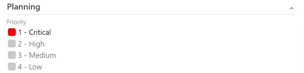
The following example defines two inputs: FieldName specifies which work item field the control is associated with, and Colors configures which colors map to which field values. Users provide these values when they add the control to the form, and the values are passed to the control at load time.
"inputs": [
    {
        "id": "FieldName",
        "description": "The field associated with the control.",
        "type": "WorkItemField",
        "properties": {
            "workItemFieldTypes": ["String"]
        },
        "validation": {
            "dataType": "String",
            "isRequired": true
        }
    },
    {
        "id": "Colors",
        "description": "The colors that match the values in the control.",
        "type": "string",
        "validation": {
            "dataType": "String",
            "isRequired": false
        }
    }
]
Input properties
The following properties define a user input:
| Property | Description |
|---|---|
| id | Unique ID for the input. |
| description | Short description of the input. |
| type | (Optional) Input type. Use WorkItemField to indicate the value should be a work item field reference name. |
| properties | (Optional) Custom properties. Use workItemFieldTypes to restrict which field types are valid (for example, String, Integer, DateTime, Boolean). |
| validation | Validation rules. Set dataType (String, Number, Boolean, or Field) and isRequired (true or false). |
Supported workItemFieldTypes values: String, Integer, DateTime, PlainText, HTML, TreePath, History, Double, Guid, Boolean, Identity, PicklistString, PicklistInteger, PicklistDouble.
JavaScript sample
A custom control extension works like a group or page extension, with the addition that it reads user input values via SDK.getConfiguration().witInputs. The following sample registers a provider that responds to work item form events:
import { Control } from "control";
import * as SDK from "azure-devops-extension-sdk";
import * as ExtensionContracts from "azure-devops-extension-api/WorkItemTracking/WorkItemTracking";

let control;

const provider = () => {
    return {
        onLoaded: (workItemLoadedArgs) => {
            // create the control
            const config = SDK.getConfiguration();
            const fieldName = config.witInputs["FieldName"];
            const colors = config.witInputs["Colors"];
            control = new Control(fieldName, colors);
        },
        onFieldChanged: (fieldChangedArgs) => {
            const changedValue = fieldChangedArgs.changedFields[control.getFieldName()];
            if (changedValue !== undefined) {
                control.updateExternal(changedValue);
            }
        }
    };
};

SDK.init();
SDK.ready().then(() => {
    SDK.register(SDK.getContributionId(), provider);
});
The following screenshot shows a sample custom work item control for the Priority field.