إشعار
يتطلب الوصول إلى هذه الصفحة تخويلاً. يمكنك محاولة تسجيل الدخول أو تغيير الدلائل.
يتطلب الوصول إلى هذه الصفحة تخويلاً. يمكنك محاولة تغيير الدلائل.
Azure DevOps Services | Azure DevOps Server | Azure DevOps Server 2022
Tip
For the latest extension development guidance, including theming and migration from VSS.SDK, see the Azure DevOps Extension SDK developer portal.
Use the basic styles provided by the Widget SDK for a consistent look across dashboard widgets.
To include widget styles, call WidgetHelpers.IncludeWidgetStyles() during widget initialization:
WidgetHelpers.IncludeWidgetStyles();
This loads sdk-widget.css into your widget's iframe, providing styles for font-family, font-size, margins, paddings, headings, and links.
For widget configuration panels, call WidgetHelpers.IncludeWidgetConfigurationStyles() instead:
WidgetHelpers.IncludeWidgetConfigurationStyles();
This loads sdk-widget-configuration.css, which provides styles for font-family, font-size, and common form elements like input, textarea, and select.
Note
For these styles to apply, add a widget class on the HTML element that contains your widget. All styles from sdk-widget.css are scoped to this class. Similarly, add a widget-configuration class on the element that contains your widget configuration.
For a working example, see the extension sample.
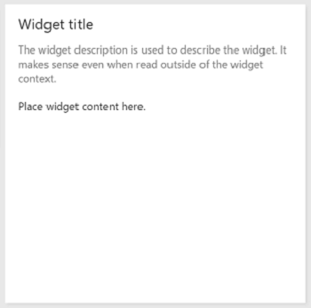
Widget body, title, and description
By adding the widget class on your widget's container element, you automatically get padding, font, and color for widget contents.
Always include a title for your widget so users can identify its purpose at a glance. Use <h2> with the title class. This also helps screen readers identify the different widgets on the dashboard.
Design principle: Widgets should have a title. Use the
<h2>tag with thetitleclass.
To add a description, use the description class on the element that contains your widget description.
Design principle: Use the
descriptionclass for the widget description. Descriptions should make sense even when read outside the widget context.
	<div class="widget">
	    <h2 class="title">Widget title</h2>
		<div class="description">The widget description is used to describe the widget. It makes sense even when read outside of the widget context.</div>
		<p>Place widget content here.</p>
	</div>
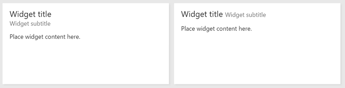
Widget titles and subtitles
Subtitles supplement the title and might not make sense when read out of context.
Design principle: Use the
subtitleclass to provide more information about the widget.
Use the title, inner-title, and subtitle classes to get the right font, color, and margins for a title and subtitle combination. The subtitle has a subdued color relative to the title.
	<div class="widget">
	    <h2 class="title">
			<div class="inner-title">Widget title</div>
			<div class="subtitle">Widget subtitle</div>
		</h2>
		<div class="content">
			Place widget content here.
		</div>
	</div>
Tips for the title and subtitle combination:
- Use an inline element like
<span>for the subtitle to appear on the same line as the title. - Use a block element like
<div>for the subtitle to appear on a new line.
Links with icons and subtext
Some widgets include links with an icon, text, and subtext.
Design principle: Use links with an icon and subtext to make the purpose of the link obvious to the user. Ensure that the icon symbolizes the link's target.
To get the same look and feel, use the below HTML structure and classes.
	<div class="widget">
	    <h2 class="title">Widget title</h2>
		<div class="content">
			<p>Place your content here.</p>
			<a class="link-with-icon-text" href="http://bing.com" target="_blank">
				<span class="icon-container" style="background-color: #68217A"></span>
				<div class="title">
					Primary link text
					<div class="subtitle">Link subtext</div>
				</div>
			</a>
		</div>
	</div>
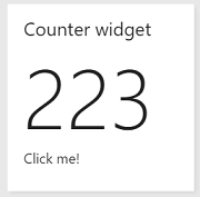
Counters
For widgets that display a count, add the big-count class on the element holding the number. The Query Tile and Code Tile widgets use this same style.
Design principle: Use the
big-countclass to present numbers in large font. Don't use it with non-numeric characters.
<div class="widget">
    <h2 class="title">Counter widget</h2>
	<div class="big-count">223</div>
	<div>Additional text</div>
</div>
Clickable widgets
To make a widget clickable so selecting it anywhere navigates to another page:
- Add an anchor tag as a child of the widget container element.
- Put all widget content inside the anchor tag.
- Add
target="_blank"to the anchor tag so the link opens in a new tab. - Add the
clickableclass to the widget container.
Without the clickable class, the default blue link color applies to all text inside the widget. The clickable class also provides a custom focus indicator for keyboard navigation.
Design principle: Use the
clickableclass and the<a>tag to make the entire widget clickable. This pattern works well when your widget summarizes data available on another page.
<div class="widget clickable">
    <a href="https://bing.com"  target="_blank">
		<h2 class="title">Counter widget</h2>
		<div class="big-count">223</div>
		<div>Click me!</div>
	</a>
</div>
Configuration form elements
Use the following classes for common form elements in widget configuration:
| Form element | Wrapping element | Guidelines |
|---|---|---|
| Simple text box | div with class "single-line-text-input". |
Use a label element to add text next to the text box. Use the input element to create a text box. Use the placeholder attribute to provide placeholder text. |
| Checkbox | fieldset with class "checkbox" |
Use a label element to add text next to each checkbox. Use a legend element to caption the group of checkboxes. Use the for attribute on each label element to help screen readers understand the form element. |
| Radio button | fieldset with class "radio" |
Use a label element to add text next to each radio button. Use a legend element to caption the group of radio buttons. Use the for attribute on each label element to help screen readers understand the form element. |
| Dropdown | div with class "dropdown" |
Use a label element to add text next to the dropdown. If you want a dropdown occupying half the width, add class "half" to the wrapping div element. If you want to use the standard arrow icon from the sdk instead of the one provided by the browser, wrap the select element with another div with class "wrapper". |
| Multi-line text box | div with class "multi-line-text-input". |
Use label element to label the textarea element used as multi-line text box. |
The following example uses each of the form elements listed in the table.
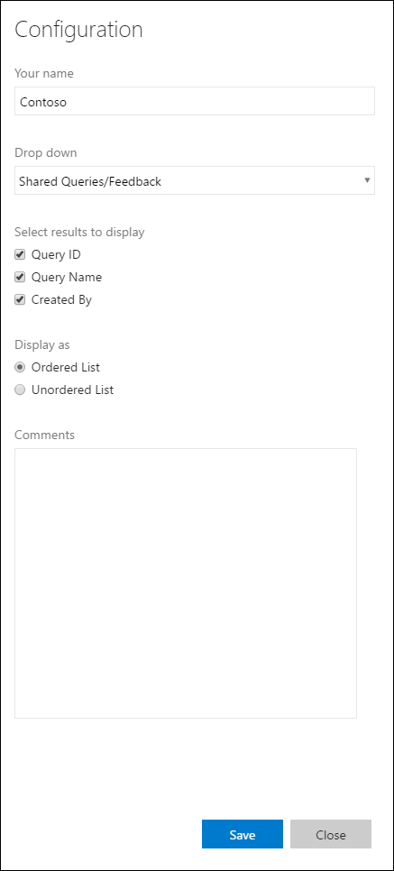
<div class="widget-configuration">

    <div class="single-line-text-input" id="name-input">
        <label>Your name</label>
        <input type="text" value="Contoso"></input>
    </div>

    <div class="dropdown" id="query-path-dropdown">
        <label>Drop down</label>
        <div class="wrapper">
            <select>
				<option value="Shared Queries/Feedback">Shared Queries/Feedback</option>
				<option value="Shared Queries/My Bugs">Shared Queries/My Bugs</option>
				<option value="Shared Queries/My Tasks">Shared Queries/My Tasks</option>
			</select>
        </div>

        <fieldset class="checkbox" id="select-results">
            <legend>Select results to display</legend>
            <input type="checkbox" id="check-option1" value="id" name="check" checked="true">
            <label for="check-option1">Query ID</label><br/>
            <input type="checkbox" id="check-option2" value="name" name="check" checked="true">
            <label for="check-option2">Query Name</label><br/>
            <input type="checkbox" id="check-option3" value="createdBy" name="check" checked="true">
            <label for="check-option3">Created By</label><br/>
        </fieldset>

        <fieldset class="radio" id="display-options">
            <legend>Display as </legend>
            <input type="radio" id="radio-option1" value="ordered" name="radio" checked="true">
            <label for="radio-option1">Ordered List</label><br/>
            <input type="radio" id="radio-option2" value="unordered" name="radio">
            <label for="radio-option2">Unordered List</label><br/>
        </fieldset>

        <div class="multi-line-text-input">
            <label>Comments</label>
            <textarea></textarea>
        </div>
    </div>
</div>
Validation error messages
To display validation errors below form elements in a manner consistent with first-party widgets, add the following snippet under each form element:
<span class="validation-error">
	<span class="icon-error-exclamation"></span>
	<span class="validation-error-text"></span>
</span>
The visibility is hidden by default. To display an error message, find the corresponding validation-error-text element, set its text, and set visibility: visible on its parent.
For example, to show an error when a text box is empty:
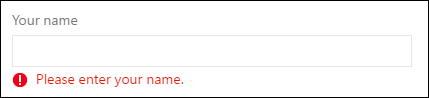
The html for this would be:
<div class="widget-configuration">
	<div class="single-line-text-input">
		<label>Your name</label>
		<input type="text" placeholder="Type Here">

		<span class="validation-error">
			<span class="icon-error-exclamation"></span>
			<span class="validation-error-text"></span>
		</span>
	</div>
</div>
And the JavaScript:
const input = document.querySelector(".single-line-text-input input");
const errorText = document.querySelector(".single-line-text-input .validation-error-text");

input.addEventListener("input", function () {
    if (input.value === "") {
        errorText.textContent = "Please enter your name.";
        errorText.parentElement.style.visibility = "visible";
    } else {
        errorText.parentElement.style.visibility = "hidden";
    }
});